If you’ve flipped through a magazine or browsed social media lately, chances are you’ve stumbled upon a slick-looking infographic.
From healthcare to finance, infographics are a popular visual storytelling medium across industries and platforms. Educators and students also favor infographics because of their versatility inside the classroom.
While they come in various shapes and sizes, the best infographics out there have one thing in common: they combine visuals and text to communicate an idea, insight, or information.
If you’re new to infographic design, you’ve come to the right corner on the internet!
This article is packed with everything you need to know about infographic creation — from understanding what makes a good infographic to examples of different infographic types for instant inspiration.
You’ll also come across editable infographic templates that you can customize and download for work, school, or business.
If you want to start right away, just create a free Piktochart account and design your infographic easily. You can start from a template or from scratch, customizing to your brand.
If you are more of a visual learner than a reader, check out the summary video of this blog post:
What is an infographic?
Infographics (information + graphics) use visuals and text to highlight key information and ideas.
According to the Dictionary of Media and Communication, an infographic is a graphical representation of concepts, or of patterns in data or information.
In Infographics: The Power of Visual Storytelling, authors Lankow, Ritchie, and Crooks define an infographic as a medium that uses visual cues to communicate information. “It can be as simple as a road sign of a man with a shovel that lets you know there is construction ahead, or as complex as visual analysis of the global economy,” the authors wrote.
The widespread use of infographics started around the same time data flooded the web when the internet gained popularity in the late 1980s and early 1990s. However, the history of infographics goes as far back as cave symbols in 37000 BC.
For example, the founder of modern nursing Florence Nightingale combined text and visuals in 1858 to convince the British Government to improve army hygiene. In Notes on Matters Affecting the Health of the British Army, Nightingale created a graph showing that the real enemies of the British army during the Crimean were cholera, typhus, and dysentery.

More than a century later, healthcare infographics remain a practical and valuable tool to communicate and share medical information.

In a nutshell, the overall goal of infographic creation is to convey complex information.
However, the purpose of designing an infographic can vary from one person to another.
Whether you’re about to make your first pitch deck template or you’re a budding instruction designer, let’s dive in at the different ways you can use infographics in the next section.
What are infographics used for
The versatility of infographics is one key reason why they are commonly used in relaying information. You can upload a blog post with an infographic, use an infographic snippet on social media, or share it privately via email.
Best of all, the visual nature of graphics makes it a good entry point in capturing your target audience’s interest. Here are six different ways to use infographics at work, school, or business:
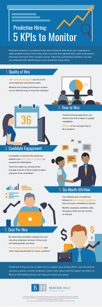
1. Keep your team on track by visualizing key metrics and data.
Data-heavy information can be difficult to grasp for some team members at work. Create and share easy-to-understand visuals with your team through infographics. Make those numbers and metrics stand out with the right colors, icons, and images. Take a look at Beacon Hill Staffing’s infographic on predictive hiring KPIs below.
Use the Piktochart templates below as a starting point for your data visualization needs as a team manager or leader. Create a free Piktochart account.
2. Simplify communication and clarify messages.
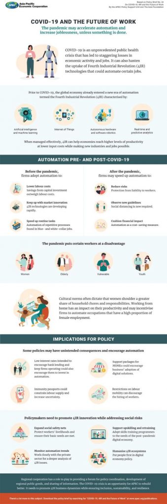
Explaining novel concepts can be a challenge. For instance, before the COVID-19 outbreak, the idea of a pandemic was new to the public and seemed far-fetched.
The good news is that infographics can help simplify and demystify complex ideas.
For this reason, the World Health Organization (WHO) used infographics in sharing accurate, up-to-date information about the coronavirus pandemic.
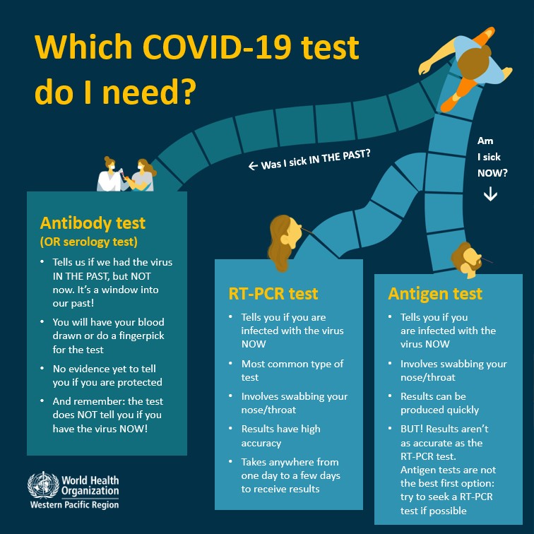
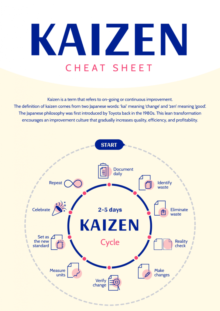
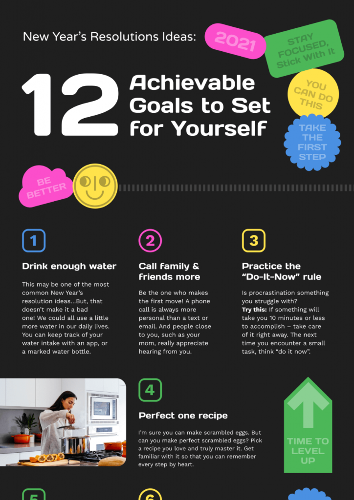
When done correctly, infographics help you understand the main idea presented with just a quick glance. As an example, the infographic below is a good read for anyone with zero knowledge of the Kaizen approach.
3. Get complex information across in the classroom.
From understanding the impact of climate change to learning new vocabulary, enrich classroom lessons with visual aids.
In fact, a small survey of undergraduate students revealed that they prefer infographics instead of text-based materials.
Whether it’s a virtual teaching session or a face-to-face class, using infographics in the classroom offers the following benefits for students:
- Promotes critical thinking in students
- Encourages students to take on multiple perspectives
- Helps students improve their information-gathering chops and sharpen their research skills
- Improves memory retention
Meanwhile, infographic activities benefit teachers through the following:
- Save more time with lesson preparation
- Be more versatile with their teaching methods
Adjunct Professor of Education and school counselor Jennifer Davis Bowman recommends three strategies to make the most out of visual aids like infographics in a classroom setting:
1. Share intent
2. Activate discussion
3. Create visual aids as a class
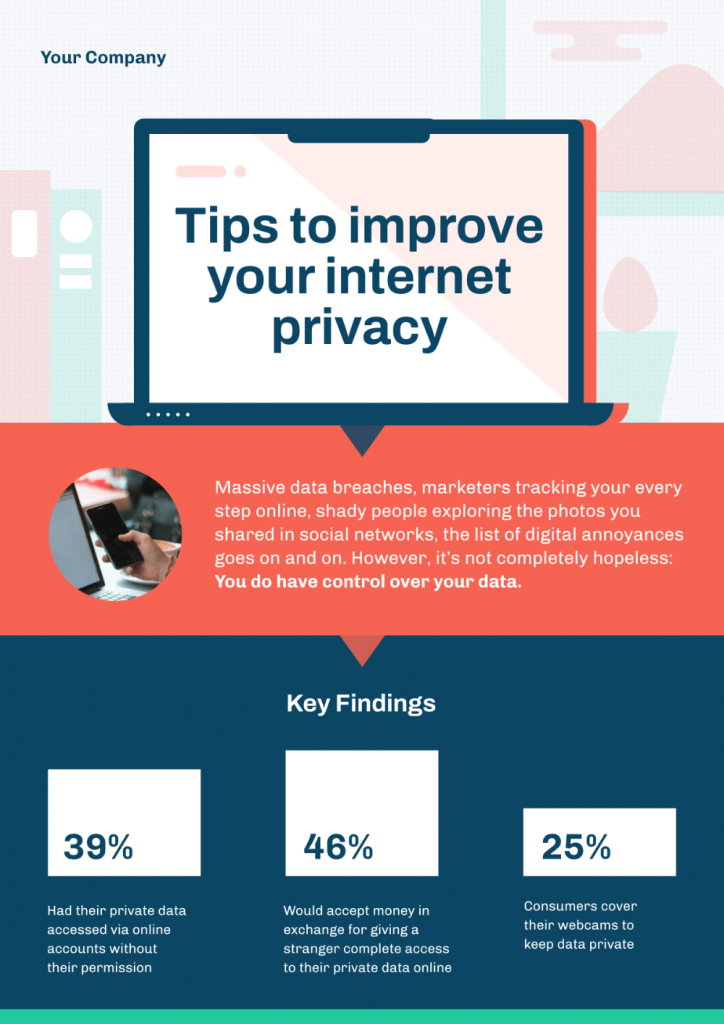
4. Spread awareness about an issue.
With 65 percent of the world’s population as visual learners, visual communication tools like infographics are ideal if you want to spread awareness about an issue.
Whether you want to educate your coworkers about internet privacy or make more people aware of biodiversity loss, a relevant infographic can have a wider reach. A well-designed infographic on your website can also help you get more backlinks and website traffic.
5. Explain procedures.
Explaining a process can be time-consuming and tedious if you rely on blocks of text alone. With infographics, you can add visuals, images, and icons to make learning more memorable and fun for your audience.
The next time you’re about to make a tutorial or a quick workflow, create an infographic instead of typing away in a Google Doc.

6. Compare ideas or products.
Help your audience make better decisions by using infographics that illustrate the similarities and differences of two opposing concepts. You can compare and contrast products, people, eras, ideas, pets, and so on. The possibilities are endless!
A meta-analysis by the Learning Research and Development Center at the University of Pittsburgh found out that case comparison activities have better learning outcomes than traditional methods of instruction.
Whether you’re a marketer who wants to show how your product is better than the competition or an educator teaching the pros and cons of GMOs in class, a good comparison infographic will make your work easier.
What are the different types of infographics?
Now that you already know how to use infographics, let’s break down each type of infographic. You’ll also discover when is the best time to use each infographic type below.
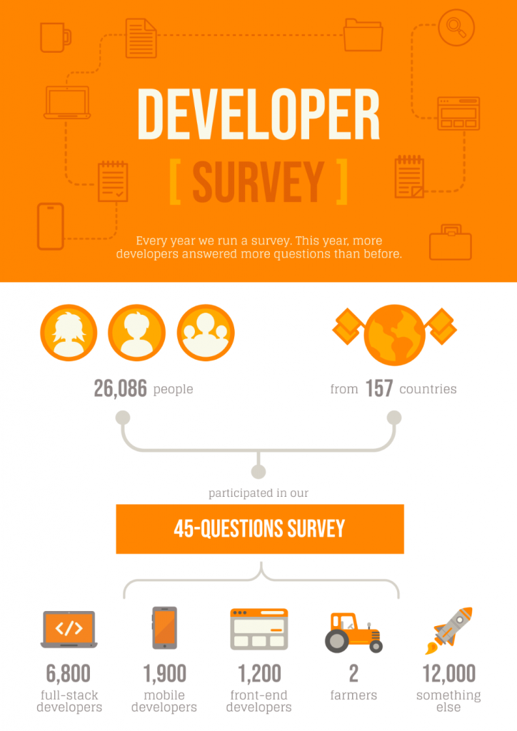
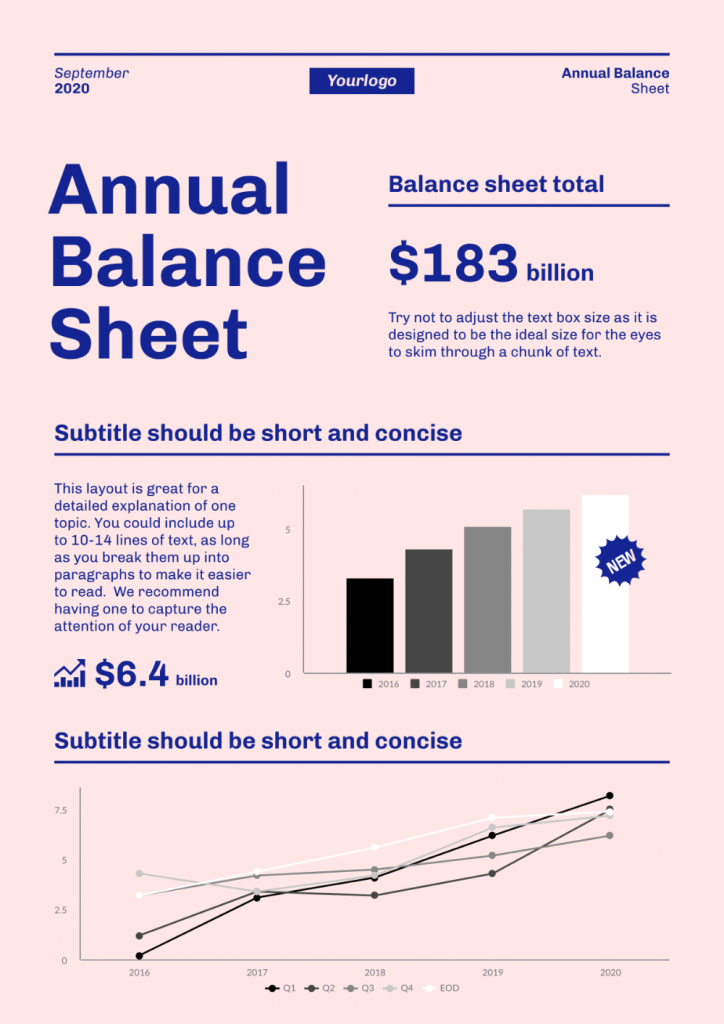
Statistical infographics
Do you want to share the highlights of your startup’s monthly report? Or would you like to focus attention on specific data points in a survey?
Statistical infographics highlight data. This type of infographic features graphs, charts, and data visualization techniques to help the audience make sense of the data presented.
Use statistical infographics to:
- Share interesting facts and figures
- Condense lengthy information
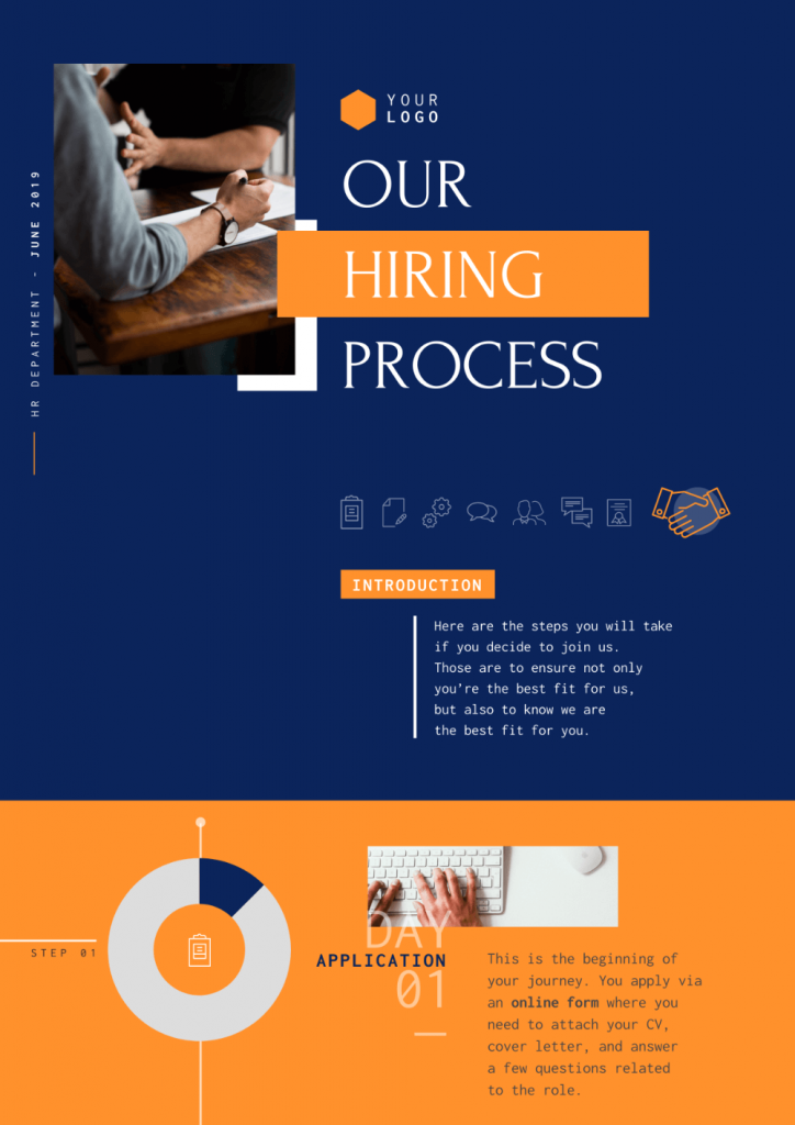
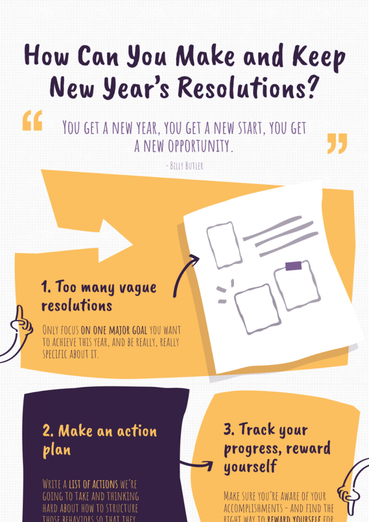
Process infographics
Choose process infographics if you want to show the different steps in a process. From sharing family recipes to describing your company’s recruiting process to candidates, a process infographic helps your audience anticipate what’s next and envision outcomes.
Use process infographics to:
- Explain a complex process into simple, easy-to-understand steps
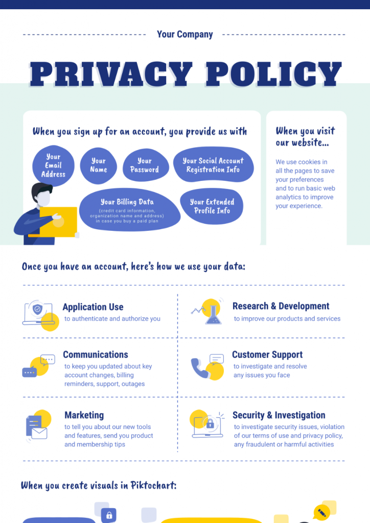
Informational infographics
Informational infographics highlight words and texts instead of figures and numbers. It is more generalized and can contain information about any topic. In this type of infographic, the text shines more than your visuals.
Use informational infographics to:
- Explain topics or concepts by pairing words with engaging visuals together

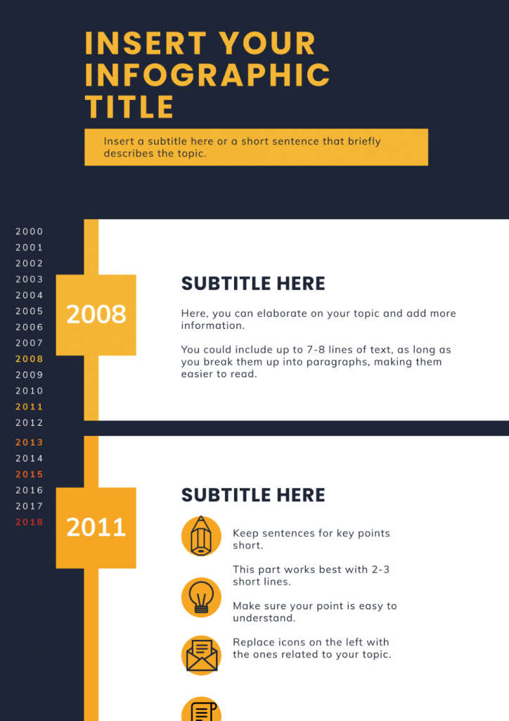
Timeline infographics
Timeline infographics illustrate actions, events, or time-related data in chronological order. You can present information in horizontal, vertical, or winding formats for this type of information.
Use timeline infographics to:
- Visualize history or show how long something will take
- Highlight how a place, event, or concept has changed over time
List infographics
The internet loves listicles! With list infographics, your audience will love you more because the list format grabs their attention quickly and enables them to retain information quickly. Icons and images can also replace bullet points and numbers to make each item or example stand out.
Use list infographics if you want to:
- Make a basic list pop out and grab your audience’s attention
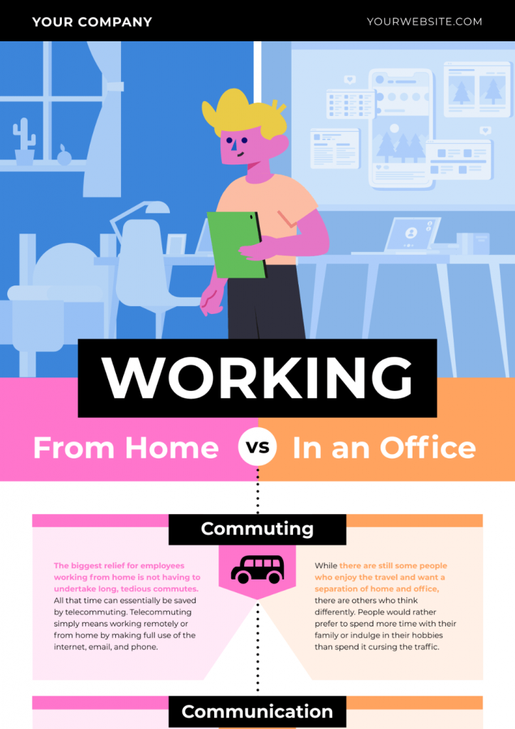
Comparison infographics
A comparison infographic compares or contrasts two options, ideas, or concepts. This infographic format helps your audience see the similarities or differences between two or multiple choices. It’s also ideal in “telling the two sides the story”.
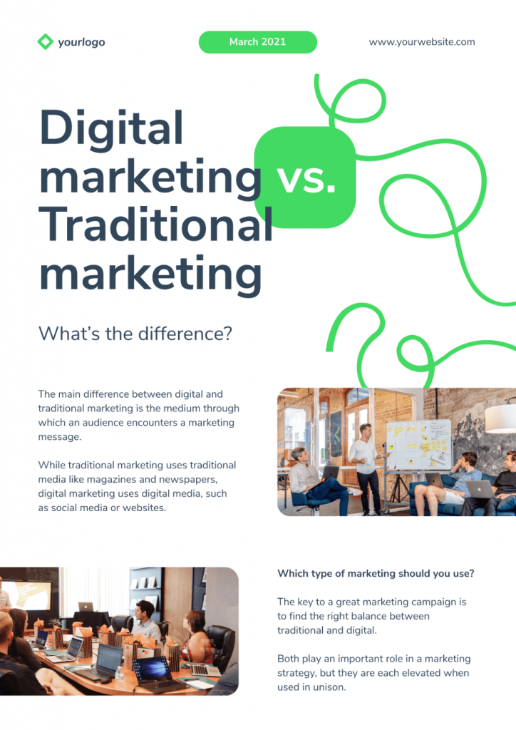
From comparing two products to showing the pros and cons of traditional vs. digital marketing like in the infographic below, help your audience make informed decisions with comparison infographics.
Use comparison infographics if you want to:
- show differences and similarities
- highlight how one option is superior/inferior to the other
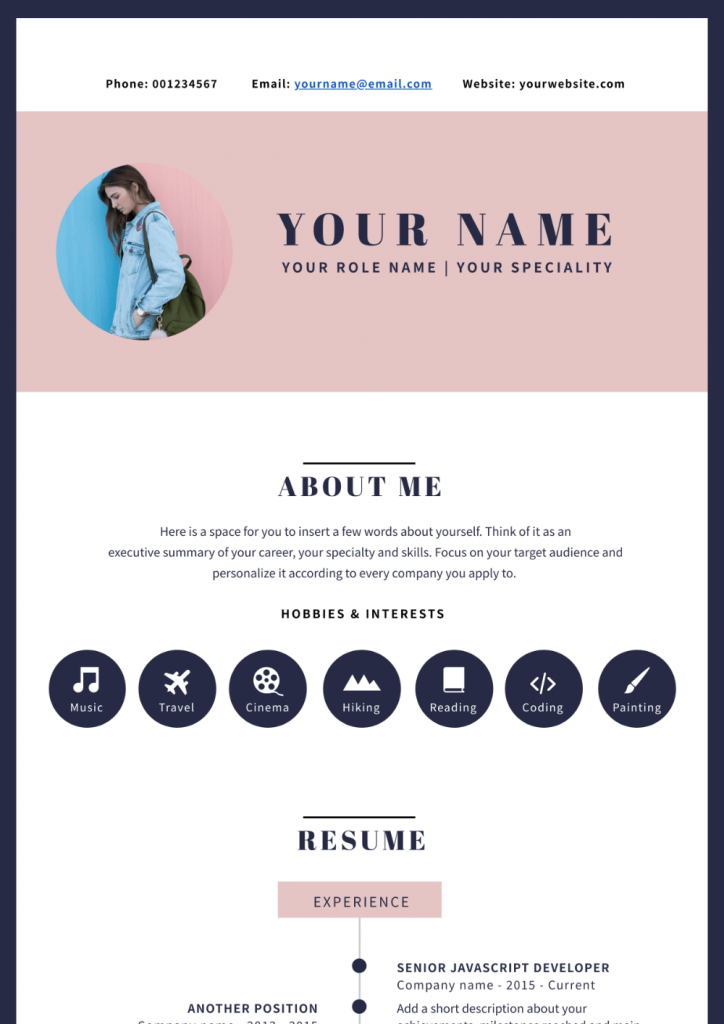
Infographic resumes
Also known as a visual resume, infographic resumes are visual CVs that help job seekers stand out from the rest of the pack.
An infographic resume presents your impressive skills, employment history, and educational background through eye-catching colors, graphs, icons, and illustrations. The best part about infographic resumes is that you can highlight your work and skills minus the information overload.
Use comparison infographics if you want to:
- Grab the attention of recruiters and hiring managers and get them to call you back for an interview
What makes a good infographic
You know it’s a good infographic when a reader glances at it and can quickly understand the main idea. Well-designed, good infographics have the following characteristics:
- Offers clarity
- Tells a cohesive story
- Easy to scan and read
- Well-researched and accurate
- Visually appealing
You can take the following steps towards making a good infographic:
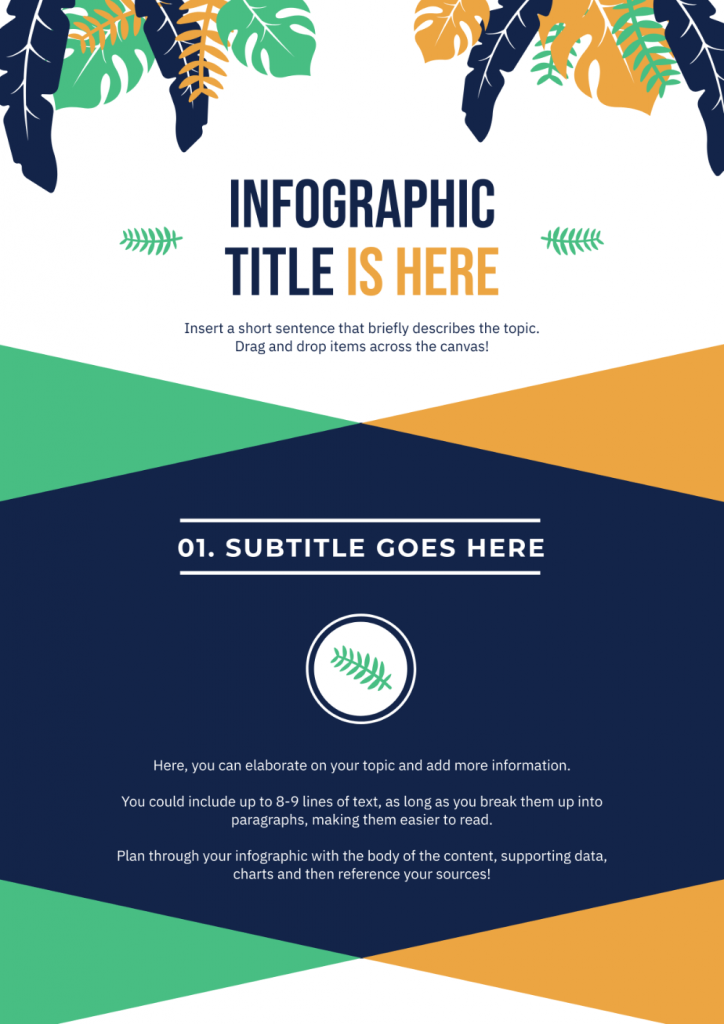
1. Choose images, icons, or illustrations that aid audience comprehension.
While words and texts are important in communicating information, make your infographic stand out with the right visuals. Choosing the right visuals in your infographic can help you create accessible, coherent, and compelling content.
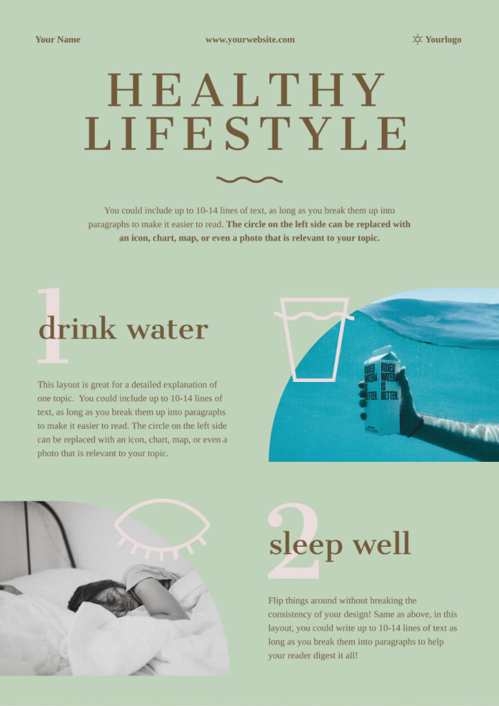
Don’t just add images or icons for the sake of having images in your infographic. Your visuals of choice should reinforce the accompanying texts in your infographic, like in the example below.
2. Have a clear hierarchy.
Next to visuals, you need to pay attention to the visual hierarchy in your infographics.
Hierarchy is the way that your text and visuals are structured and prioritized in your infographic. These include headers, subheaders, paragraphs, text descriptions, visuals, and your call-to-action.
At the most basic level, a clear hierarchy in your infographic guides the viewer as they scan your infographic. It tells them which content is the most relevant and shows the relationships between pieces of content in your infographic.
An infographic without a clear visual hierarchy is filled with clutter leading to reader confusion.
3. Pick the right color combination.
Make your infographics come to life by putting more thought into your colors.
The right color combination can make or break your infographic. Aside from shapes and lines, colors can set the mood of an infographic and dictate how it will impact your readers. Plus, research reveals that the human brain uses colors and shapes to “detect and discriminate” objects.
Pro tip: Use 60-30-10 rule when planning for your infographic colors:
- A primary or “root” color will cover 60 percent of your infographic.
- A secondary color will cover 30 percent of the infographic.
- An accent color will cover the remaining 10 percent of the infographic.
Can you spot the primary, secondary, and accent colors in the infographic below?
Learn more tips in 4 Steps to Choosing Good Color Combinations for Your Infographic.
4. Group related elements and information through lines, borders, colors, and shapes.
Like visual hierarchy, grouping related elements together can help you create a good infographic.
Why?
Let’s take a quick look at the Gestalt Principles, a set of principles that describe how the human brain recognizes patterns, simplifies complex images, and groups similar elements when perceiving objects.
One of these principles is the Law of Common Region. This principle describes how items within a boundary are perceived as a group and assumed to share some common characteristics or functionality.
A good infographic follows this principle using shapes, borders, and lines to group elements together. For the infographic example below, the borders, shapes, and lines are used to group infographic elements.
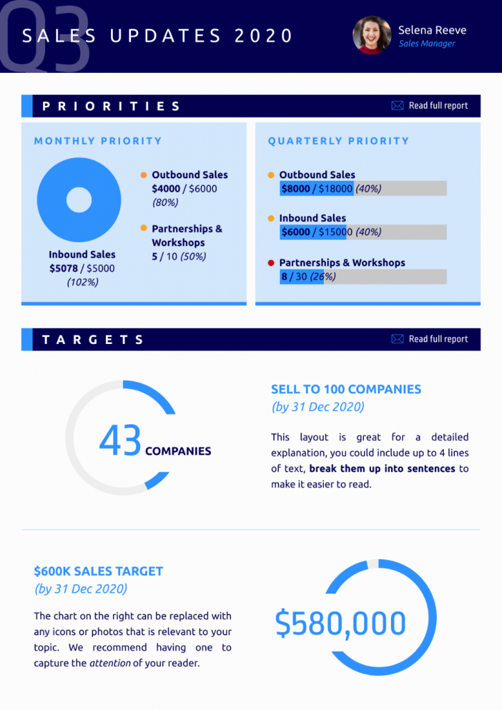
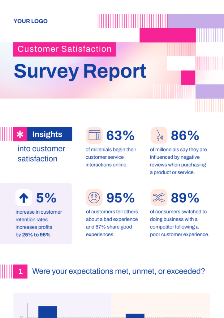
5. Use graphs and charts to communicate data.
Another important step for creating a good infographic is to make good use of charts and graphs. Besides being easy on the eyes to read, there’s a shallow learning curve for the audience because they are quite common.
Some quick tips to remember when using graphs and charts your an infographic:
- Add short explanations or bullet points that explain your chart or graph. It also makes sense to add additional data that you cannot include in your visual.
- Avoid multiple data points that will be difficult for your audience to interpret. For example, bar charts should have fewer bars as much as possible, and line graphs should have no more than four lines.
- As much as possible, do not use scatter plots and stacked bar charts, particularly if you have a non-scientific audience.
- Use pie charts sparingly because most people are not good at estimating volume or area. The Storytelling with Data team recommends using a horizontal bar chart, organized from greatest to least (or vice versa) instead of a pie chart.
How do I create an infographic?
You’ve made it this far, and we’re now entering the final stretch of this article!
In this section, you’ll learn how to make an infographic even if you don’t have a design background.
1. Identify your target audience.
Like all types of content, the first step in creating infographics is to identify and familiarize yourself with your target audience.
If possible, talk to at least five people who fit the criteria of your target audience persona and explore their pain points, needs, and wants. Go beyond the usual demographic questions such as age, occupation, educational background, and household income.
Robin Geuens, Piktochart’s resident SEO, also recommends understanding your target audience’s level of knowledge. By doing so, you’ll be able to skip over basic information in your infographic.
2. Define your goals.
An infographic all by itself is just a piece of content. Infographic creation without a purpose is a meaningless exercise. When you have a clear infographic purpose, you’ll be able to pick the right type of infographic for the job, saving you time and effort.
Here are some goals that you can aim for the next time you’re designing an infographic:
- Report on data.
- Raise awareness.
- Reveal patterns or trends.
- Simplify complex information.
- Highlight a sequence of events.
- Compare two or more ideas or concepts.
- Explain a process and showcase a step-by-step guide.
- Encourage people to buy a product or avail of a service.
3. Gather your information.
After you nail down your target audience and infographic purpose, your next step is to gather the “info” (information) part of your infographic. Keep in mind that the data and information you share are the foundation of a compelling infographic.
Follow these steps to collect relevant and reliable information for your infographic:
- Consult open source databases. Go to a local library or browse sites of government agencies.
- Explore websites that end in .edu, .org, and .gov. These are typically educational institutions, nonprofit organizations, and government agencies. The data presented on these websites are generally credible and authoritative.
- Conduct in-person interviews or create a survey.
- Check for relevance and collect up-to-date information.
- Understand the intent of your source and find out if it’s an opinion or a fact.
4. Choose the type of infographic.
As mentioned earlier, there are different types of infographics to choose from. Each type has its purpose, format, and way of displaying information.
For example, timeline infographics can either be presented vertically or horizontally. Meanwhile, comparison infographics are often presented in vertical format.
Knowing how your infographic would look will help you pick the right infographic template.
5. Create a logical hierarchy.
Create a logical hierarchy in your infographic by planning its structure. Writing for an infographic is not the same as writing content for a blog post or an academic paper.
Before you start making your infographic, write your content either in Word or in a Google Doc. This will give you an overview of your infographic content and you can switch data around without editing your infographic.
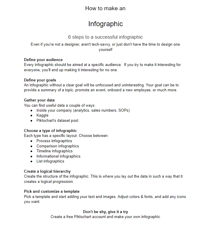
Your infographic should contain the following elements:
- Title
- Introduction
- Body Content
- Conclusion/Call-to-Action
- Sources
6. Pick and customize a template.
The best part about making infographics these days is you don’t have to start from scratch. For example, you can browse through Piktochart’s infographic template collection and pick the suitable template based on your infographic goals and the type of information you’re about to present.
From timeline infographic templates to infographic resumes you can customize, all it takes is a few clicks to tailor it to your preferences. You can also mix and match colors as needed. Before you know it, you’re all set!
An added benefit of infographic templates is you can reuse and repurpose your infographic templates! This is particularly useful when you create reports or graphics that have to be updated regularly.
7. Download your infographic.
After all the hard work, you’re ready to download, embed, and share your infographic! Before you download and say “that’s a wrap!”, you have to:
- Check the validity of your sources.
- Double-check for typos and grammar errors.
- Have someone go over your infographic and ask for feedback.
With Piktochart, there are many download options to choose from, whether you’re planning to share your infographic online or offline.
For more infographic design tips and in-depth advice, go to How to Make an Infographic in 30 Minutes.
Now Go Make Your Best Infographic Ever
When you put information and share data in front of your audience, you are requiring them to process information. Infographics help your audience accomplish this goal more effectively.
In summary, you’re not just sharing information with infographics. A good infographic helps your audience make better decisions, get insights, and motivate them to act.
Get started with your first infographic today. Sign up for a free Piktochart account.
About the author:
Kyjean Tomboc is an experienced content marketer for healthcare, design, and SaaS brands. She also manages content (like a digital librarian of sorts). She lives for mountain trips, lap swimming, books, and conversations over beer.

