Turn Boring Data Into a Compelling Story With Our Bar Graph Maker
It’s time to make your data understandable, compelling, and convincing. With Piktochart’s bar chart maker you can easily translate your data set into a visual story that will grasp the attention of your audience.
Create a bar chart for free Watch a demoHow to make a bar graph in 6 easy steps
1
Log in
Create or log into your Piktochart account
2
Pick a template
Pick a template made by designers or start from scratch
3
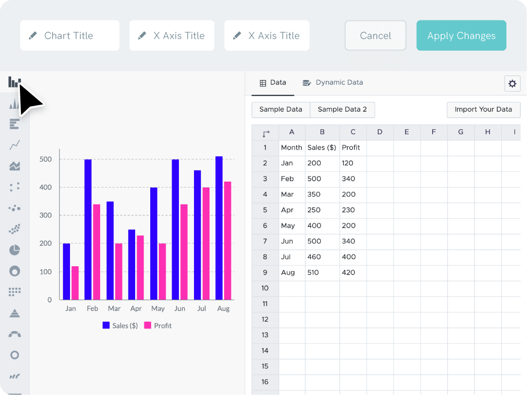
Open the chart maker
Go to tools and open up our chart maker
4
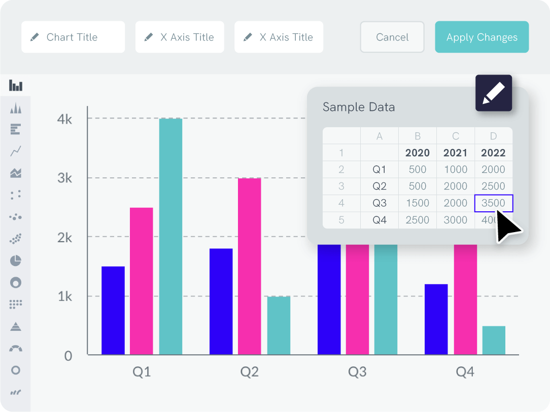
Enter your data
Copy-paste your data points straight from excel, csv or link a Google sheet
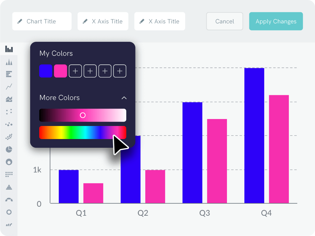
5
Adjust to your liking
Adjust data labels, x-axis, y-axis, graph title, background color, and more
6
Download or share
Download your graphic as a jpg, png, pdf file, or share your graphic on social media