In many ways, I really love this time of year. More than halfway through the school year, my students and I have achieved a level of comfort in our classroom, the likes of which I eagerly anticipated back in September.
I know my students, they know me, and our school day (more or less) flows from one established routine to another. But with this comfort come slightly different challenges:
- Because they are comfortable, my students’ voices get louder during group work.
- Because I am comfortable, I let it slide when I am giving instructions and do not have 100% of students’ eyes on me.
- Because we are all comfortable, those routines and procedures that I taught in September, retaught in January, and that we practiced many times in between, begin to falter.
When I notice this pattern unfolding, I know the time is ripe for a good old fashioned reteach. And a Piktochart infographic editor is exactly the tool on which I rely to really drive my message home.
Here are a few reasons why:
Infographics give me a new way to teach old material
“We just reviewed this in January” I think, each time a student fails to meet a relatively basic expectation. But we all need reminders, and presenting old information in a new way means I’m more likely to grab and hold the attention of a greater percentage of my students.
[clickToTweet tweet=”Presenting old information in a new way means I’m more likely to grab attention of more students.” quote=”Presenting old information in a new way means I’m more likely to grab attention of more students.”]
Infographics show, rather than tell
I know the expectations.
Kids know the expectations.
They know that I know the expectations.
So telling them over and over again can feel like shouting in a dark cave – I hear my own voice but wonder, “are they hearing me?” Infographics provide visual cues and take this uncertainty away. Even if kids don’t hear me, they can clearly see the expectation. Rather than shout, I can point.
[clickToTweet tweet=”Infographics provide visual cues that help set clear expectations. #classroom #visuals” quote=”Infographics provide visual cues that help set clear expectations”]
I can put in a little time now, and save a lot of time later by using my infographic in myriad ways.
Following the steps below, I created an eye-catching, easy-to-read infographic in only thirty minutes. I can then use it in multiple ways:
- It can serve as my anchor chart while I reteach a routine or procedure in a quick mini-lesson, and I can reference it quickly at the start of each lesson thereafter.
- I can print poster-sized copies and paste them in strategic areas of the classroom (Infographic for Morning Routine? Post it right by the door where students enter. Procedure for Sharpening a Pencil? Post it by the pencil sharpener.)
- If it’s a procedure that students need all day long (How to Get Help During Independent Work, for example), I can save the infographic as a JPEG, paste multiple, notecard-size copies in a document, then print and tape them to student desks.
Ready to start? Follow these steps to create your infographic in 30 minutes or less:
#1. Focus on one routine or procedure that really needs work
Ask yourself, “what’s keeping me up at night?” Start there. If you’re having some difficulty putting your finger on the exact place to start, here are a few ideas for routines and procedures that (in my experience) lend themselves well to infographics, and have a high return-on-investment:
- Morning Routine
- First Five Minutes of Class
- Transitioning to and from Lunch or Recess
- How to Get Help During Independent Work Time
- Keeping your Binder Organized
#2. Choose a basic layout
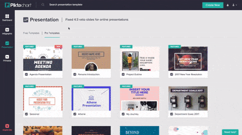
I really like the templates titled Minimalist 2, Timeline Itinerary and Flowchart Guide. They feature a timeline/flowchart arrangement, so they’re perfect for a routine or procedure. In my infographic, I used Minimalist 2.
Log in to Piktochart → Click on “Infographic” on the left → Select “Minimalist 2” → Click on “Use Template”
#3. Edit and simplify the template by moving, rotating, or deleting features
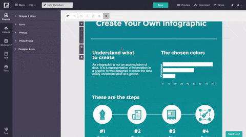
In my experience, extra words or graphics only distract from the main points, so I delete anything I won’t use. For my infographic, I kept only the title, timeline graphic (with the stock icons), and the numbers and text boxes underneath. I then rotated the timeline from horizontal to vertical (in order to more clearly convey the order of events) and arranged the numbers and text boxes along the line from top to bottom.
To delete an element, click on it and press “delete”. To move it, click on it and drag it.
To rotate it, click on it, click on the top circle in the center of the icon, and rotate it until it is positioned to your liking.
#4. Type in your steps with minimal wording
I like to start by typing each step using the same language I have used all year. If the text is too long to fit across the infographic in one line, I reword it to make it shorter and more clear. Remember, the more you include, the more potential for confusion.
Click on the textbox and resize it to stretch across the screen. To edit the text, double click inside of it and begin typing. To change the text color, click on a text box, and use the “Color” button on the toolbar at the top.
You can edit the size, font, and color using the toolbar across the top. Once you like the style, you can duplicate the text box by clicking “copy” and “paste” on the same toolbar.
#5. Find icons to highlight the key point for each step
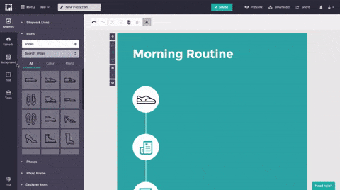
In my experience, visual cues benefit all students — primary, secondary, general education, special education, English-language-learners, etc. I like to use clear, simple images that underscore my main points, but don’t confuse or distract. Want your students to use a pencil? Find an icon of a pencil in the Piktochart icon library. Keep it simple!
Click on “Graphics” on the left side of the screen → “Icons” → type your keyword into the search box.
#6. Experiment with the color scheme to make your infographic shine
This is (in my opinion) the most fun part. Play around with different color schemes to convey the right mood and, more importantly, capture your students’ attention.
To change the background, click on “Background” on the left side of the screen, then experiment with background images, opacity, and background color.
#7. Add more details to beautify your creation
Since my visual is about morning routines, I’m adding additional elements such as clouds and sun to spice it up!
As previously, click on “Graphics” on the left side of the screen → “Icons” → type your keyword into the search box.
Don’t forget to name your infographic, click on the green “save” button (just to double-check), and you’re finished! You can click on “Preview” in the top right corner to check your work, then click on “download” to save it as an image or (if you’re a pro user) a PDF, and you can print it from there.
Here’s my finished visual!
The time is always right to review a classroom expectation or procedure, and Piktochart is a perfect tool for such a lesson. When planning a reteach, creating an infographic allows you to revisit one of your established routines or procedures and examine it in a new light.
When teaching, your infographic can help you capture your students’ attention and further their understanding. And after the lesson, your infographic continues to work for you as a visual cue for your students, reminding them of your expectations, so you don’t have to.
Teachers – do you have suggestions of other routines, procedures, or expectations that lend themselves well to infographics? Feel free to comment below with your ideas, examples, and questions!


