As you start making infographics, you’ll realize that certain types of infographics do a great job of communicating specific types of data or information.
For example, process infographics work well with step-by-step guides, while historical data stands out if you present it with a timeline infographic.
This resource will walk you through the different types of infographics, the attributes of each infographic format, and when to use them.
We’ll also touch on best practices, examples, and downloadable templates for different infographic types.
After reading this guide, you’ll be more confident and knowledgeable in choosing the most effective infographic type for your visual storytelling goals.
The 10 Infographic Types: Uses, Examples, and Best Practices
The way humans consume and retain information has evolved over the centuries.
But one thing remains the same, according to Colin Ware, Director of the Data Visualization Research Lab at the University of New Hampshire — we acquire more information through vision than through all of the other senses combined.
It’s not a surprise that infographics are 30 times more likely to be read in their entirety than plain text posts.
For this reason, a well-designed infographic remains a top choice in simplifying complex information while boosting shareability at the same time.
The great news is that anyone can create infographics!
Before you get started, you have to do your homework and understand the basics of infographic creation.
For instance, it pays to know which infographic format will work well with a specific type of content or data set.
Scroll down to learn about the 10 different infographic styles that you can use the next time you’re about to make a presentation, craft a report, or plan for your social media content.
Let’s get started!
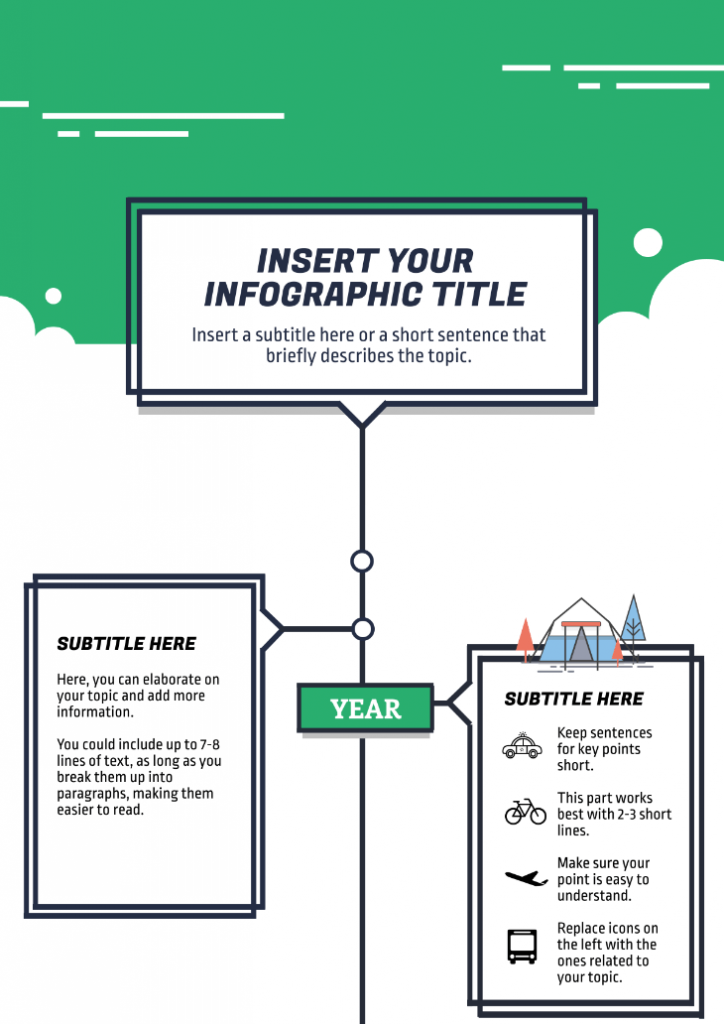
1.Timeline infographic
A timeline infographic is the ideal infographic type if your goal is to:
- Visualize history
- Plan for an event
- Highlight a sequence of events
- Take your audience on a journey
- Share a story in chronological order
- Set the audience’s expectations on how long a process will take
From sharing the origins of dessert to presenting an overview of your work history, a timeline infographic allows you to demonstrate how an idea, project, or story came to be.
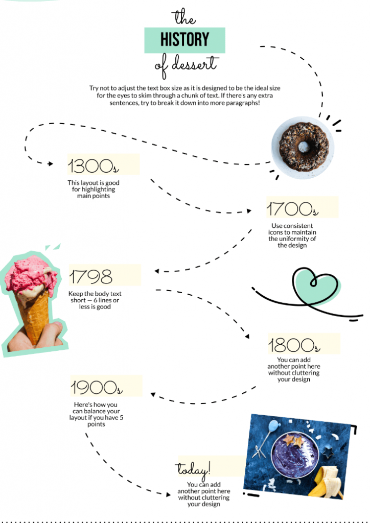
Timeline infographic best practices:
Make your timeline infographic stand out and easy to understand for your audience with these best practices:
- Use simple icons to illustrate significant points in your timeline.
- Emphasize each major point by contrasting colors and adjusting font sizes.
- Connect different points in time with a line.
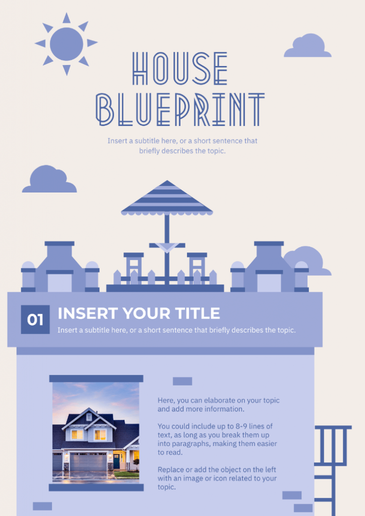
- Label major points appropriately and write a short description if necessary, like in the timeline infographic template below.
- Have someone else look at your infographic and ask for feedback. An extra pair of eyes from a team member or coworker will help ensure that your infographic is free of errors. This best practice also applies to the rest of the infographic types listed below.
Sharing an infographic with a team member is easy with Piktochart. Create a free account.
2.Process infographic
A process infographic is the best infographic format if your goal is to:
- Break down a complex process into easy-to-digest pieces of information
- Provide a summary of steps in a process
- Visualize a procedure
Use process infographics if you want your audience to retain the details of a process or procedure quickly.
The process infographic template below does an excellent job of explaining a complex concept for the layperson — the different phases of a clinical trial.
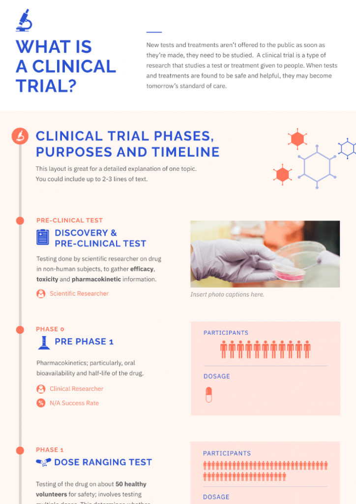
Process infographic best practices
Whether it’s your family’s well-guarded recipe or an onboarding sequence for new clients in your agency, an effective process infographic is the result of the following best practices:
- Assign a color for each step in your infographic.
- Use directional cues like arrows, numbers, or lines to direct readers to the next step.
- Save space with the S-shape format as illustrated in the process infographic example below.
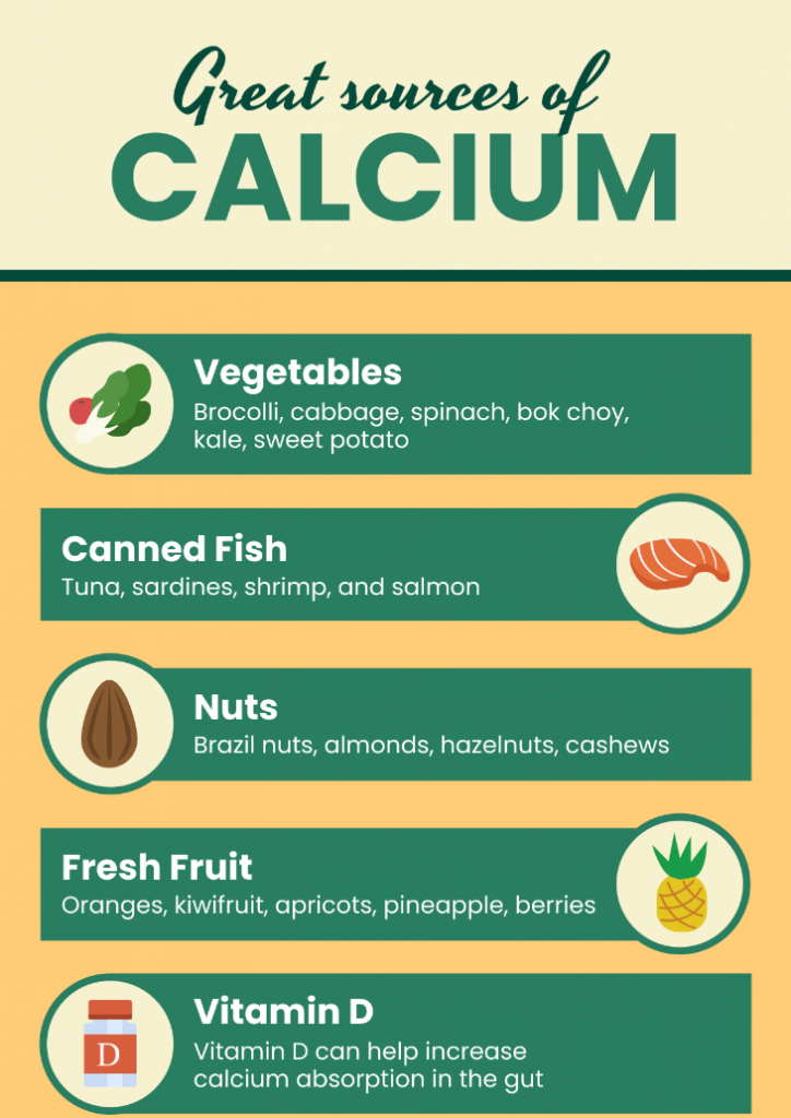
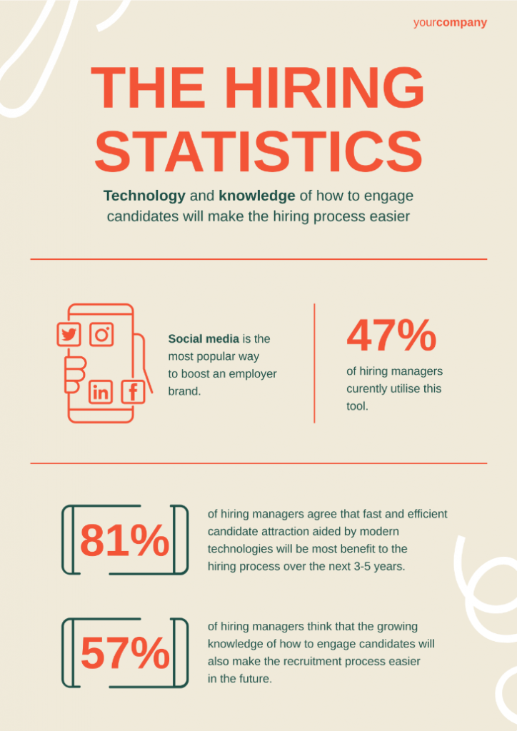
3.Informational infographic
As one of the most popular types of infographic, the informational infographic format is perfect if you want to:
- Share an overview of a specific topic
- Introduce a new idea or concept
- Make a plain blog post or article more engaging for your readers
An informational infographic is a suitable infographic format if you’re about to present a highly technical subject to an audience who is not familiar with the topic.
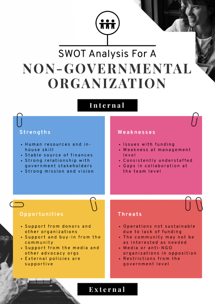
For example, anyone who’s new to SWOT analysis would be able to grasp the concept right away by looking at the infographic below. Unlike other types of infographics, an informational infographic is mainly composed of texts or words rather than visuals.
Informational infographic best practices
Drive the message home with an informational infographic through the following best practices:
- Introduce the main points of your infographics through illustrative icons and descriptive headers for better engagement.
- Use numbers (when appropriate) for each section in your infographic. Numbers help with readability and reading comprehension.
- Limit your infographic color palette to three to five colors, as illustrated in the example below. It makes your infographic look more cohesive.
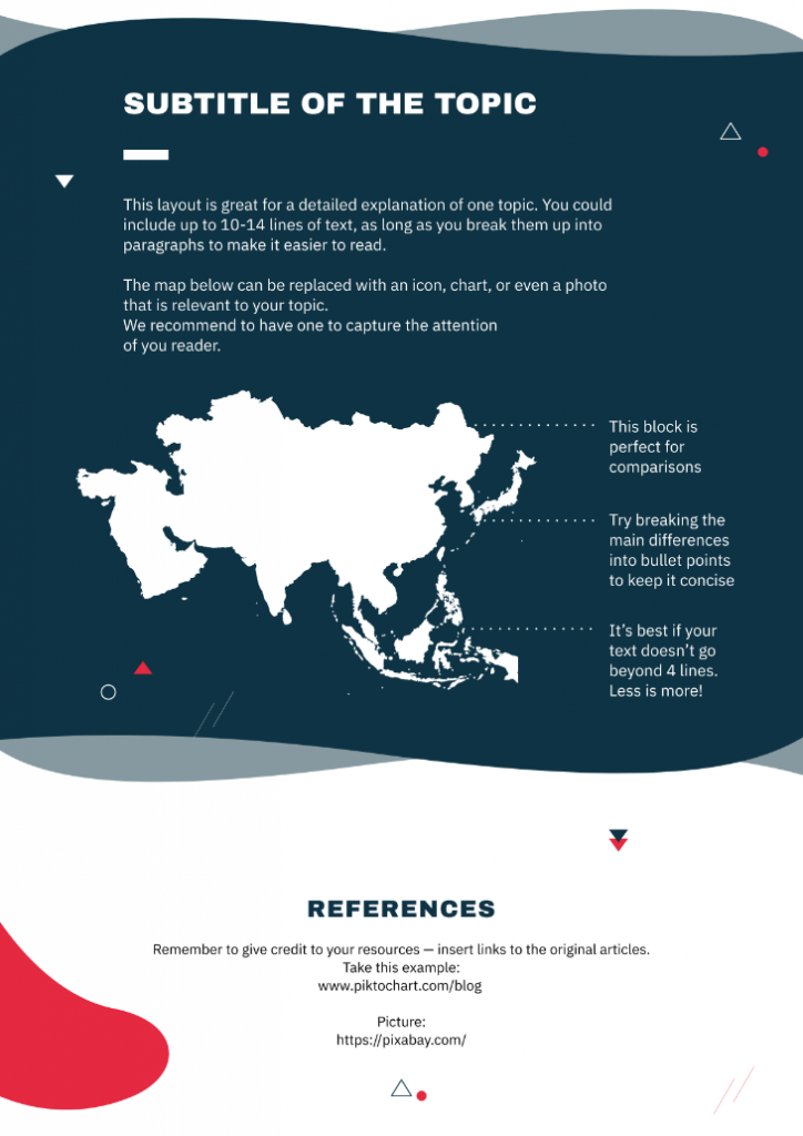
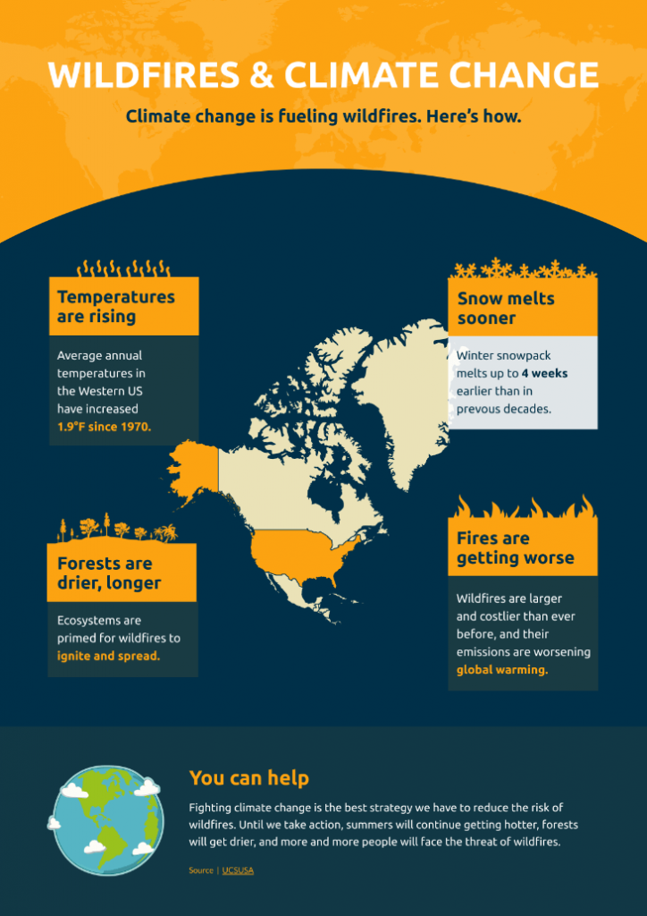
4.Map infographic
A map infographic is your best bet if you want to present demographic data or share location-based information. This infographic type is one of the easiest ways to:
- Illustrate trends on a specific location — global, national, states, cities, towns, and even your neighborhood
- Share visual stories of a particular place
- Communicate survey results or product statistics based on location
Map infographic best practices
From analyzing global supply chain patterns to tracking COVID-19 recovery in your city, help your audience understand data and information in the context of a geographical location through map infographics
Here are some best practices for this infographic format:
- Be mindful of map color conventions. For example, blue stands for bodies of water like rivers, oceans, and lakes. Meanwhile, the color red is for areas of particular interest like military sites. It also helps to use darker colors for places that you want to highlight.
- Do not overlook important details such as your map legend, scale bar, and data source. These details help your audience understand your map infographic better.
- Avoid clutter by putting more thought to your labels, like in the map infographic example below.
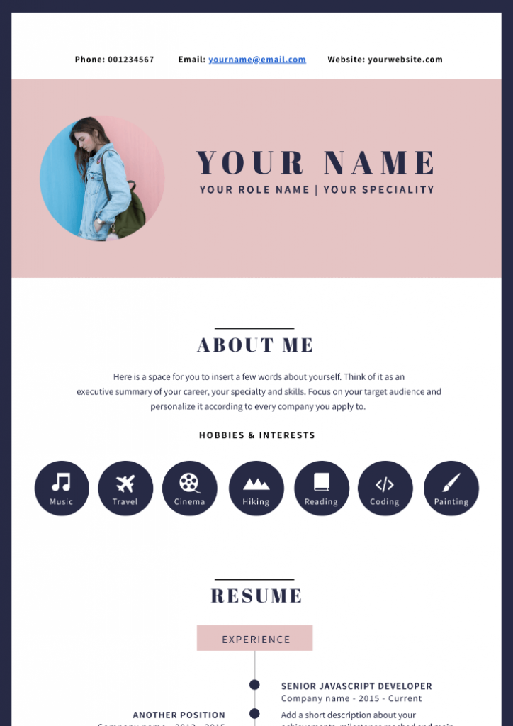
5.Resume infographic
A resume infographic, also known as the visual resume, helps job seekers put their best foot forward by visualizing their plain CV.
Use the visual resume format if you want to:
- Set yourself apart from other candidates and get the hiring manager to call you for an interview
- Caught the eye of recruiters, leave a remarkable impression, and compel them to learn more about you
- Showcase specific sections in your resume like certain skills, projects, and teams you’ve worked with
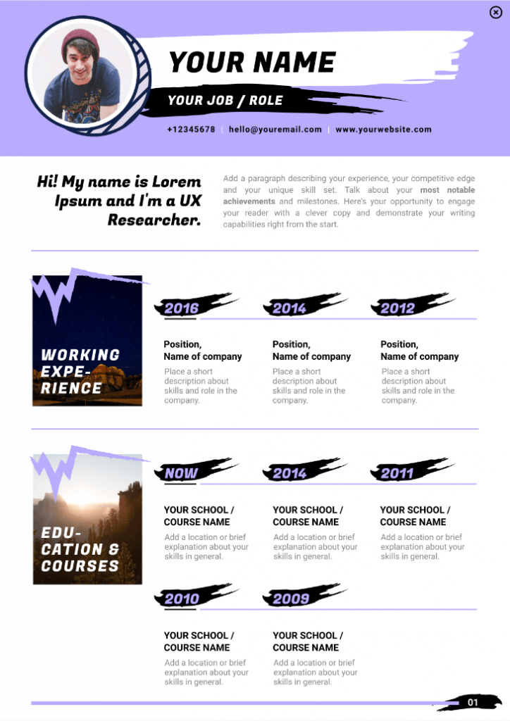
Resume infographic best practices
Whether you’re after your dream job or you’re looking for a way to make your freelancing website pop up with a visual CV, here are some infographic resume tips and tricks you should know about:
- Choose fonts, icons, and colors that reflect your personality and the role you’re after. For example, if you’re in the food and beverage industry, use food icons and images.
- Visualize your career history and skills through timelines, pictograms, and charts.
- Put the most crucial info at the top of your infographic resume. It could be your most recent work experience or a project you’ve done that’s relevant to the position you’re applying for.
Learn more – How to Create an Infographic Resume That’ll Get You Hired (+10 Inspiring Examples)
6.List infographic
The human brain adores lists, which explains the popularity of list infographics. From checklists to to-do lists, infographics are excellent infographics formats if you want to:
- Share a collection of tips
- Support an idea or topic with major points
- Summarize your presentation
List infographic best practices
Make your list easy to remember for your audience through the following best practices:
- Keep your list short and on point.
- Use borders, numbers, or boxes to group elements together.
- Replace bullet points with icons to make significant points stand out.
7.Data visualization infographic
Of all the infographic chart types, a data visualization infographic is best used for communicating data using charts and graphs.
They are beneficial if you want to:
- Make a case for an argument, opinion, or perspective
- Share statistics and make them more impactful
Data visualization infographic best practices
Data visualization infographics let the numbers speak for themselves. They are quite versatile — from students who want to share the results of their thesis to nonprofit organizations who aim to raise more funds by proving their impact. Follow these best practices:
- Focus attention where you want through colors, icons, and pictograms that match the text or number. For example, use transportation icons and images if you’re presenting data about the transportation industry.
- Choose the correct graph or chart for your data. Learn more in The 10 Essential Types of Graphs and When to Use Them.
- Label your charts and graphs clearly
- Find the central theme in your statistics and tell a story using this theme. Your data visualization infographic should answer: why should I pay attention to these statistics?
Before you get to work with your data visualization infographic, we reviewed the best data visualization tools for you.
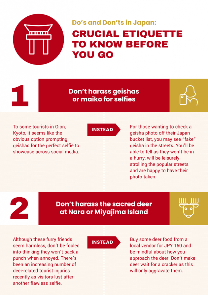
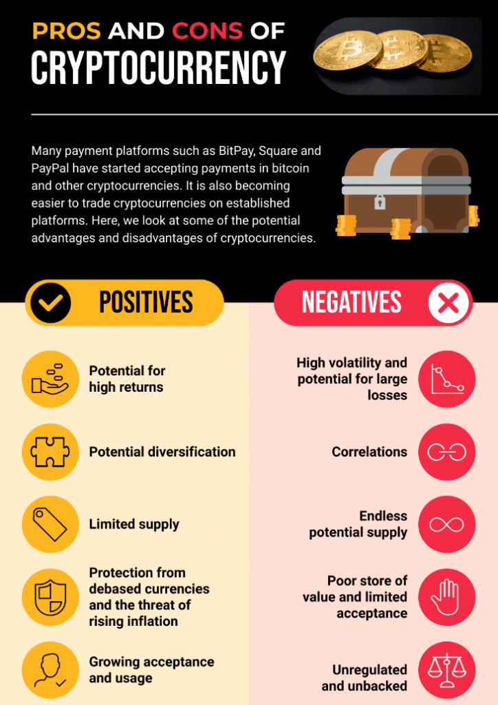
8.Comparison infographic
The comparison infographic or versus infographic is another popular infographic style you see in blogs, social media, and emails. It’s commonly used for a reason — it helps provide clarity when deciding between two or more objects, places, ideas, or concepts.
Use comparison infographics if you want to:
- Encourage your audience to see two or multiple perspectives
- Compare pros and cons
- Show similarities and/or differences
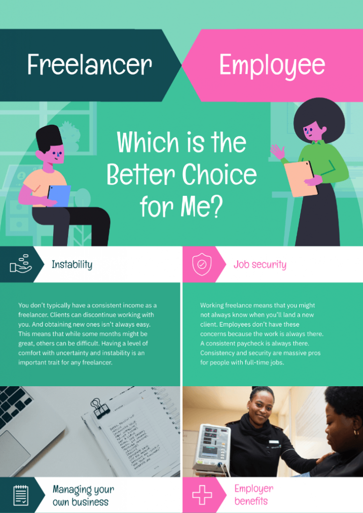
Comparison infographic best practices
Help your audience make informed decisions through the following best practices for comparison infographics:
- Use colors strategically. For example, assign a specific color for each topic or idea in your infographic. The cryptocurrency infographic below uses yellow for its pros, while the cons are written in red.
- Divide your infographic horizontally or vertically. You can also use borders and tables if you want to compare multiple options
- Group similar topics together through boxes or bubble charts.
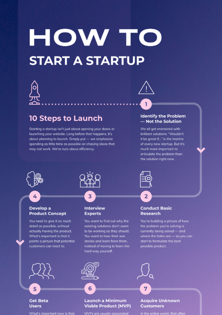
9.Flowchart infographic
The flowchart infographic is a powerful infographic format to:
- Simplify workflows
- Present solutions
- Brainstorm ideas
- Visualize chain of command
- Share possible scenarios or consequences
- Describe processes with multiple paths clearly and concisely
Flowchart infographic best practices
Here are some ways to make your flowchart infographic more engaging and easy to understand:
- While there are exceptions, most flowcharts are read from left to right and top to bottom. For this reason, start your flow chart at the top left corner of your infographic.
- Use arrows, numbers, dots, or lines to encourage readers to follow along.
It only takes minutes to make a process flow chart in Piktochart. Watch the tutorial below:
10.Interactive infographic
An interactive infographic combines traditional infographic design, motion, and interactive elements. This infographic style is often used in data visualization and content that employs gamification.
Use interactive infographics to:
- Allow audiences to uncover new information
- Explore the infographic based on their interest
- Increase the time spent of your audiences on your infographic
Interactive infographic best practices
- Have an end goal in mind for audiences who will interact with your infographic. Use this end goal in your infographic’s call-to-action. Do you want them to sign up for a newsletter to check out the quiz results in your infographic? Or would you like them to visit your main sales page to learn more about the products you highlighted in your interactive infographic?
- Keep the interaction short. No one wants to spend a lot of time engaging with your infographic. It also leaves the viewer wanting more as you lead them to the next course of action.
How do you choose between all the various infographic types we’ve just listed?
Ultimately, the infographic format you choose has to help you achieve your visual storytelling goal with as little fuss as possible.
Start with an end goal in mind, the information you want to share, and where you’ll be sharing it.
For example, if you want to compare two choices, a comparison infographic is your obvious choice. If you’re mainly sharing data and numbers, a data visualization infographic is your strongest bet. Finally, if you want readers to engage with your infographic and stay longer on a page, an interactive infographic should be your priority.
Whatever your infographic goals, Piktochart helps you design various types of infographics even if you’re not the “artsy” type.
At Piktochart, our mission is to empower people around the globe to tell powerful visual stories that matter. People like you.
Create a free account to share your visual stories.