Here’s an uncomfortable truth:
Most resumes end up in the trash.
While you spend hours looking over every detail of your CV, the recruiter on the other end only gives it around 6 seconds before deciding if you’re a good fit or not.
To get the job, you need to stand out. No one knows that better than Terry Chapman.
Terry is a technology strategist who spent the last 20 years working for companies like Microsoft and Fujitsu. The job market in the tech field is extremely competitive, so if he wants a job, he needs to stand out. Terry achieves this by creating an infographic resume:
“When you think about it, your resume or CV just has one purpose and one purpose only – it gets you to the interview stage in the recruitment process. Once you get the interview, your prospective new boss will decide whether or not you are a good fit for their company.
So when I decided to restructure my resume into an infographic, it was with this in mind. I wanted my resume to reflect my professional outlook of being dynamic and progressive… and to help me land in either the ‘yes’ or ‘maybe’ pile for any future job interviews.”
In this article, we’ll go over how to create an infographic resume and we’ll look at some tips Terry has for us. If you want to skip ahead, here’s a table of contents:
But first, let’s clear something up.
What is an infographic resume and how is it different from a normal one?
An infographic resume is one that uses graphics and illustrations to present key information about your work experience and capabilities.
The big advantage they have over regular CVs is that they make you stand out immediately. The downside is that you can get carried away with the graphics and make your resume hard to read.
Now that we’ve got that out of the way, let’s create one ourselves.
How to create an infographic resume from scratch
We took some tips from Terry’s experience and combined them with the expertise of a few Piktochart employees who also created infographics to get a job. The result is this guide on how to design your resume! To put it into practice, create a free Piktochart account and work on your CV online.
1. Create the structure
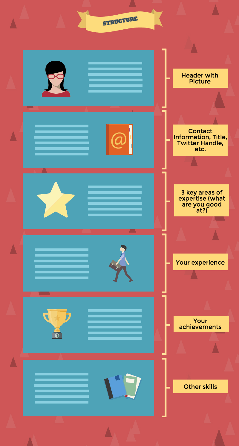
Start by making a note of the essential sections you think your resume should have. Try to go old school and draft it on paper first. That should leave you room for improvement without wasting too much time once you start designing. Here’s an example structure:
Here are some sections you could add:
A header – Your picture and/or current title and your contact information (e.g., your Twitter handle, website, email).
3 key areas of expertise – What are you known for? What are your main strengths?
Your experience – Using icons, list your areas of experience (e.g., web analytics, content creation, social media management, etc.) or map out your previous roles and companies you’ve worked for – whichever you think works best for your situation.
Achievements – Brainstorm a few things you’ve achieved in your previous roles (e.g., spoke at the ClickZ conference, got Certified by Google, grew an online community by 400% in 12 months, etc).
Languages or other skills – Depending on what’s important for your dream role, list the languages you speak or skills you have and visualize their level with stars or charts.
Quotation – Think of a quotation that best characterizes you and write it down. What’s something that’s unique about you?
2. Choose a template to start designing your resume
You could start from a blank page, but since we’re not designers we’re going to start from a template. Log into your Piktochart account (or create one if you don’t have one) and create a new graphic.
When you create a new graphic, you can search for resumes or CVs under the poster section. This will give you templates you can start from.
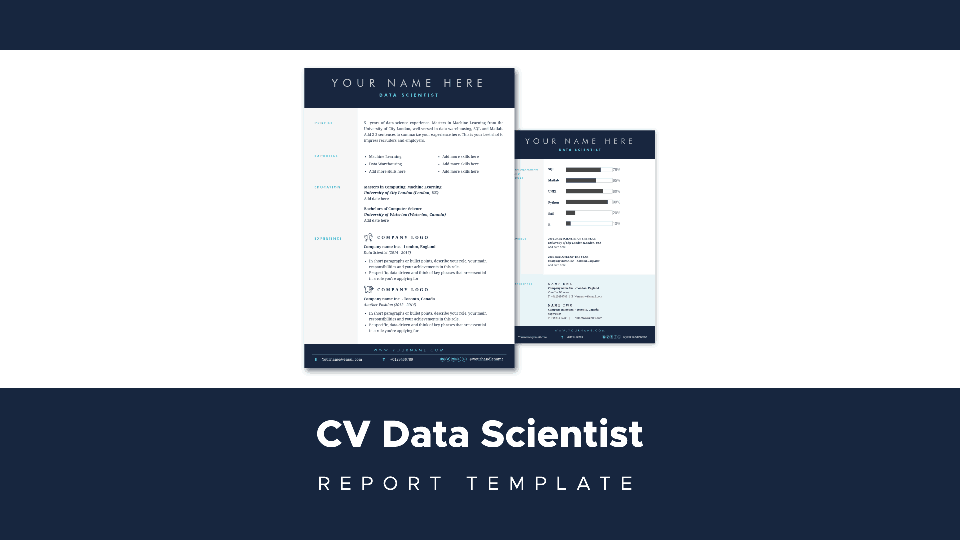
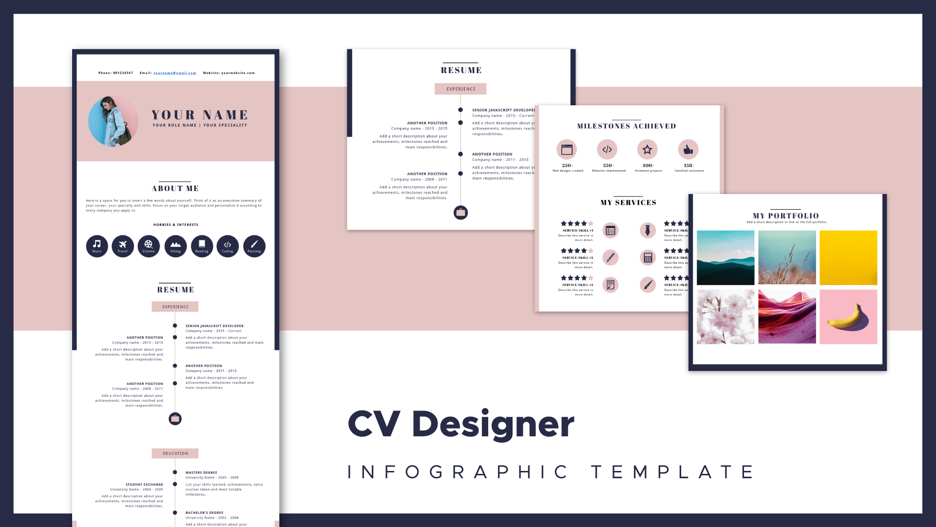
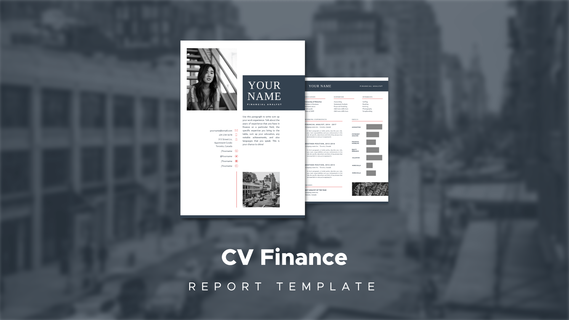
Here are a few templates to get you started:
If you really want to create your own design from scratch, check out this video where Romi takes you through the process.
3. Make the design your own
The next step is to customize the visual template. A template is a good starting point, but it’s usually not tailored to the job your applying for.
The design of your resume has a very big impact on how you are perceived. If you are applying for a more serious role, having a resume with a lot of bright colors and funny fonts isn’t a good idea. It communicates you’re not taking the job seriously.
Let’s quickly look at how to change the colors and fonts of your template.
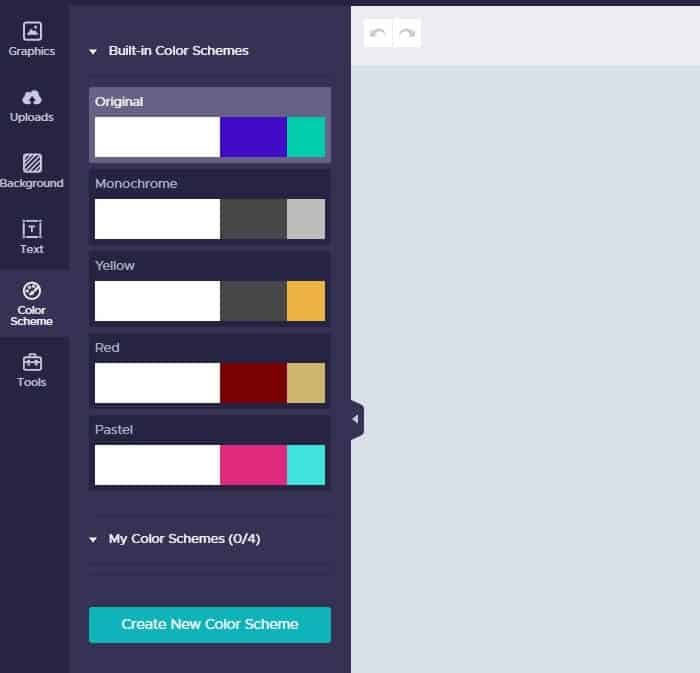
To change the color scheme look at the left-hand side and click on the color scheme tab. This will give you a set of pre-configured color schemes that you can use in your template. Go through each one and find one that fits your style best.
4. Nail your intro
The next step in your design is to focus on the opening. This is how Terry explains it:
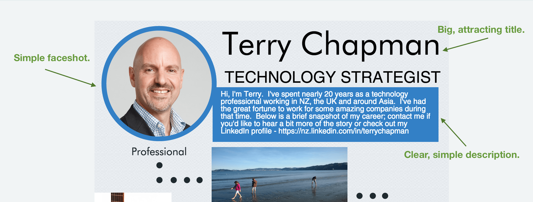
”I wanted to have a strong ‘opening’ to my resume that would provide a teaser to make a potential employer interested enough to want to bring me in for a chat and an icebreaker for the interview conversation.”
For that, he copied a circular picture, used a big, clear title with his name, and crafted a simple, short, to-the-point description of what he does and who he is.
It’s important to remember to make this section as relevant to the job as possible. It’s great to have a cat named Mr. Tibbles, but (unfortunately) the recruiter isn’t going to care.
5. Add different sections that are relevant to the job
For the rest of the resume, follow the same process – after deciding the message that you want to convey for that section, refer to the basic structure you designed in point #1 and decide whether or not you need more information.
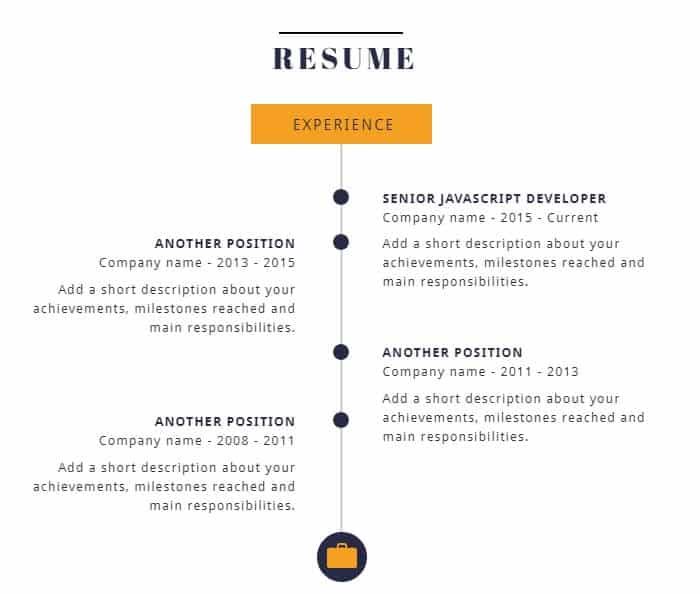
You could, for example, at a timeline with all the experience that you have. This is a great way to show your progression over the years.
Another section you can add is a chart or graph that shows how well versed you are in different skills. For example:
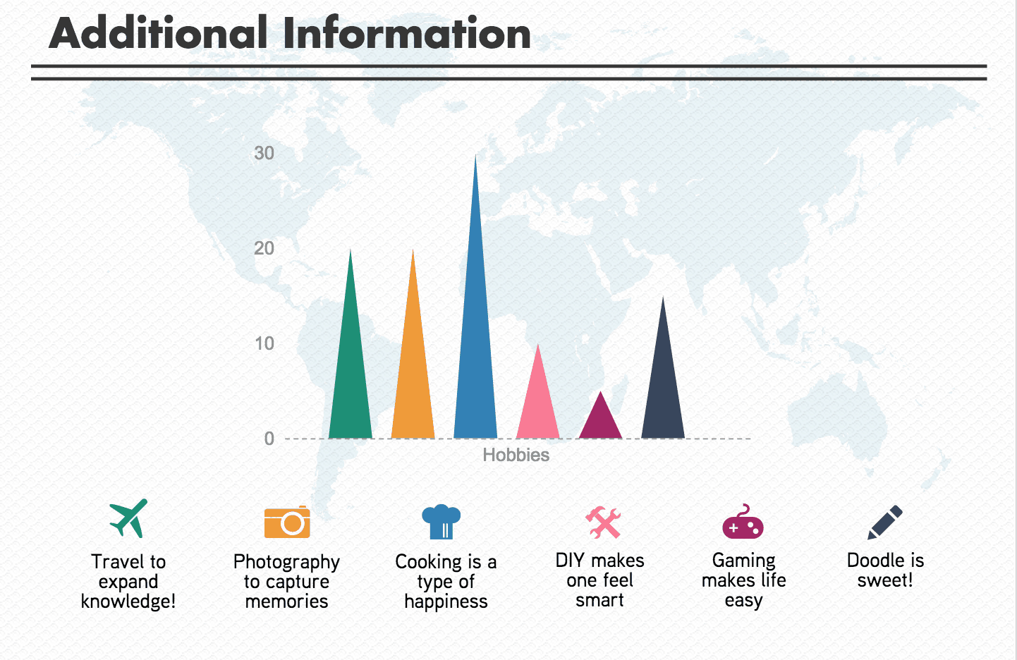
You should always put the most relevant information on top of your resume. This makes it easy for the recruiter to quickly skim your resume and see if you are the right person. The faster you can get them interested, the longer they’ll look at your resume.
6. Testing & feedback
When you are done with the first “prototype”, remember to test it. Have a few people like your friends, family, and people in similar roles take a look and proofread it before you send it out.
Ask them for their general feelings about your resume: is it clear? What stands out? What’s missing? You might get really valuable feedback!
7. Download your new shiny resume
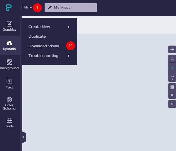
After outlining your resume, choosing a template, and adding in all the different sections, now it’s time to download your new resume. To do this, go to “file” and choose “download visual”.
This gives you the option to download your visual as a PDF or a PNG. If you want to print it out and send it to different recruiters, download it as a PDF.
10 infographic resume examples and what you can learn from them
When creating your resume, it’s a good idea to look at some examples and see what others are doing well and what you can learn from them. Here are 10 great examples of infographic resumes:
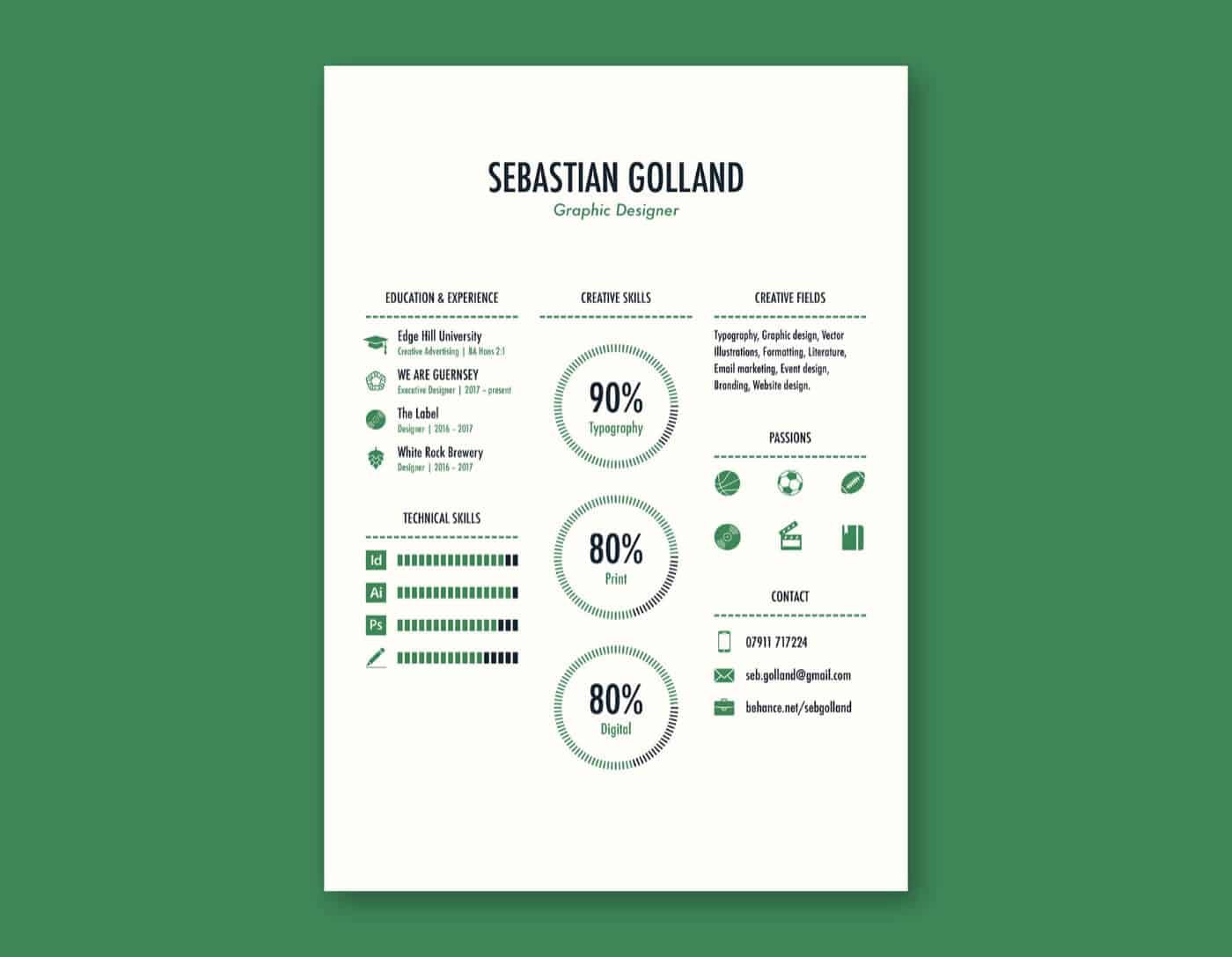
1. Keep it simple
Created by: Sebastian Golland
A common mistake is to stuff as much info into your resume as possible. Not only does this make it hard to read, but the recruiter can just decide to not read your CV altogether. It’s best to keep it simple and just put in the information that is crucial to the job.
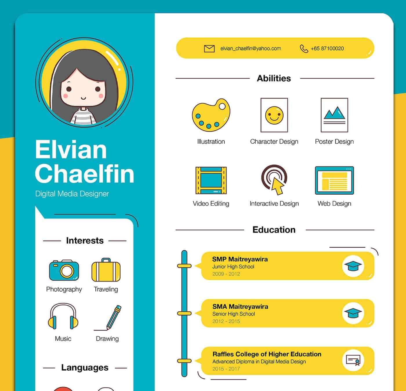
2. Add some personality
Created by: Elvian Chaelfin
An infographics resume gives you the chance to show the company what kind of person you are. You can add icons and illustrations of what you like to do, as long as your resume is still easy-to-read and easy to scan.
3. Don’t be afraid to be bold
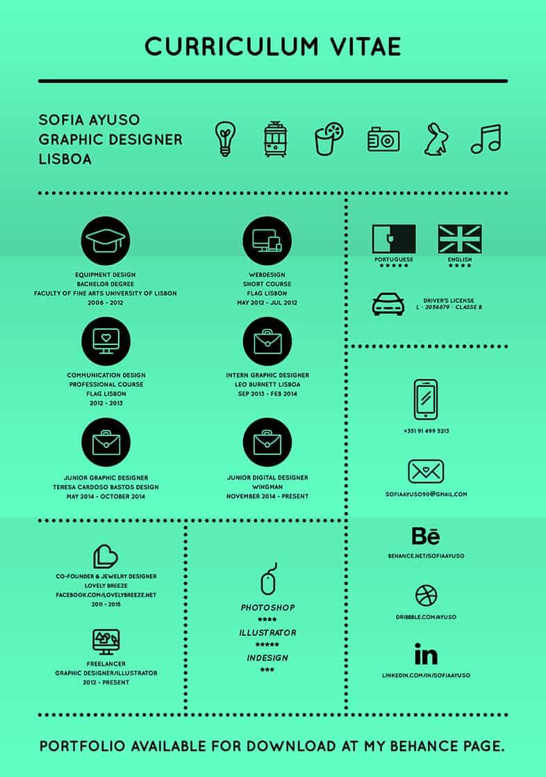
Created by: Sofia Ayuso
Look at the resume above and tell me it wouldn’t catch your eye. It’s a bold move, but if you do it right you can really draw attention to your CV.
4. Show, don’t tell
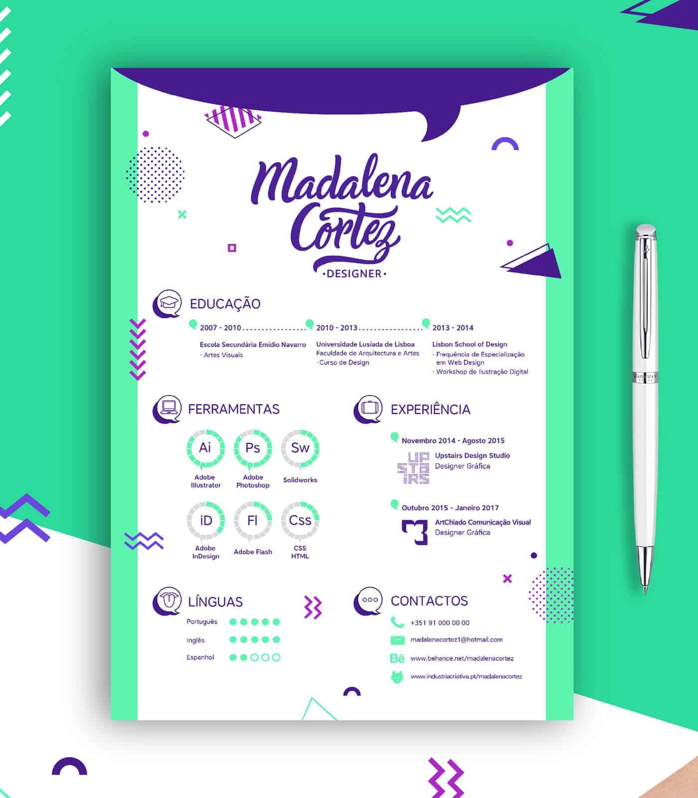
Created by: Madalena Cortez
In resumes, you can tell a recruiter anything — and often times people do. Unfortunately, that also means that everything you put on it is going to be taken with a grain of salt. Instead of telling you are great at something, show it. If you say you’re creative then make your resume as creative as possible. This way you’re showing that you can do it instead of just telling them.
5. Do the squint test
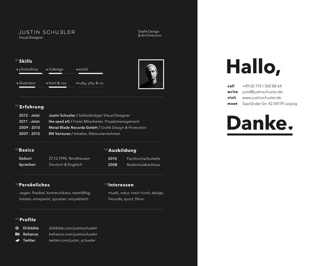
Created by: Justin Schueler
When you finished your resume print it out, hang it on the wall, take a few steps back, and squint your eyes. What part of your resume draws your attention first?
Is it the thing that you want to draw attention to? Is it something that is going to get you hired? Or is it a part of your resume that is less strong and that you’re just adding to give it some personality?
6. Put important info on top
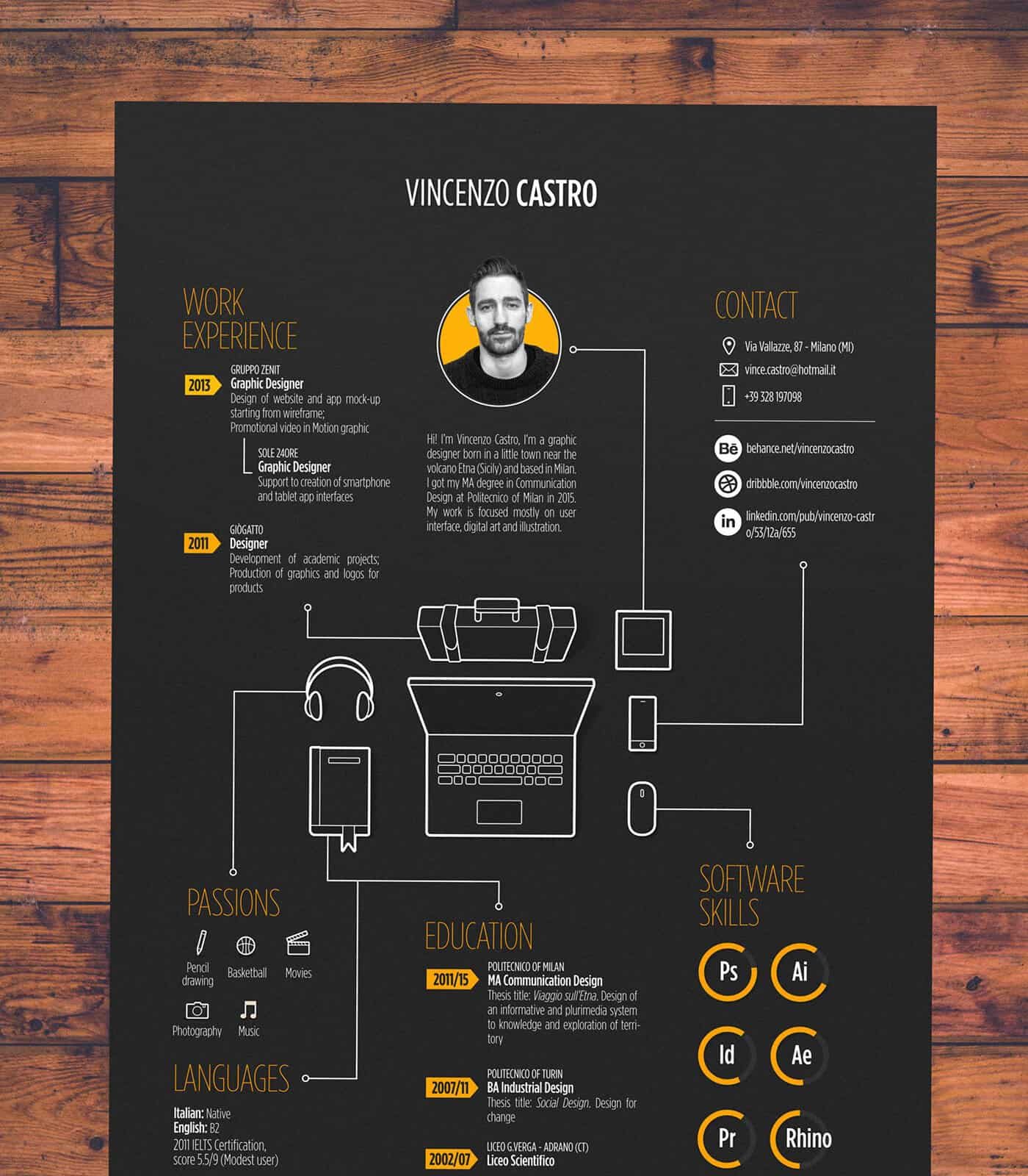
Created by: Vincenzo Castro
Since recruiters only give your resume a few seconds, put your most important info on top. In most cases, this means your experience. If you went to an Ivy League school you can try putting your educational top, but employers care a lot less about your education than they do about your experience.
7. Less is more
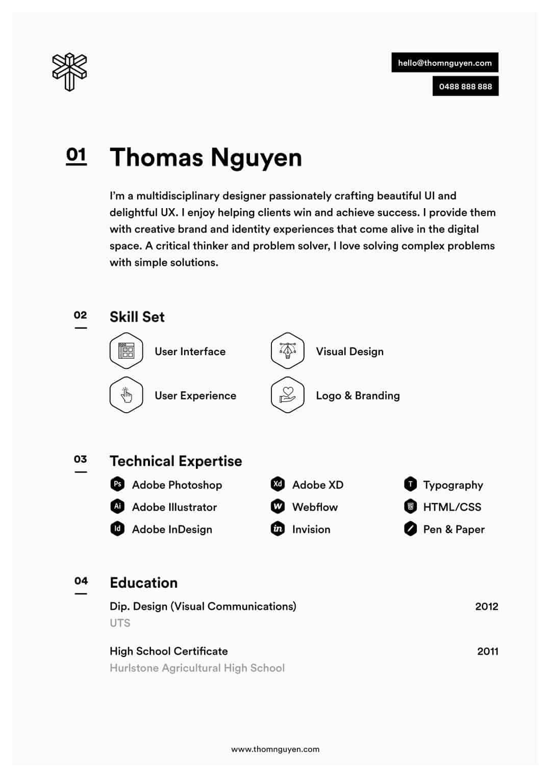
Created by: Thomas Nguyen
In this article, we’re using examples that were created by designers. Their job is to create something that is showing off their skills and that is really creative. Maybe you don’t want to go that far. Maybe you want something that doesn’t stray too far from the norm.
In that case, this example by Thomas is perfect for you. It’s very clean, only uses black-and-white, and has clear sections.
8. Consistent color scheme
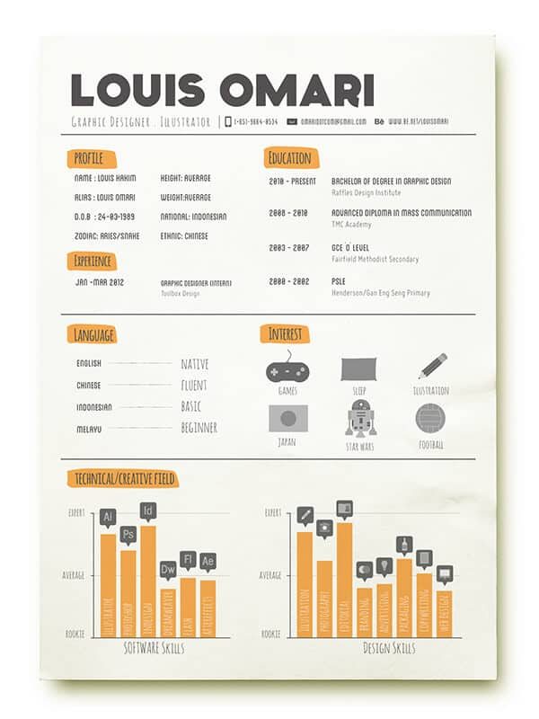
Created by: Louis Hahn
Color can add a lot of flair to a resume. However, if you decide to use color, make sure to keep it consistent throughout the entire thing. Switching between different colors makes it look tacky. And I bet that’s not something you want to convey.
9. Make it easy to scan
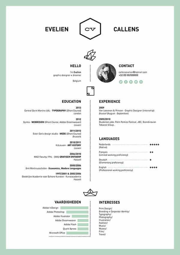
Created by: Evelien Callens
Sometimes what you don’t put on the page is more important than what you do put on it. Using white space can make your resume 10 times easier to scan. Like we said earlier, the faster you can convey key information, the higher the chance that recruiters are going to look at it and get interested.
10. Only choose a few colors
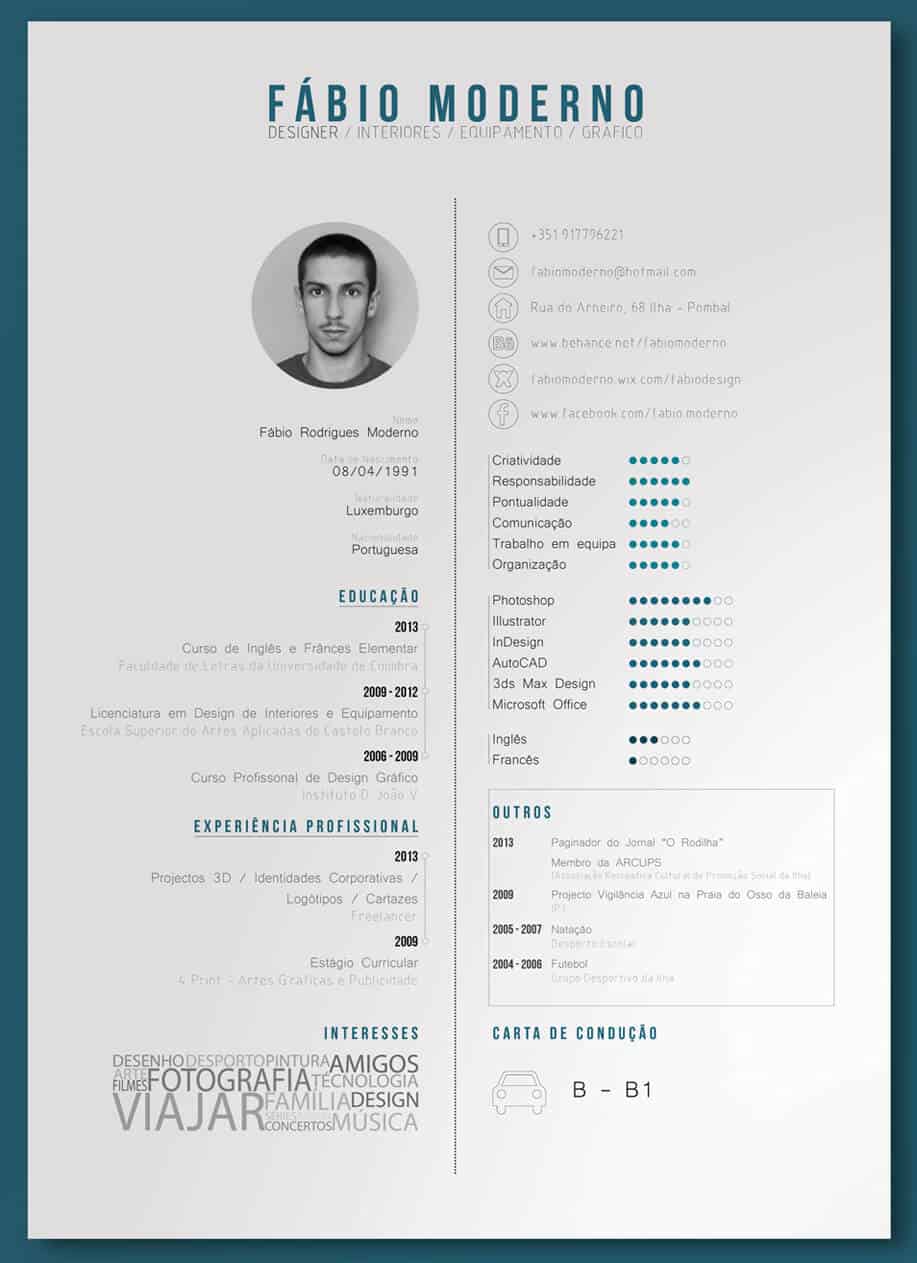
Created by: Fábio Moderno
When you decide to use color, start out with one and use it in specific places. For example you can use color in your headers, in your graphs, your icons. Anything you want to put focus on can be improved by adding a touch of color.
9 More tips for modernizing your resume into an infographic
If you are looking to do something for the first time, a wise practice is to get some advice from people who’ve done it before. That’s why Terry offers these 9 tips for anyone who wants to turn their resume into a visual infographic.
- Resumes should be easy to read
Remember that an infographic resume should not be a copy and paste of your LinkedIn profile or a Microsoft Word doc. It is meant to be easy to digest, so steer clear of big blocks of text like long descriptions.
2. Prioritize key information
There is no way to include absolutely everything in your infographic resume. Make sure to prioritize! Print out your existing resume and cross out things that are less relevant to your current job search.
3. Do your research
Read up on what makes a great Social Media Strategist, Community Evangelist, or Blog Editor. Try to match the desired skills with your own.
4.Look at plenty of other resumes for inspiration
There are plenty of infographic resume examples out there. Look around on Pinterest to find ones that are similar to the job you’re applying for. Don’t copy, but get inspired and gather ideas. Don’t forget to write them all down!
5.Know your audience
Like any good visual or writing, consider your intended audience. The purpose of the resume is not to get you a job, but to get you the interview for the job. Try to include enough information to prompt your prospective employer to want to ask you questions about your resume content in an interview.
6. Think about the role and the industry
How much or little text you use will depend on the industry and the type of job that you are applying for. One of Terry’s tasks as an IT architect is to be able to convey complex information in a simple and easy-to-understand way – less text and more graphics worked for him with his role. Again, consider what your audience requires in order to make a decision to get you in for an interview.
7. Make it printable
Most recruitment agents and prospective employers will want to print your resume to take into the interview. Make sure that your infographic still looks good when printed! Terry used the guidelines in Piktochart to play with formatting to ensure that the page cut offs were where he wanted them to be. It also means that he needs to send the resume in A4/Letter PDF format when he thinks it will be printed – which would be almost always! In his first interview with the new format, he took his tablet with him so that he could pan around and zoom in on any content that the interviewer wanted to talk about.
8. Run a spell check
Just because an infographic places more focus on visuals it doesn’t mean you shouldn’t carefully check spelling and grammar! Spelling mistakes and poor grammar will shunt your resume into the ‘no pile’ despite any stunning visuals!
9. Some companies might not be ready for your infographic
Be prepared with a ‘long form, boring’ format for recruiters or employers that really can’t wrap their heads around an infographic resume. For Terry’s, he made sure his LinkedIn profile contains his long-form career information and he added pointers to that in his infographic resume.
“The way that I see it is that my new resume is creative and reflects my professional style; if a potential employer rejects it over a more traditional one, then it is probably not a company I’d enjoy working at.”
Time to make your own resume!
Now that you’re well-versed on how to turn your work experience into a visual, it’s time to flex your resume building muscles and make your own. If you’re looking for more inspiration, I suggest checking out this gallery with some of the best resumes on the web.
Create visuals in minutes, online.
Watch this demo to learn how to get started with Piktochart and all the graphics it enables you to make.
Watch the free demo