Free Online Comparison Chart Maker

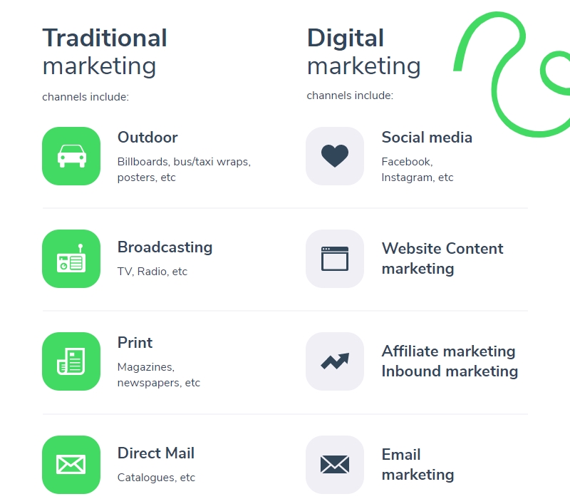
Having to make a good decision while pouring over paragraphs of text isn’t always the best way to go. A clean infographic visualizing the pros and cons is a better option. With our free online comparison charts maker, you can compare two products, highlight the pros and cons of an idea, or create a simple infographic explaining the dos and don’ts of your favorite activity.


Create a comparison chart for free Watch a demo
Comparison chart makercollaboration on visuals with Piktochart

Collaboration

Work together on a comparison chart

Invite your team members to work on a comparison chart with you. Share your chart, your brand assets, and review your peers’ graphics on the fly. With Piktochart, everyone’s on the same page.

Create a comparison chart
Comparison chart makerkeep comparison chart on brand

Branding

Keep your comparison chart on brand

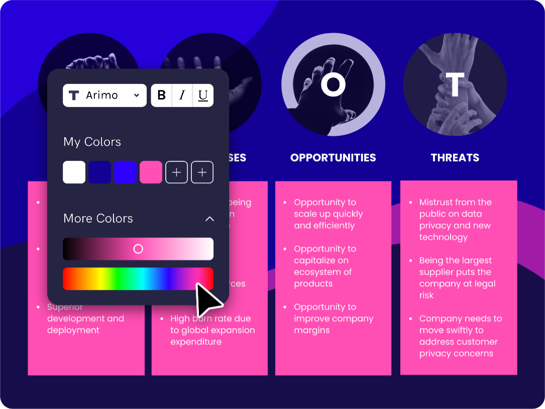
Need to make sure all of your comparison charts match your brand? No problem. Drag and drop your logo or a screenshot of your website to extract your brand colors. Do you want to use your brand fonts? Your custom color palette and uploaded fonts will always be accessible in the editor. Each comparison chart can be adjusted to fit your brand.

Create a comparison chart
Comparison chart makerFormat benefit asset library

Assets

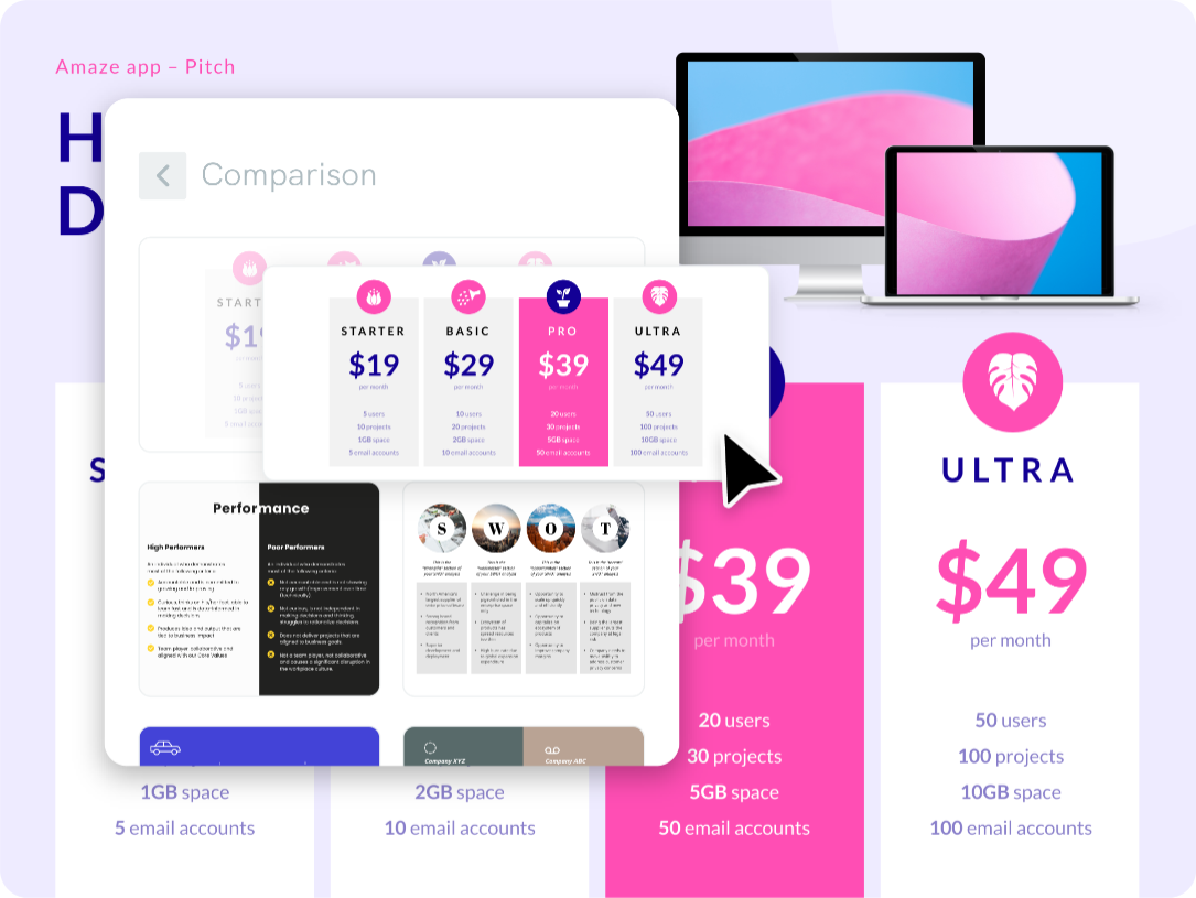
Spice up your comparison chart with images and icons

The times of searching for the perfect image, illustration, or icon are over. With Piktochart’s free library of graphics, designs components, and templates, the visual inspiration you are looking for is there where you need it. Making your comparison chart beautiful has never been so easy.

Create a comparison chart
Comparison chart makerreuse comparison charts

Repurposing

Create once, use forever

With a team account, there’s no need to spend hours re-creating the same report every week or month. Organize your templates and past projects in folders. Make it easy for anyone on your team to repurpose content on the fly, ultimately saving their time.

Create a comparison chart

Testimonials

Erica Barto
Erica Barto
Selection, Testing & Assessment Specialist, Valero Energy Corporation

“Piktochart is my go-to tool when I’m looking for a way to summarize data that is easy for our upper management to review. Piktochart provides me with the tools to display data in a creative, visually appealing way.”

Claudia Bayod Borrego
Head of Internal Communications, Arval BNP Paribas Group

“Piktochart has allowed me to change the style of my company’s communications. The campaigns are more visual, modern and attractive thanks to the templates that always serve as inspiration. Now even my colleagues use it! Piktochart helped me to engage, increase participation in events, add value to internal campaigns and to reinforce the culture and communication flow of my business.”

Priscila Aldana
Priscila Aldana
Talent Management, Boston Scientific

“As an HR Assistant, I have to find new and creative ways to engage our employees and effectively communicate across a large organization. Piktochart has tremendously helped me in achieving this.”

Sharon Yeung
Sharon Yeung
Accountant, SIA Engineering Ltd.

“Piktochart helps me translate often dry financial policies and accounting standards to easy to understand and concise one-pager visuals for management.”

How to make a comparison chart

  1. Gather your data

A good comparison chart starts with a good idea and good data. The best way to start is to sit down, grab a piece of paper, and write down all the different points for each element you’re comparing

  1. Pick a template

It might seem like all of your peers suddenly became Photoshop experts, but the truth is most of them are starting from templates and not a blank canvas. If you’re not a designer, starting from scratch isn’t the best option. Instead, use one of our comparison chart templates created by professional designers. You can pick from different types such as infographic templates, presentations, reports, posters, and more.

  1. Add a comparison chart to your visual

Go to our design components and pick a comparison chart. Each element has it’s own design and flavor. You can add as many charts as you want.

  1. Adjust to your liking

Once you added a comparison chart, adjust it to fit your needs. Add your text, customize the colors and the fonts, add more graphs to support your arguments,

  1. Share your comparison chart

Once you’re finished editing your charts, download your graphic as a jpg, png, pdf file, or share your comparison chart with team members. Need to have your boss give their approval? With a Piktochart Team account, you can have stakeholders comment on your visual.

Comparison chart templates

View templates

First you have to gather your data. Next, log into your Piktochart account and pick a template. Once you found a nice template you can go to our design components and choose a comparison chart. Once it’s added to the visual you can adjust it however you like.

Piktochart is good for creating long-form infographics that communicate data. It’s good at visualizing processes, reporting on data, and keeping your company up to date.

With Piktochart Team, you can collaborate with colleagues. Keep your branding consistent by adding brand colors and fonts. Set permissions and ask managers to review your visual.

Frequently Asked Questions (FAQs)

Contact Us Anytime

[email protected]

Ready to try Piktochart?

An infographic maker, presentation creator, and report builder in one online platform. No graphic design skills needed.

Sign up for free Watch a demo