From stock market prices to sports statistics, numbers and statistics are all around you.
However, data alone is merely a combination of figures and doesn’t tell a story. The most meaningful data in the world is useless if it’s not communicated correctly.
In her book Storytelling with Data, Cole Nussbaumer Knaflic writes:
“Effective data visualization can mean the difference between success and failure when it comes to communicating the findings of your study, raising money for your nonprofit, presenting to your board, or simply getting your point across to your audience.”
Identifying the relationship between your data points and telling the story behind the numbers will also encourage your audience to gain actionable insights from your presentation.
How do you do this?
You visualize data through charts and graphs.
The good news is you don’t need to have a PhD in statistics to make different types of graphs and charts. This guide on the most common types of charts and graphs is for you.
Keep reading if you’re a beginner with no data visualization background but want to help your audience get the most out of your data. You’ll also discover data visualization best practices, advice from experts of the craft, and examples of well-thought-out charts and graphs below!
Most common types of charts and graphs to help communicate data with impact
Whether you’re about to create a collection of business graphs or make a chart in your infographic, the most common types of charts and graphs below are good starting points for your data visualization needs.
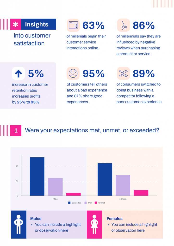
1. Bar chart
A bar chart, also known as a horizontal column chart, is popular for a reason — it’s easy on the eyes. With bar charts, you can quickly identify which bar is the highest or the lowest, including the incremental differences between bars.
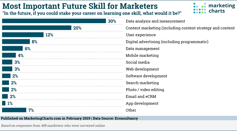
When to use bar charts:
- If you have more than 10 items or categories to compare
- If your category labels or names are long
Best practices for bar charts:
- Focus on one color for bar charts. Accent colors are ideal if you want to highlight a significant data point.
- Bars should be wider than the white space between bars.
- Write labels horizontally (not vertically) for better readability.
- Order categories alphabetically or by value to ensure consistency.
Pro-tip for bar charts from Jessica Witt of the Witt Perception Lab, a lab that focuses on information visualization and action-specific perception:
“Bar charts must always have a zero baseline (y-axis value at zero) to ensure consistency.”
Customize your bar graph with Piktochart’s bar graph maker. Create your free Piktochart account.
2. Line chart
Use a line chart to plot continuous data or data with infinite value. For example, the line chart below highlights the increase of keyword searches for “remote work” across the US from February 1, 2020 to March 22, 2020.
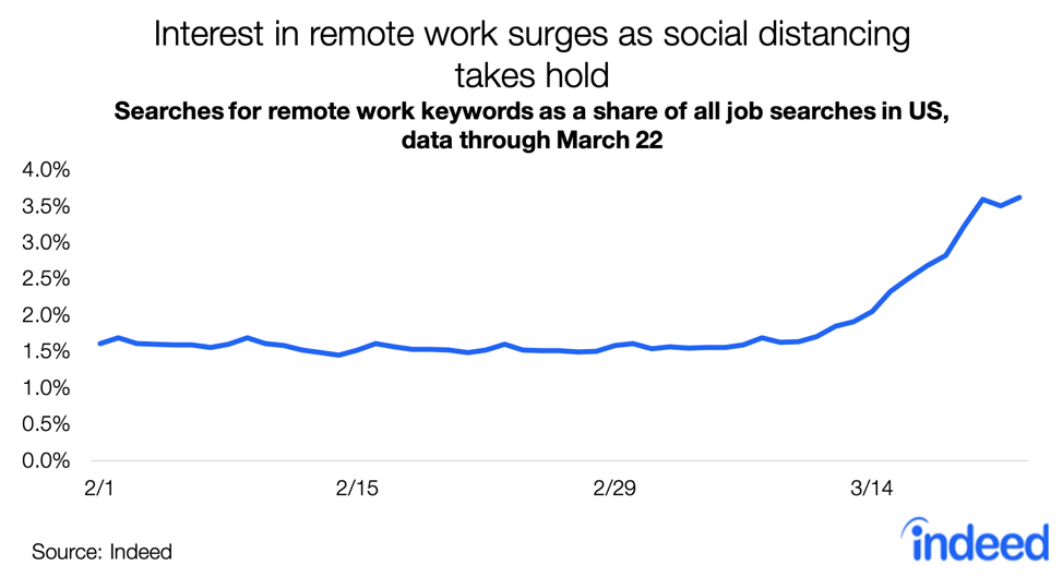
When to use line charts:
- Compare and present lots of data at once
- Show trends or progress over time
- Highlight deceleration
- Present forecast data and share uncertainty
Best practices for line charts:
- Use solid lines only because dotted or dashed lines are distracting.
- Ensure that points are ordered consistently
- Label lines directly and avoid using legends.
- Don’t chart more than four lines to avoid visual distractions.
- Zero baseline is not required, but it is recommended.
Pro-tip for line charts from Mike Cisneros, an award-winning data visualizer:
“The range from your smallest value to your largest values should take up about 70 to 80 percent of your graph’s available vertical space.”
3. Area graph
An area graph is like a line chart as it also shows changes over time. One difference is that area graphs can represent volume which is typically filled with color.
The area graph example by the BBC below shows a simple comparison of two data sets over a period of time.
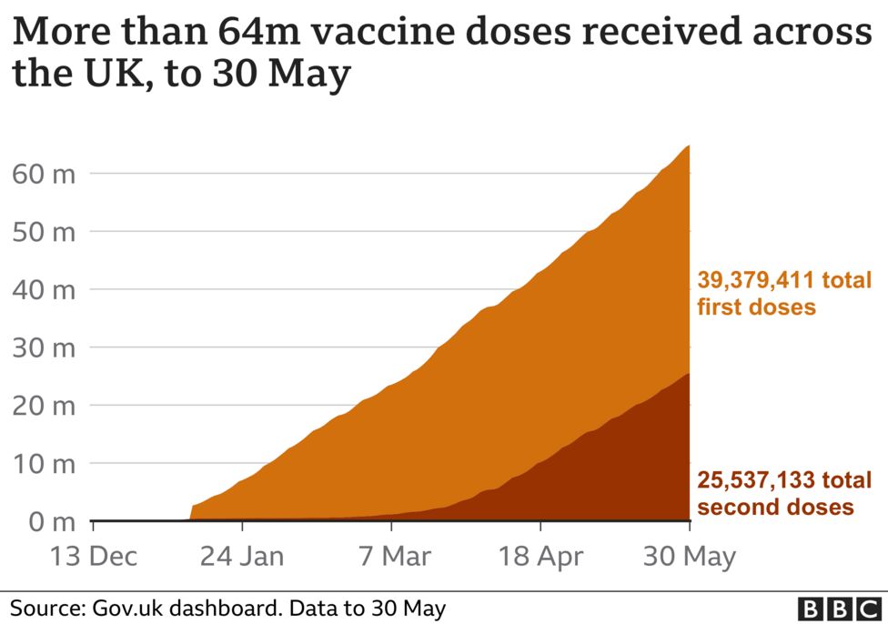
When to use area graphs:
- Display how values or multiple values develop over time
- Highlight the magnitude of a change
- Show large differences between values
Best practices for area graphs:
- Don’t display more than four categories.
- Use transparent colors to avoid obscuring data in the background.
- Add annotations and explanations to your graphs.
- Group tiny values together into one bigger value to prevent clutter.
Pro-tip for area graphs from Lisa Charlotte Rost at Datawrapper:
“Bring the most important value to the bottom of the chart and use color to make it stand out. Your readers can compare values easier with each other if they have the same baseline.”
4. Scatter plot
A scatter plot or a scatter chart helps show the relationship between items based on two different variables. Dots are plotted in an x-y coordinate system. In some cases, a trend line is added (like in the example below) to a scatter plot.
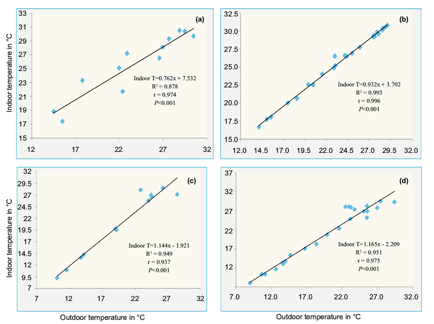
When to use scatter plots:
- Show relationships between two variables
- You have two variables of data that complement each other
Best practices for scatter plots:
- Start the y-axis value at zero to represent data accurately.
- Plot additional data variables by changing dot sizes and colors.
- Highlight with color and annotations.
Pro-tip for scatter plots from Mike Yi of Chartio:
“Add a trend line to your scatter plot if you want to signal how strong the relationship between the two variables is, and if there are any unusual points that are affecting the computation of the trend line.”
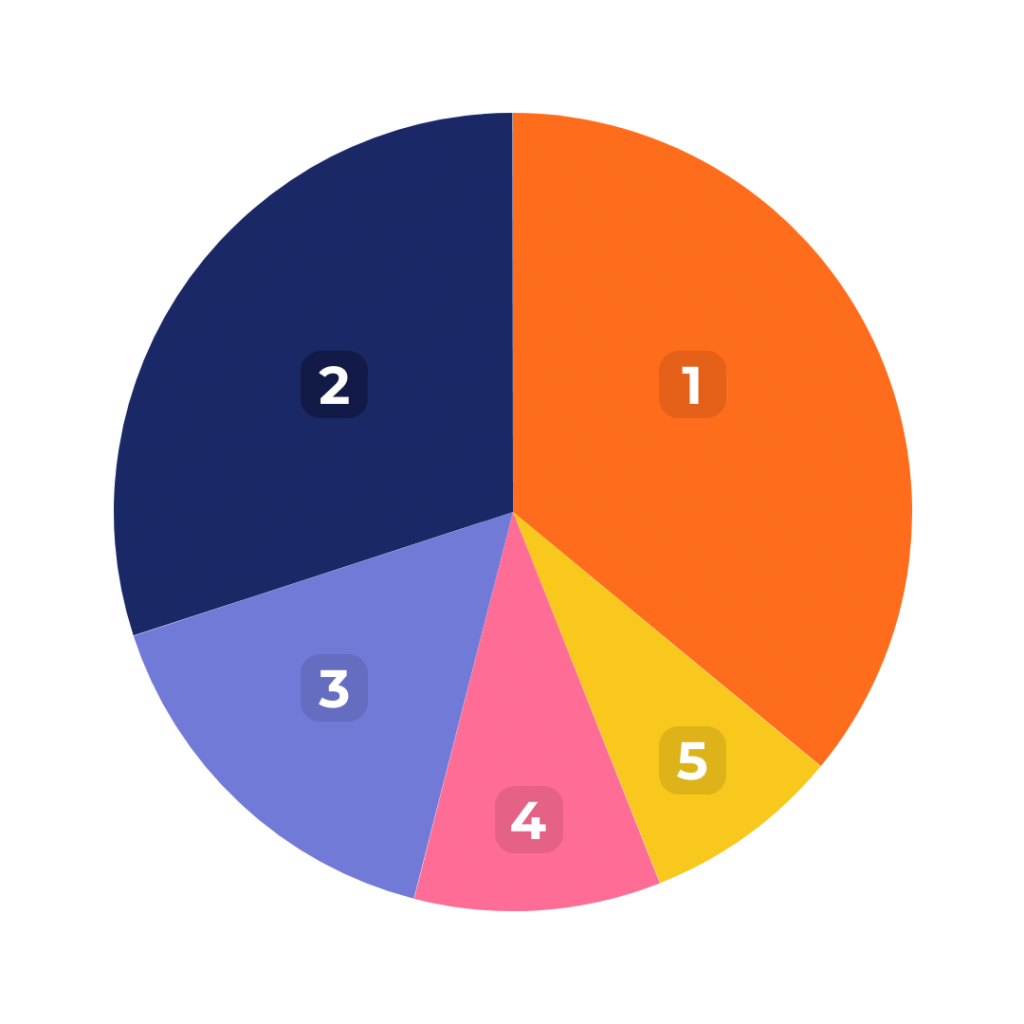
5. Pie chart
A pie chart highlights data and statistics in pie-slice format. This type of chart represents numbers in percentages, and the total sum of all pies should equal 100 percent. Pie charts are most impactful to your audience if you have a small data set.
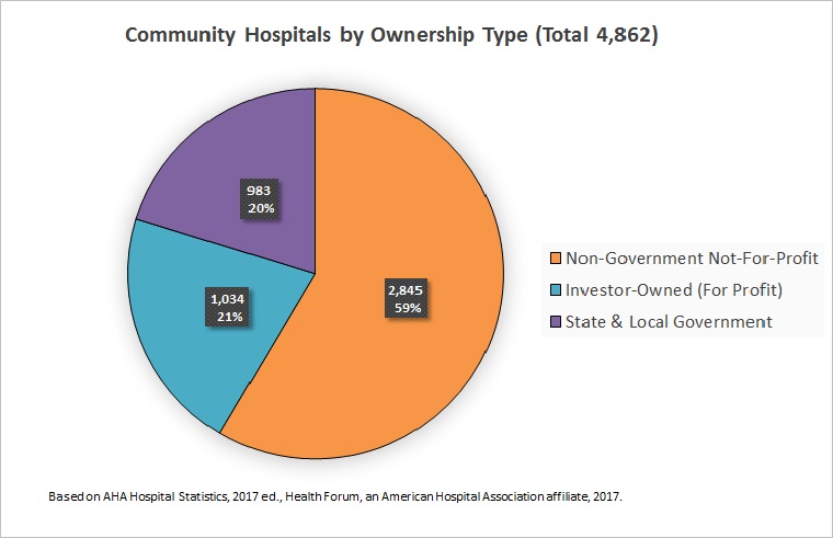
The donut pie chart, a variation of the pie chart, shows a design element or the total value of all the variables in the center.
When to use pie charts
- Illustrate part-to-whole comparisons — from business graphs to classroom charts
- Identify the smallest and largest items within a data set
- Compare differences between multiple data points
Best practices for pie charts:
- Limit categories to 3-5 to ensure differentiation with the slices.
- Double-check if the total value of the slices is equal to 100 percent.
- Group similar slices together in one bigger slice to reduce clutter.
- Make your most important slice stand out with color. Use shades of that specific color to highlight the rest of the slices.
- Order slices thoughtfully. For example, you can place the largest section at the 12 o’clock position and go clockwise from there. Or place the second largest section at the 12 o’clock position and go counterclockwise from there.
Pro-tip for pie charts from visual communication researcher Robert Kosara of Eager Eyes:
“The pie chart is the wrong chart type to use as a default; the bar chart is a much better choice for that. Using a pie chart requires a lot more thought, care, and awareness of its limitations than most other charts.”
Customize your bar graph with Piktochart’s pie chart maker. Create your free Piktochart account.
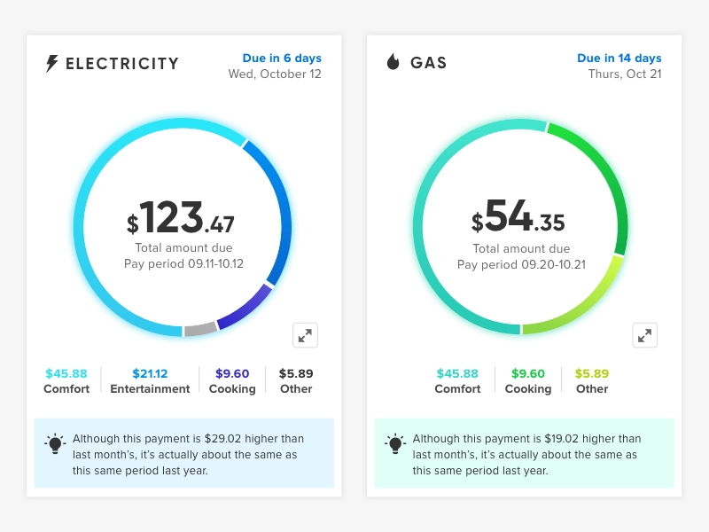
6. Pictograph
A pictograph or a pictogram is a type of chart that uses pictures or icons to represent data. Each icon stands for a certain number of units or objects. For example, the infographic below contains a pictogram— each human icon represents 10 percent of CEOs.
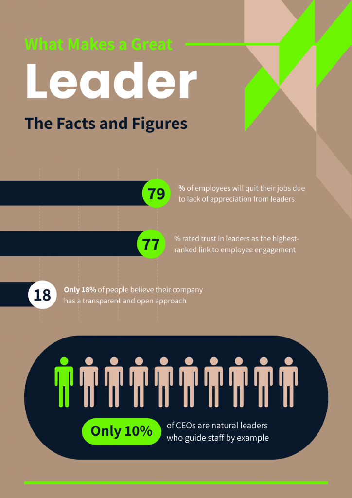
When to use pictographs:
- When your target audience prefers icons and pictures
- Show progress of a goal or project
- Highlight ratings
- Share survey results
- Share level of proficiency
Best practices for pictographs:
- Keep your icons and pictures simple to avoid distracting your audience.
- Do not use contrasting colors for your icons. Instead, use shades of one specific color.
- Limit rows to 5 or 10 for better readability.
7. Column chart
A column chart is ideal for presenting chronological data. Also known as the vertical bar chart, this type of chart works if there are only a few dates to highlight your data set like in the example below.
When to use column charts:
- Display comparison between categories or things
- Show the situation at one point in time
- Share relatively large differences in your data values
Best practices for column charts:
- Plot bars against a zero-value baseline.
- Keep your bars rectangular and avoid 3D effects in your bars.
- Order category levels consistently: from highest to lowest or lowest to highest.
Pro-tip for column charts from Storytelling with Data:
“As you add more series of data, it becomes more difficult to focus on one (bar) at a time and pull out insight, so use multiple series bar charts with caution.”
8. Bubble chart
A bubble chart or a bubble plot is a lot like a scatter plot. However, bubble charts have one or two more visual elements (dot size and color) than a scatter plot to represent a third or fourth numeric variable.
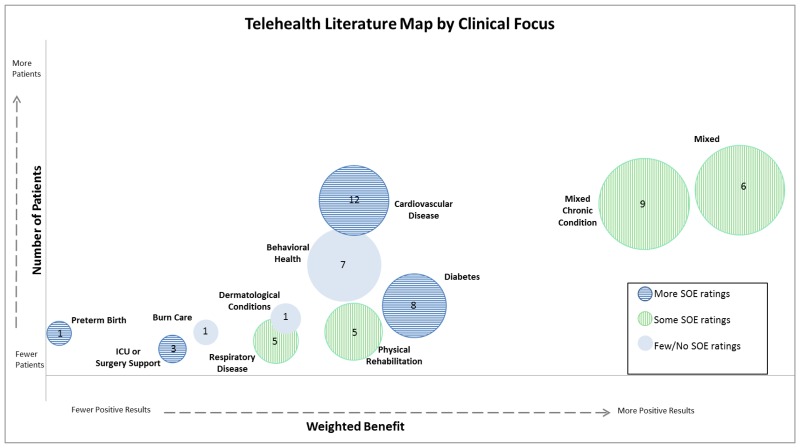
When to use bubble charts:
- Show relationships between three or more numeric variables
Best practices for bubble charts:
- Scale bubble area by value, not diameter or radius.
- Use circular shapes only.
- Label key points clearly.
Pro-tip from Elizabeth Ricks, a data visualization instructor:
“Include words for static bubble charts. It’s always a good idea to label your axes, provide clear chart titles, and annotate important data points with illuminating context. This is especially true when you are using a data-dense chart type like a bubble chart, and you aren’t standing next to it ready to explain away any confusion that viewers might have at first glance.”
9. Gauge chart
A gauge chart, also known as a dial chart, is an advanced type of graph that shows whether data values fit on a scale of acceptable (good) to not acceptable (bad). For example, you can create a gauge chart to display current sales figures and use your quarterly sales targets as thresholds.
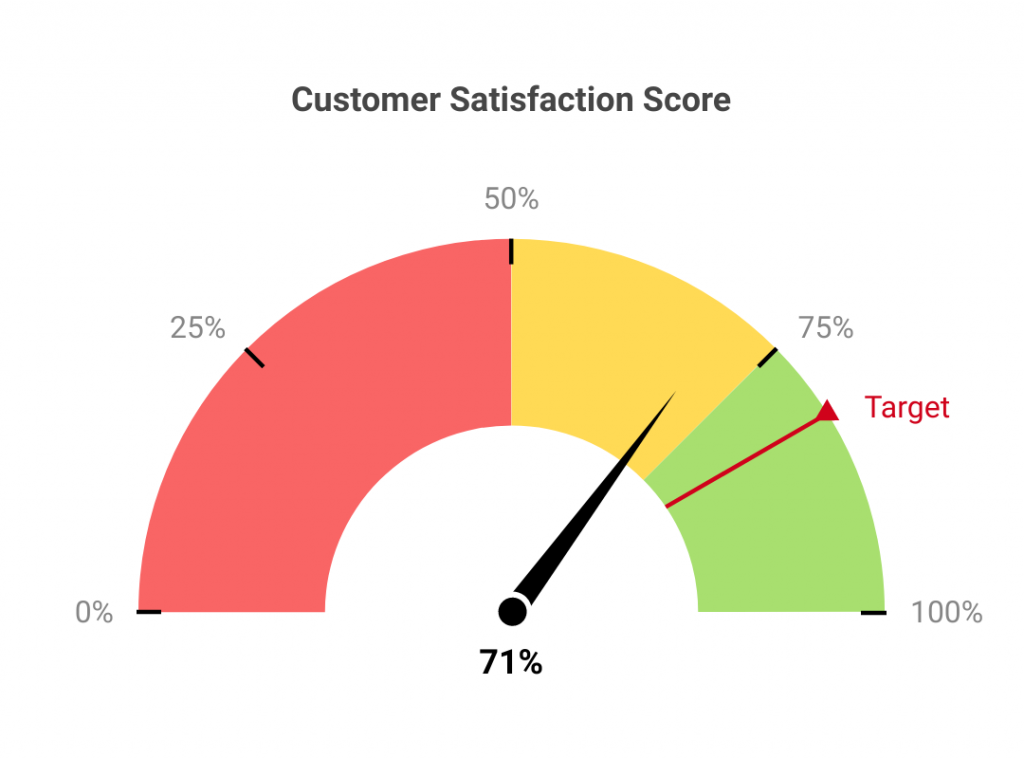
Gauge charts are particularly helpful where the expected value of the data is already known. This helps organizations create actionable reports and help employees understand where they stand in terms of metrics by looking at the chart.
When to use gauge charts:
- Share target metrics and display the percentage of the target goal that has been achieved for a certain period.
- Highlight progress of a linear measurement.
- Compare variables either by using multiple gauges or through multiple needles on the same gauge.
Best practices for gauge charts
- Limite 2-3 colors for each gauge or avoid high contrast color combinations.
10. Stacked Venn
A stacked Venn chart is used to showcase overlapping relationships between multiple data sets. This type of graph is a variation of the original Venn diagram, where overlapping shapes or circles illustrate the logical relationships between two or more variables.
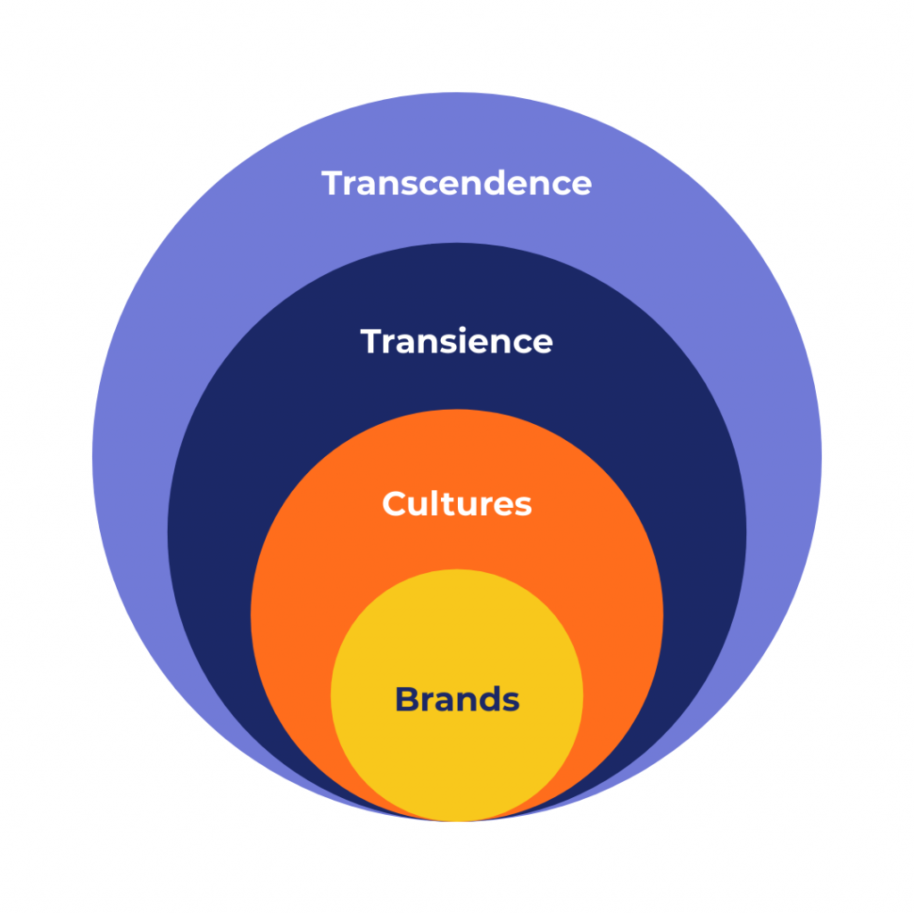
When to use the Stacked Venn:
- Emphasizing growth within an organization or business
- Narrow down a broad topic
Best practice for Stacked Venn:
- Avoid high contrast color combinations to ensure readability.
What about the other types of graphs and charts?
There are plenty of other types of charts and visuals — candlestick charts, Gantt charts, heat maps, waterfall charts, and the list goes on. They are almost always specific to a particular industry, and the ones we’ve listed should be enough to address your basic to intermediate data visualization needs.
Choose the graph or chart that is easiest for your audience to read and understand
Thoughtfully designed charts and graphs are a result of knowing your audience well. When you understand your audience, you can communicate your data more effectively.
Before you share your chart or graph, show it to a couple of colleagues or a small group of customers. Pay attention to their questions, their observations, and how they react to your chart or graph.
Create a free Piktochart account and sharpen your data visualization chops by making graphs and charts in minutes.
About the author:
Kyjean Tomboc is an experienced content marketer for healthcare, design, and SaaS brands. She also manages content (like a digital librarian of sorts). She lives for mountain trips, lap swimming, books, and conversations over beer.