Brand guidelines are the rules and tools used to determine your brand’s elements.
Without well-defined guidelines, your elements will likely end up all over the place and lack cohesion and consistency.
Designers, writers, and anyone else involved use brand guidelines to ensure they’re creating content that is unified in style and feel.
They include many different elements such as fonts, color palettes, and logo designs. Together, these elements will create your brand identity.
Defining your brand guidelines can seem like a daunting task. Fortunately, many popular brands have shared their own style guides with the public to learn from.
We’ll be looking at some of the leading brands and what creative directions they took to become the iconic leaders they are today.
But first, what exactly does a style guideline entail? Let’s find out.
What Should Be Included in Your Brand Guidelines?
The following elements form the core of any good style guide.
1. Brand Story
Your brand story is what introduces you to the world, so you need a good summary that gives people insight into your brand’s heart and soul.
You should identify your brand’s vision, mission, personality, videos, and audience in the summary. You can share all of this information or just some of it.
2. Logo Guidelines
Deciding on the logo of your brand can be fun, but a lot of thought should go into it. The colors you plan to use and the way the logo will look in different environments are important points to consider.
It might be best to hire a logo designer even if you have many ideas — a professional will help ensure your logo looks as good as possible no matter where your audience views it.
3. Brand Color Palette
Colors are significant in brand design. The color palette you choose will define the look and feel of your brand. It is recommended that you stick to four or fewer colors to avoid designs that look too ‘busy.’
Light colors are great for backgrounds with text in darker colors and a dash of color that makes the color scheme ‘pop.’
Just keep in mind that your chosen colors must work everywhere you plan to market. Whether the colors work in newsletters, emails, or social media will be determined by how well you plan your palette.
4. Typography and Font Guidelines
The font you use for your brand is more important than many marketers and entrepreneurs expect. Typography will help define your brand design, and using the wrong font and size can make a big difference in how well a logo or brand name is accepted by your audience.
In your brand guidelines, you need to identify the font(s) associated with your brand, how big it should be, and what color(s) should be used for text.
5. Image Guidelines
As the creator behind your brand, you’ll likely have a good feel for what kind of images and illustrations will suit it best. But as with all the other elements, you need to put a lot of thought into the images that will be associated with your brand.
You can gather many images and photos you like for your brand guide and keep them to refer back to for inspiration. It’s a good idea to research what kind of imagery works well for your industry.
Mood boards are also a nice way to get an idea of the feelings you want to evoke in people who interact with your brand. Whatever approach you choose, make sure that your images are always high quality and that you use reliable photo editing apps or software.
6. Brand Voice
When working on brand identity, it can be easy to forget about your brand voice, which is represented mainly in the writing style you use.
The way your brand is represented in writing will affect how your audience feels about you. For your branding guide, write down the kind of adjectives that describe your brand’s personality.
Select words that will demonstrate your brand voice and include a guide on what kind of language you don’t want to use.
The 14 Best Brand Guidelines
The following brand guidelines are some of the best examples of what a good guideline should look like. Created by professionals, these work really well and should serve as a nice inspiration for you and your creative team.
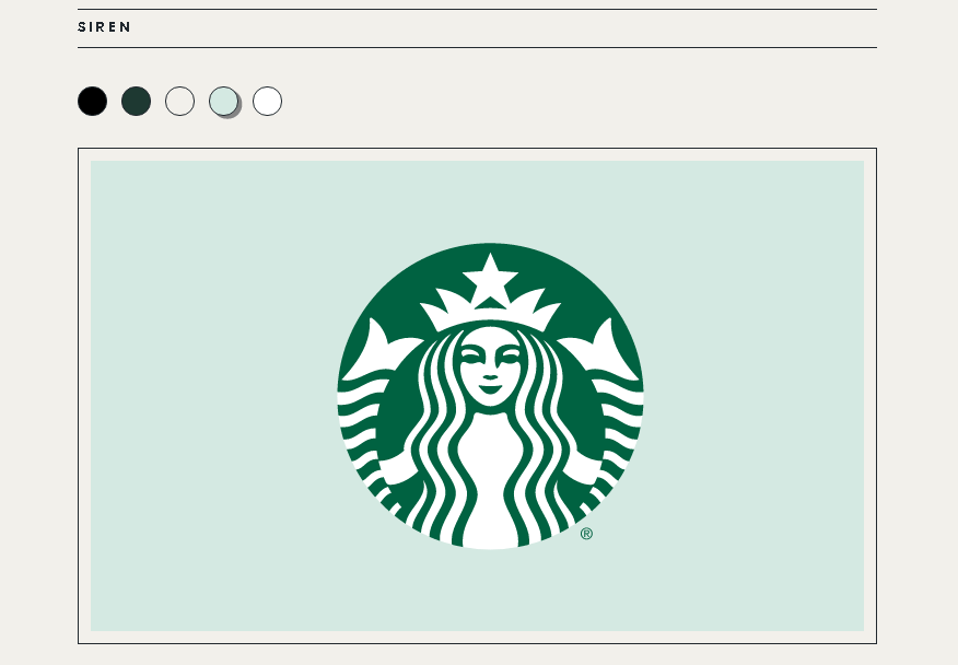
1.Starbucks
Starbucks’s ‘brand expression guide’ takes a good look at how Starbucks used color to make its brand come alive. The inspiration behind the Siren in the logo is also explained.
Because the Starbucks logo is well-known (thanks to good design), the brand can use it on its own without any text, and people will still recognize it.
This style guide explains how to use the logo, the complementary color palette, and their chosen font to keep all designs consistent.
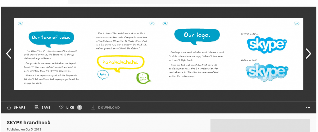
2.Skype
In Skype’s brand book, the brand’s tone of voice, logo designs, colors, and typefaces are all discussed in detail. The motivation behind every choice is explained, too, so designers can get a feel for what the brand identity is.
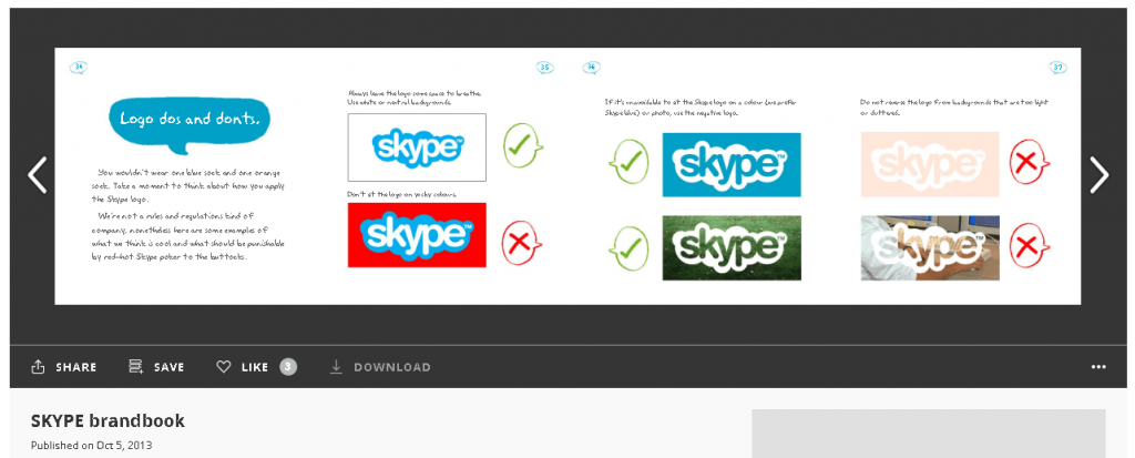
When designing your own brand guidelines, it’s a good idea to include do’s and don’ts as well. This will avoid misunderstandings that could result in problems further down the design line.
Skype makes it clear what they don’t want to be done with the logo to ensure it looks great and recognizable wherever it is seen:
3.Audi
Audi is a household name worldwide, which means that the brand is replicated and promoted in thousands of places.
As you would expect from a household name such as Audi, the brand’s style guide is rather extensive.
The brand’s mission and vision are clearly explained and what kind of feelings should be provoked when creating marketing campaigns.
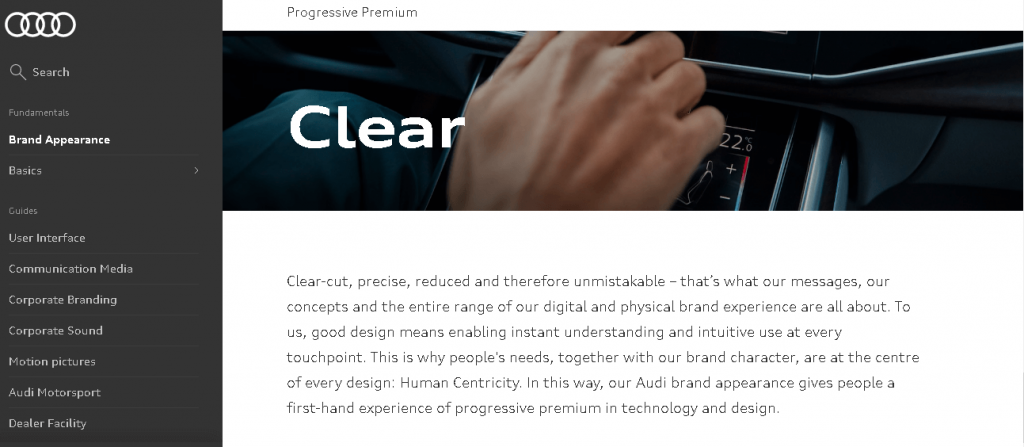
There are also guidelines on user interfaces, motion pictures, corporate branding, and even corporate sounds.
4.Asana
The designer behind the rebranding of SaaS company Asana, Micah Daigle, wrote a brand book that laid all the fundamental motivations behind what makes the brand what it is.
The team gave the brand attributes that represent it best, which is a good idea for getting a feel for brand identity.
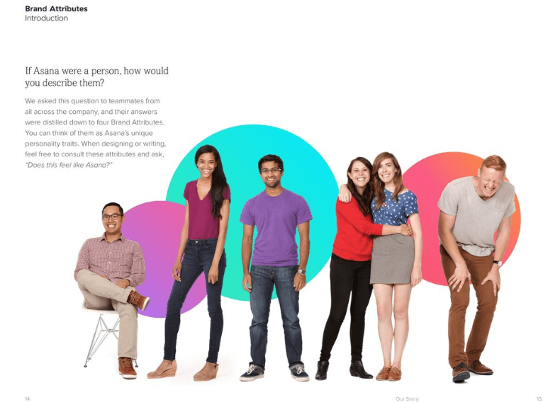
The brand’s logo, which is as simple as three ‘corange’ (coral and orange) dots, represents the company’s aim to make it easy to collaborate as teams. Choosing a logo that represents the company’s service is clever, though not always feasible.
5.Urban Outfitters
Brand Outfitters have a sharp focus on quirky product shots and edgy designs, and it is shown perfectly in any media the brand ever releases.
Its brand style guide goes into detail about logo designs, typography, do’s and don’ts, and photography methodology used when creating content.
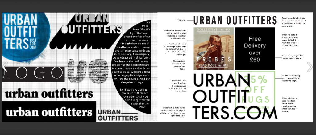
Even the store environment is discussed to give designers a better idea of what the brand is all about. This is a good approach because anyone who reads the guidelines will know exactly how to represent the brand now.
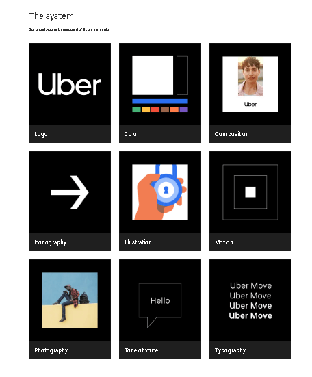
6.Uber
Uber has a comprehensive style guide that explains how color is used by the brand, how they approach photography, and what their tone of voice is.
The guide also makes it clear what the logos must look like, what fonts must be used, and the composition system works.
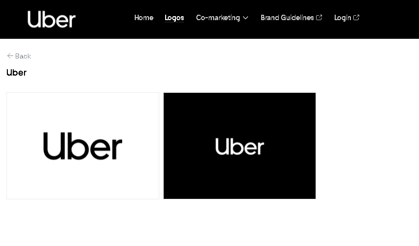
It is clear from the information shared that Uber likes to keep things simplistic and elegant in recognizable colors and with a tone of voice that represents the brand’s personality.
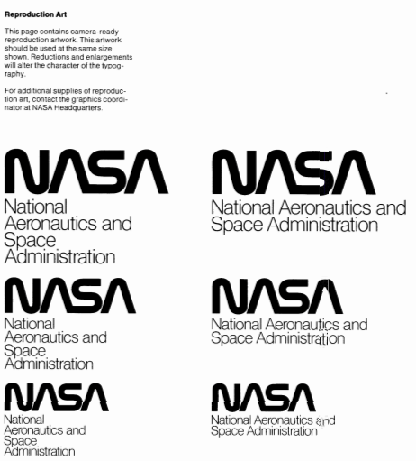
7.NASA
NASA has thorough brand guidelines that are meant to be followed to the T. Having such specific style rules is a good idea if it’s very important to your brand that elements like logo and typography are never wrong or inaccurate.
No stone is left unturned by the guidelines, and the attention to detail is quite admirable. There are also examples of how to use the style rules to ensure it is done right in any given situation.
Even an example of the brand’s letterhead is shown — NASA is serious about consistency.
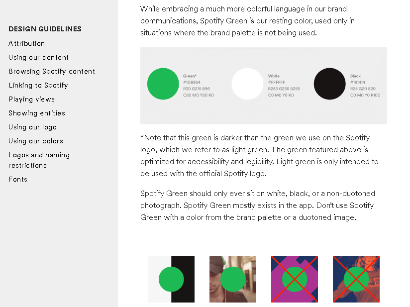
8.Spotify
Spotify has a style guideline that is pretty straightforward and gets right to the point. It discusses the importance of the color palette and how it should be used.
The guidelines also go into how links to Spotify must be handled, how the log is used, outlines naming restrictions, and discusses typography.
If you’re going to be digital in your marketing approach (which is recommended), you should have a brand guideline that considers all aspects of internet usage.
You have to keep in mind how logos will change in appearance when viewed on different platforms, how your palette’s colors might be affected, etc.
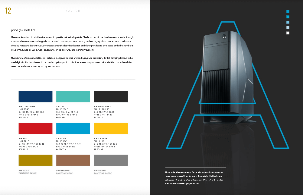
9.Alienware
Alienware is focused on the gaming industry and has designed its logo and chosen colors that reflect that very well. In their brand style guide, the brand lays out how their color palette is used and what their tone of voice is.
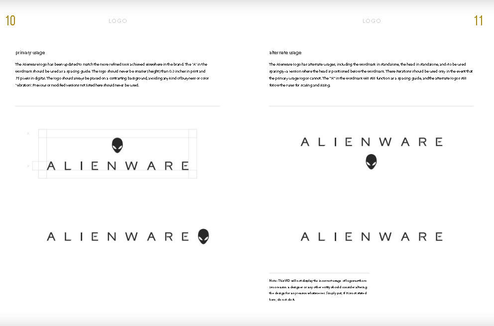
The guide goes into detail about how the brand aims to connect with gamers and form real relationships. The icons used in Alienware content are discussed as well, with clear examples shown.
Having good examples of these elements is a great idea and eliminates any possible misunderstandings. Consider also adding infographics that outline your brand’s most important guidelines.
10.MailChimp – Voice & Tone Guide
If there is a brand that understands the importance of a good brand guideline, it’s MailChimp. They have an entire guide dedicated to voice and tone alone, highlighting how important it is to get it right.
The emphasis is on creating content that is friendly and human and feels familiar to MailChimp’s audience.
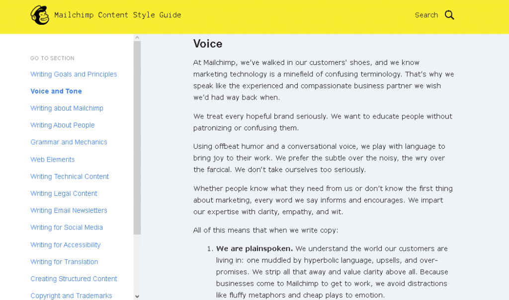
Although other elements like color and typography aren’t discussed in this guide, it’s still very comprehensive on what the brand aims to achieve.
11.YouTube
The guidelines of video-streaming service YouTube are concise and cover all the important basics.
YouTube’s logo is one of the most easily recognizable in the world, so it’s no wonder the brand’s style guide is comprehensive when discussing what may, or may not, be done with it.
If you’re planning to use video marketing strategies, it’s essential that you have thorough guidelines for your team to work with. Perhaps also outline which video editing software you prefer to use for your content.
12.Slack
Slack has a standard ‘Media Kit’ that explains all the rules that must be followed regarding its logos and content.
It is pretty basic but goes into the brand’s values, tone of voice, and personality to lay out what it aims to achieve with its audience.
Color usages and typography are also discussed, accompanied by examples.
13.Zendesk
Zendesk has a unique approach to its brand style guide, which is called ‘Brandland.’ In this guide, the company discusses everything there is to know about the brand, its philosophy, and its attributes.
The guide also discusses brand identity, typography, and the brand’s color palette, and how it should be used. Sound and photography rules are also discussed in detail.
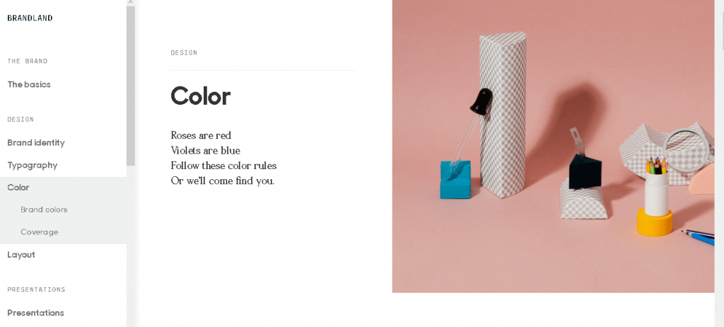
When a guide goes to so much trouble to show off what it is and how it should be represented, marketers find it easier to capture its essence in marketing and when creating content.
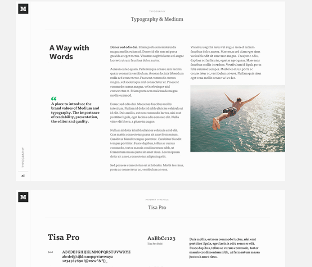
14.Medium
Medium’s brand guidelines take time to dive into exactly what it allows and doesn’t allow. Typography is discussed in great detail with clear examples of how written content should look like.
It also discusses how colors are used and how to implement the brand’s iconography.
Make Your Brand Guidelines As Easy To Understand As Possible
Creating guidelines is an important step for any brand and getting it right is crucial. It’s just as important to make the guidelines easy to understand and not a problem to follow along with.
And when you need to present them to your manager or boss, you can use Piktochart to create presentations that keep your listeners’ attention. Create an account and try it out yourself for free.
About the author
Mark Quadros is a SaaS content marketer that helps brands create and distribute rad content. On a similar note, Mark loves content and contributes to several authoritative blogs like HubSpot, CoSchedule, Foundr, etc. Connect with him via LinkedIn or twitter.