Today, visual communication is more important than ever. The time we spend in a home-office is rapidly growing. Not only that, but the interaction between us changed significantly in the last couple of years.
It’s completely normal to work with somebody for a long time, but never meet them in person. You can get customers, suppliers, investors anywhere on the globe—without the actual need to travel there personally.
Webinars have been with us for quite some time, but we can all agree that the number of webinar events is unprecedented. With those comes a variety of webinar services, so nowadays you are presenting through MS Teams, later participating in Google Hangouts, and tomorrow you are invited to a Webinarjam event.
Even personal meetings are becoming fast-paced. Everybody has a lot to do. It is critical to communicate in a clear an simple way.
This is why visual presentation is now more important than ever. It is not difficult to lay out an idea in 50 slides and give a two-hour presentation. But in the modern world, it is not possible to have such long interactions.
A challenge is to put an idea on a few presentation slides and get your message across in five minutes. While this is an extreme example, in most cases this is what the presenter should strive for.
In this post, we will go over the main tips on structuring an informative, clear, and short presentation.
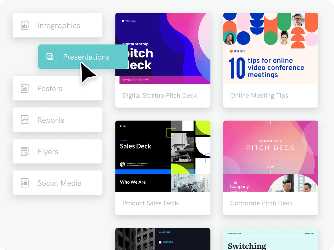
You could also learn on the go by creating an account on Piktochart for free. Select one of our presentation templates to get started.
Considerations Before Structuring Your Presentation.
Before we dive into actionable tips to get your presentation going, first let’s clarify some of the main points.
What is the goal of your presentation?
What is the main objective of the presentation, is it to pitch investors? Get new customers? Discuss an idea with your colleagues?
Never do the presentation just because “it has to be done”. Your whole pitch will be much more efficient when you know exactly why you are doing it and where you need to get your audience to.
Who is your audience?
As for every marketing endeavor, the same goes for presentations—know your audience. It does not have to be exact research, but you must know the overall information.
Age, profession, interests—the more you connect with your audience the more memorable will your presentation be.
No matter the goal of the presentation, during your pitch, the audience is your client. And as a famous saying goes, “know your client”.
What are the main points?
Right at the beginning, establish the main points that you want your audience to remember. If I would ask one of the presentation participants in a week what was your pitch about—what would he/she answer?
Presentation style
There are many ways how you can style (structure) your presentation. Which approach you will choose hugely depends on what is required from you. Let’s go over some of the most popular styles of the presentation:
- Short Presentation
If you are one of many presenters that day, you will have a very limited amount of time to present your idea. In addition to that, you may be speaking after many people. So at this point, the audience is already tired and it is important for you to stand out.
In this situation, you must compress your ideas to as few points as possible. Your presentation will probably not have more than 3-5 slides. On these slides, only the main points will be included.
Piktochart has many great templates that will help you create a pitch deck (or a quick presentation) in no time! Sign up for free to create a visual.

- Guest Presenter
If you are one of the main participants of the program, you will have more time to present. Though it may not seem so, it is much easier to prepare for a longer presentation than for a short one.
In this case, you may add more points to each slide, and speak more freely on the topic.
- Problem Solving
You may see this approach frequently on TED. Presenters briefly talk about themselves, then they describe the problem that exists there.
To emphasize its importance, they also describe the possible impacts of the problem not being solved. After the stage is set, they describe how they would solve it.
- Storytelling
We frequently see this approach in various motivational presentations. Storytelling is a great way to emotionally connect with the audience. All the stories start with an underdog. Why? Because everybody can relate.
They go through struggles, setbacks, problems. Again—everyone can relate. They end with catharsis in a form of success or justice. For the last part, not many can relate but they can emotionally resonate with it as they too would like such an outcome for themselves.
- Demonstration
We all remember the presentation of the iPhone by Steve Jobs in 2007:

Or the unveiling of the Tesla 3 model by Elon Musk:

Rather than the speaker, the center stage is given to the product. This is what good demonstration-presentation should look like.
The main topic becomes the product, so all the tips that we will discuss in this post must be related to it.
There are many other niche styles of the presentation, but most of the ones you see (and do) will fall into one of the described categories.
So since we established the main presentation styles, let’s dive a bit deeper into the way a good presentation would be structured.
Presentation Structure
While in the previous section we established what and to who we will be presenting. In this section, we will go over the main flow of your presentation.
In this section, I will use some examples. All of them come from Piktochart, and they are of course done for illustration purposes only—so please do not judge my creations too critically.
Also, for each section, I will be using a different visual template. Your presentation should of course be coherent in terms of style!
- Cover Slide
Through your presentation, you are telling a story and all good stories start at the beginning. Cover slides look professional when you present and they are a must when you are printing or sending.

Nothing too complicated. Brief and to the point. The cover slide is there to establish the topic (or that audience knows that they are in the right room) and set an overall tone to the presentation.
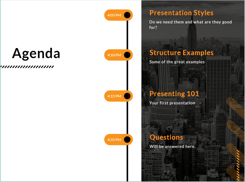
- Agenda
If you have a longer presentation, an agenda slide should be included. Sure, if you are going with a 5-minute sales pitch—skip this, but it is good to let your audience know what you will cover and how much time it will take.

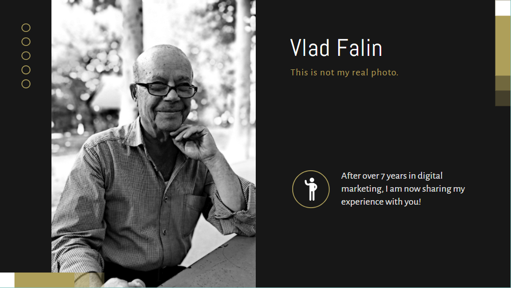
- Profile Slide
It is important to establish authority with your audience. Why should they listen to you? What qualifications or experiences do you have?
The profile slide is a great tool to establish your background and also to connect a bit.

I am not a big fan of jokes in presentations. Particularly when speaking to a bigger audience. What may seem like a witty joke to you, may be taken as not funny or even insulting by your audience.
But if I would be considering a small joke, it would be in the profile slide. Do not overdo it, or don’t it at all if you are not sure about it.
- The Problem
The common pleasantries are behind us and now we are getting to the main part of a good presentation. It opens with The Problem.
For this post, I will not be explaining how to present a quarterly financial report (you may find plenty of report presentations here). But (as you may have noticed) we are rather having a look at how a sales deck, investment pitch, or product presentation may look like.

The problem slide will set out the main point of the presentation. This is when you are trying to seriously connect with your audience.
In the case of a pitch—you are trying to present the problem in such a way that many people can relate to it. If nobody can relate—nobody will be interested.
If you are just doing a presentation on the topic (not a sales pitch), you might want to draft this in a way that will explain the overall environment of the topic that you are to tell about—to set the tone of the whole presentation.
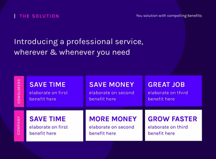
The Solution
After the tone of the presentation is set, or in the case of a pitch—the problem is explained, it is time to deliver what everybody is here for. For the pitch it would be the solution, for the overall presentation—it would be just an explanation of things (or possibly your personal view on the matter).

As with everything else, the provided solution/explanation must be as simple as possible. It must directly tackle the problem/the tone of the presentation that you‘ve set in the earlier slide.
The Conclusion Slide
After the main talk is done, close the presentation with the final slide. One of the teachings of leadership books (or pseudo-teachings) is that even if you are silent for the whole meeting, but in the end, you recap all that was said by others—you will be seen as a leader.
Closing statement matters. Ending with a properly chosen inspirational quote is something that worked well for me.

Of course, it will depend on the overall theme and tone of your presentation. But first and last impressions matter. So make sure you close on a strong note.
Q&A
Right before the closing slide, it is good to set up a “stop slide” which will remind you that now is a good time to take some questions.

You may start with a couple of pre-written questions to get the discussion going and then see if there are some questions from the public.
Closing Slide
The final slide of your presentation will be the one with Thank You note and contact information.

Make sure that you include the contact information, so you make it easier for everyone to find you.
That is it. While it may seem like a lot of work, with Piktochart templates you will be much quicker. The brief slides that you see above took me a couple of minutes to make.
So while we have the main structure of the presentation behind us, let’s have a look at some actionable tips that you should think of when preparing for your event or a webinar.
Presentation Tips
No matter what type of presentation awaits you, here are some tips that will hopefully help you as much as they helped me:
- When designing your presentation, make sure to leave space on the left or upper side. This will serve you well if you have to print and bind your presentation.
- Font type matters. It sets the tone for your presentation. Piktochart has lots of great combinations to choose from, but when in doubt, Helvetica and possibly Verdana will always look good. For tables with lots of numbers, Arial will be both readable and will fit the cells.
- Font size matters too. If it is a financial report that your colleague will be reading on his/her monitor, sure, you can go with a smaller font. But when presenting to an audience, keep around 30 for text and 40 points for titles.
- This will force you to put less text on the slide.
- Always imagine that you are a 50+ investor sitting in a back row. How readable is your presentation for him/her?
- In small groups, take questions as you go. It will help you develop the topic and better feel out what your listeners are thinking about (worried about).
- In bigger groups, leave the Q&A to the end of the presentation. Otherwise, it will be too messy and you will constantly get interrupted.
- The presentation podium is an enemy. It will make you stand in one spot, with no movement, and monotonously monolog through your presentation. Do not do it.
- Use your voice. It is said that to get into the meditative state of trance, you have to hum on the same low frequency. You do not want that to happen to your listeners right? Do not be overly dramatic or emotional, but do not be afraid to give a rhetorical question or to give color to your presentation with the proper use of your voice.
- Do not read from your presentation. Your slides are there just so you can keep track of where you are in your story. Pay attention to the audience, not the presentation.
- If possible, do not give out your presentation in advance. Your audience will read through it, make their conclusion about it and you will have no chance to explain all the nuances.
Conclusion
The hardest part of a presentation is to start. When you are staring at a blank slide, it seems like it just can’t be done. You do not know where to put the pictures, how the titles should be, how the text will be laid out.
Here is where Piktochart comes to the rescue. Create an account for free and choose the design that seems to work for your topic and just start filling the blanks. As you will progress, the path will be much clearer.
Hopefully these tips on how to structure a presentation and how to present it will help you achieve your goal!
About the Author
Vlad Falin is a founder and blogger at Costofincome.com, where he writes about digital marketing, landing page builders, business, and motivation.


