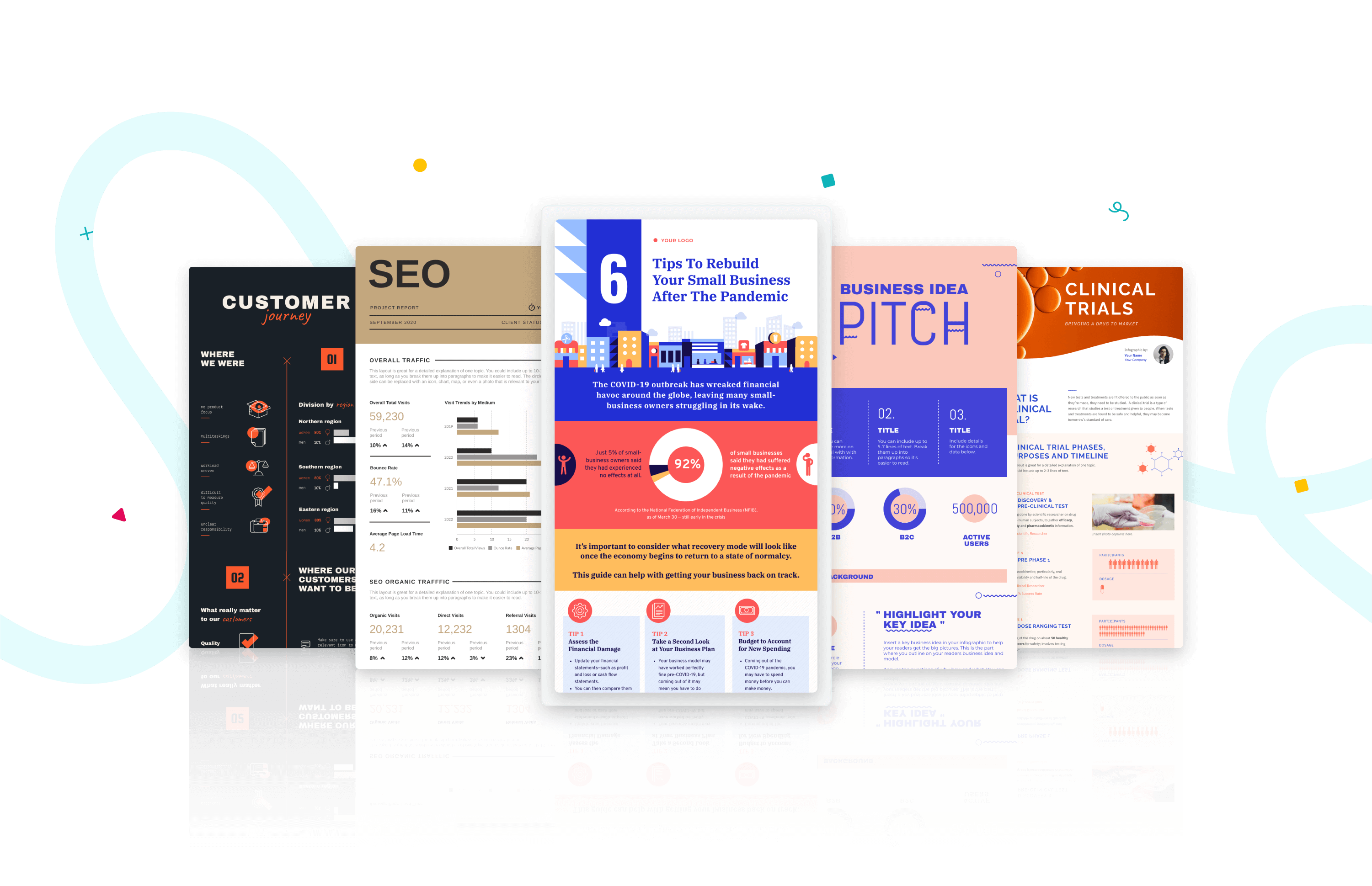
2020 has been a crazy year (if not the craziest so far).
If we had to choose one word to describe it, it would be unpredictable. From the pandemic to #blacklivesmatter, the wildfires, and the election in the US. 2020 contained one surprise after another.
For us — the design team in Piktochart — the one thing we’ve learned is how communication and design play a big part in bringing content to life and connecting people across the world.
Despite the range of cultures and backgrounds, we agree that certain designs catch our attention more than the others; or some styles that feel more familiar than others.
Here’s our prediction for the upcoming design trends from various categories (i.e,. illustration style, icon style, color, font and data visualization) that will bloom in 2021.
We also include some tips on how you can take advantage of these styles to level up your visual communication game. If you’re short on time, you can use the table of contents below to jump to each section.
…and to get started right away with visual communication, you can simply create a free account on Piktochart and work on infographics, reports, presentations, posters, and more.
2021 predictions:
1. 3D Design
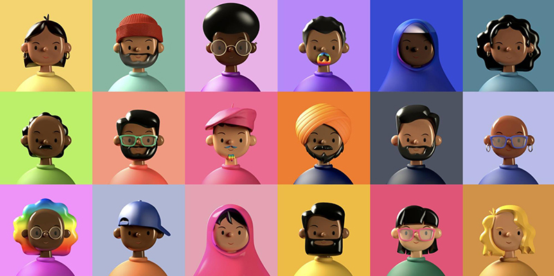
Have you seen any of the following 3D-like avatars on your newsfeed recently?
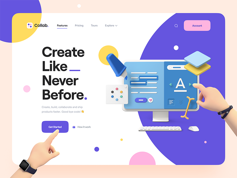
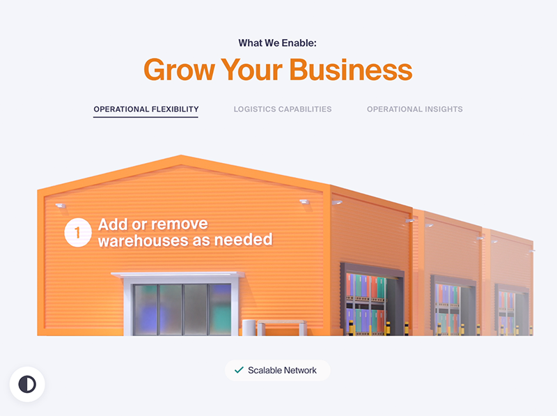
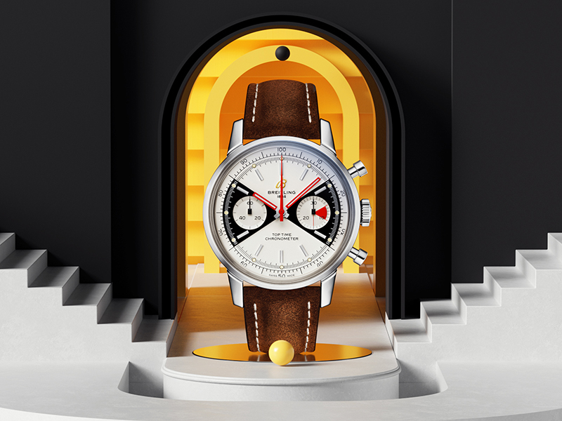
While minor 3D effects like shadow and overlay have been around since forever, in 2020, designers are taking it to another level, and this style is taking over the internet.
It’s getting a spotlight due to the hyper-realistic effect on a supposedly 2D illustration of characters or scenes. We predict that this will keep getting more popular in 2021.
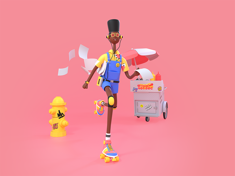


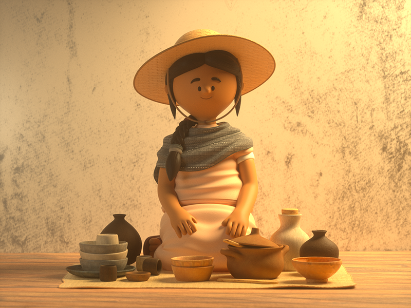
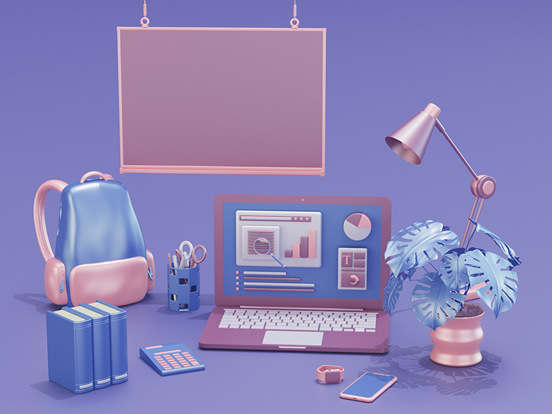
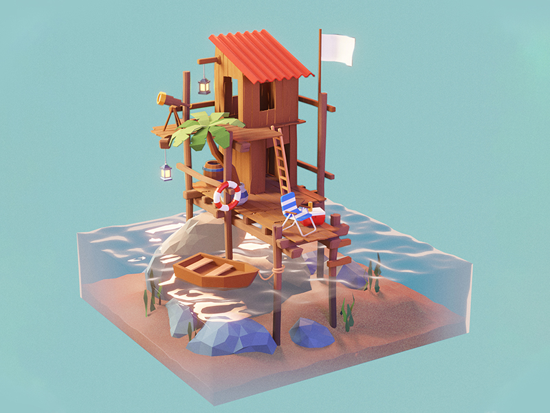
Those textures look so real that they begin to look more like a photo than an illustration. Apart from the illusion of depth, what distinguished this style is the usage of highly vibrant colors. Digital and web designers are well aware of that, and they often use 3D visualization to better visualize products and processes on websites and social media.

2. Natural & Organic Shapes
Natural design and organic shapes have been growing in popularity for quite some time; with people moving to healthier and more natural choices in general. Not only do we see designs with bold prints of leaves and colorful fruits, but also plants are being used as decorative elements.

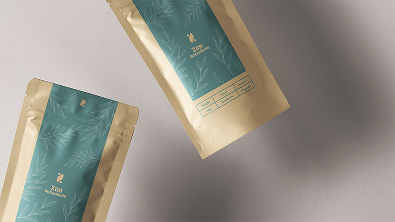
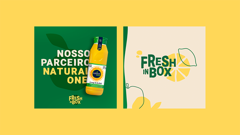
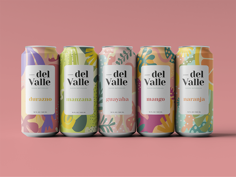
With the current pandemic, we all feel the urge to spend more time in nature, and this brings a set of opportunities to instead bring nature to you.
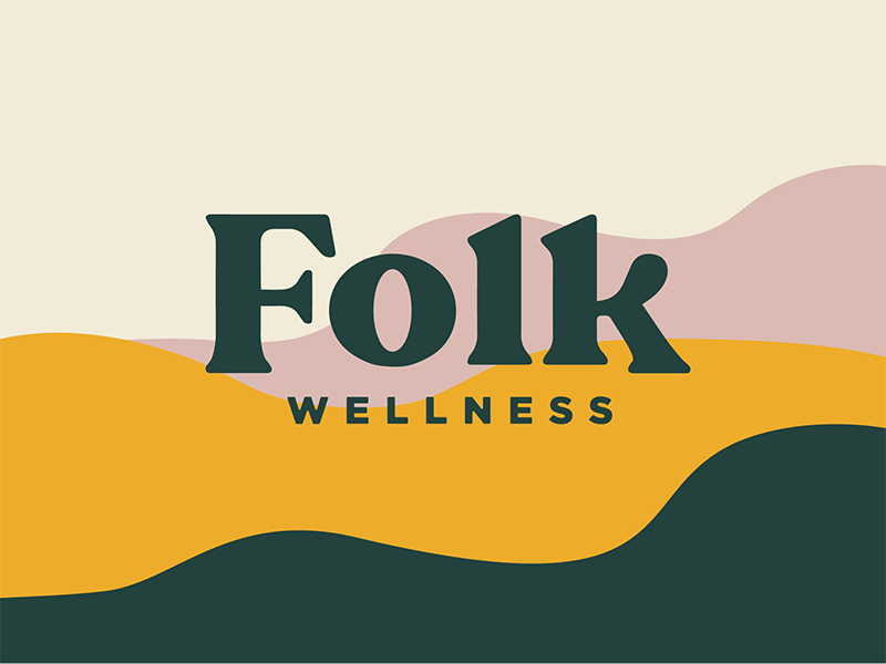

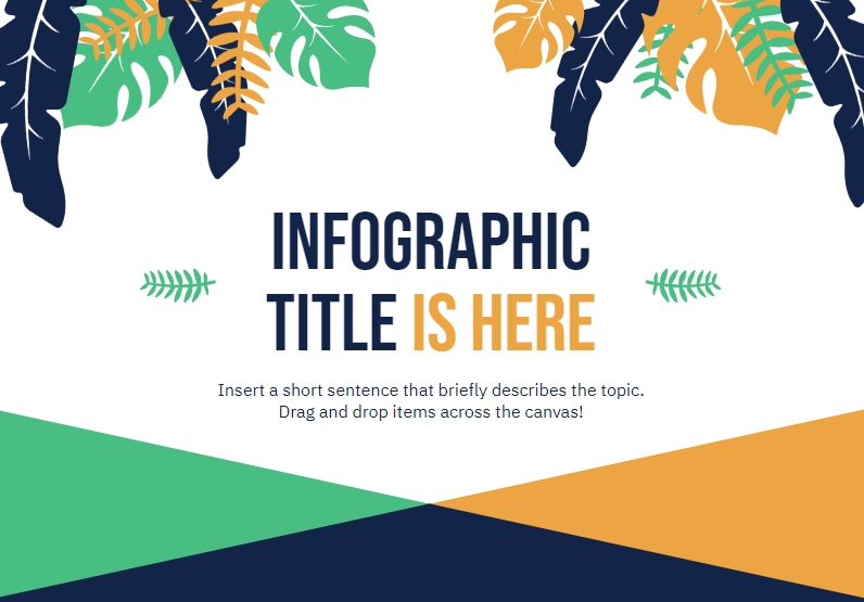
You can inject fresh air into your visual by using leaf shapes in your infographics, or adding plants in your presentations or reports to visualize company growth, as shown in this template:
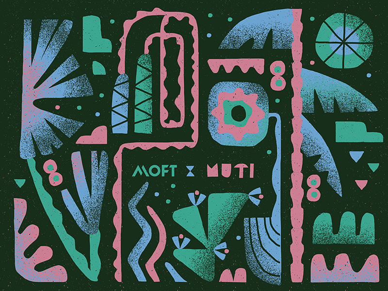
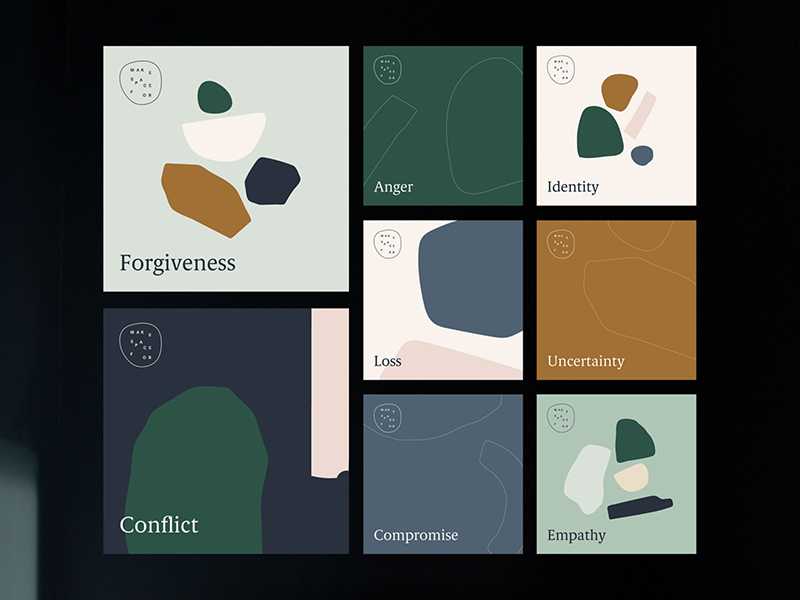
Organic and artistic shapes, which have been dominating retail designs for quite some time, are now bringing social media posts to life. Curvy and fluid-like lines and shapes are often seen on social media feeds as they convey a joyful and light-hearted feeling.

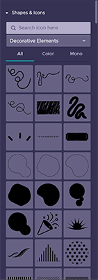
Organic shapes and lines are ready to be used as icons in Piktochart, you might find them under the Decorative Elements tab shown below. Mix and match shapes and lines, rotate and flip them, resize them into different sizes. There’s no hard rule on this so go on and have fun decorating your visual!

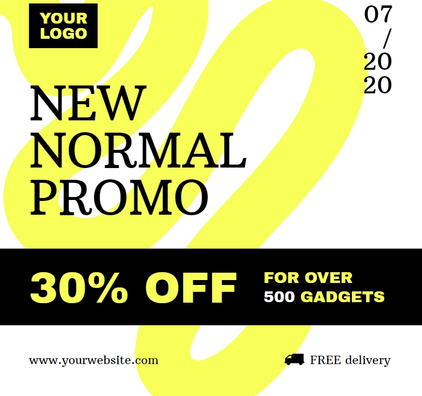
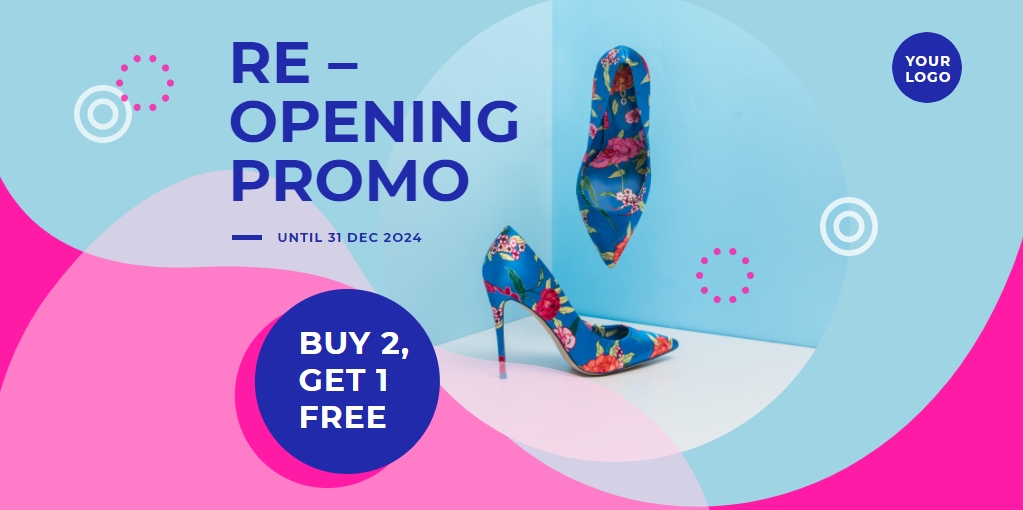
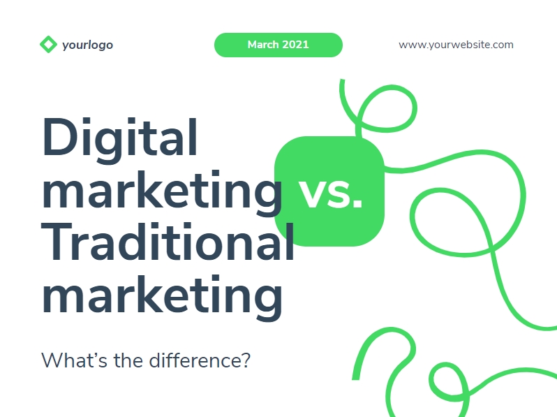
When you are working with continuous slides, carousel posts or long-form infographic, the organic lines also help to redirect your audience’s eyes and guide their reading flow.


3. Monochrome & Duotone Colors
In terms of color style, monochromatic and duotone colors have inspired designers throughout centuries to create minimalist and elegant looks on print designs.
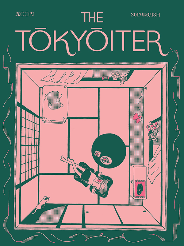
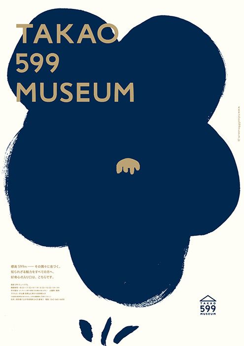


The key is to use a limited set of well contrasting colors, (you can play with tints & shades) and to apply it to all the elements within your visual, from the background, icons and photos to charts.
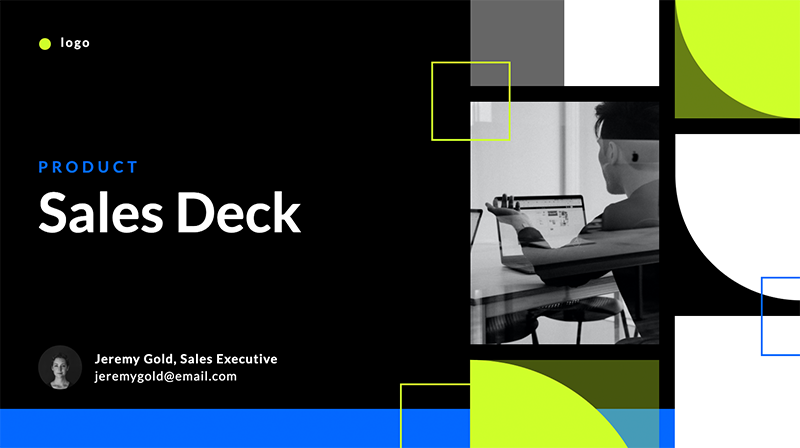
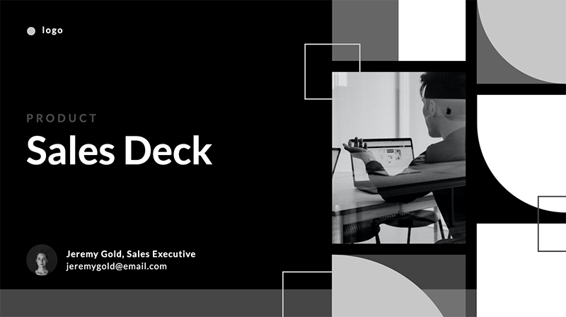
Full color Monochrome color
Tip:
Do you know you can easily manipulate the color of your visuals and adjust it to your preferences with our Color Schemes feature.
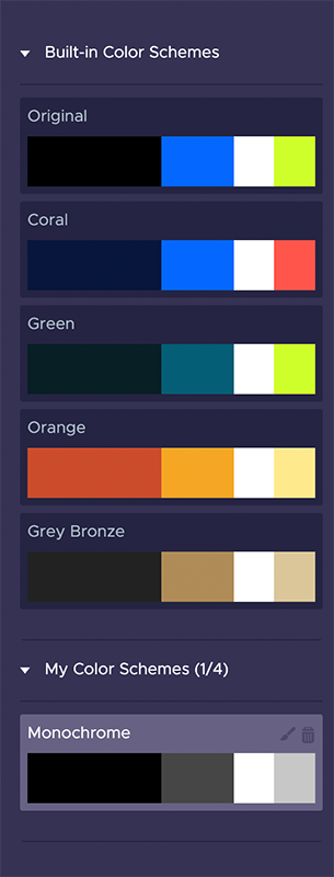
Apart from the built-in Color Schemes, you can create up to 4 sets of color schemes based on your branding colors or simply using your favourite colors.
Monochrome doesn’t always mean black and white, but instead we use different shades of one color. When monochromatic colors are combined with one accentuated color, it helps to highlight the point and send a clear message to your audience. Your eyes will be redirected to that one different color almost immediately.
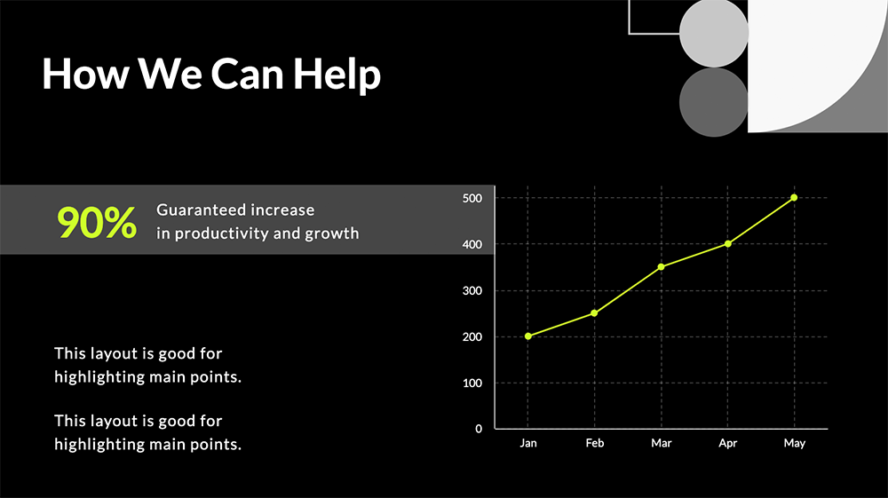
For example, we use green to emphasize the urgency on the 90% percentage on the above slide.
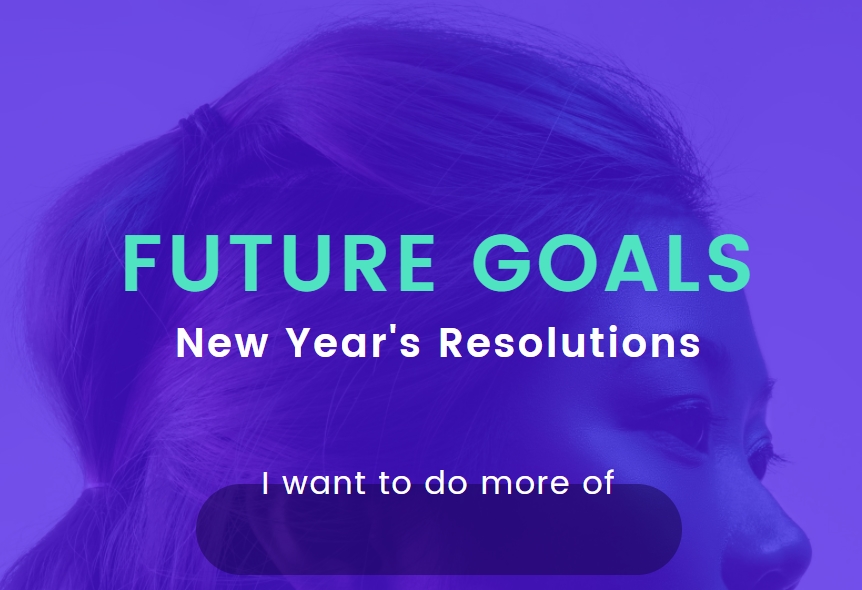
Duotone was a popular image filter or effect in 2018, where you combine two highly contrasting colors, and the trend continues to spread not only to photos but illustration and poster design.
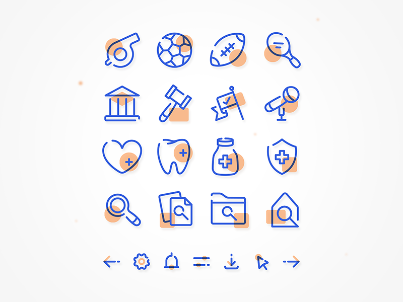

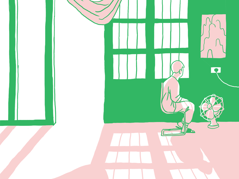
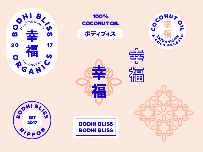
We predict that this trend will grow in 2021. You can easily apply it to your infographics, presentations to social media posts with these templates:


4. Geometric Shapes & Patterns
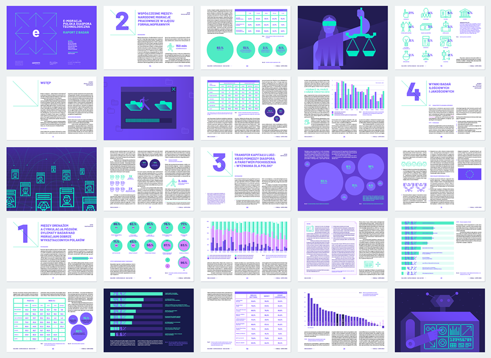
They’re back! Geometric shapes are an all-time favorite design element that gets better and better over time. In fact, we were using them as part of our Business Storyteller Summit 2020 branding too.
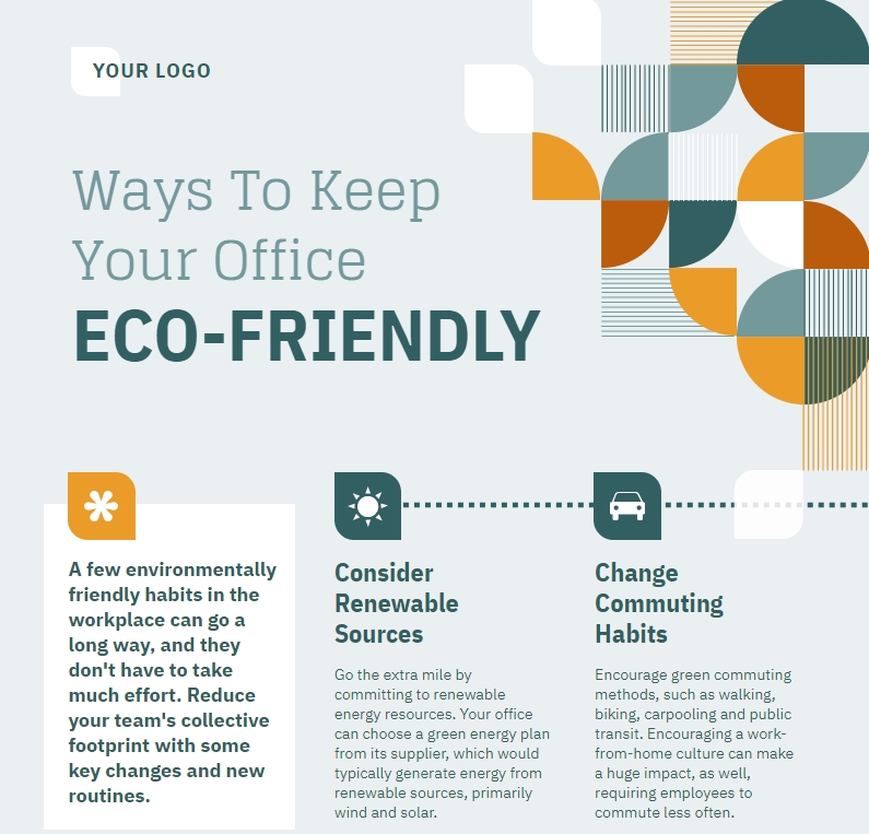
The idea is to build a complex component from basic shapes like squares, rounds, rectangles, or triangles. You can use them as a visual metaphor to envision your concepts and tell your brand stories. The creative possibilities are endless.
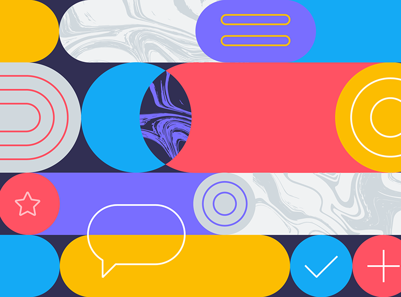
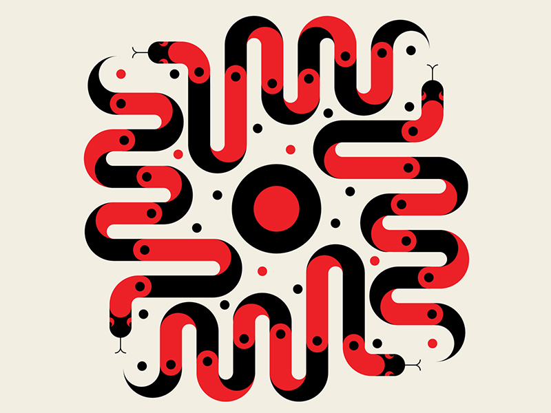
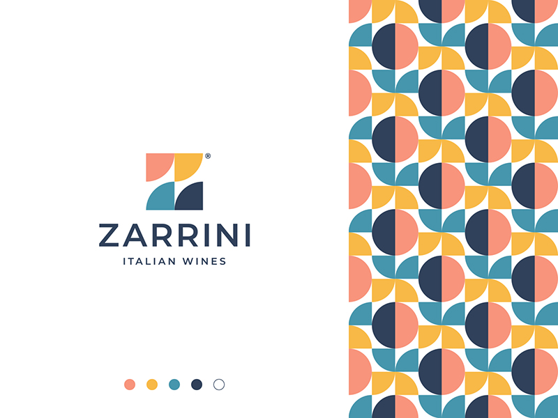
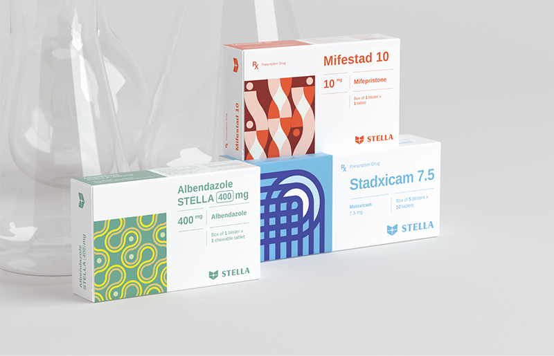

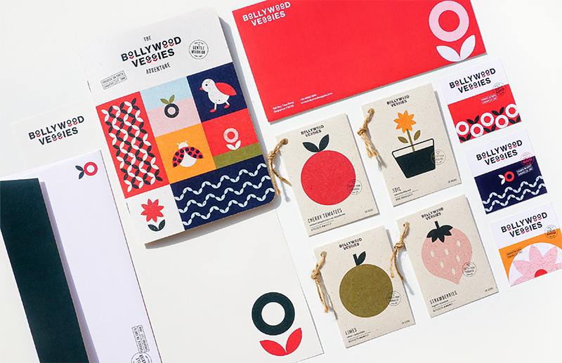
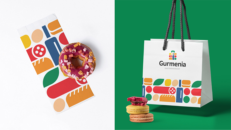

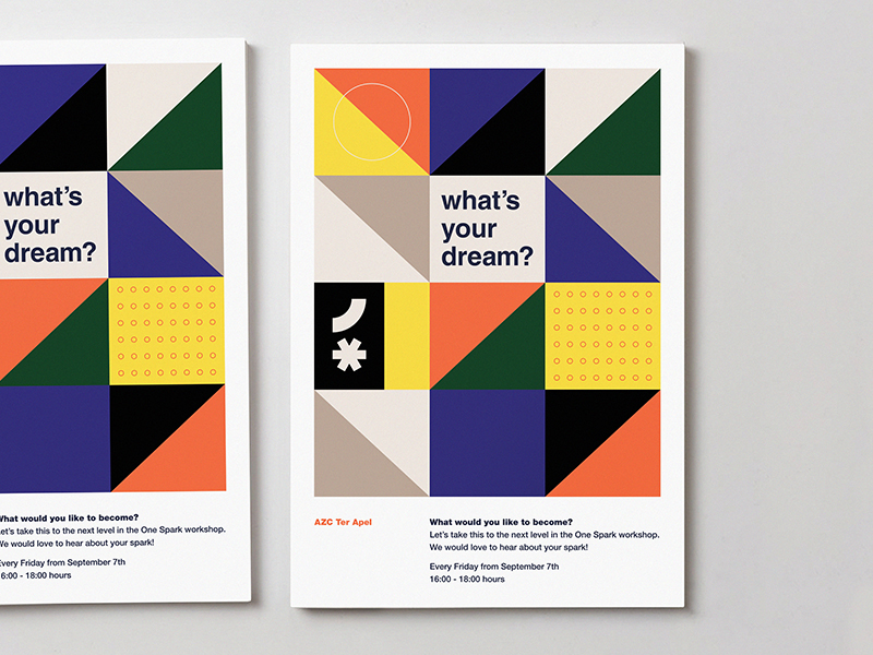
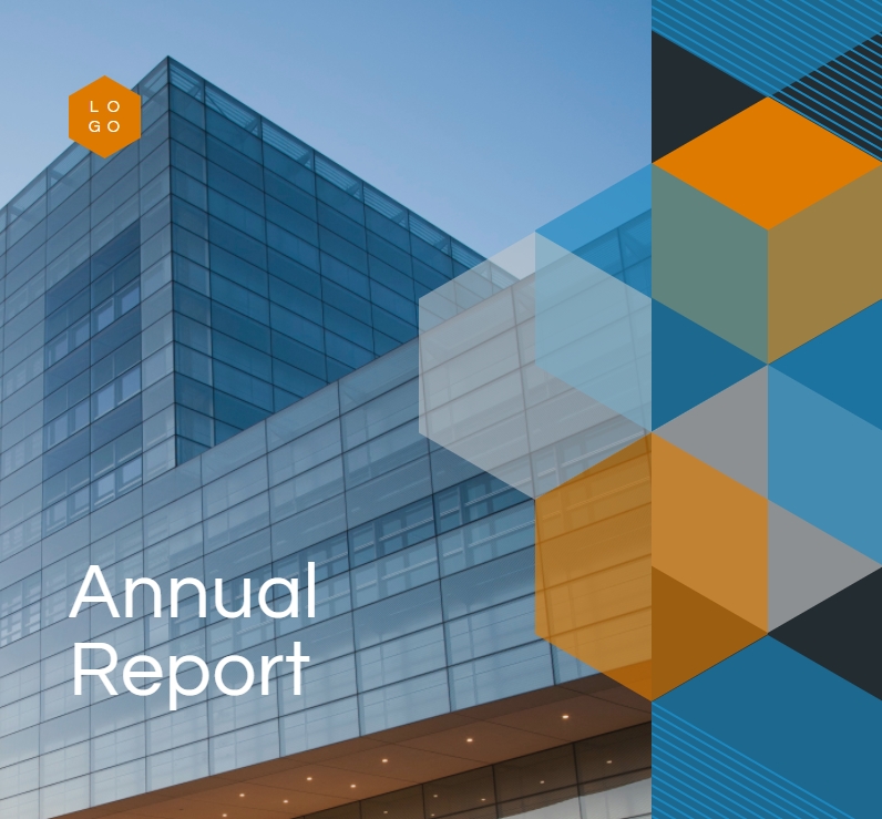
Geometric shapes and patterns are very versatile. Reports or employee handbooks, for example, contain a lot of complex information and data. Therefore, we tend to choose a simple design with minimal decorative elements and focus on data visualization. In the above case, geometric patterns come in handy to give a touch of liveliness to your report while keeping its look professional, without disrupting the focus flow.
Create handbooks and reports with geometric patterns:

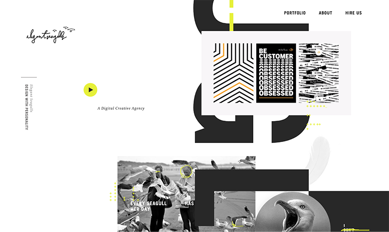
5. Typographic Contrast
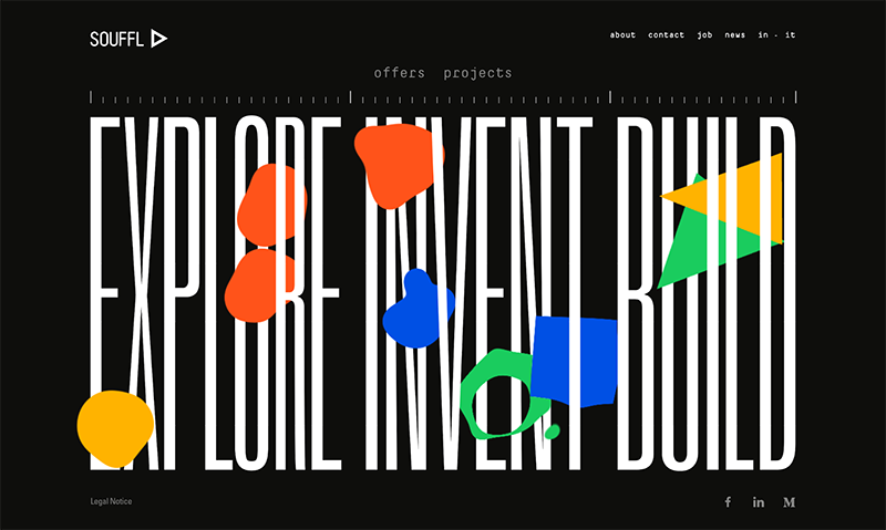
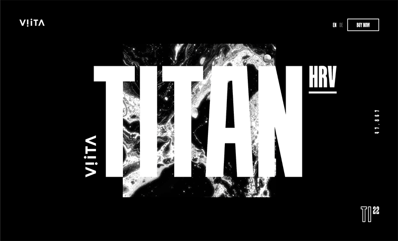
By contrast, we mean combining fonts with very distinctive characteristics or style to create harmony. And to create contrast, you can play with font sizes, font weights, or even pairing two completely different looking fonts.
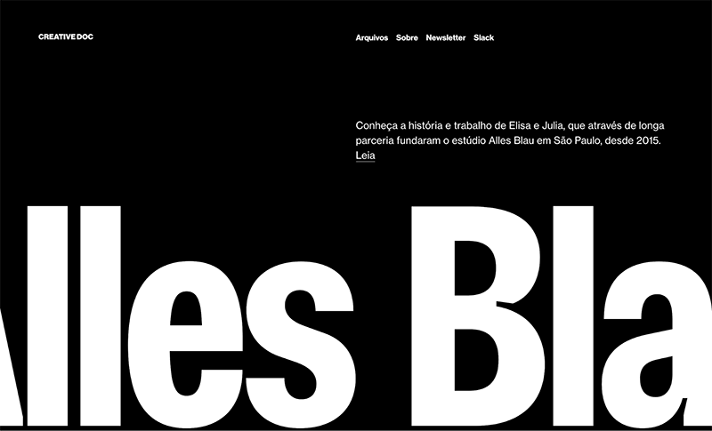
The trend started in 2019, by 2020, maxi typography–where you play with contrasting font sizes–was commonly used in website and landing page design.
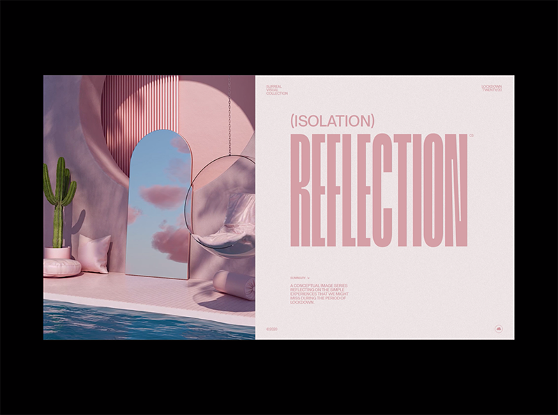
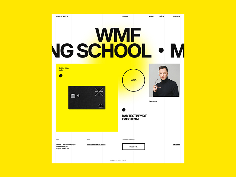
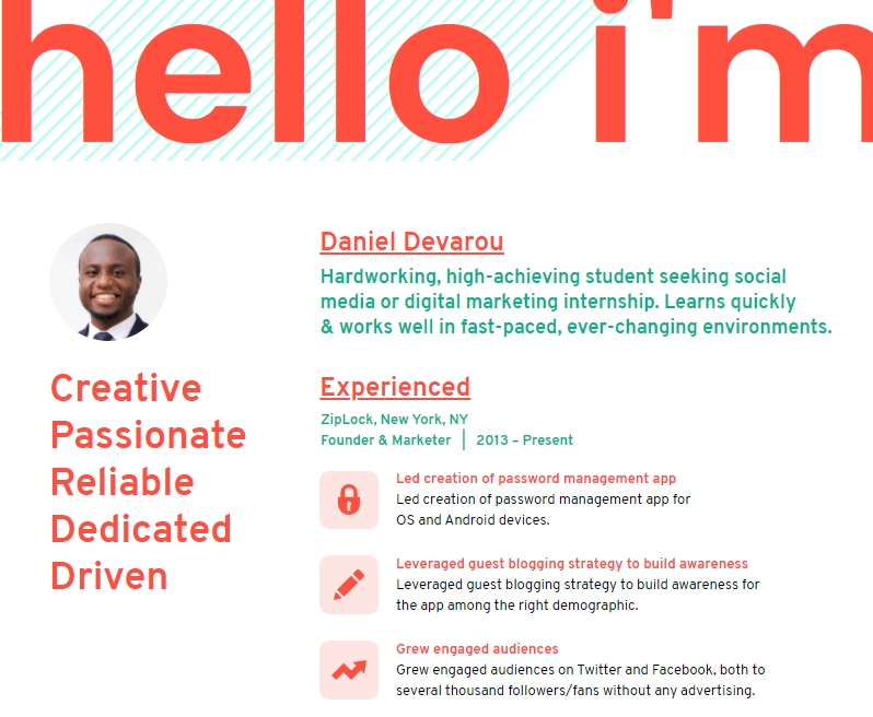
We are expecting this trend to become even bolder in 2021 because it’s perfect at attracting attention. You can apply this style to your ebook cover page, to resumés or CVs. You can also use it in social media to divert the attention and help your audience to focus. The key is to be as quirky as possible, use an extra big size font for headline and keep your body copy to its minimal readable size, or combine a bold-strong serif font with regular sans serif.
Jumpstart your typography journey with templates below:

6. Visualized Data
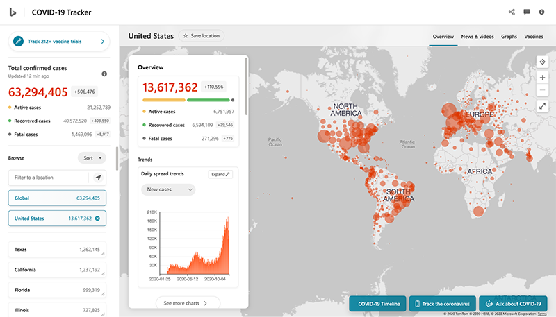
Data visualization plays an important part in reporting and visual communication. It brings your information to life in the shortest amount of time.
During the pandemic, we have witnessed how data visualization helps to keep information overload under control, and keep everyone updated on the critical numbers.
As you look closer at data visualization, you’ll notice the rising trend of infographics on data reporting and step-by-step instructions in 2020.

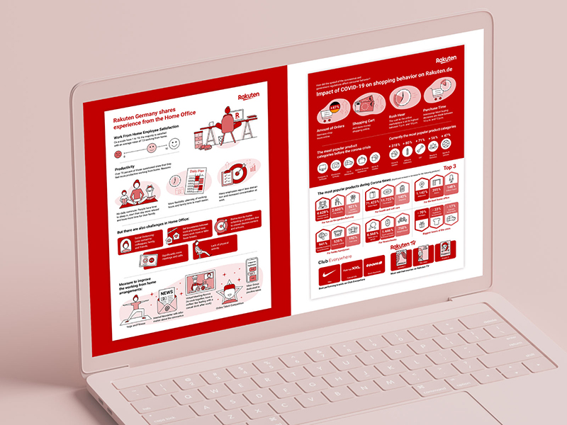


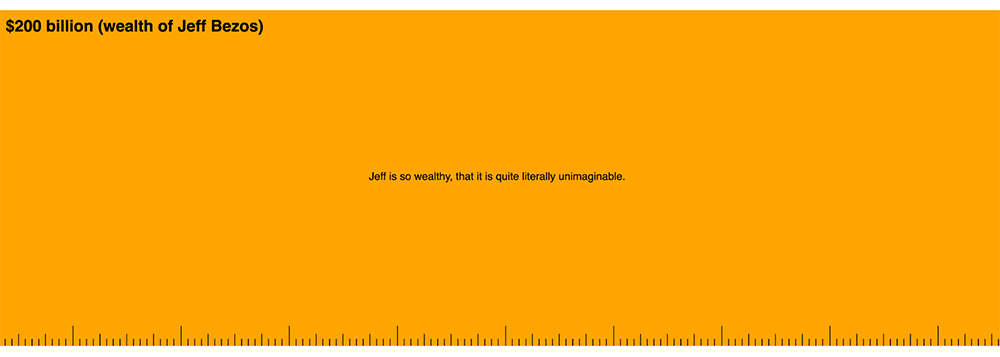
Apart from this, we can see another trend of using simple graphics and text to visualize the data.
In the fast-paced world of social and digital media, simple visualizations can help convey your message quickly while at the same time ensuring accuracy.
It is a great format to provide a comprehensive overview of information. And you can apply it to your recurring reports such as Hiring Dashboard to Email Marketing and Social Media report.
Looking Ahead
That’s our prediction on 2021 design trends. We are excited to discover many more innovative and creative designs that will inspire you to communicate your story. Let us know what’s your take on our prediction and which of these trends you will apply in your visuals.

You don’t need to be a graphic designer to create beautiful visuals.
Try Piktochart for free.
Sign up for free