Today, brands rely heavily on data visualization to communicate through reports to senior executives, internal teams, and even their customers. And that’s not surprising, considering the human brain processes visual content 60,000 times faster than text.
Keep reading to understand what data visualization is and why it’s crucial in 2021.
Table of Contents
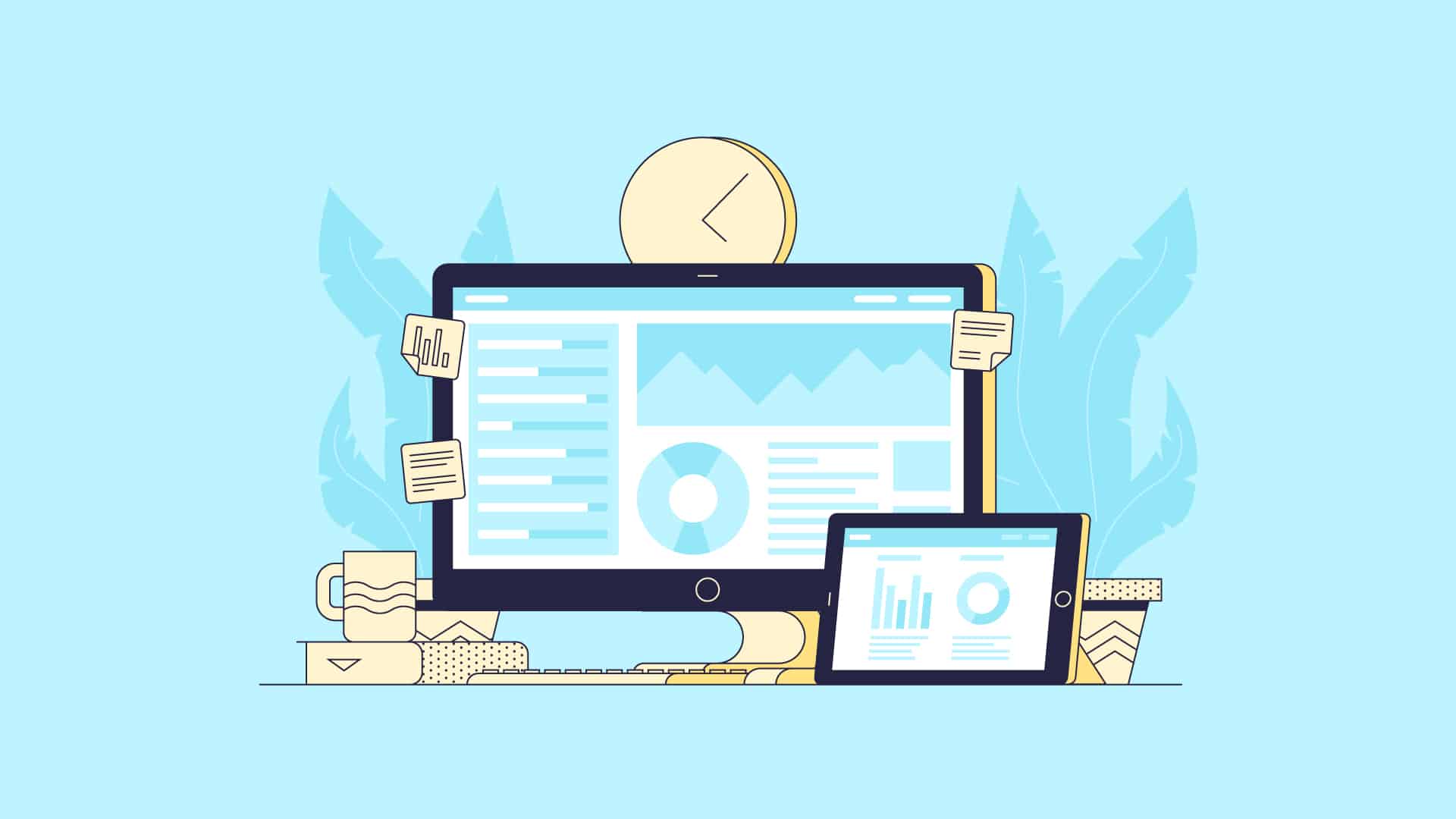
What Is Data Visualization?
Data visualization is essentially the process of creating graphical representations of information using various methods such as pie charts, tables, scatter plots, graphs, geospatial, maps, infographics, and so on.
Data visualization tools and tactics help reveal patterns and trends hiding beneath the surface of mountains of complex data. They enable companies to present data-driven insights and findings in formats that all stakeholders easily understand.
When done right, data visualization leads to better and faster decisions. It also facilitates more innovative business investments that are far more likely to yield a more substantial return on investment.
Benefits of Data Visualization
With the right tools and techniques, data visualization can optimize many areas of your business performance, from marketing and branding to team collaboration and productivity. Here are the top five benefits of data visualization.
1. Better absorb business information
One of the most significant benefits of data visualization is how it enables the easier absorption of large amounts of business data.
Humans are visual creatures, with 90% of information transmitted to the brain being visual. And most people today have a shorter attention span than a goldfish, which means if the information is presented as dull slabs of text, you’re likely to get distracted and miss out on essential bits.
With the use of bar graphs, pie charts, etc., data visualization helps business owners and decision-makers to discern useful connections between multi-dimensional data sets and make better, data-driven decisions quickly.
2. Faster access to meaningful business insights
Along the same lines, when you leverage data visualization tools and techniques, you’re better equipped to extract relevant and valuable insights from the information at hand.
Well-crafted visuals make it easy to uncover not-so-obvious patterns within your data sets. For example, if you conduct an industry survey of your customer base and present the key findings in the form of a histogram, you can readily gain insights about where to prioritize efforts and resources to meet the demand.
Plus, data visualization lets you better represent your objectives and key results (OKRs) — a framework to create measurable goals, align them to business objectives, and track how well you’re achieving them.
3. Improved understanding of business operations
Running a successful business involves a lot of moving parts. Effective data visualization helps you better understand your multifaceted operations and clearly see the connections between the various business activities.
It also helps you analyze your critical business metrics and optimize your day-to-day business operations and test the effectiveness of your project execution plans, thus improving efficiency over time.
For instance, with a real-time marketing dashboard, you and your marketing manager can conveniently monitor the key performance indicators (KPIs) for each campaign, test, and pivot your strategies to keep hitting your goals.
4. Communicate business insights better
Data visualization not only enables faster access to meaningful business insights but also helps your teams communicate them more effectively.
Sure, typical business reports involve some tables and charts, but they’re usually brimming with lengthy explanations. So much so that they often fail to highlight the most critical insights needed for efficient decision-making.
With data visualization tools, you can generate to-the-point visual reports that encapsulate valuable business insights and complex data through a series of graphs and charts.
Furthermore, data visualization tools often have built-in collaboration features so you can improve team collaboration and make better data-driven decisions as a coherent unit.
5. Capture customer sentiments accurately
You know the importance of understanding your customer’s demographics, pain points, likes/dislikes, preferences, and so on.
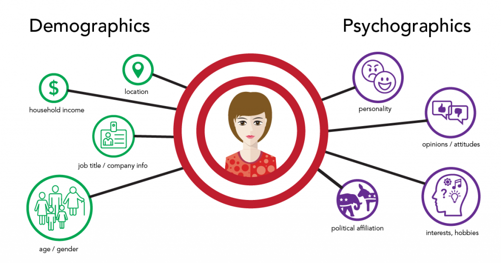
Source: Branding Compass
Data visualization tools let you dive deeper into customer sentiments and customer-focused data to reveal their perception of your brand, what they speak about your brand on social media platforms, how they spread the word about your business, and more.
The insights obtained can help you shape business and marketing strategies, tailor brand outreach, improve the customer journey, and optimize your sales funnel for higher conversions.
Emerging Data Visualization Trends in 2021
With the advantages of data visualization clear, let’s look at some of the top data visualization trends of 2021.
1. Use of smart devices
Data from smart platforms have begun to enhance our physical surroundings.
For example, consider smart traffic systems. Such a system can help foresee major traffic congestions before a commute begins. It can also predict public transport shortages and guide commuters to avoid bottlenecks in their routes.
Furthermore, augmented reality (AR) in vehicle dashboards could improve safety by overlaying critical information for the driver within their line of sight and notifying them of possible risks and emergency alerts.
In essence, increased smart device usage conduces more data collection and analysis. For all smart device data to be as effective as possible, data visualization will help detect anomalies, patterns, and spikes.
2. Data storytelling
Most publishers today are aware of combining visual storytelling and data. Data storytelling is the process of creating a logical narrative using data sets and accompanying visualizations.
Presenting data as a story is a compelling way to convey the meaning of the data and drive action based on data analysis. In doing so, business owners can better leverage the data at hand as they now understand it better.
Simply put, data storytelling provides actionable insights in a more meaningful way, facilitating better decision-making.
Data storytelling is a fast-growing trend. Effective data visualization — using interactive charts and bar graphs — inherently helps build a stronger narrative and is, in fact, a core reason behind why data storytelling will refine and define the future of data-driven decision-making.
3. Real-time data visualization
Visualizing big data in real-time is now more of a must-have than a nice-to-have for modern companies. Customer demands and the overall business landscape move fast, and real-time data visualization is how you can stay up to date and ahead of the curve.
Real-time data visualization is crucial not just for businesses but for the greater good. For instance, the Johns Hopkins University dashboard was built in 2020 to visualize the spread of the ongoing pandemic. It enabled officials to pinpoint emerging hotspots and deploy resources more efficiently in real-time.
So real-time data visualization helps accelerate the decision-making process, allowing for timely and better decision-making.
4. Augmented/Virtual Reality
Last but not least, using three-dimensional data visualization to build interactive models, maps, games, virtual events, etc., might be the next big thing in the way we use big data.
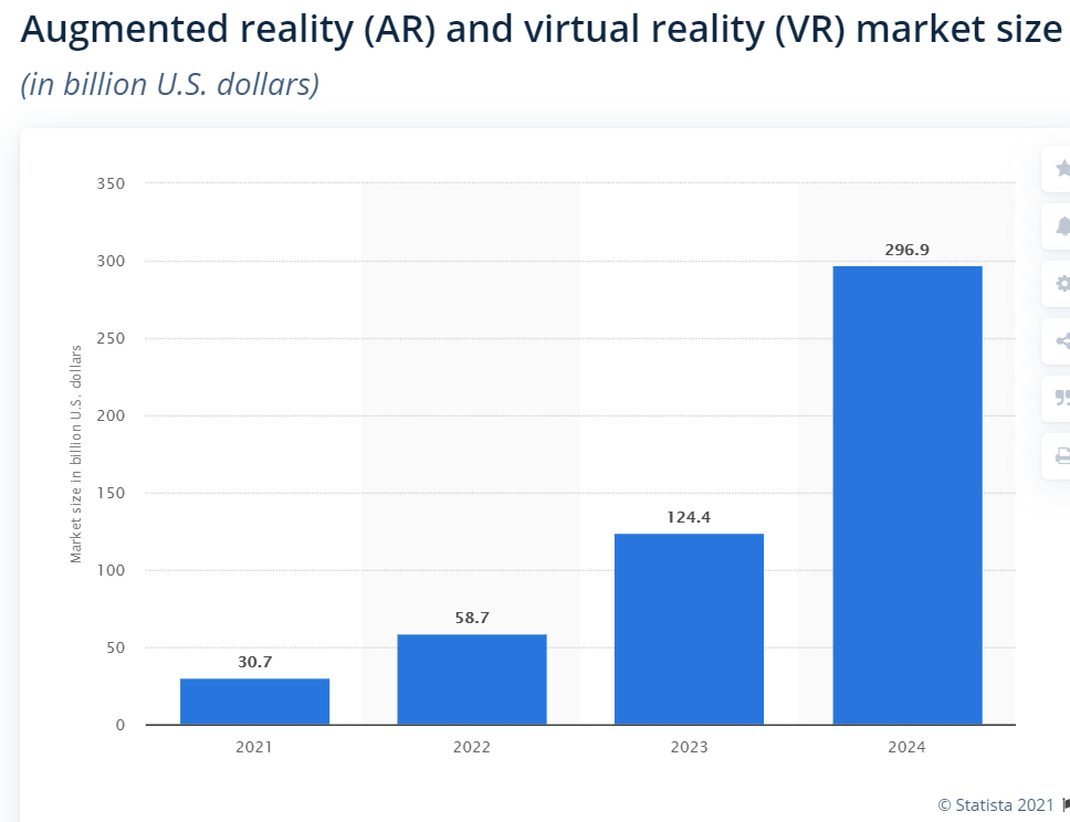
The market size of AR and VR is anticipated to be worth around $58.7 billion in 2022, which hints at the tremendous potential of data visualization and analytics.
Augmented reality is becoming increasingly mainstream and is now a part of digital customer engagement trends too.
For example, Ikea Place is an AR-based app by Ikea that enables potential customers to check how well furniture such as chairs, desks, etc., would look and fit in their home. They can browse the in-app catalog, select a product, then drag it around on the screen to see how it fits in the room. Another example of AR in customer engagement is the trending use of AR filters in Instagram Stories.
And with the help of data visualization, VR allows you to interact with information as if it’s tangible, thus improving big data analysis and decision-making.
Data Visualization Is the Way Forward
Combining data with the right visual formats lets you present information in a far more digestible way.
To recap, data visualization facilitates better assimilation of crucial business information, quicker access to valuable business insights, improved understanding of business operations, and accurate customer sentiment analysis. It also enables data storytelling, pattern identification, and real-time, more efficient decision-making.
And with the volume of data increasing at the speed of light, data visualization is one of the best ways to make the most of all your business data and stay ahead in a competitive market.
About the author:
Mark Quadros is a SaaS content marketer that helps brands create and distribute rad content. On a similar note, Mark loves content and contributes to several authoritative blogs like HubSpot, CoSchedule, Foundr, etc. Connect with him via LinkedIn or twitter.