This is part of the Infographic Design Series and we’re delightfully at the last post of this series. Before getting into the nitty gritty details about charts, here’s a quick recap of what we have covered on infographic design so far.
- How to set the tone of your infographics with typography personalities
- How to pair fonts
- How to pick great color schemes
- How to arrange your visual – a layout cheat sheet
- How to create clean and attractive infographic through alignment
- How to handle icons and images beautifully in a quick-and-easy manner
- How to create meaningful and enriching story with background images
Data is an essential part of infographics and reports. Without data, we’ll just have ‘graphics’ and no ‘info’. The challenge however is to present these facts and numbers which can be rather dry into something that is more aesthetically pleasing – without taking away the quality of data being presented. However, in attempt to make data fit into an infographic, our users are sometimes guilty of ‘over-designing’ making the data presented look cluttered and difficult to understand
Don’t fret, we will show you some simple tricks (really!) to make your charts look good while retaining quality. They are really simple design tricks that you can easily learn to spice up your charts, making them turn out to look professionally designed or at least not out of place!
‘Dress up’ your charts to complement the subject matter
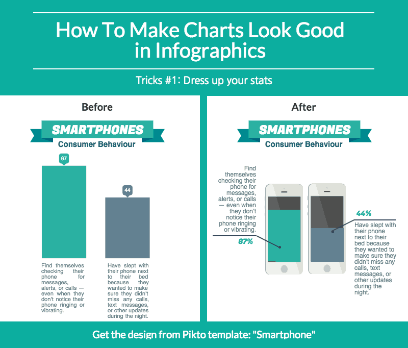
Say you have some key data to include in your infographic, a sure way to make the charts ‘fit’ with the rest of your content is to assimilate elements of your content into the chart design.
In the example below, you can see how adding some elements of the subject matter into the chart design makes the information stand out and easier to understand.
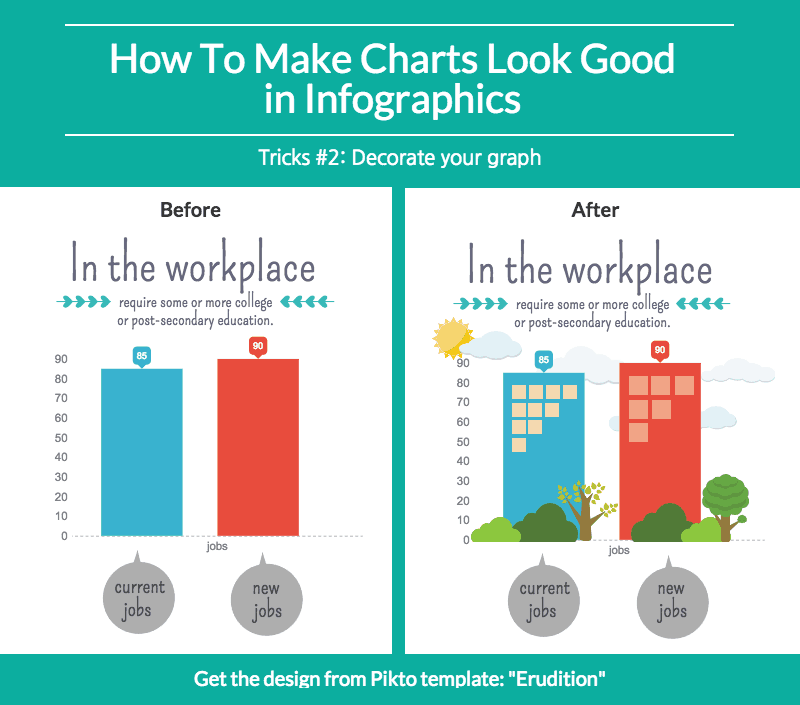
Paint a visual story for your charts
Besides adding meaningful images to your chart, you can also decorate them with visual objects giving it some spark. Dull looking graphs and charts sometimes fail to attract attention from the viewers. Hence, turning boring graphs into something aesthetically pleasing attempts to grab the attention of the viewers to the data you want to present.
This method may require a little extra work as you will need to put together a few design elements to form a visual story however, looking at the example below, you can see how a spruced up graph looks much better compared to a dull one.
Turn your charts into meaningful visual
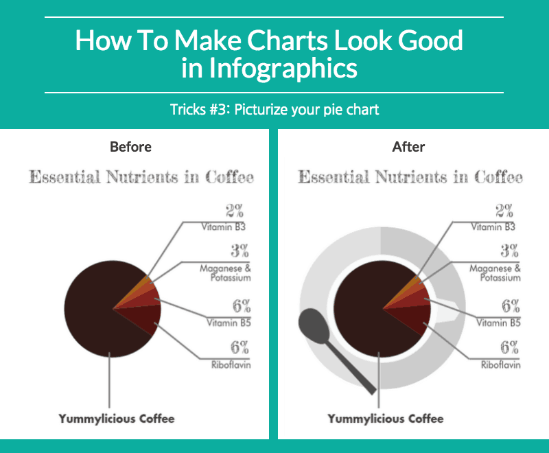
Last but not least, you can turn your chart into a picture. This is the ultimate coming together of info and graphics where you use elements of your design to illustrate your data. This approach is also used in picture infographics where a graphic portrays data creatively.
For the example below, we just overlapped and adjusted the chart on top of an image of a coffee cup. Simple, yet effective.
These examples focus on merging visual aids with data. This does not just enhance your content, it also enable you to create attractive and meaningful designs.
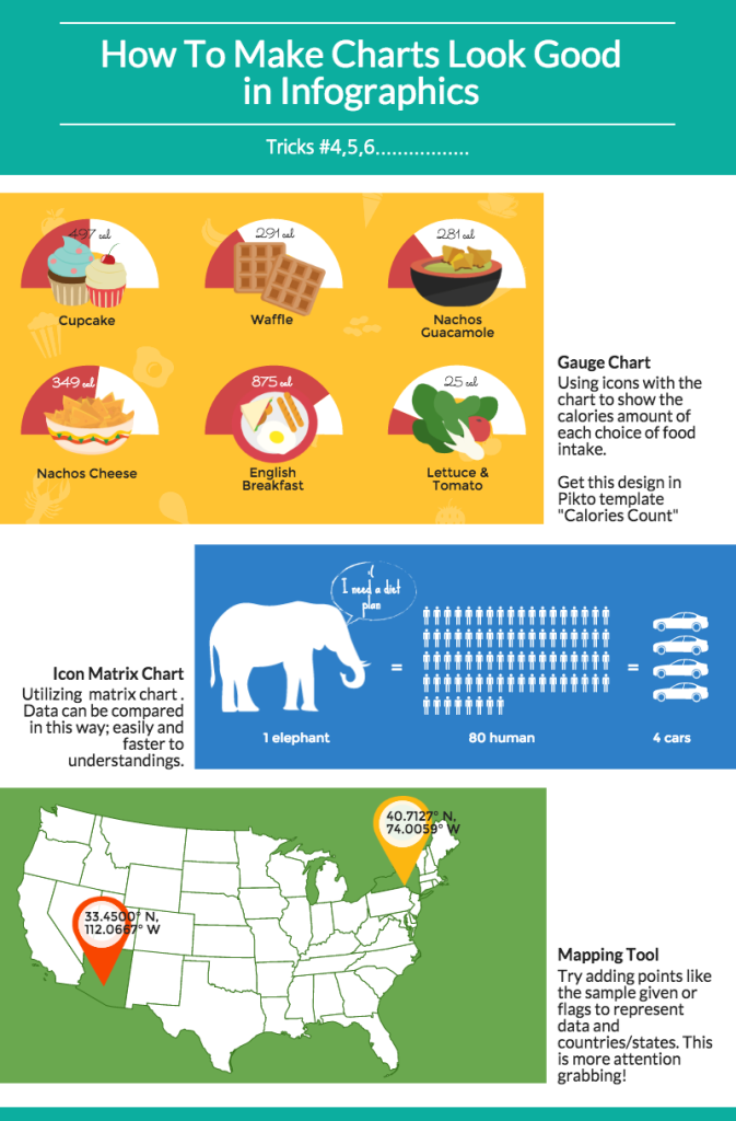
Optimize your Pikto-Charts!
Believe it or not, some of our charts in the editor are good as-is. The tips below will help you along! Also, do note that our amazing chart functions allow you to import data from Google Spreadsheets and look out for our SurveyMonkey optimisation function coming soon.
We hope that these guidelines give you an inspiring beginning to more beautiful and meaningful charts that will enrich your infographics. You may find some of these tricks in our Pikto templates. You can also gain access to tons of resources on charts and all other things Piktochart at our Resources page. Be sure to check them out!
Now that we have reached the end of our Infographic Design Series, I hope you enjoyed the things we have shared thus far- we sure hope so! Leave us a comment below and share these posts with your peers. Most importantly remember to Make Information Beautiful!
