You have less than 4 minutes to nail your message.
This is how much time, on average, investors spend looking at a pitch deck.
The above time limit refers to pitch decks that are sent via email.
Although you might have 10-20 minutes during a stage pitch, in reality, it gets even more challenging when presenting live.
At most, you have 20-30 seconds to bring anything essential across.
Yes, we know. That’s a lot of pressure.
But don’t worry.
We’ve got you covered.
As part of the #PiktoWebinar series, Piktochart has teamed up with Kai Xin Koh to develop a winning pitch deck template.
Kai Xin Koh is the Co-founder and Story Strategist at HighSpark – a communications training and consulting agency that helps startups and category leaders create winning pitches.
To date, Kai Xin and her company have helped to develop more than 500 powerful narratives. The startups they worked with raised cumulatively over $80 million in funding.
So whether you’re an entrepreneur, founder, or marketer looking to create an investment pitch deck, get ready to pitch perfect.

This post summarizes the most important tips shared by Kai Xin and Natasya Sunarto (Communication Design Manager at Piktochart) during our webinar.
These tips will guide you through the creation of a successful pitch deck. One that will make you stand out from the crowd.
If you prefer listening over reading, catch the full conversation in the on-demand webinar below.
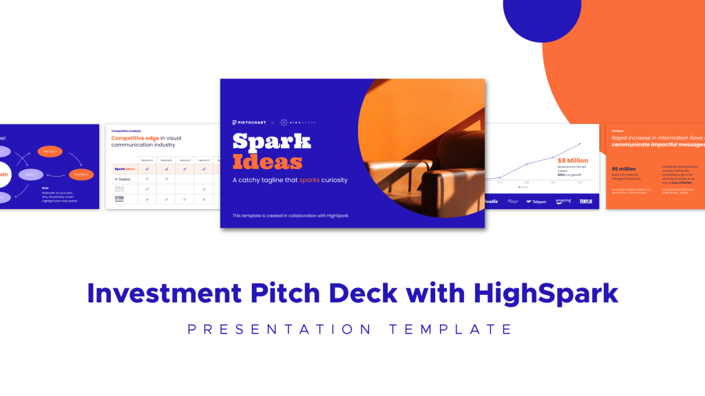
And if you immediately want to jump to editing the Spark Ideas pitch deck template, click the image below.
You can also follow the presentation slides from this #PiktoWebinar below.
Here is what we will cover:
Core elements of a pitch deck that will hook investors
There are tons of investment pitch deck templates out there.
Pretty much each of them follows the same flow.
You will find some key elements that repeat across the decks.
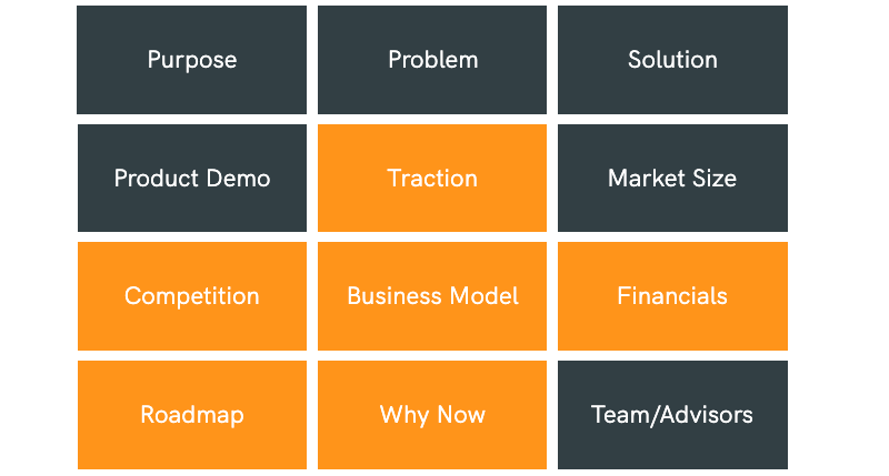
These elements are probably familiar to you from other blog posts you might have read:
- Purpose
- Problem
- Solution
- Product Demo
- Market Size
- Team/Advisors
So what is different about the template that Piktochart has created with HighSpark?
We didn’t want to templatize it.
We wanted to help you understand what investors are looking for and ultimately give you a competitive advantage.
That’s why we focused on the key components that are commonly missing in a pitch.
You can see them highlighted in orange.
From Kai Xin’s observation, founders often get too caught up with the market’s problem and their solution. They go on and on, talking about how great their idea is.
Result?
They end up losing valuable time and the attention of their audience.
Let’s face it.
You aren’t probably the only company out there trying to solve a particular problem.
Use your time wisely.
Dedicate the first few slides to hooking the investors by showing them what they care about most first.
If we look at the data based on DocSend’s research, we see that pages that the investors spend the majority of their time on are not so much about the product itself.
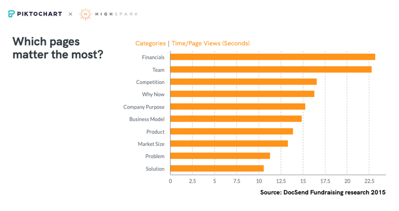
Investors are mostly interested in knowing how profitable the business can be, the team, competition, and the company’s purpose.
It’s essentially a flipped flow of a standard pitch deck template.
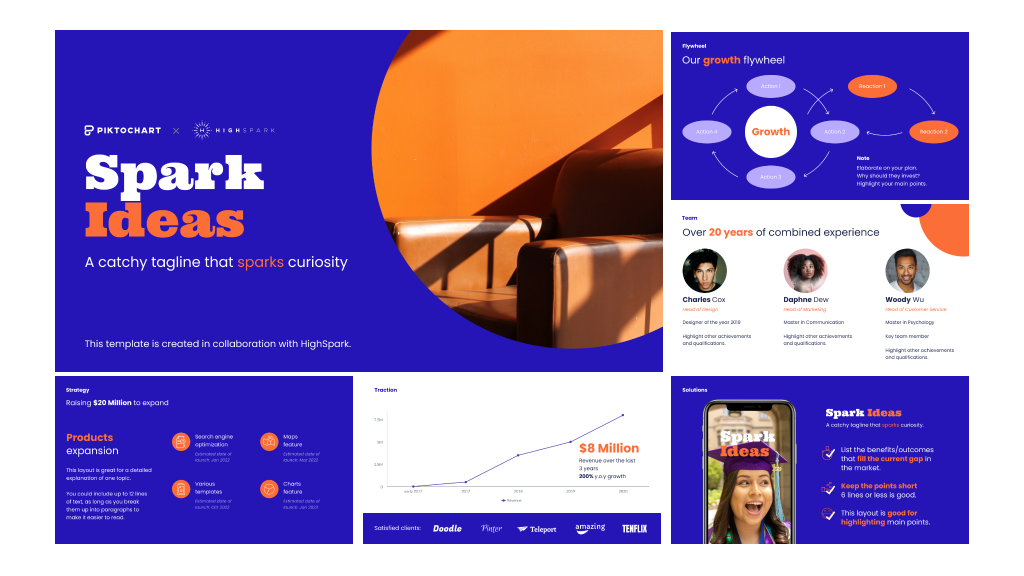
That’s where we focused on when developing the Spark Ideas pitch deck template.
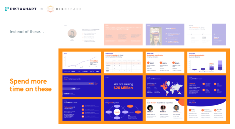
We prioritized what the investors care most about:
- Profitability
- Scalability
- Sustainability.
If you are able to prove that your business ticks the boxes across above mentioned pillars, it makes it very attractive to investors.
Main takeaway: Sell the business model more than the idea itself.
A pitch deck structure that will help you to differentiate
As mentioned before, focusing on the problem at the beginning of your pitch deck, doesn’t help you stand out from the crowd.
Imagine investors going through thousands of pitch decks. All of these decks start with a problem and a solution.
It gets even worse if you are operating in a competitive market.
But if you want to start this way, then at least make sure that you focus on the question of “why you?”.
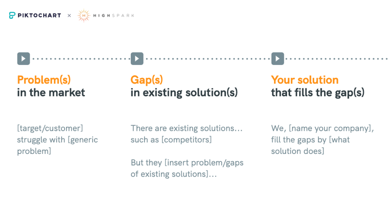
Show the problems in the market and the limitations in the existing solutions. Essentially, instead of a generic problem, you should be focusing more on the problem with your competitors.
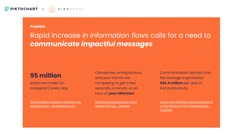
Once you have this part covered, show the problem’s severity, ideally from the monetary standpoint. Try to answer the question: “How big is the potential market value”?
After that, you highlight how your solution is here to fill the gap left out by the competition.
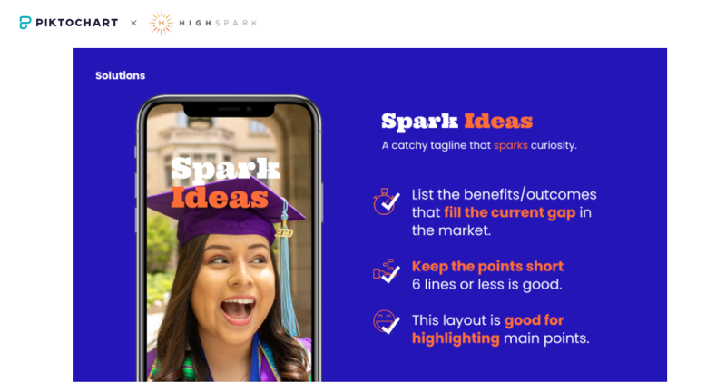
Main takeaway: When starting with problem-solution structure, make sure you differentiate your problem statement.
Ways to start and end your pitch
You don’t need to follow the standard structure.
There are other ways to start and to end your pitch presentation.
The advantage?
They include the element of surprise that immediately makes you stand out.
You could, for example, start with the “traction” element.
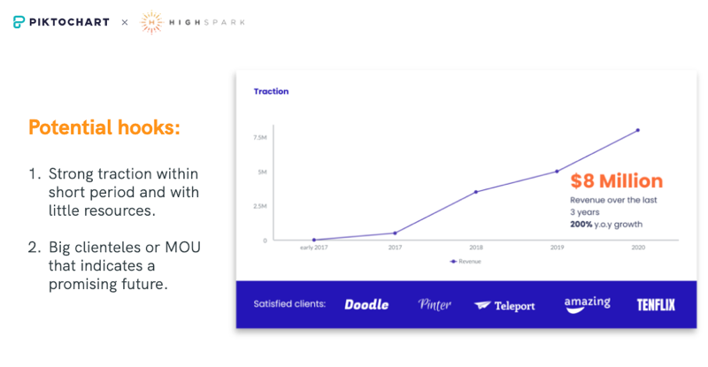
If you have gotten a lot of interest in your product in a short time frame and with limited marketing spend, use this to your advantage. This can be a great narrative to start your pitch.
Another initial hook can be your team.

Maybe you have a team with an amazing track record and relevant experience? Or it’s your second company after a successful exit with the first startup?
Make sure you highlight this first.
Investors are investing in people. Don’t forget about that.
The truth is, there is no one right way to start your investment pitch.
This is because every founder, every startup, every business has its unique strength.
That’s why Kai Xin always recommends finding your unique strength and starting your pitch with it.
Ok. Now that we know how to start, what about the ending?
Typically pitch decks end with a financial forecast or a general “thank you” slide.
But we have to create a sense of urgency.
Show the investors why now is the perfect opportunity to enter the market.
Convince them that if they were to wait any longer, the opportunity would be gone.
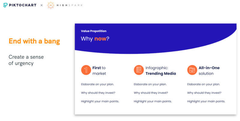
Main takeaway: Find your unique strength and use it to hook investors/
Design tips for visualizing your pitch deck
Now.
How can you visualize everything that we have discussed in the above paragraphs?
Step one is opening the Spark Idea pitch deck template that Natsya and Kai Xin have put together for you.
If you don’t have a Piktochart account yet, you can create it for free in under 3 minutes.
Once you are in the template, we suggest editing the logo first.
You can drag and drop your logo and easily swap it with the placeholder one.
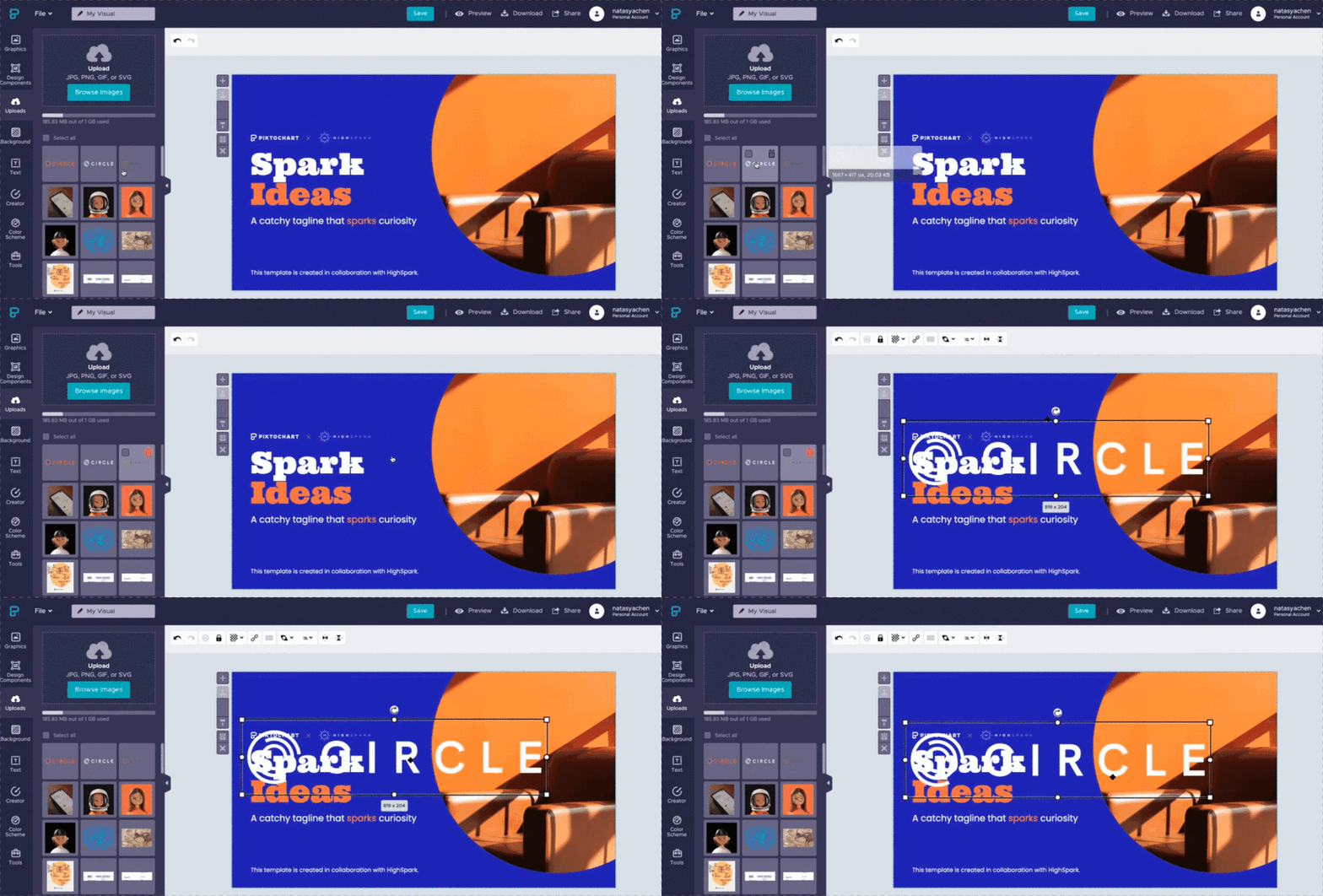
After that, it’s time to edit the text.
If you have your content saved somewhere, you can copy and paste it into the slides. Remember to proofread first, though. Make sure it’s crisp and clear. Remove unnecessary jargon and vague metaphors.
You can also choose from thousands of free icons and photos available in Piktochart to match your brand and content style.
As you noticed, the template consists of quite a few charts.
To edit them, you simply need to double-click on the chart and edit the data just the way you would edit a Google Sheet or an Excel file. You can also link your Google Sheet to Piktochart directly to make it even easier.
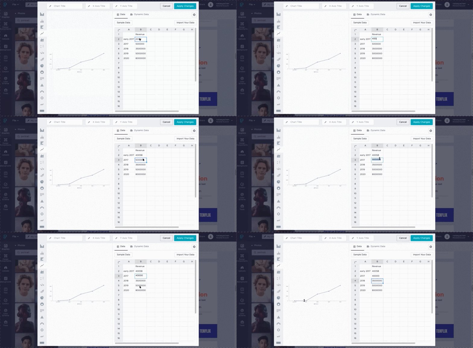
If you want to change the chart type, an interesting one you might want to try out is the “icon matrix” chart. It allows you to visualize your data in a way that matches your industry or product better. This way you can enhance your story.
Customizing our winning pitch deck template
Once your content and charts are customized, it’s time to make sure that the whole pitch deck matches your brand.
Under the personal settings drop-down in Piktochart, you will find the Brand Assets option.
Click on it to get redirected to the page where you can upload your fonts and brand colors.
Piktochart allows you to auto-magically extract brand colors from an uploaded screenshot of your website or your logo image. This helps to save some time on adding hex codes.
The easiest way to apply your custom brand colors to the template is through a color scheme.
This way, instead of changing the color of each element slide-by-slide, you can bulk-apply the colors across the whole presentation with just one click.
If you want to follow step by step how to make all these changes to the template, check out the second part of the webinar with HighSpark where Natasya gives a demo of Piktochart.
Pitching to investors with Piktochart
You edited the template, polished the starting and ending slides of your presentation, and customized everything to match your brand.
Now you are ready to pitch.
Almost.
Before you present to prospective angel or venture capital investors, it’s essential to practice.
Do several dry runs of your pitch, and make sure that you know all your business numbers.
Prepare to tell a story and to engage your audience.
It’s also a good idea to create a list of potential questions and your answers to them.
Usually, before the actual in-person presentation, you will need to send your pitch deck to prospective investors in advance.
This is where Piktochart’s sharing feature can come in handy.
You can send a public link to your pitch deck to the investors and see how many of them have viewed it. At the same time, you give them a chance to interact live with any of your presentation charts.
Once you are ready to pitch live, you can either download your pitch deck (PPT / PDF format) or present it directly from your browser using Piktochart Presentation Mode.
Take a deep relaxing breath and get ready to raise some funds.
Good luck!
