Data presentation comes in different shapes and sizes. One of the most common ways to visualize it is by use of charts, graphs or diagrams.
We have now refreshed the look and behavior of charts in our online design app to make your design experience even better. Here’s what changed:
- Responsiveness of the plot area
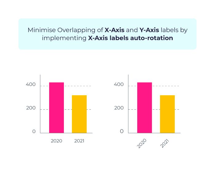
If the X-axis contains many labels, they will now automatically rotate by 45 degrees to prevent overlapping. Long labels will be truncated.
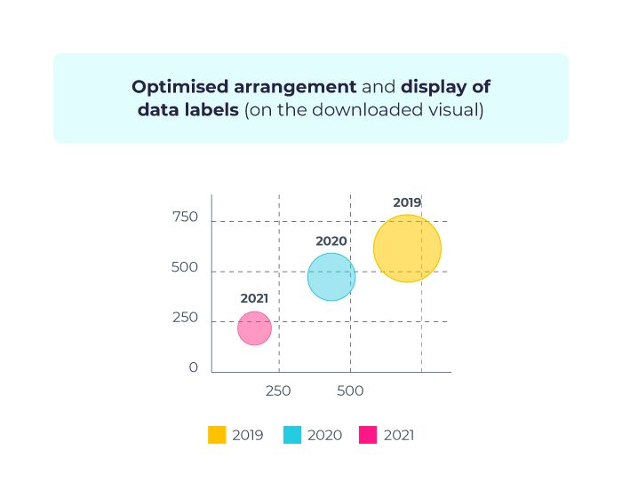
- Arrangement and display of data labels in the downloaded visual
The new labels will now take up less space and will include font size responsiveness depending on the size of the chart in order to minimize overlaps with larger values. This will result in better readability and overall improved design of your visual.
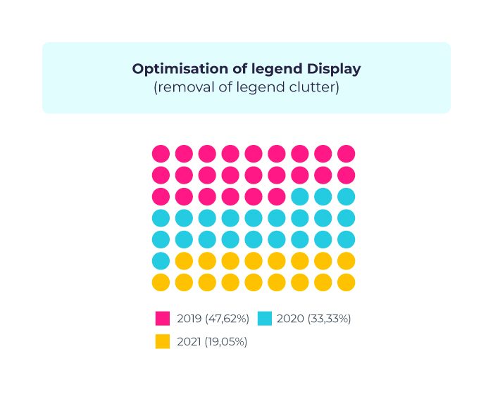
- Display of the legend
We have now improved the overall appearance of the legend and fixed its alignment.
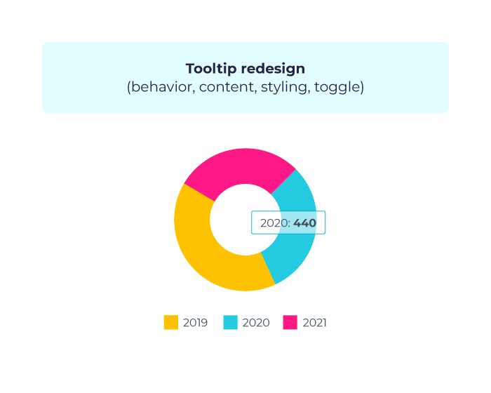
- Tooltips
Tooltips got a makeover too! Their styling is now more appealing and they’re more intuitive.
Please note that as of 31 March 2020, all old charts will be updated automatically and we will not be able to support old charts moving forward.
To learn what else changed about charts and to find out if you need to take any actions, please read this Support Article.
If you have any questions, please contact our Support Team.