Here at Piktochart, we try to showcase and celebrate great infographics. We want you to see the best of the best in the hope that they’ll inspire you and drive you to create something awesome. We’ve got the tools, and we want to help you design the best infographics with them.
Speaking of tools, one of the features in Piktochart people often ask us about is our data import feature. This feature allows you to take data from a spreadsheet on your computer, a Google Spreadsheet, or your SurveyMonkey results and add them directly to your infographic as a chart or graph. Create an account on Piktochart and check out our graph maker for free.
We hear that users know how the data import feature works, but they have a hard time visualizing what their data will look like once it’s added. Users also want to know how they can use data in their infographic to add information without adding clutter.
Which is why we put together this interactive site made up of 85 eye-catching data visualization examples, to inspire and motivate you in your next project. Click the below image to check it out!
So with these things in mind, we’ve put together a collection of some of the best designed data-driven infographics out there. And at the end of this post, check out our guide to importing your data into an amazing infographic of your own!
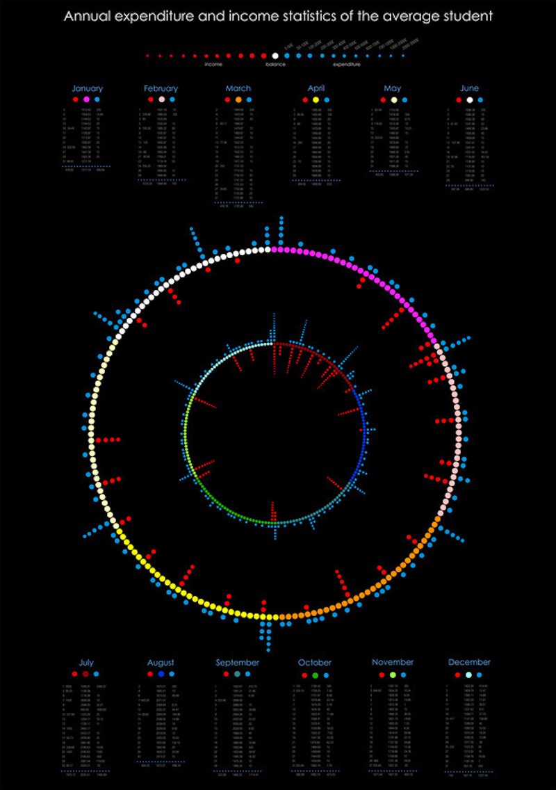
This infographic created by Rapolas Jukavicius is a great example of taking less-than-complicated data and designing something amazing. Rapolas has charted the budget of an average college student in visually appealing colors and shapes. This is a great example of taking something as simple as a spreadsheet and making it far more engaging as an infographic.
In this infographic, data visualization artist W. Bradford Paley showcases the interconnectedness of different areas of science. A networking diagram as complex as this one could be remarkably difficult to follow on paper, but his use of color and layout show areas of emphasis and connections that would be otherwise overlooked in a whitepaper-style presentation.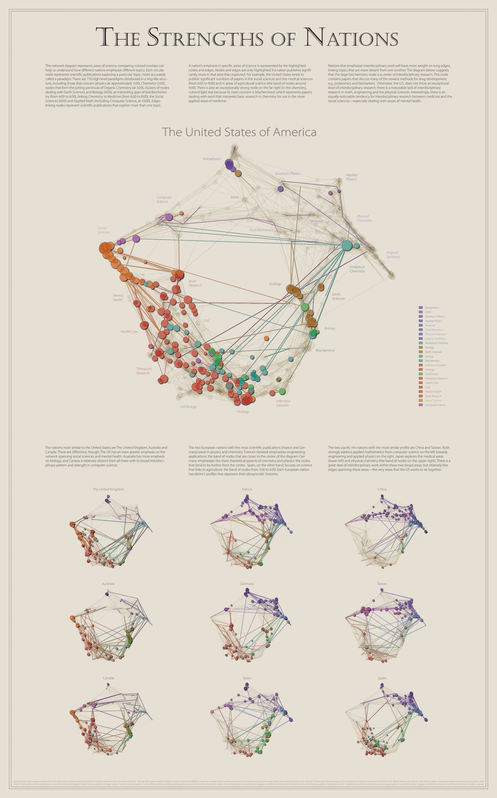
This infographic portrays a large amount of information and data in a creative compare-and-contrast way. RJ Andrews has organized the daily routines of 16 famous creatives in a familiar, color-coded clock-style presentation. This allows the reader to easily draw comparisons between the schedules of many different people at the same time.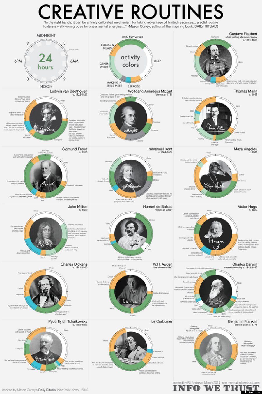
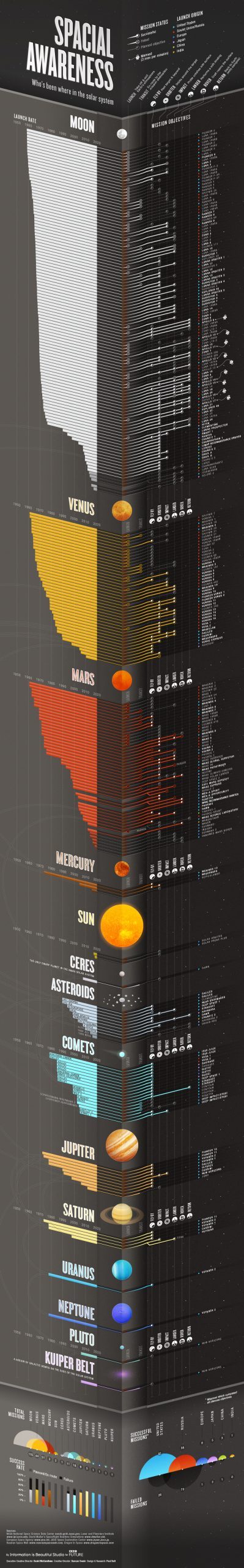
This massive infographic packs in a ton of information (and a solid pun as well!). In addition to the use of color and iconography, information designer Paul Butt also makes use of angles to add dimension to this giant infographic about space travel. Utilizing all of these design elements has allowed Paul to pack a large amount of information into this… space.
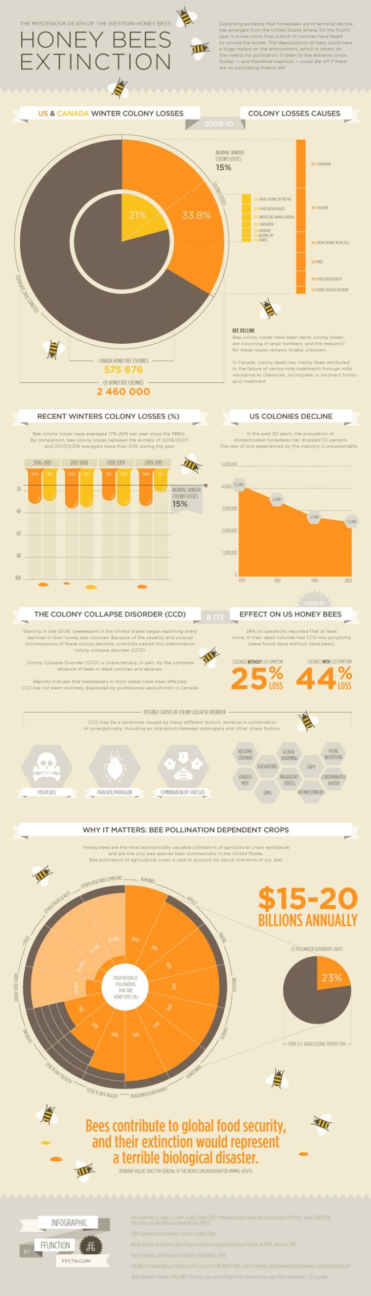
Beekeepers have reported losses of nearly 30% of their colonies every year since 2005, and, in their own words, “FFunction made this infographic to help understand the importance of the problem and its effects on our food supply and ecology.” The infographic designers at FFunction made great use of a coordinating color palette and bee-themed vectors to create an attention-grabbing visual element in an effort to bring more attention to this issue. An infographic like this one is much harder to miss than a news article or blog post.
Population density isn’t a topic that gets most people excited. This infographic by LSE Cities takes a look at the subject matter in a way that is more visually engaging, almost to the point of being able to see the cities themselves. The entire series of infographics on urban age cities uses a color palette and layout methodology that is both complex and appealing in its presentation style.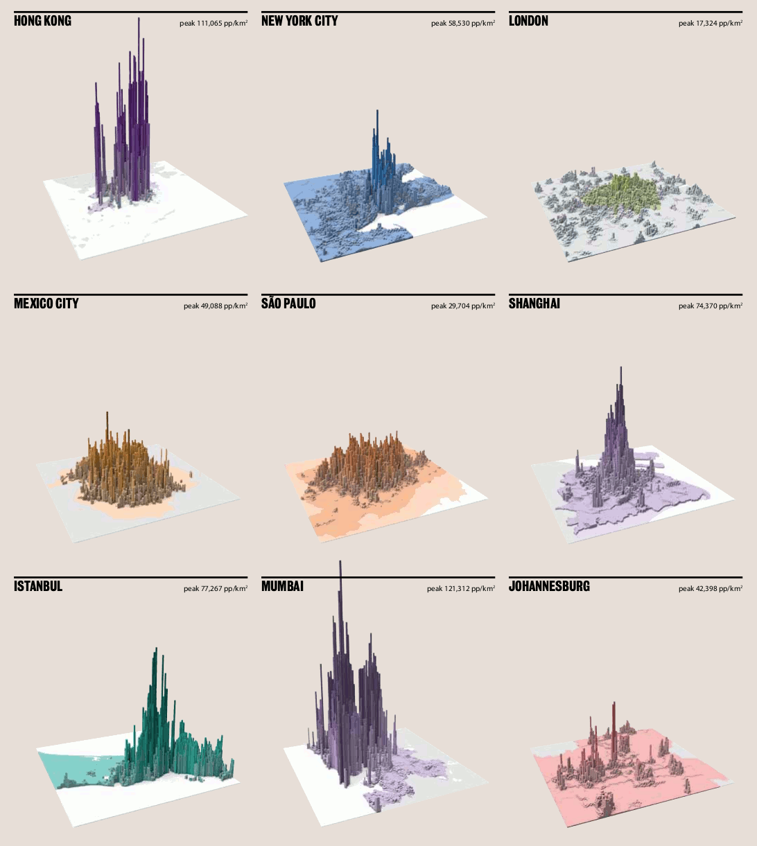
This infographic charts 50 years of rainfall in downtown San Francisco. Data designer Stephen Von Worley wanted to look at the odds of a wetter spring based on past weather, so he compiled data from the National Weather Service and made excellent use of color (in his words, “‘dead grass’ brown and … ‘pooling water’ blue”) to look at the likelyhood of having to mow his lawn more than once a month. ?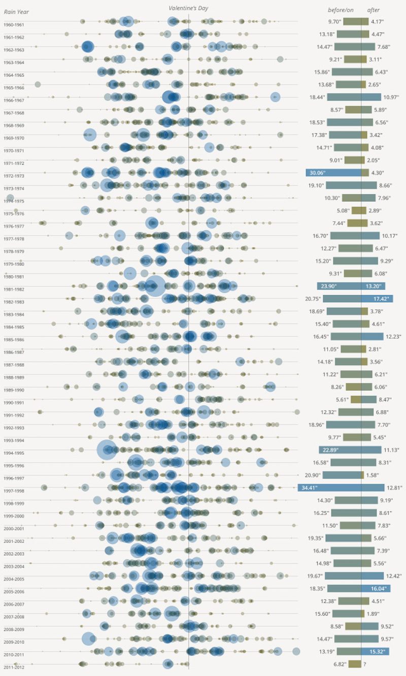
This timeline-style infographic looks at the rise and fall of many of the major online empires of the last 20+ years. Century Link Quote uses an interesting clocklike approach, along with line graphs, to chart the successes and shortcomings of large companies like AltaVista and Yahoo, among others. By layering each company’s timeline on top of the others, the creators of this infographic have made it easier to see how decline in one area can lead to gains in another.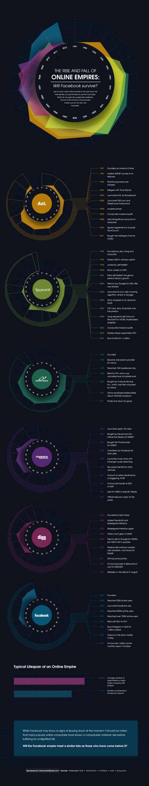
You can also check out timeline infographic templates by Piktochart and create visuals by signing up for free.
SEOMoz packs a ton of information into this easy-to-follow infographic about the cost of search engine optimization. Segmenting sections with the use of headers and coordinating colors make the information easy to digest while the easy-on-the-eyes palette doesn’t overwhelm the reader with too much visual stimulation.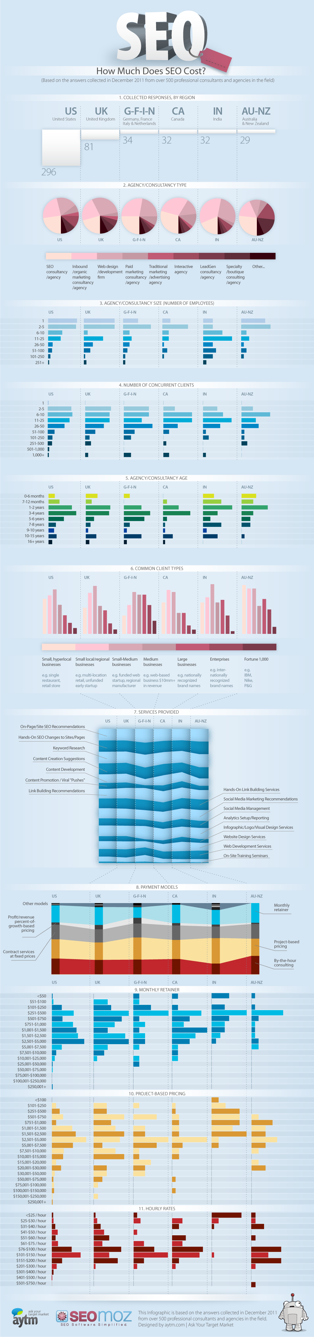
This gigantic infographic on typography may be my favorite one in this collection. Creative Market has packed in so much information and data that I learn something new every time I read through it. Amongst the timelines and statistics are well-designed examples of typefaces and art that appropriately and engagingly conveys the author’s message. It may be because I’m a bit of a type nerd, but I think this infographic does just about everything right.
After looking through this collection of data-driven infographics, you’re hopefully wondering how Piktochart can help you create your own. Between our selection of templates and our built-in tools for importing data, you’re only a few steps away from making your own beautiful infographic that’s full of data and information!
Your first step should be to start with a template that will showcase your data. We have a few that we recommend, but don’t let that restrict you. All of our templates are customizable to fit your needs.
Your next step is to import your data. There are two ways to do this. First, you could use our Survey Monkey integration to seamlessly pull your results into a collection of bar graphs, pie charts, and line graphs.
Your other option is to use the Data import feature. You can use the tool to add your data manually, or you can import a spreadsheet in most of the common formats (CSV, XLS, etc.).
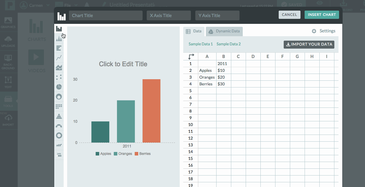
If you use Google’s suite of office apps, you can take advantage of one of my favorite features. You can connect a chart in your presentation to a Google Spreadsheet in your Google Drive.
We call this feature the “Dynamic Data” importer because connecting your chart to a Google spreadsheet allows the chart to change as the data in your Google spreadsheet is updated. There are no additional steps needed on your end. Pretty cool, huh?
These are the some of the best data-driven infographics we could find, and we hope they inspired you to make some of your own. You could create an account on Piktochart for free and get started right away!
Do you have a great data-based infographic that you’d like to share? We’d love to see it! Drop a link in the comments or hit us up on Twitter, and maybe we’ll put together a reader-designed infographic post featuring your work!
Make amazing infographics with Piktochart.
Timelines, Comparisons, Lists, Processes and Informational. We have it all.
Sign up for free