
💯 Learn how to effectively get your message across with the Fundamentals of Visual Storytelling course.

WM (00:33):
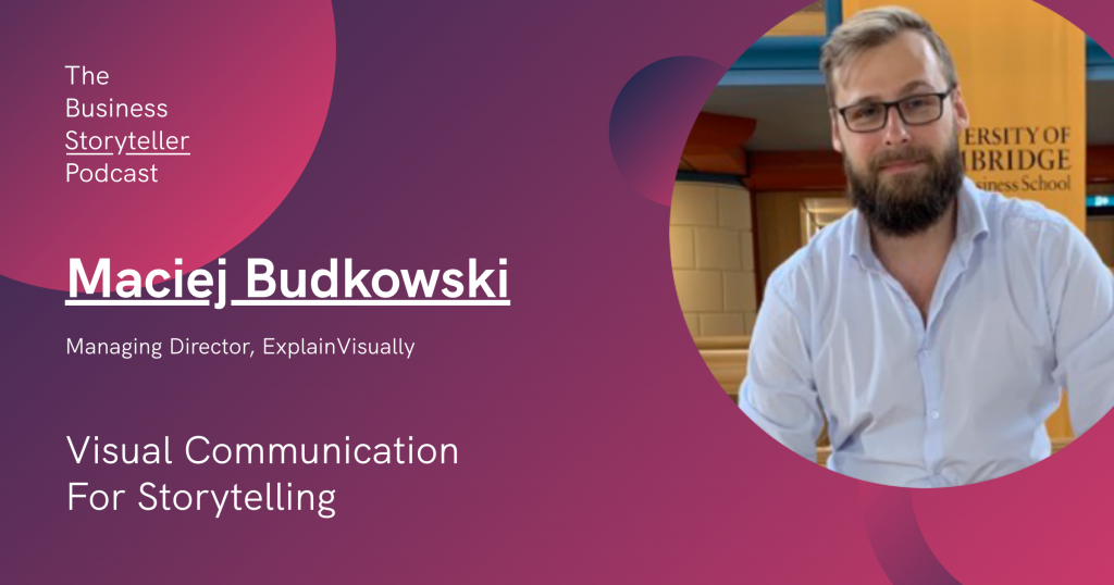
Hi there and thank you for listening to The Business Storyteller Podcast. My name is Wilson and I’m your host for today’s episode. In today’s episode, we’d like to uncover why visual communication is important for storytelling and I’m delighted to be joined by an expert guest, Maciej who is the Managing Director of ExplainVisually, a business-savvy visual thinking agency. With his wealth of experience, Maciej will be sharing his insights on this topic today.
Hi Maciej, welcome to The Business Storyteller Podcast and I’m so excited to have you with us today. How are you doing?
MB (01:05):
Hey, I’m doing fine. I’m also very happy that I got an invitation from you. I can elaborate a little bit on what I do. I was looking for an interesting tagline for our agency and I came up with this – we’re an agency that helps you get understood by the clients, by the employees, and by any stakeholders. Apart from that, I’m also the creator of Luminous. It’s an independent project where I visualize words, best ideas, quotes, and mental models, and I share it on Twitter. If you want to, you can take a look. It’s just a for-fun project and I don’t earn anything from this. And I advise startups from time to time as well.
WM (02:00):
Okay. So how long have you been in this industry and how do you get to where you are at ExplainVisually?
MB (02:05)
Well, my visual communication journey has been pretty long. For most of my life, I thought about visual communication like most people that it’s basically about choosing nice colors, icons, and logos, and that’s it. I wasn’t living in the cave though. I know about infographics, but I felt that their primary role is to visualize data, not ideas. So you could see for example, how many cars has Tesla produced compared to Toyota? Or you could see an illustration of all species that died because of global warming. Then in 2013, I read an article by Tim Urban called ‘Why Generation Y Yuppies Are Unhappy‘. It was posted on a now very famous blog Wait, But Why? And Tim used stick figures and very simple drawings to explain how our huge life expectations and peer pressure can make us unhappy.
I just remained an avid reader of this blog. I never felt I could do something like this myself or work in this industry yet. Then I worked in a high-tech telecom company called IS-Wireless. That’s pretty big right now, by the way, and they had very complicated products. I was responsible for marketing and sales. If you work in marketing, you have to understand what you’re selling because otherwise, you cannot do it properly. The products I was selling was like LTE physical layer simulator for R&D. It was very challenging because I didn’t have a telecommunications background. We used a lot of technical graphs and it was pretty new to me. And then I started to understand you can use visuals to communicate very complex things in a way that’s easy to digest. And it’s easy to digest even for a business person, not a technical person. It was a eureka moment for me. After that, I joined ExplainVisually where I was employee number one. You could use visual artists to explain everything from tech products to strategy of a rocket engine factory, or compliance procedures of a national lottery. We’ve done so many projects that I learned that visuals are an extremely universal tool for communication.
WM (04:52):
Wow, that sounds like a great wealth of experience you’ve had, especially being the first employee of ExplainVisually. For someone like you who’ve been in the industry for some time, I’m sure you’ve seen the rise of visual communication. Now, if I’m to ask you this question, why is visual communication so important at the present time and why should we care about this – what would you say to that?
MB (05:16):
I think it’s important because the world gets more and more complex, and the products we buy are very abstract. So for example, if you ask your grandparents what products they buy, they will tell you, “I buy a bread, I buy a desk, I buy a car.” These are all things that you can see and touch. They are very tangible but today’s products are not tangible. They are very abstract, like paying for a subscription to stock photos. Like having an app on your phone to hail a ride or social media or cloud. Try to explain it to your grandma – good luck! For us, they are pretty normal because we get used to them, but sometimes we were like grannies ourselves. Twitter, for example, had to use an explainer video to make it clear that they are not Facebook clone. It was like 2007 or something like that. Slack had to educate people on how they are different than email. They are not just like chats that you’ve had on websites in the nineties and they were pretty robust. Even if you look at the first iPhone ads, everyone remembers there was Steve Jobs on this Mac conference and he was saying a very nice story. But if you look at the first iPhone ads, you have a black background and iPhone and the hand. Hand clicks music, and a voiceover says, this is your music. The hand clicks Safari and says, this is your web. The hand clicks email and says, this is your email. And ding, ding, this is your call. And all of this, you can have in an iPhone. Today you wouldn’t make an ad like that because everyone knows what’s an iPhone, but at this very early stage, you had to explain to people what the hell is that. Every day now we have thousands of new innovative products and they need to be explained. I may be biased, but I believe that the best way to explain them is to do it visually.
It doesn’t end here. Like some strategies are very abstract. If you want to tell your employees we want to make a digital transformation. What the hell is digital transformation? It’s like a buzzword. With visuals, you can make it very tangible. You can show people examples how will it work, what will change, and so on. And also the same with procedures. They are also very abstract. I think we already experienced the power of visuals, but we sort of don’t remember that. If you go to the school, you probably will have a food pyramid. You have to eat this amount of bread, this amount of oils, this amount of sugar. Millions of people have seen it because it was summarized in a nice visual form. But imagine the teacher asks you, these are free articles about nutrition that you have to read. Kids wouldn’t do it. Even though this food pyramid as far as I know is outdated for a few years now, people still use it because it’s very sticky. It’s very easy to just digest this data. This is the pyramid and I know what they have to do. I think this is why it’s important, but I have also two other ideas.
One of them is that our life is not that simple. Our grandparents, their life was like you go to work, you cook a dinner, and maybe you watch TV. And then you go for a walk and visit friends, and they happened to be at home. You just ring a bell and your friends are there. Try to do it today. It’s almost impossible because your friends will be on yoga class or they will go to the new Korean restaurant or they are picking up their kids from the coding schools so they can be better prepared for the digital future. We are very busy and our lives get pretty fragmented, so we need these information pills. We need something that’s very easy to digest and visuals are very easy to digest. On top of that, we get distracted pretty often. When we started, I told you that I’m going to mute my phone because otherwise, you get emails, notifications from the apps, you get the calls all the time. If this attention is so fragile, you need a tool that helps you to get it and hold it.
It’s easy to get attention. You can just make a clickbait article. You have a headline, people click it, you get the attention. But the main challenge is how to hold the attention for a long period of time so we can communicate. If you watch the movies from the ’80s, you might have an idea. They are a little bit boring because you have very long scenes. You have a scene for a minute, nothing happens and two characters are just talking. If you show this movie to someone from the younger generation, they might be it’s so boring. Nothing happens there. They are just talking. On the other hand, you have TikTok where they change the camera angle every three seconds. They do it on purpose. Because if we see the change, it’s easy for us to follow the plot. If you look at new movies like The Avengers, it’s very fast in terms of how the scenes change.
Trying to wrap it up, I believe that visuals allow us to make abstract products and concepts easy to understand and communicate them fast and in a more engaging way so people can really follow.
WM (11:45):
I think you defined it very well helping us to see the history of it and also the relevance of how it used to be in the past and in the present. I like the part of trying to explain to my grandparents, how does it look like the subscribe to an app today. I think visuals do so much that we possibly didn’t think that it would be so helpful that it has been a part of our norm every day. But without it, we wouldn’t be able to define a lot of abstract things. Thanks for sharing that really good history and also the analogy that you gave to us.
So you’ve been in this for some time and ExplainVisually itself has a remarkable amount of projects that you’ve completed – more than 300. Based on your observation and experience, how do you see visual communication affecting the future of businesses and brands? We talk about the present earlier. Now, what do you think is going to affect the future of visual communication?
MB (12:39):
First of all, we have product side. Many products lost because they were poorly communicated. People just couldn’t understand the value behind them and didn’t buy the product. With visuals, it’s easier to communicate the value so there’s less risk that the product won’t work well because it’s misunderstood. On the other hand, it may be brutal because you couldn’t say, “It’s great, but they just don’t understand me” because if you communicate it clearly and they understand you and they don’t want to buy it from you, well, maybe the product itself isn’t that great. So I think it will be easier to innovate or at least maybe not even innovate but to communicate innovation in the future. And it will be easier to get alignment among teams because if you can communicate in a crystal clear way, like what’s your strategy, what’s your goal. For people, that will be easier to engage in your project. And also, visual is less culturally biased. So when you have international teams – for them, it’s easier to understand like when something is up. Typically, it means it’s better than when it’s down. When something is big, it means that there’s more of it. And then this is pretty universal like colors are pretty culturally biased. White is a color of grief in Japan but not in the West. When it comes to shapes, they are pretty universal. I think it will be easier for teams to get alignment.
WM (14:30):
Yeah, that’s a really good point, especially on how visual is very universal. I think that perhaps could be throughout even the future. It’s pretty much the same. Thanks for sharing your insight on that based on your experience. Now, I also know that for some of our listeners who are listening to this, they’re probably perhaps a smaller business or brand and they have yet to embrace visual communication as part of their marketing strategy. Perhaps it’s a bit too costly. It just takes up too much skills and expertise that we do not have.
Based on your experience, what is your advice to help them to at least get started somewhere with visual communication?
MB (15:07):
First of all, you need to know your audience. It’s very universal in marketing because you will communicate it differently with Gen Z teenagers than boomer banking executives. It’s pretty obvious in terms of words and in terms of visuals as well.
The second thing is your goal. Do you want to educate, sell, or inspire? It will define how much text you will have. What do you want to highlight? What colors will serve best?
And the third thing is a form. If you’re a small business, you have a wide variety of options here. For example, when we’ve done an animation for Ikea that presented their digital transformation strategy. We’ve done it in a cartoon style because we wanted to make it more human and nice to watch because the subject itself was very technological and abstract. So we had this like a cartoon explaining what are the goals, what do we want to achieve, and so on. But you can also go for these vector tone-down graphics that are more serious and give you a more serious vibe. This is also an option. But you can also use diagrams. Like, as I told you, in this high-tech company, we use diagrams. Very often, people sort of understand it, but not exactly. If you make a diagram of it, it can go viral because you make something super clear that everyone tried to really understand. If you have like zero marketing budget and I highly advise it, you can go for memes and I’m not joking. I really seen two days ago a job posting about a meme creator that’s paid 80,000 bucks a year for meme artists. There are people on Twitter or even on LinkedIn that use a lot of memes to explain different subjects and they do it pretty well.
But obviously, it depends on your audience. If you target banking executives, it will be harder to use memes, but it’s not impossible. It’s like a very low-budget option. You just need a person who is good at internet. The most important one, I think is the message, what do you want for them to understand? And the thing is if you want to make a visual, you need to really thoroughly understand the thing you’re talking about because it’s hard to draw something that you have this vague understanding. We could all experience that in Math classes where you try to make a matrix or draw some Cartesian diagram or whatever, and you didn’t understand it. It was very hard to make it work. Memes here are great examples. Memes are funny because they can describe our reality in one picture. They are very on point, but you can not create a good meme unless you really understand your reality. You have to make an observation first and then you create the visual and the same with business visuals
WM (18:41)
Those are really good advice, especially the one with memes. I guess there’s no excuse for anyone not to even try visual communication because that’s the simplest form. It’s low cost. There are so many memes generators out there as well. Really interesting insight about how people are also hiring for meme generators these days.
You’ve mentioned earlier that you’ve been in ExplainVisually since it began. Since it was founded, you were the first one. In relation to visual communication for business, how has visual communication itself benefited ExplainVisually ever since it was founded?
MB (19:15)
Well, we’re in this nice spot that if you make a great visual for our client, it’s sort of like an ad for us. We can use it to promote our services, so we are like cheating a little bit here because most companies cannot have this kind of option, but we use a lot of visuals in our offers. So the client can understand why we are different from other options on the market. The client can understand the value behind it. We have nice timelines., we have also a pyramid of our process, like what we do and what other companies do. We use a lot of infographics in our articles, so they are cartoonish. We have an artist drawing an infographic to make an article easier to understand. Thanks to that, we have content for social media, because then you can just put the infographic there.
It’s also about the attitude. Even if give feedback to each other, very often we do it visually. People like to draw something or like even sometimes we use a sheet of paper and we just draw something and say I want it to look like that. Or we use a more professional approach like we use iPad pro to make it easier to grasp. That’s how I got my insight about alignment of the teams because when you make it visual, it’s idiot-proof. You cannot make a mistake there.
WM (20:56)
I appreciate the fact that you shared that it’s not only for marketing purposes but alignment of teams. So I think you all really embody ExplainVisually – living and breathing visuals, even in your meetings, in giving feedback. That is really interesting. I think that’s something that a lot of businesses and brands can consider doing, as simple as just taking down a piece of paper and jotting down, just drawing some of their feedbacks.
You all have also worked with a lot of notable brands. I’ve seen that you’ve worked with brands such as Revolut, Carlsberg, Pfizer, Ikea, Nestle, Tesco, so many more with hundreds of projects being done. For all of these, I’m sure there are certain tips or similarities that you all think about whenever you work at them. Now, if you are speaking to someone who wants to learn how to do visual communication rightly, what would be your three tips for them?
MB (21:48):
Adding to what I said already, I will highlight once again that you need to understand the subject thoroughly. I will repeat it hundred times a day just to make it sure because it’s very hard to explain something without that.
The second thing is looking for a metaphor. For example, many people use cloud services today. We use Google Drive or maybe Amazon Web Services. But when you think about it, there’s no such thing as cloud. These are heavy servers in concrete data centers around the world. It’s pretty far from the cloud in the sky, but we use the cloud as a metaphor to really grasp that your servers are somewhere there and not in your office. You should find such metaphors for the products, projects, or procedures. It can also be an analogy like you can say that Spotify is a Netflix for music. People are like okay I get what’s that about. So metaphors and analogies are very helpful in visuals because then it can be very easy for a person to grasp what do you want to communicate.
And the third thing is obviously storytelling. That’s in the title of this podcast, so I will feel very bad if I haven’t mentioned them. The visuals are a great tool to make your story stick. We see it in movies, we see it in comic books and we see it in normal books as well. I read Lord of The Rings. You open the book and you have descriptions like hobbits are small and chubby. Gandalf is tall. He has a long gray beard and a very stern look. And Mordor is dark full of clouds and evil-looking monsters. And these are all visual. They have been painted in our heads by the author and without them, it would be almost impossible to follow the plot because you couldn’t visualize what’s going on, so your mind wanders away. You can write your story like Tolkien and use visuals, or you can show it like Stan Lee done with Spider-Man. Or you can show it with a movie or with infographics, but without visuals, I believe it’s impossible for the story to stick. You don’t need to draw them. You don’t need to design them. You can use your words, but you need to create these visuals, so people can really see in their heads. This, by the way, is why it’s so hard to read Math textbooks. They don’t have any visuals. It’s just leaving a logical stream of information. If you look at many corporate materials that I work a lot with, they look like that. Unless there’s a person that really and wants to make them more easy to digest, it’s just like 20 bullet points. Especially now when you communicate virtually, you don’t sit in the same room. They can open Facebook in another tab or LinkedIn, or just buying your things on Alibaba or whatever. So, yeah, I believe these three things like understanding of the subject, finding metaphor or analogy, and storytelling. These are the things that I find the most important.
WM (25:53)
I wholeheartedly agree with you about how without visual storytelling, it’s almost impossible for people to actually understand what’s going on. So I like your point on metaphor and analogy. I find it really helpful. Never thought about that before, but that’s a really good one that you mentioned. We are coming to almost the end of our podcast and I’m also sure that you have been inspired by a lot of businesses and brands that you have seen from the outside, other than your clients.
Perhaps could you share with us, what are some of your favorite examples of businesses and brands who are doing visual communication successfully this time?
MB (26:33)
The first one at the top of my mind is Slack. I really like how they explained how they are different from email and how they help to streamline communication, so you don’t have like 20 different subjects like you have an email. But you have a channel for one project, a thread for a like mini conversation inside the project. It’s pretty old and I don’t think they have it on their website now, but they used the metaphor with balls that were just going through different tunnels. So you had the red ball going through a red tunnel and the green ball going through a green tunnel and yellow through a yellow tunnel. It really nicely illustrated how they can streamline the communications in the company. If you go to their website today, they just show their tool how it looks like, but in a very nice human, and fun way. So there’s like a screenshot from Slack, but with some people saying very funny things. This is a role model for me.
The other thing is Gong. This is a B2B company. They deliver software that analyzes all your sales calls and tells you what works. So you can say after 5,000 sales calls, we know that when clients ask these questions, we have like 10% higher chances of closing a deal. This is a nice product, but they target salespeople like the VP of sales, but also normal salespeople. And these people are pretty relaxed and straightforward. They are nonbullshit types of people, so their style is very relaxed. They used memes, even though they are a multi-billion dollar company. They use memes even on LinkedIn. They use gifs. They have nice colored charts. They use gifs and memes and they have like thousands, sometimes hundreds, like almost every time, but sometimes even thousands of reactions. It’s not easy to get this kind of engagement on LinkedIn company page because these are in most cases pretty boring. So they really know what they are doing.
And the third one is Replete. It’s like an environment for software developers, something like GitHub, more or less. Developers like this retro kind of stuff – old computers and so on, so they went for this dynamic, fun communication. If you go to their website, there are some things that look like a video game from the ’90s. If you type in YouTube, the video is called announcing Replete apps. So this is like a video game from the ’90s, or maybe even the ’80s. And they announced the app with this kind of visual. It was very nice for this kind of audience.
There’s also one, I don’t think it’s a business, but it’s more like a fun project. It’s amazing. It’s called Poolside FM. It’s like this very retro ’70s-’80s. They post pictures from the ’70s and ’80s on their Instagram. They have a huge following and even their app looks like an old computer, so you have to click something. This is like a beautiful understanding of visual communications. And I learned yesterday that they got nominated to the Apple design awards. So yeah, if Apple tells you that you’re good at design, then probably you are.
WM (30:50):
Yeah, Apple is definitely the standard of design. I’ve heard Poolside FM. We also use it in Piktochart, especially our developers, they love it because of the retro feeling that it gives. You mentioned Slack and I just recalled like five years ago when we started using Slack, it didn’t make sense at all. How do we use this thing? And now it’s been used by almost every top company in the world. So visual communication has clearly helped them to define their product better. Well, thanks for sharing so many valuable insights with us today.
I’m really so glad to have you on this episode to help us to understand why visual communication is important for storytelling. I think coming from an expert like yourself, it makes a lot of sense for our listeners today. Before we conclude this episode, I’d love to ask you some fun questions and I do this with every guest. These questions are related to storytelling and I think it’s a great way for our listeners to actually learn what inspires you. So are you ready for this? My first question for you is this, what is your favorite movie?
MB (31:54)
I really love Lord of The Rings. That director’s cut, this version that lasts like 15 hours. I really loved this movie. I mean, it’s like perfect. But from the storytelling point of view, I think the best movie I’ve ever seen apart from this very serious movie, I really do believe that Avengers: Infinity War is the best entertainment style movie in terms of storytelling ever. And this is why I will tell you why. When you get the opening scene, they are in a spacecraft and you have Thor who just defeated the very powerful, his sister on his planet. He’s like super powerful, the god of thunder. You have Hulk who is also like the most powerful person in the Avengers team, but Thor and Hulk debate over that. And you have Loki who is also super powerful, the whole Avengers team couldn’t beat him. So you think these are the most badass characters in the whole universe and they get beaten up like kids by Thanos.
So from the storytelling point of view, you thought these are super badass characters. If Thanos has defeated them so easily, how on earth are they going to win with him? So we have so much tension there because there’s no way they are going to beat him. Like if the three most powerful people from their team have lost, no way. And now you open this curiosity gap in your audience and they are like, “Damn, I really want to see how they’re going to do it at the end of the whole movie”. So for me, this opening storytelling is a masterpiece. Maybe it’s pretty nerdy of me, but yeah, I really do believe that.
WM (34:22)
Yeah, it’s 10 years in the making for this whole storyline to come together. I remember the excitement of everyone watching the premiere and everyone going crazy over it. Recently they celebrated I think their second year of Infinity War, so that’s amazing.
MB (34:40)
The thing that you mentioned, that’s also totally true. Like how they connected all the stories, I think like 20 movies in one. This plot, these characters, how they made the dynamic between some of them, some of them liked each other. Some of them not, some of them inspired each other, and so on. This is a masterpiece, like they won’t get an Oscar because Oscar has never gone to this kind of movie but I really do believe that they should get an Oscar for screenwriting.
WM (35:14):
I mean the amount of fans that they have following this franchise is a testament itself. That’s really cool. Alright, so that is a movie. That is one form of storytelling. What about your favorite book?
MB (35:32)
I have two, I don’t know which one should I choose. I will choose the one that’s more like easier to read for an average person because the one that I really like is pretty niche. Maybe not many people will like it. This is like a series of books. It’s called The First Law. It was written by Joe Abercrombie, the British writer and it’s a fantasy book. It’s something like if you mix Lord of The Rings, like the whole epicness of the story with a more realistic maybe cynical view from House of Cards, you will get this book. This is very interesting in terms of the characters, the plot. It’s not so obvious. It destroys a lot of tropes. If you have a hero, he’s not like Captain America that is super nice and everybody loves him, but he has his bad behaviors. One of the main characters just killed his friend. More or less like in Game of Thrones where it’s so unexpectedly everyone can die in every scene, so this is more like that.
WM (36:55)
Nice! I’m sure our listeners would love to check out some of your recommendations they’ve given to us. Now, I’m just going to wrap this up by asking you some quick-fire questions. So basically it’s just a this or that question and you have less than five seconds to respond to them. Are you ready? So my first question to you is this, would you prefer a theater or cinema?
MB (37:18):
Cinema.
WM (37:21):
Now this is the second one. Would you prefer reading or writing?
MB (37:25)
Reading, but hard question.
WM (37:28)
This is probably a bit tricky. Social media, would it be Facebook or Twitter for you?
MB (37:32):
Twitter.
WM (37:35):
This is the interesting one because I know you’d like to watch movies. What about Netflix or YouTube?
MB (37:43):
Netflix. Because you have longer, you know, you can get really sucked into the world. YouTube is more fragmented.
WM (37:50):
Yes, and I think they do series very well as well. This is for all the movie fans out there – Avatar or Star Wars?
MB (38:00):
Well, Star Wars, because I haven’t watched Avatar.
WM (38:04)
You have to.
MB (38:06)
Yeah. This is on my list for like 10 years. I haven’t watched it when it was in the cinema, so I couldn’t see it in 3D. So then I felt I don’t want to watch it in 2D because it wouldn’t be that cool.
WM (38:26):
There’s a reason why they have the highest-grossing film of all time. Finally, would you prefer action movies or documentaries?
MB (38:38):
Action movies.
WM (38:40):
Nice! Well, that was fun and I certainly enjoy your responses. I’m sure our listeners can also find out what really inspires you as a visual communicator. Before we wrap up, I’m sure some listeners would like to stay connected with you. How can they reach you?
MB (38:57):
You can type in ExplainVisually on Facebook, Twitter, Google, LinkedIn and find us on social media and also me, Maciej Budkowski. I think it will be hard to write because it’s a Polish name, but it will be written in the title. You can also follow Luminous. This is my product on Twitter. I do it for fun and many people find it fun as well. This is the best way to stay in touch.
WM (39:35):
Nice! I’m really keen to check out Luminous and also for our listeners to also follow all the pages that you mentioned as well. Once again, thank you Macieh for coming on this episode of The Business Storyteller Podcast. I’m really grateful for having you to share your insights with us today and that’s all for today’s episode and until the next one, Thanks for joining us!
ExplainVisually: https://explainvisually.co/en/
Connect with Maciej on LinkedIn: https://www.linkedin.com/in/maciej-budkowski/
Connect with Maciej on Twitter: https://twitter.com/maciejbudkowski
Luminous, project by Maciej: https://twitter.com/Stay_Luminous
Connect with Wilson: https://www.linkedin.com/in/wilsonmoy90/
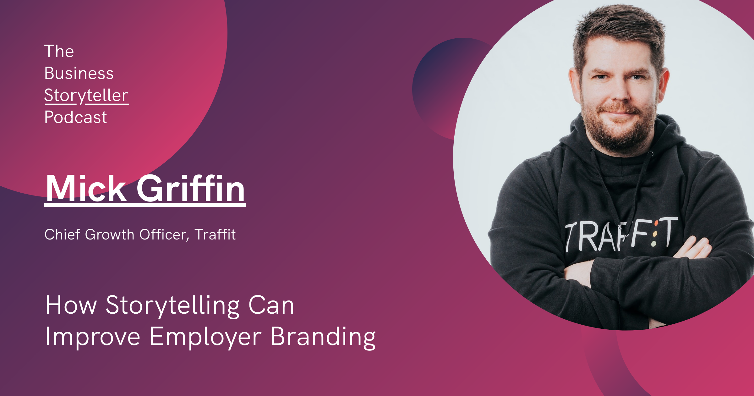
Mick Griffin, Chief Growth Officer at Traffit shares his best practices for storytelling in employee branding and his belief in making companies human again.
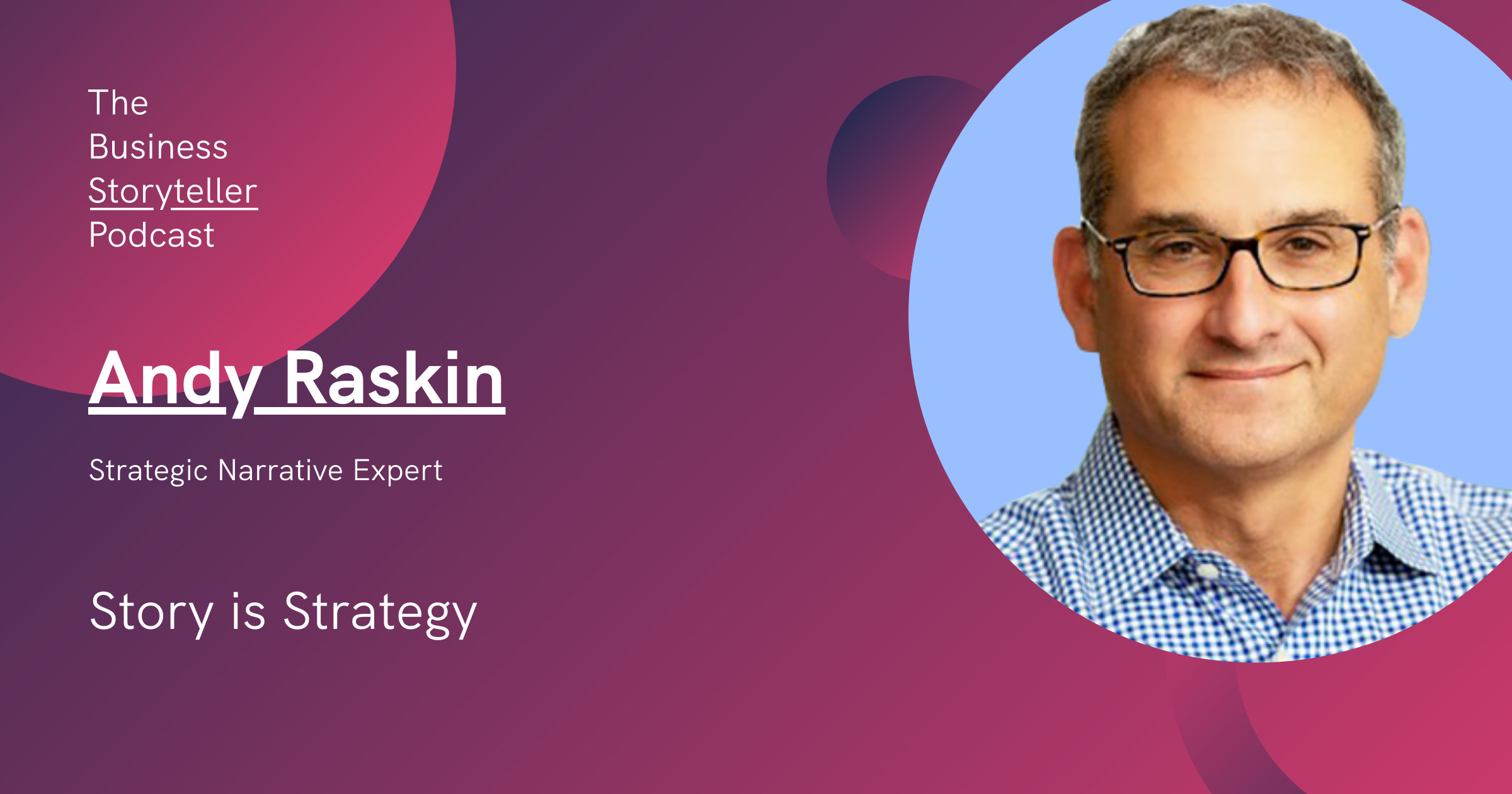
We speak with Andy Raskin about developing a strategic narrative and how it can positively impact not only sales and marketing but also the product.
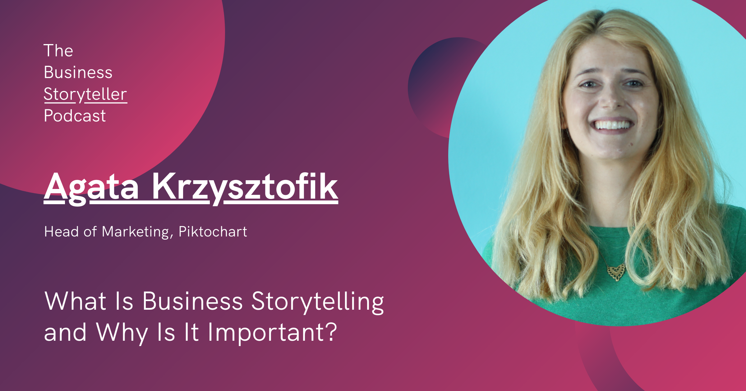
In our pilot episode, we seek to discover what business storytelling is and why it is important with the Head of Marketing at Piktochart, Agata Krzysztofik.
An infographic maker, presentation creator, and report builder in one online platform. No graphic design skills needed.
Get started for free Watch a demo