Matchmaking your typefaces (or pair fonts) can be fun! But, it can also be a pain when things go awry and mess up your infographic. A well-made infographic has no more than two different typefaces or four type variations, i.e. type size, and bold or italic style.
[This is part of the Infographic Design Series. Check out the other posts!]
Do you know that besides mixing your fonts, you can play with font styles to create contrast? You can use contrasting fonts in upper or lowercase for headings or use italics and bold to highlight words or phrases within a body text.
In this post, we will show you the things you need to know about typeface, pairing and contrasting so you can pair fonts beautifully.
1. Four general type classifications
Let’s learn some typography jargons before we go into pair fonts techniques.
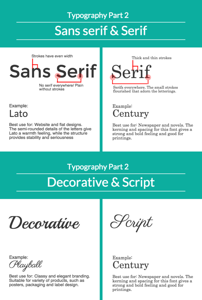
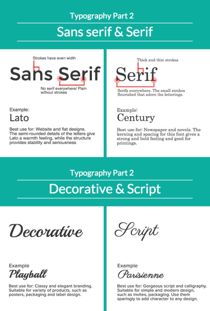
Here is a summary of the typography classifications, what each type represents and where it is usually used.
- Sans serif and Serif are similar but with distinct finishing. Sans serif typeface is with composed simple lines while Serif has “extensions” to its finishing. Sans serif is best used for website and flat designs, creating serious and stable copy. Serif, on the other hand, is slightly fancy but produces strong and bold quality. This makes Serif typeface suitable for printing, i.e. newspapers and novels.
- Decorative typeface is a novelty face. This type creates various moods, but mostly classy and elegant quality. This type is good for branding in products packaging, labels, and posters.
- Script is cursive or handwriting type that are ornamented with flourishes. It’s stylish and elegant. Best use for classic ads and content, or even for wedding stationary. You will notice the fonts give off a soft and classic feel, yet intense and strong.
2. Creating contrast using similar typefaces
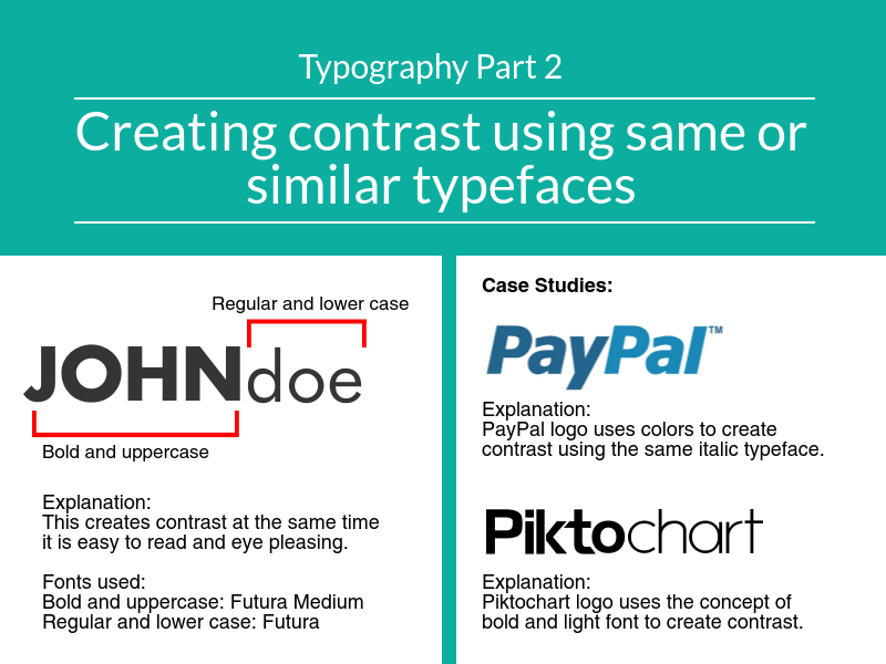
Using similar typefaces you can still create contrast by applying different font styles like bold, italic, upper or lower case. You can use a bold typeface like Futura Medium pairing it with slimmer font of similar typeface like Futura to create headings or sub-headings. The differences in style make the copy easier to read.
3. Pairing fonts of the same class
If you find using different typefaces for a piece of content not to your liking, you can pair fonts of the same typeface classifications. It gives a good contrast yet does not deviate far from its style.
You can apply different font size or different typefaces (of the same class) for your headings, sub-headings, and body text. Taking the following Decorative typefaces as example, the heading uses Lovers Quarrel in larger text, while the body text is Loved by the King in smaller text.
You can also use the same typeface where the heading is bold and bigger in size while the sub-heading or body text in lighter in color and smaller size. For instance, using only one typeface, Georgia you can have stronger and larger heading with body text in a lighter color to create contrast.
4. Applying typeface based on content
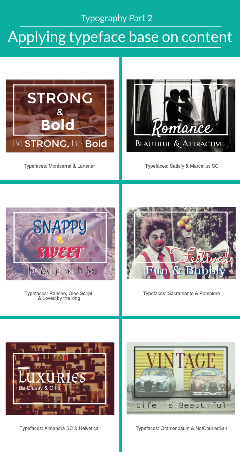
You can also apply typeface and pair them in ways that reflect the subject. Here are some example of font pairings and typeface applications that reflect the content.
You can use Sans Serif fonts like Montserrat and Lanenar for strong and bold content or Serif fonts like Satisfy and Marcellus SC to go with beautiful and attractive image like wedding photos. You can also pair fonts like Almendra SC (decorative) with a simple Sans Serif font like Helvetica to create a stylish and elegant piece.
All fonts mentioned in this post are available in Piktochart editor. We hope you are inspired by this post to make beautiful infographics with these font pairing ideas.
Enjoy pairing your fonts!


