Posters.
They’re those snazzy one-pagers that seek to capture your attention while also serving up bite sized information.
You’ve seen them everywhere, plastered on the walls of the streets or tucked away in an email attachment.
While there’s a myriad of types and they all are varied in terms of themes and designs, they are all united in their goal to be persuasive and eye-catching.
While in the last article, we did a walk-through on creating a good poster which explored determining the goal, content, designs, and other best practices.
Today, we’ll have an overview on all the different types of posters, running the gamut of advertising to travel, and find out what makes them special.
And to also inspire you with some examples.
If you want to jump to different sections, you can use the links below. In case you’d rather start right away, create a free Piktochart account and make a poster online.
Different types of posters:
1. Advertising
What are they?
Ad posters are typically used by brands of varying sizes for promotional purposes.
But they’re also often used to champion a cause.
Either way, ad posters are designed to be heavy hitters in terms of sparking emotion in the viewer in order to incite action – whether it is to make a purchase, improve brand opinion, make a donation to a cause, or even a lifestyle change.
Why are they special?
Unlike other posters, which are usually more forthcoming in their goals, advertising ones are typically designed to house subliminal messages, are laden with symbolism and are meant to provoke, inspire, and even distress.
In short, if an ad poster is well-designed, it’s impossible to feel neutral about it.
Compared to other posters, ad posters are typically designed to have a “wow-factor” and can be hilariously funny or undeniably persuasive.

For example, the message that this Nike ad is trying to convey is to “stand out.”

The above example says that your steak and fries will taste like cardboard if you don’t bring Heinz into the mix.
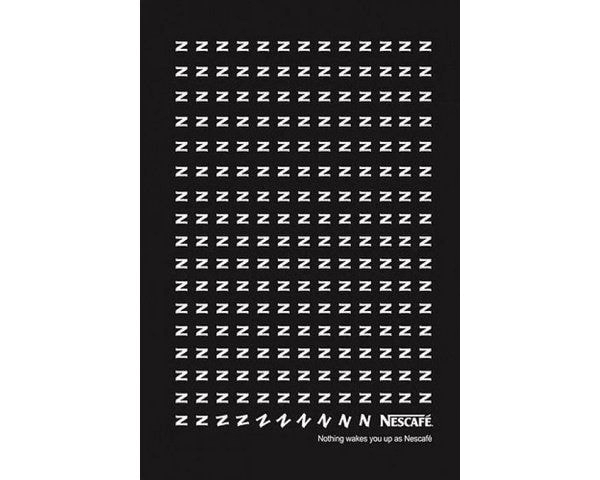
This Nescafe ad suggests that with a good cup of coffee, your z’s (which symbolize sleepiness) will perk up.

This final ad poster from TopGear magazine puts out the message that driving and social media shouldn’t mix and can be deadly.
2. Informative
What are they?
Informative posters are exactly what they sound like – one-pagers that serve to well, inform.
They can vary in terms of their design, as some will look like infographics while others just contain visuals, but their goal remains the same across the board.
They all contain a multitude of factual information that aim to educate the viewer as much as possible.
Why are they special?
Unlike other posters, informative posters are always going to be fact-based and serve to help viewers become more data-informed.
Compared to other visuals where viewers can skim quickly and move on, readers of informative posters usually stay awhile to educate themselves.
However, unlike research posters, which we’ll be discussing later in the article, informative posters don’t require any background knowledge of the subject and are generally created to educate the layman.
They can also be more fun and whimsical in comparison.
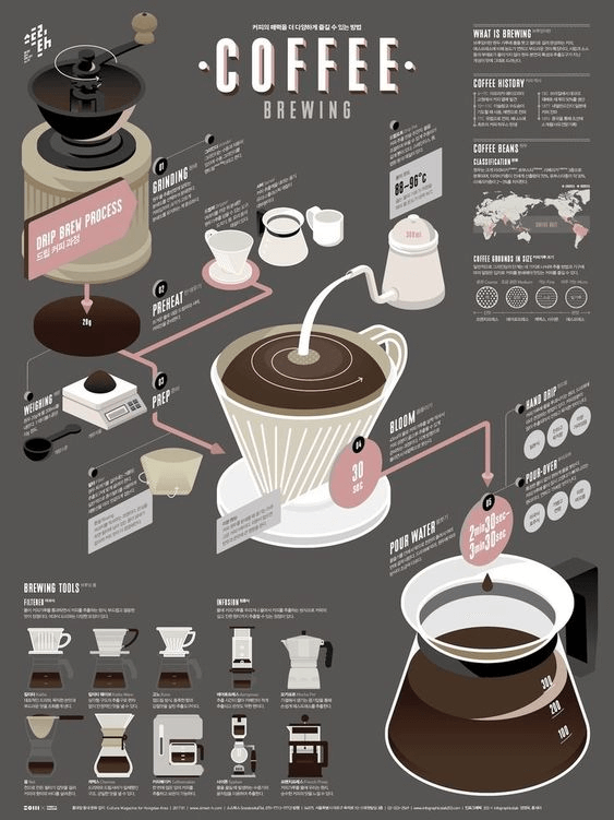
From Function Creative comes the ultimate coffee brewing guide including instructions and the different equipment.
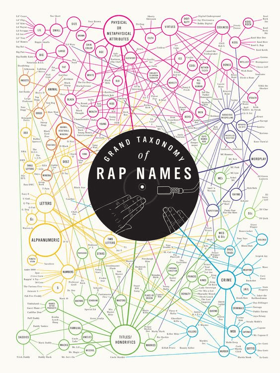
From Pop Chart Lab comes a very impressive informative poster showing 282 rap names based on semantics.

An incredible infographic from Co.Design that details every trip to the moon ever.
3. Affirmation or Motivational
What are they?
Affirmation or motivational posters are one-pagers that have the sole purpose to inspire.
They usually contain motivational quotes or clever, catchy copy represented with large and bold typography, overlayed on inspirational background images that work to tug on the heartstrings of the viewer.
They’re always positive, and aim to make the viewer feel good.
Why are they special?
Unlike other posters that serve up information at either a bite-sized or longer format, affirmation and motivational posters aim to incite mainly positive emotions in the viewer.
These types of one-pagers are actually used as pieces of art, which some folks will feature in their homes or offices, or tools to help people improve their lives and can be referenced over and over again.

This affirmation poster from Zazzle.com inspires the viewer in that failure is never final. Plus, the background image of the lion symbolizes strength and courage.

This minimalist motivational poster from BayArt is a reminder that the viewer should aspire for more. To be more than a big fish in a small pond.
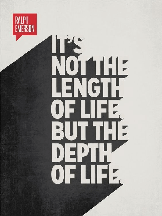
This impactful motivational poster reminds viewers to live life to the fullest.
4. Movie Posters
What is it?
Fairly self-explanatory, but the movie poster is used to advertise or promote a film and serves as the cover of all promotional materials.
The one-pager’s very important job is to pique the viewer’s interest to search for the trailer, so in short, the movie poster has a high stakes role.
What makes it special?
Movie posters are a part of the ad poster family, but they stand out because their purpose is a little more focused and their message a lot more clear. It exists to create buzz around an upcoming film, or allow the viewer to make a decision towards buying tickets to see one currently in theatres.
More importantly, movie posters are designed to contain as many elements from the film as possible.

This movie poster of Blade Runner 2049 encompasses many elements from the film.
All four main characters present, holding guns which shows it’s an action movie, all against a neon futuristic city backdrop.

This movie poster of The Martian is also well-designed as it is enticing.
It’s clear that the movie is about space exploration gone awry.
If Matt Damon isn’t enough to get you scurrying to the cinema, then certainly the tagline “Help is only 140 million miles away” will.

The movie poster for ‘Fellowship of the Ring’ includes all the main characters, as well as some supporting.
The costumes also clue fans of the trilogy into how authentic the film’s representation of the book will be.
5. Event Posters
What is it?
Event posters are also rather self-explanatory. They exist to drum up buzz and awareness for an upcoming event, and also to offer up bite-sized information and a little call-to-action.
If done right, the event poster can build anticipation for your event and pique the interest of would-be attendees to learn more from your website.
Why is it special?
Event posters stand out because the poster’s design needs to be able to quickly and effortlessly tell the viewer what they can expect from the event, so the elements on the poster have to match the theme and mood.
This is because the poster has to do the important job of “selling” the event, but it also has to attract the ideal attendee.

This event poster on food and film represents the dual-theme of the festival cleverly, with Charlie Chaplin’s bowler hat doubling as a cloche – revealing a single film negative.
Plus the bright pink is attention grabbing and will surely draw in those with a flair for drama.

This event poster on an upcoming night market cleverly uses a string of lights and a gradient as a backdrop to create a relaxed yet playful mood at sundown.
The whimsical typography used also contributes to a youthful mood, as this poster is likely looking to attract a younger crowd.

This event poster uses mainly typography, with some design accents to create an elegant, Art Deco-esque mood.
The color palette of navy blue, gold, and white promises attendees an evening of old-timey decadence.
6. Travel
What is it?
Before the days of social media, where people could easily scroll through a feed and marvel about the beauty of a destination, there were travel posters.
Their aim was to inspire viewers to see the world, and also used by travel agencies and airlines to promote their services.
Which is why all the travel poster examples that you see are mostly vintage collectables, with modern versions mimicking the art deco / modernist style of the originals.
What makes it special?
Travel posters are special because they’re one of the few posters that can embody timelessness while still being modern at the same time.
They also have the primary goal of inspiring luxurious wanderlust in its viewers, encompassing only the most attractive elements of a destination – usually a key landmark.
What’s more, a travel poster has the very important job of capturing the most beautiful, quintessential moments of its destination.

This travel poster of Venice, Italy, encapsulates the essence of the City of Water – with its striped mooring poles and gondoliers.
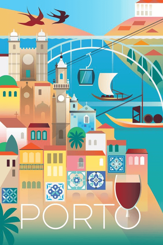
This travel poster of Porto, Portugal captures the essence of the city. Colorful houses, the tin-glazed ceramic tilework, and of course, a glass of port.

This slightly more modern travel poster, depicts Miami, Florida as a lively, active, beachy destination with towering palm trees swaying in the breeze.
7. Research
What is it?
Research posters are typically used by the academic community to display their findings at conferences.
They’re text, data-heavy, but also leverage charts and graphs and other data visualizations to get their point across.
Why is it special?
They stand out because, unlike informative posters, research posters more serious in nature and oftentimes contain jargon and are created specifically for a target audience that already has a background knowledge in the topic.
They’re also perhaps the most text-heavy of all posters and require a lot more time and attention from the viewer.
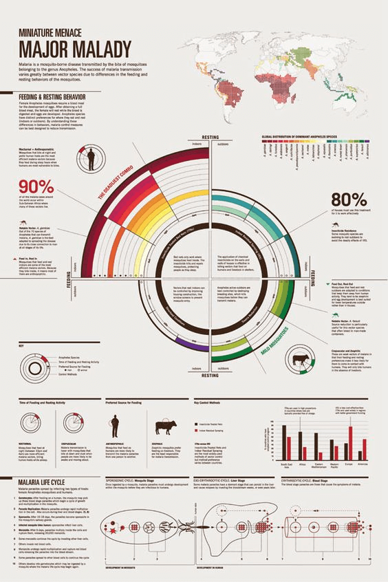
This research poster looks into how micro and macro mosquito behavior factors play into how malaria spreads around the world.

This beautifully-designed research poster looks into the tough issues of consent and reproductive health within marriages in India.
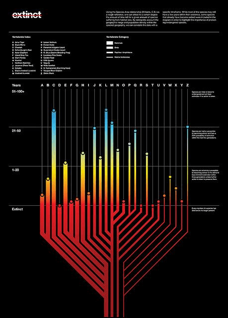
This research poster uses data visualizations to communicate the sobering truth of animal species that have gone extinct, or ones that will soon.
Wrapping Up
When it comes down to it, there are certainly a handful of different posters with varying goals.
Whether it’s to tap into the emotions of the viewer, inspire towards a call to action, inform and educate – there’s no doubting that a poster is certainly a small but mighty communication medium to get a point across.
Create professional visuals quickly and easily.
Watch this free demo to learn how Piktochart can enable your inner graphic designer. No technical skills required.
Watch the demo


