So you’ve got a keynote presentation coming up, and you’re hitting the books to make sure you’re armed with the best plan possible. Besides taking notes from all the greats on TED, you’re reading up about a message structure that works, and looking for the perfect template.
While it seems like you’ve got your bases covered, like all things in life, there’s always a way to streamline the planning process.
According to Aaron Weyenberg, the UX Lead for TED and a self-professed “master of slide decks,” and the wizards behind Apple’s presentation slides, there are a number of tricks of the trade that you can rely on to create a rocking keynote presentation.
Below are some of our favorites. And to easily create a professional-looking presentation, sign up for Piktochart. It’s free and it allows you to make beautiful visuals without being a graphic designer.
1. Do your slides last
While most keynote speakers will typically build their presentation around the structure of a template, Weyenberg says that “building your slides should be the tail end of developing your presentation.” Before working on your slides, you should put together your main message, structure, supporting points – then practice and time your presentation.
The reason for this, he says, is that the presentation needs to be strong enough to stand on its own. Approaching a keynote like this requires a shift in thinking.
While a beautiful set of slides is imperative to your presentation, it should not be central to it.
Weyenberg said it best: “The slides are just something you layer over [the presentation] to enhance the listener experience.”
Observe these 2017 Google I/O keynotes, especially CEO Sundar Pichai’s – the role of the slides are to support what the speaker is saying – not the other way around.
2. Get creative with photos
Often times, presenters will be far too literal or cheesy with their image choice. Weyenberg suggests to use images that are simple, yet punchy – and pairs nicely with your spoken words. He says to look for photos that are:
- Related to your keynote’s concept
- Are not complex in terms of composition
Metaphors or even something a bit more literal could work, but it should be clear as day as to why the audience is looking at it – and should only enhance what you’re saying.
Here’s an example that Weyenberg used in his deck for the launch of a new TED.com. The idea here is that the launch should be perceived as the “beginning of something new,” and that TED will learn, adapt, change and grow. 
3. Simplify charts and graphs
While most presenters will simply drop an image of their charts and graphs into their deck, Weyenberg points out that it might be a bit “unsightly.” If you need to use data to back a point that you’re making, you should make the extra effort to make it more attractive – and this can be done by recreating it in your presentation app.
There are a couple benefits to doing this:
- It will make your presentation seem consistent and well-thought out
- You’ll have control over colors, typography, and more.
Here a Weyenberg example: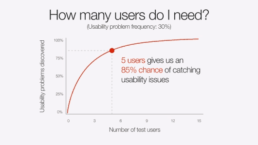
4. One theme per slide
According to the designers of Apple presentation slides, less is certainly more. Trying to cram too many ideas on one slide can only work to your detriment. Beyond ideas, the same goes for statistics.
Let’s play a little game:
For the following idea, how many slides would you use?
“The developer program is incredibly vibrant. We have over six million registered developers. Demand for this show has never been greater. We sold out in just over a minute [71 seconds].”
While the average person might think that 6 million and 71 seconds would belong on the same slide and be short and sweet enough, let’s compare it with what Apple’s CEO Tim Cook did.
He only leveraged two slides: The first said “6 million,” and the second: “71 seconds. Sold out.”
The point here is this – if a statistic is important enough and you want people to remember it, give it it’s own slide.
5. Create a visual experience with data
Taking a leaf again from Apple’s presentation book, once you’ve gotten the hang of having just one stat per slide – you should also make it as visual as possible.
In a 2016 keynote, Apple designers included the exciting factoid that the tvOS App store had reached 6,000 apps – but included a screen load of those very apps in the background of the slide.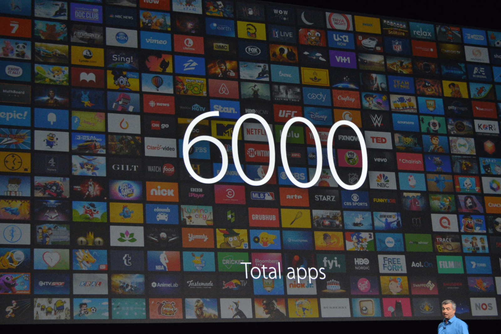
One data point per slide, combined with it being visually interesting – is sure to be memorable.
6. Practice Really Makes Perfect
Imagine the late Steve Jobs, a legendary keynote presenter, still rehearsed for months before a presentation. According to Brent Schlender, one of the co-authors behind the Steve Jobs biography “Becoming Steve Jobs,” Jobs would rehearse and prepare “exhaustively” for all of his public appearances.
Despite being a natural on the stage, Jobs never would wing it, he came to the show well prepared.
“I once spent an entire day watching him run through multiple rehearsals of a single presentation, tweaking everything from the color and angle of certain spotlights, to editing and rearranging the order of the keynote presentation slides to improve his pacing,” remembers Schlender.
While you may not be a perfectionist like Jobs, you are likely also not nearly as good of a presenter as he is – so practice really makes perfect in this case.
7. Tell A Consistent Story
Circling back to Weyenberg’s tips – he suggests that in a good slide deck, every slide should feel “like part of the same story.” Think of your deck like a story – every slide should feel cohesive to the big picture message you’re trying to communicate – as opposed to random ideas juxtaposed together.
You can do this by:
- Using the same or similar typography, colors, and imagery across all slides
- Using templates can help with maintaining the same look and feel
8. Less is more
We explored the less is more concept earlier in the article by suggesting you keep to one idea per slide. The same can be applied to text.
When it comes to creating slides for your next keynote, the cardinal sin is a slide with ample text that is verbatim of your spoken presentation.
What this does is encourage people to keep their eyes on your slides instead of listening to you.
Weyenberg also points out that a text-heavy slide forces the brain to multitask between focusing on what it’s reading and hearing – which is quite difficult and will compromise your presentation.
Here’s an example of a slide with too much text.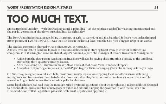
This one from a Google I/O keynote is much better.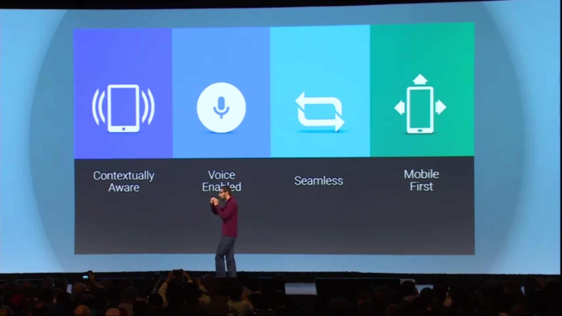
9. Consider topic transitions
While you want to make your slides look like a cohesive unit, you want to also keep in mind that making every slide look the same may be boring. Weyenberg suggests to:
- Create one style for the slides that are the “meat” of the message
- Then create another style for the slides that are transitioning between topics
For example, if your overall slides have a dark background with light text, you can use transitional slides that have a light background with dark text. This way, they’ll still feel like they’re from the same presentation family without being completely uniform.
10. Tell a captivating story
It is fitting that our final tip comes from likely the greatest keynote presenter of all time. The late and great Steve Jobs had the ability to captivate and inspire his audience with his talks, and that’s because he was a very good storyteller. And that’s the golden leaf that you can take from Jobs’ book today.
Always aim to tell a captivating story.
One example is perhaps when he introduced the iPod: “In 2001, we introduced the first iPod. It didn’t just change the way we all listen to music. It changed the entire music industry.”
Listen to Steve Jobs weave a story about the digital music revolution when unveiling the iPod.
Bonus Round: Tips From Piktochart Designers
Besides learning from those at TED and Apple, we also wanted to throw in a “bonus round” of tips from our designers. We think these could work well as a checklist to run through when you’re just about ready to finalize your presentation.
- Always remember that your audience is sitting far away. So ensure that your title font size is large enough to be seen from a distance, and that your body text is no smaller than 20px.
- Use only two colors for your entire presentation – a primary and secondary color. If you must use a large color palette, your maximum choice should be up to five colors.
- Make sure that there is enough white space throughout your presentation. This will give your content room to breathe. Less is definitely more in this case.
- Emphasize only one object per slide – whether it’s an image, statistic, quote. This will make sure your audience stays focused.
Time to Make Your Own!
1. Business Keynote 
This sleek, stylish, yet no-nonsense template is perfect for that keynote on the latest business trends that you’re about to deliver. Edit this template in Piktochart now!
2. Social Media Keynote 
This playful, yet professional template works great for that data-heavy keynote that you’re about to give on the future of social media. Edit this template in Piktochart now!
3. Design Inspiration Keynote
This fun and techie template can be used to communicate your vision, processes, and mobile strategy in your next design inspiration keynote. Edit this template in Piktochart now!
Create presentations, reports, and infographics in minutes.
Watch this demo to learn about the benefits of Piktochart.
Watch the demo