This post is contributed by one of Piktochart’s designers, Jen Yen.
We launched our brand-new look for our website few weeks ago with changes in its structure, layout and overall look and feel. The decision of revamping comes to our mind when we see there are so much more room of improvement for the website.
The process start off by nailing down the objectives for the new website, planning the sitemap then finding references for the layout design.
This time by fine tuning our 2 main colours (orange and teal), it brought us a much better colour scheme…. By tuning down the orange colour to a more soothing level and adding brown colour as our complementary (supporting) colour, we have a much better colour scheme for our branding! Success!

old colour scheme

new colour scheme
What is new and improved on the site?
Home page

versus

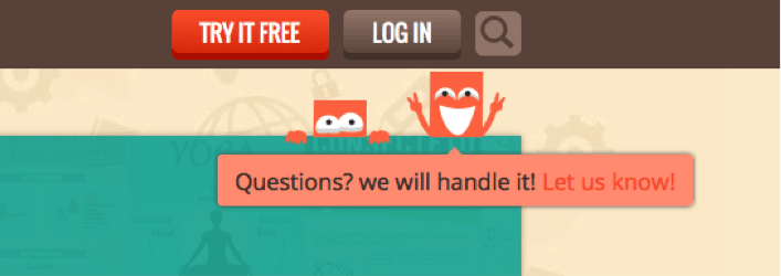
You will find bigger call to action and clearer graphics to represent our values.
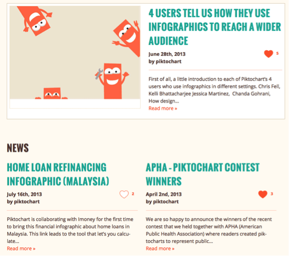
Featured and latest news of Piktochart
Get our latest updates here!
Case study
A collection of our users’ case study

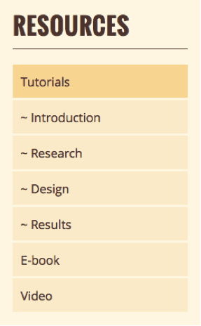
Resources
Which consist of tutorial and other infographics related references which would really help a user to create an infographic and know more about data visualization.
Events
More updates for the event we will be holding

The overall process took about two and a half months.
Enjoy the brand new look of Piktochart website. Comment below if you have any feedback!