When it comes to engaging the right data visualization there are some rules of thumb. There are many ways to represent your data, check out the following six examples to get you started. Or, you get jump right into creating visuals by signing up for a free account on Piktochart.
Why data visualization
Every day we rely heavily on visual representations to understand information easily and quickly. For instance, charts, icons and maps. Effective data visualization improves entire communication process. This applies to all industries. Here are some reasons why we need to data visualization.
- Tell a story and makes it easier to grasp
- Represent large quantity of data coherently
- Assist readers to discern the relationship of the data
- Enable discovery of new insights
Types of data visualization
1. Time series data
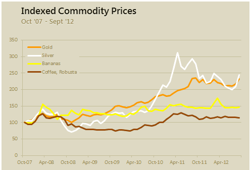
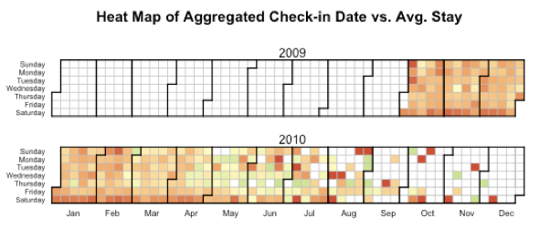
This type of data visualization is typically in chronological form. It involves temporal measurements (changes over time). Line chart is typically used. However, you can also use a bar chart or heat chart to represent time series data.
Examples
A simple line chart that indicates the change over time.
A heat chart / heat map gives an effective visual of the changes over time.
Image credit: blog.revolutionanalytics.com
2. Geographical data
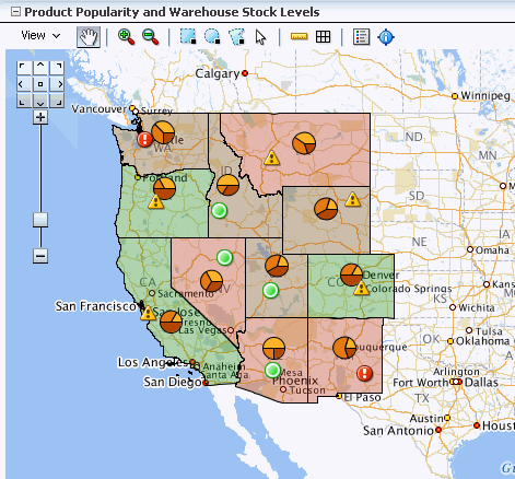
A map is best used for location-based data. Effective map or geographical chart should include a proper annotation. Also complement with graphs or charts is advisable.
Examples
Geographical map data visualization that is combined with pie charts and indicators.
Photo credit: oracle.com
3. Compare sets of values
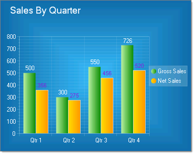
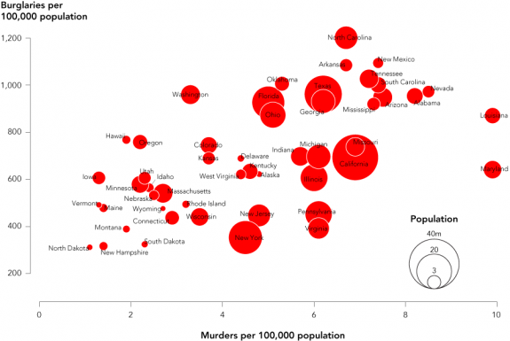
When showing comparison data like highest or lowest value, use bar chart or histogram. You can also use tree map or bubble chart for comparison of more than two elements.
Examples
Simple comparison between two elements over a period of time.
Image credit: www.telerik.com
A tree map provides an overall picture of comparisons among parameters.
Image credit: economist.com
A bubble chart that shows the comparison of multiple elements.
Image credit: flowingdata.com
4. Percentage values
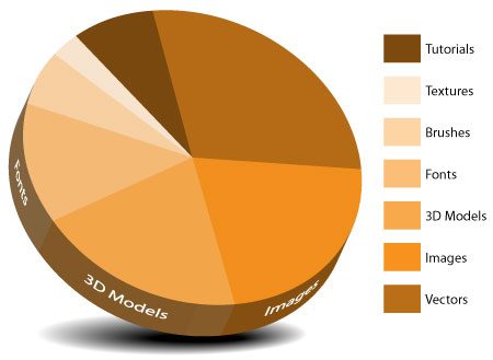
To indicate percentage, use a pie chart. There are multiple creative variations of a pie chart. However, do not overuse pie charts. It may make your data. Do not use more than 5 to 7 fields of data as it will look overcrowded. Thus, it defeats the purpose of clear data representation. Use a pie chart when all the elements do not overlap and provide a complete picture.
You could create interactive pie charts with Piktochart by signing up for free.
Examples
A simple pie chart that provides a complete story.
Image credit: themetoday.com
A gage chart is good for indicating the percentage to completion.
Image credit: enterprise-dashboard.com
5. Scale comparison
Scale data best visualized using images. It is the most visually effective comparison.
Examples
With a comparison diagram by size, you can easily grasp the information displayed.
Image credit: www.arkesis.org
6. Text analysis
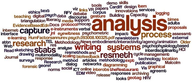
The popularity of text analysis increases along with the prominence of search engine optimization. There are few ways to represent data for text like word tree, tag or word cloud, and phrase net.
Examples
A word cloud diagram can be used to indicate most used words in a blog.
Image credit: tel.ioe.ac.uk
A phrase net diagram can show the relationships between words used for deeper understanding of a context
Image credit: betterevaluation.org
Interested to get started with data visualization using Piktochart? Create a free account and check out how you can do that with this template.
