Sales reports provide insight into a business’ customer base and market position. They typically provide information on the number and value of deals closed, as well as potential leads.
But a sales report is more than a simple presentation of data.
Sales managers use it to analyze performance and develop strategies. They also measure the sales team’s progress towards their goals and assess individual rep performance.
Founders, CEOs, and CFOs also take sales reports into account when preparing business forecasts, plans for growth, and product or service development.
What metrics should you include in a sales report?
First, this will depend on the purpose of the report.
For example, are you responsible for a startup’s business development? You’ll need to include data on prospects.
On the other hand, is the R&D team considering products to develop? You can provide information on your company’s top-selling products or the types of service contracts with the highest value.
Or perhaps potential investors asking how you fare against your competition. As part of the CEO’s report, you’ll need to contribute data on your market share.
Typically, a sales team will conduct sales presentations every month, quarter, and year. For these regular reports – such as monthly sales reports – you’ll likely use recurring metrics.
Here are the key metrics to include in a regular sales presentation or report.
Sales progress vs goal
Compare the total value of your sales for the month with your goal. Provide both the value in dollars, as well as the percentage.
For example, if you targeted $15,000 worth of sales but only achieved $13,000, you’d have achieved 86% of your goal. You’ll also need to explain how many transactions or deals it took to reach that amount. Compare this with the number of deals you initially forecasted.
Sales forecast for next month
Typically, the sales team will have set monthly forecasts at the beginning of the year. However, the sales manager may adjust this to reflect the past month’s performance.
Let’s say the sales forecast for this month was $15,000, and $17,500 for next. However, your team achieved $20,000 this month – and have plenty more deals about to close in the pipeline.
The sales manager can then decide to make next month’s forecast $20,000 or even $22,500.
Sales performance by rep
There may be more to sales rep performance numbers – and that’s typically explained in sales presentations. For example, different sales reps may be assigned to different industries and types of customers.
One might target direct consumers, who tend to make decisions quickly and make purchases of $300 or less.
Another sales rep may be assigned to business clients in an industry that takes a long time to make purchase decisions. It might be due to various hurdles to overcome, but when they do sign a contract, it’s worth thousands of dollars.
Sales forecast by rep for next month
This will be relative to your overall sales forecast for the next month. Reps may also increase their next month’s target if they have plenty of deals about to close.
Sales reps planning to go on vacation for 10 days the following month may have to manage their expectations and present realistic targets.
Leads generated vs goal
Leads are the people or businesses who are likely to purchase your products or services. You’ll need to work closely with your marketing team to identify leads.
Present the total number of leads achieved this month, compared to your goal. To put the numbers in perspective, you can present a chart that provides a month-on-month comparison of the number of leads generated.
Leads generated by channel
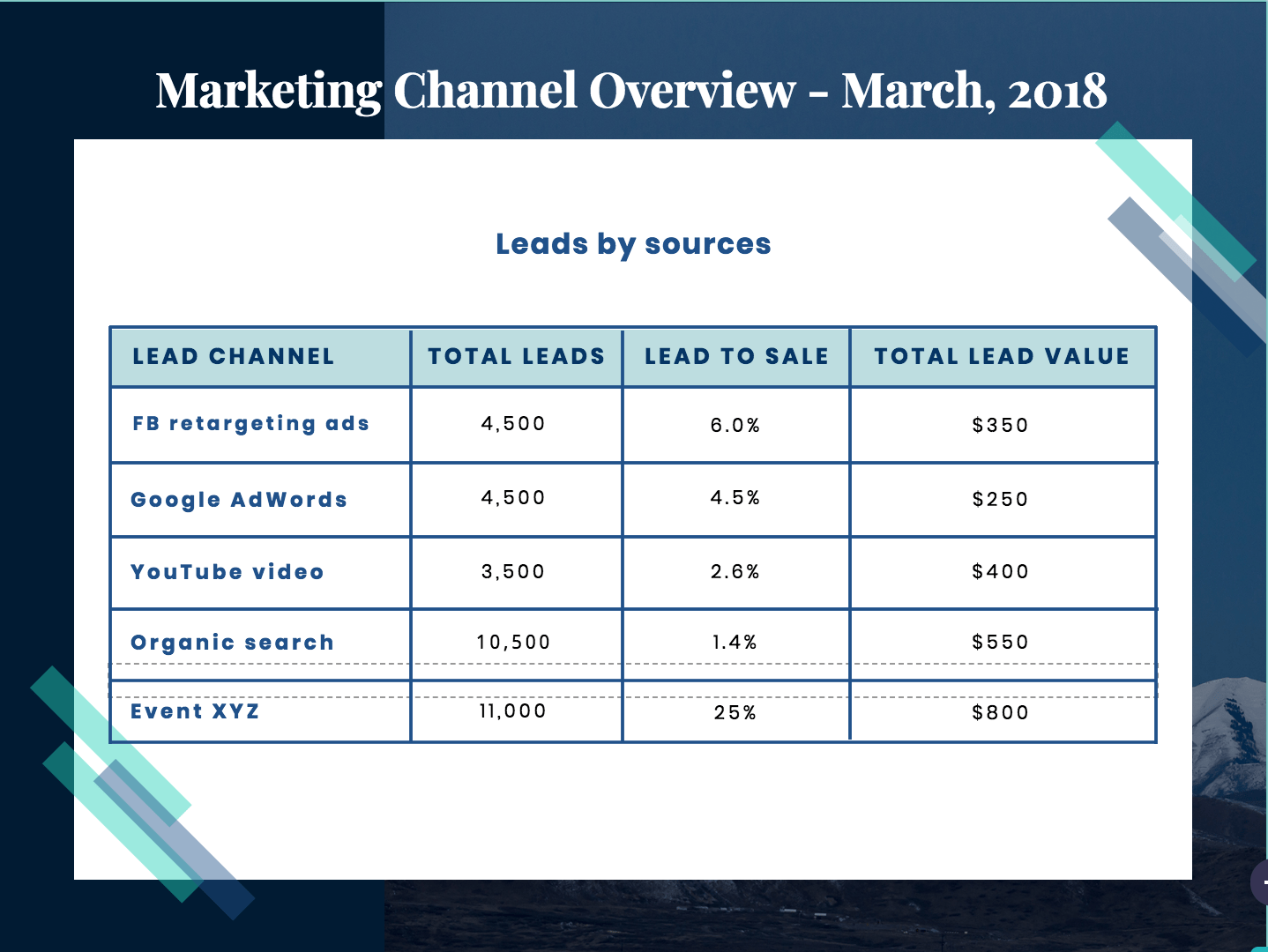
This part identifies the different online and offline channels used to create leads. This can include Facebook retargeting ads, Google ads, YouTube videos, organic search, and events.
Lead to sale
Calculate the percentage of leads that were converted into sales, by channel.
Total lead value
Present the total sale value of the converted leads, by channel.
Visualizing sales metrics
Once you have the data, think of how you’ll present it.
After all, you’re a sales rep. You know that in order to get people to buy, you’ll need to capture their attention, curiosity, and desire.
It’s best to use charts and graphs when presenting lots of numbers. You’ll have to test which type of visual best explains the data.
Line chart
Source: The University at Buffalo
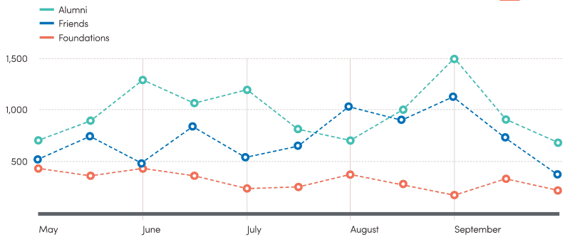
Use a line chart to represent continuous data, such as daily sales numbers. Line charts are great for spotting trends and patterns over time, as well as comparing different data sets.
As you’ll see in the example above by the University at Buffalo, the data sets are made clearly recognizable with the different colors. Important data points in time, such as the number of alumni, friends, and foundations at the beginning of each month – are marked with a dot.
Bar graph
Source: Hootsuite
In their 2017 report on the global state of social media, Hootsuite presented plenty of data. They mostly used bar graphs when comparing whole numbers among different geographical areas.
In the example above, Hootsuite used bars to represent different countries. The higher up the graph went, the more Internet users it represented. To make it easy for readers to follow the data, the bars were arranged from the highest to the lowest value – rather than randomly or alphabetically.
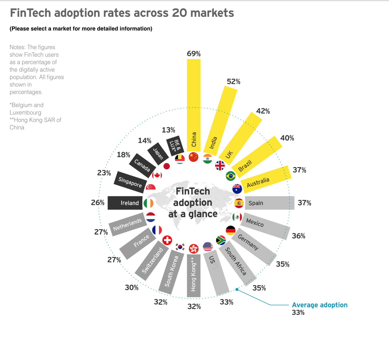
You can make your bar graph even more interesting by making it circular, especially when comparing statistics by country. That’s what Ernst & Young did to visualize fintech adoption across different markets:
Source: Ernst & Young
Pie chart
Source: CB Insights
Pie charts are useful for showing the components of a whole. That’s why they’re typically used to represent percentages.
In the example above, CB Insights showed homeownership for each generation in the US, relative to the country’s entire population.
For precision, the exact percentage is written on the ‘piece of the pie’ that represents it. Otherwise, your sales presentation would end up being a guessing game of ratios and percentages.
Scatter plot
Source: Global Extreme Poverty report
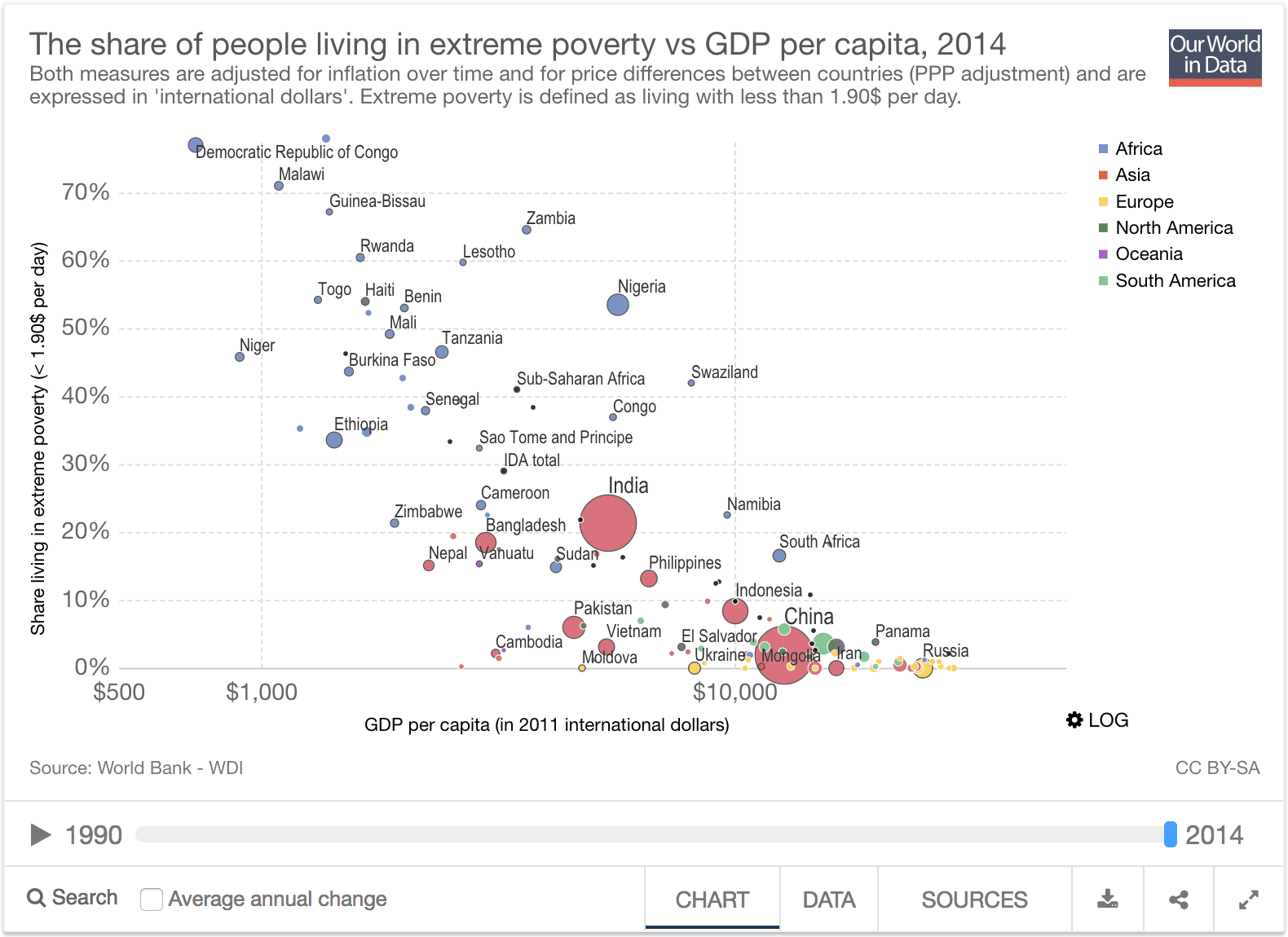
Scatter plots can look daunting, but. this type of visualization is actually quite useful when you need to present three variables.
It also shows the distribution of data, making it easy to spot clusters.
For example, in their Global Extreme Poverty report, researchers Max Roser and Esteban Ortiz-Ospina used a scatter plot to display extreme poverty levels for each country, as well as GDP per capita. The third variable is each country’s population, represented by the size of the dots.
With this scatter plot, one can easily see that extreme poverty rates tend to decrease the higher a country’s GDP per capita gets. The distribution shows that African countries tend to experience both extreme poverty and low GDP per capita, while the opposite goes for European countries.
There are plenty more ways to visualize data, but the examples above are easily applied to sales reports.
Now let’s look at how we can put all these data and visuals together in a sample monthly sales report.
A guide to creating a monthly sales report
1. Cover Page
Begin by creating an attractive and professional cover page. Personalize it with your company logo and the name(s) of the writer(s).
Since this is a monthly sales report template, identify the month covered by the report.
2. Monthly Sales Summary
Start the report with a summary of your overall performance for the month.
This first page shows upfront how much the company has made this month in sales. When presenting sales, provide the total value, as well as the number of deals it took to reach that value.
Next, compare the actual sales achieved with that month’s target, and show the rate of progress towards your goal. Show how many deals you projected to close in order to reach the goal.
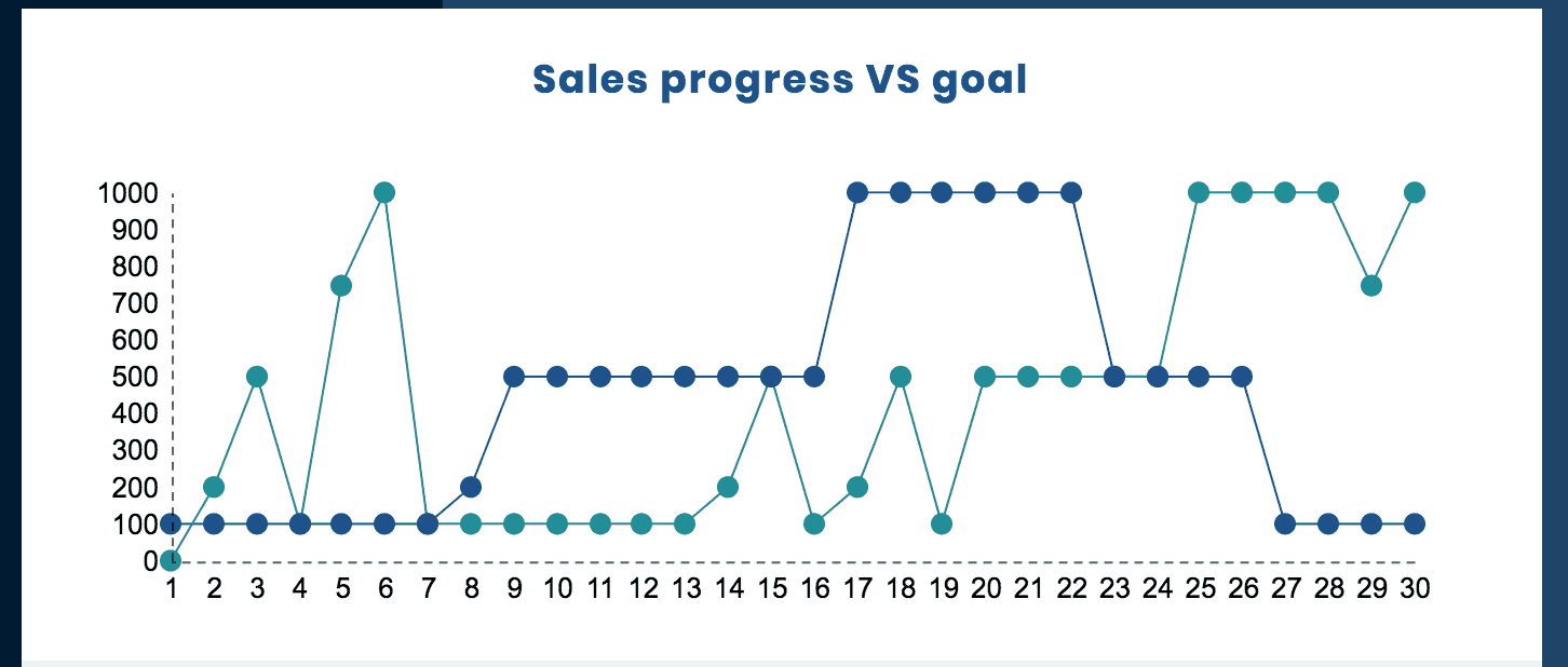
A line chart is used here to show the difference between performance and goal. Instead of a simple line, we suggest using dots to make it easier to gauge how you fared each day.
Also, when comparing different data sets, use highly contrasting colors, like light gray and dark blue.
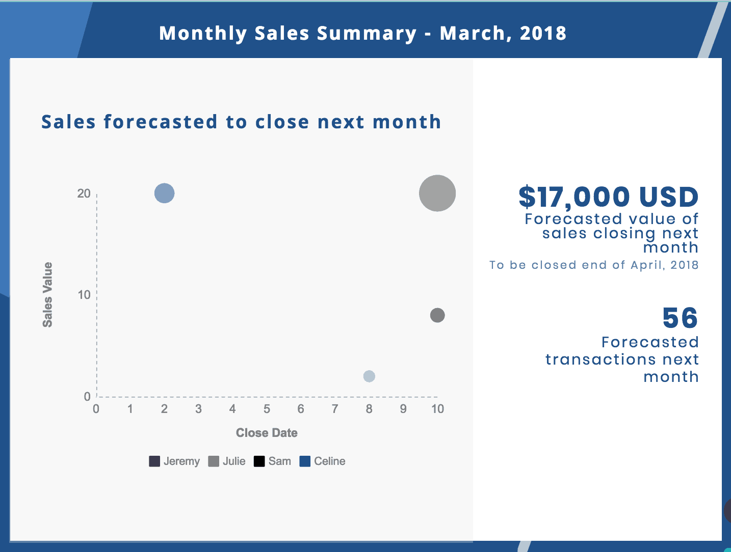
Now that you’ve looked back on your performance, present the goals for the next month:
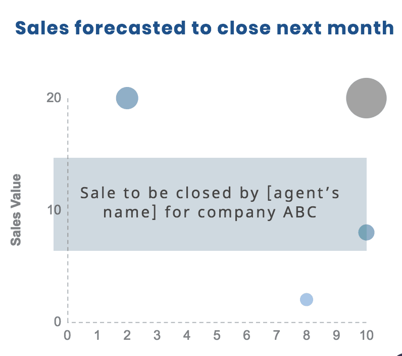
On this page, you have your forecasted value and number of transactions. We’ve also added the timeline.
If you prefer to identify goals per agent, you can show a scatter plot and differentiate agents by using differently colored dots.
3. Sales Team Performance
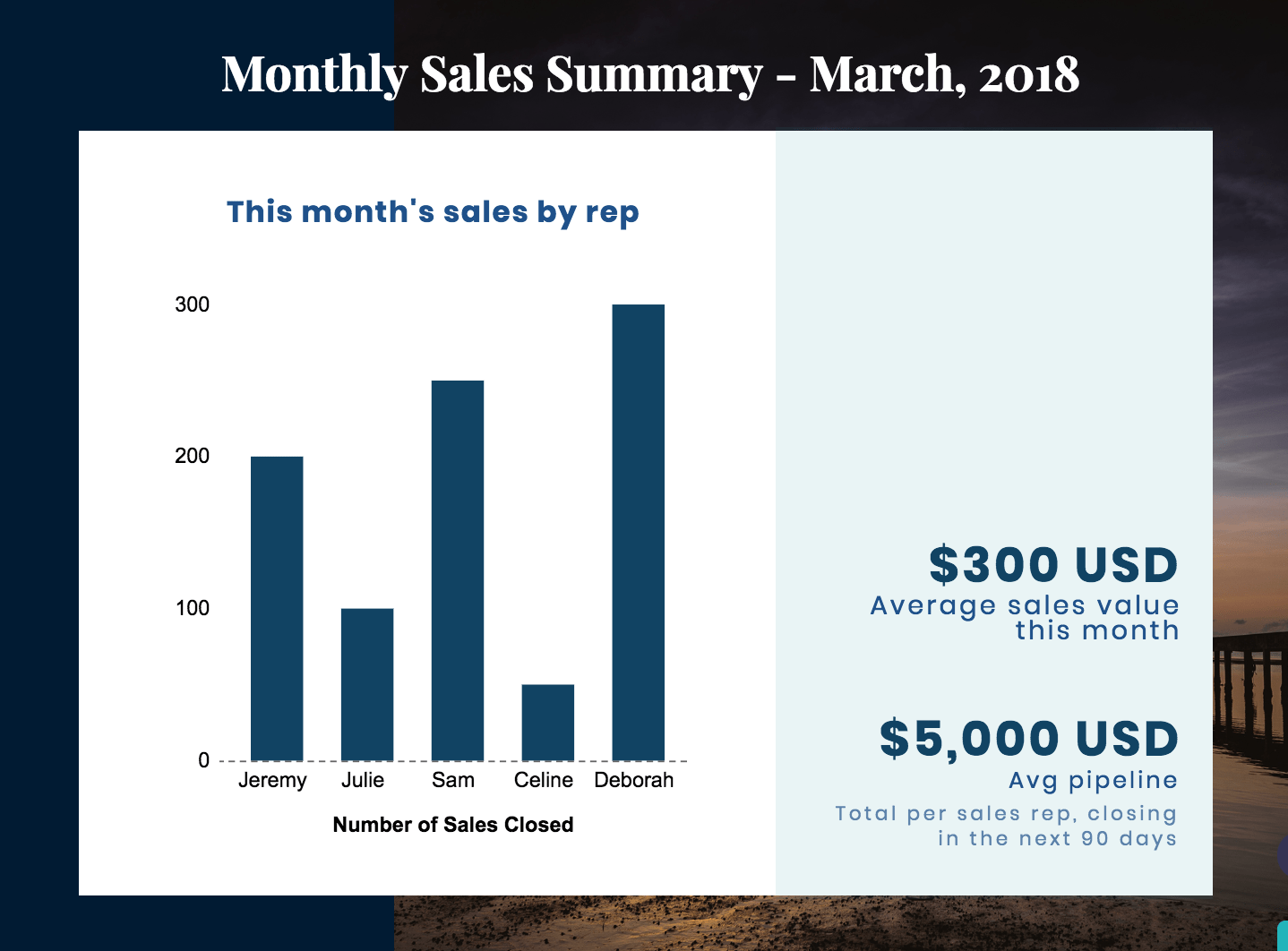
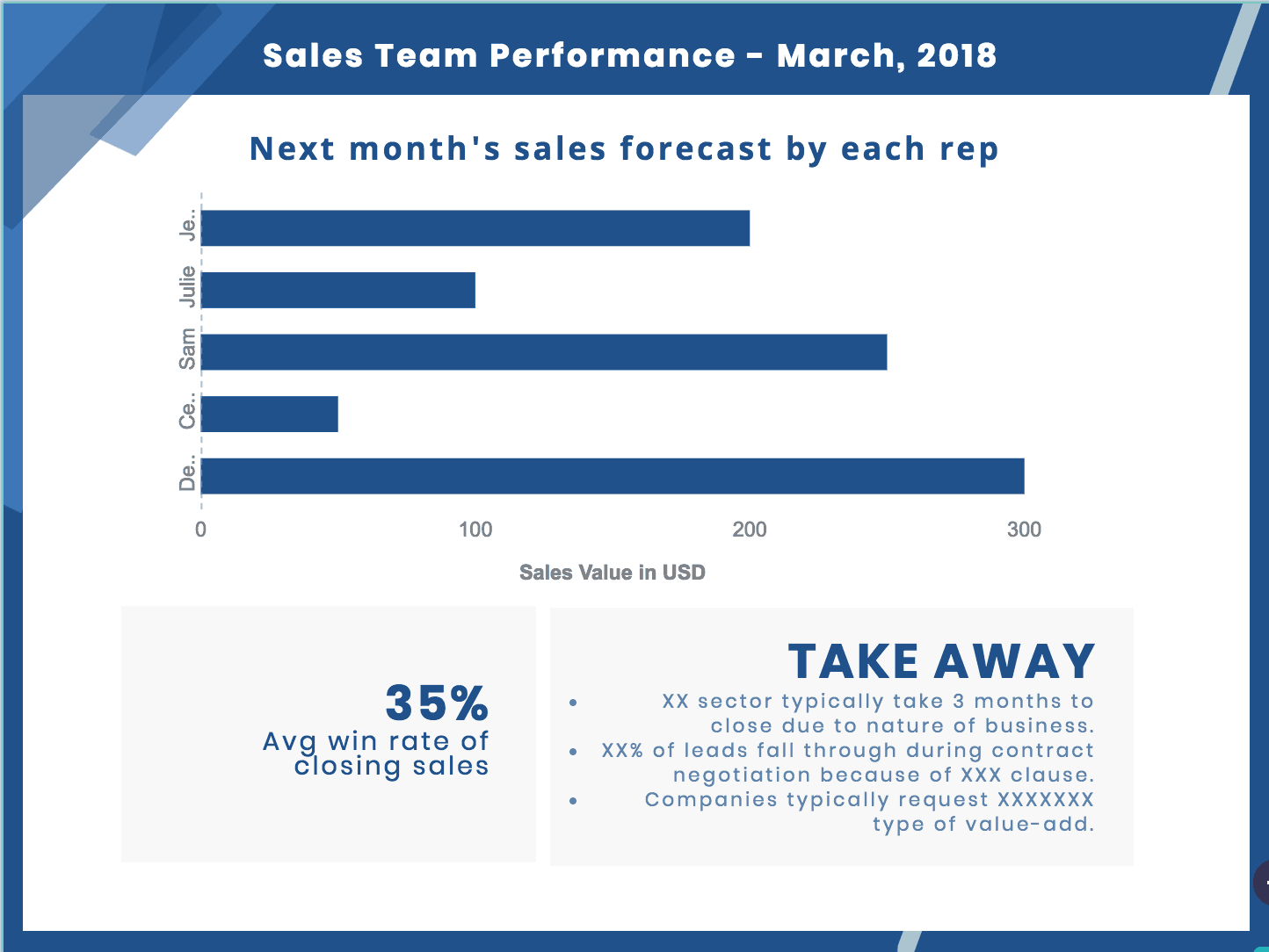
Like a report card, it each salesperson’s performance. Here’s an example, based on the same monthly sales report template:
Here, we’ve used a bar chart to clearly compare the value of the sales achieved by each salesperson.
Make important numbers stand out by using larger fonts. Here, for example, average sales value and average pipeline are presented in a larger, bold font.
Next, still with a bar chart, present your forecast per sales rep. Add takeaways that are based on information not shared on the graphs, such as reasons behind the sales performances of each rep.
4. Marketing Channel Overview
The next important part of a monthly sales report is an overview of the marketing channels that generated leads and drove sales.
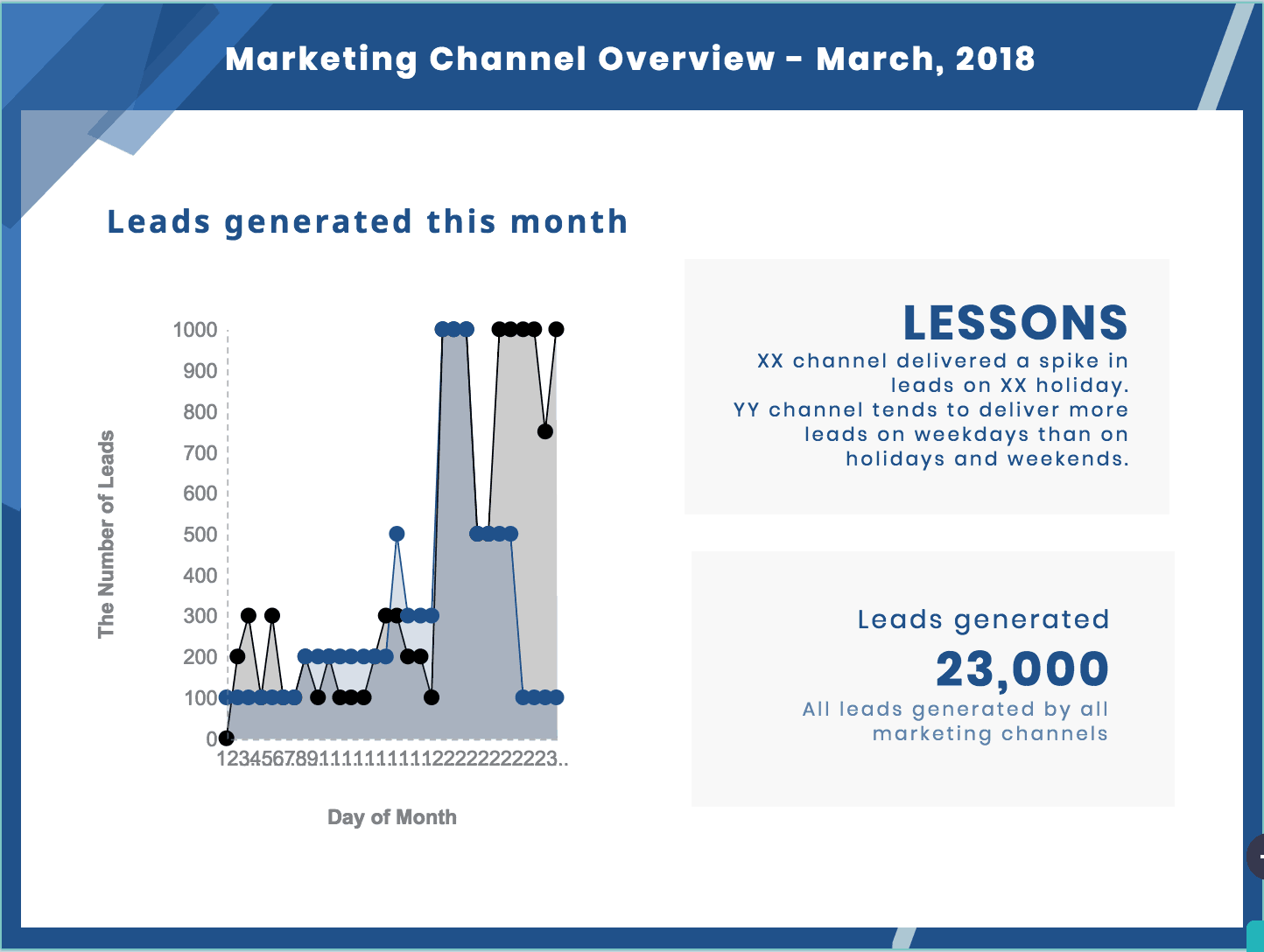
It will look something like this:
Here, we used an area chart to compare the number of leads generated by each marketing channel. Notice the total number of leads generated by all channels that month is displayed.
Meanwhile, think of the ‘lessons learned’ section as a behind-the-scenes explanation for channel performance. What important data do you have that the chart can’t fully explain?
For example, we’ve written the following lessons:
-
- XX channel delivered a spike of leads on XX holiday
- YY channel tends to deliver more leads on weekdays than on holidays and weekends
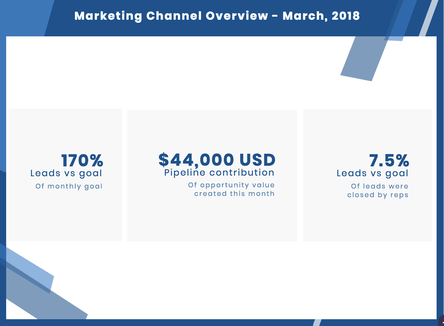
Next, take a break from graphs to provide key numbers:
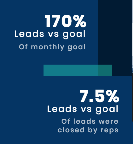
How many leads did you generate this month, divided by your goal? If you targeted 13,500 leads but instead generated 23,000, that means you achieved 170% of your goal.
That sounds good, but how exactly does that affect the business? Translate that into opportunity value, and into results – meaning how many of the leads became customers.
In the example above, 7.5% of the 23,000 leads were closed by sales reps this month. That’s equivalent to 1,725 closed deals.
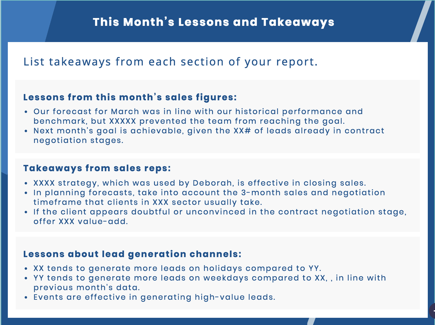
5. Lessons and Takeaways
Finally, add your lessons and key takeaways based on the sales figures, each sales rep’s performance, and the marketing channels overview.
Your turn to make a sales report
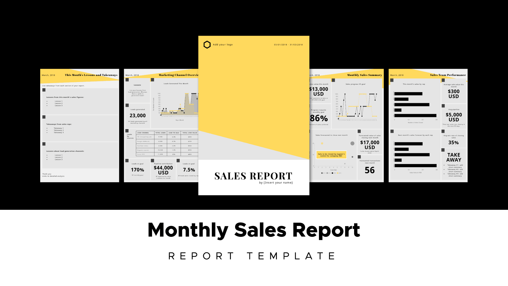
Now that you’ve done some reading up on the key metrics you should include in your sales reports, and have a leg up on data visualization – it’s time to make your own sales report. Try our sales report template on for size!

