We Will soon be updating this post with the latest addition. Another change to our branding direction. Stay tuned! (July 2013)
Revolution of Piktochart Infographics
We have been through several stages and keep on revolving to enhance our product. With more and more new features added to the product itself, the design and user-interface of the application have come into our consideration of revamping in order to give our users the best of the best to experience the product. So does our website, piktochart.com!
If you have been following us, our website had gone through several stage and few revamps. Let me guide you through the revolution of our Pikto Web!
01: The Robot & Machine
First we started off with the robot concept by having robot processing data with factory background.
The illustration and the graphics have portray the fun and interesting side of Piktochart.
Later on, with the revamping of our application new user interface and the brand new sleek and tech savvy logo, we too revamped our website and this time was pretty tough as we wanted to have a complete new look and concept of the website.
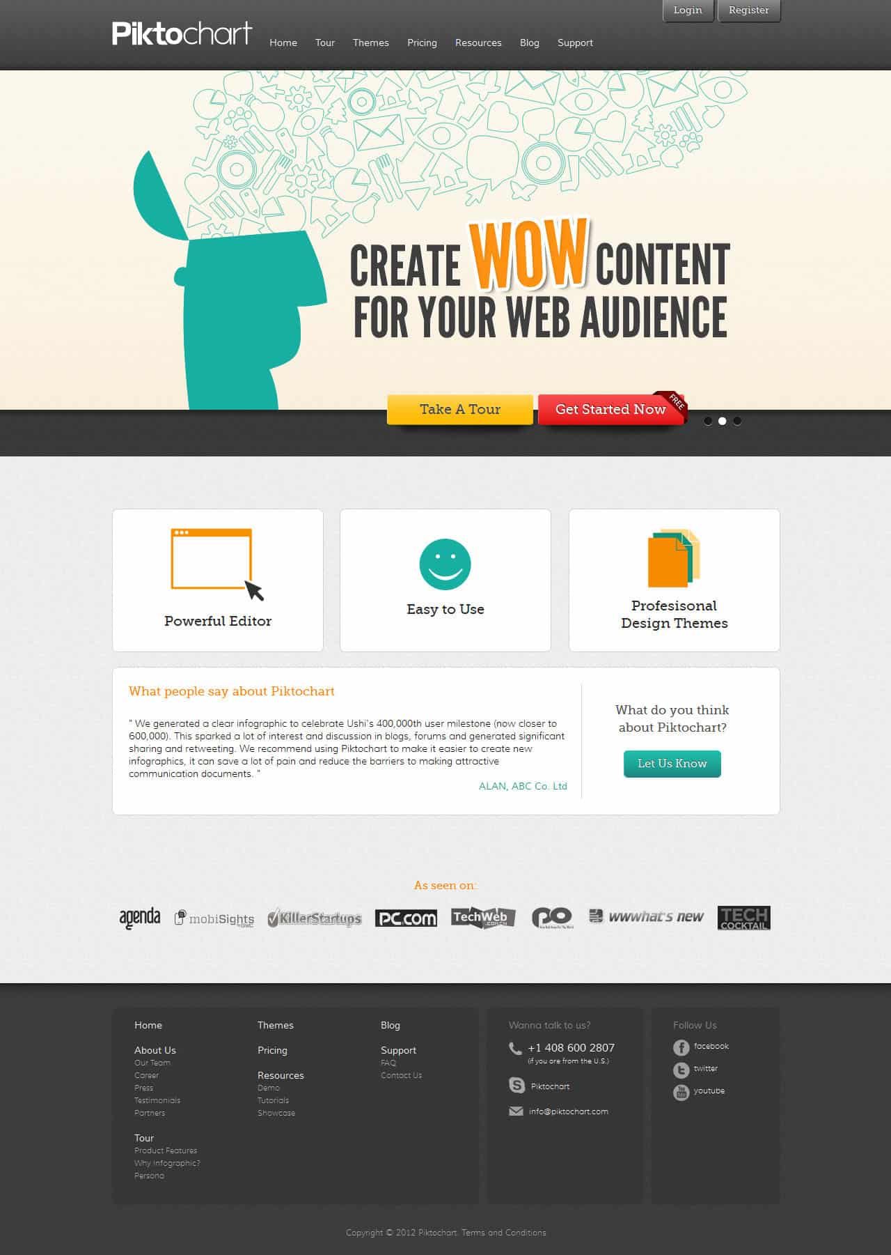
We went through every bites with joy and laughter because of the ideas given by everyone in the team was rather funny. We came to an end by nailing the idea of boiling brain, colourful graphics and happy faces.
02: Boiling brain, colourful graphics & happy faces
Our website feature a happy faces with colourful graphics flowing in the brain representing all the boring data have been replace by beautiful infographic with Piktochart! Each and every page of the website have its own unique banners to shout out different messages. With the new launched website, we are bringing out the message of the fun and easy way to create infographic.
03: The Orange Teal
Soon, in conjunction with the release of version 2 of the application. We enhance our web design a little bit by discarding the colourful graphic and replacing it with white, orange & teal, a fresh combination of colour scheme in the “web 2.0” style sites and apps. The flamboyant orange colour denotes a sense of playfulness and curiosity and teal on the other hand tend to be inviting, cool and confident.
We too did a little arrangement of the layout and making it more user friendly and easy to read
We thank you for being here with us, growing Piktochart with love 🙂
With the newer website launched, you ‘ve also come across the page “why infographic”.. That’s the introduction of how infographic grow from the stone age to this modern millenium era and also the future of how infographic will look like.. the interactive type.
We are currently working on version 2 of piktochart app, so be prepare for another new version of our website too. They’ll be much more fun, fast and friendly. And we thank you for being here with us, growing Piktochart with love 🙂
Cheers
Jen Yen (Designer at Piktochart)


