How do you make healthcare information easier to digest? Healthcare professionals in Malaysia dived into this as they learned the visual art of storytelling during a two-day workshop with Piktochart in October.
“This was the second time we trained their team of statisticians, doctors and nurses on visual storytelling with Piktochart,” says Alison Wok, Piktochart’s Client Engagement Specialist who led the training of 30 research officers from the National Institute of Health (NIH) under the Ministry of Health Malaysia.

At the NIH, researchers “generate a lot of reports, research presentations and posters for health awareness,” Wok says, adding that they were “finding it hard to explain complex numbers and flows during their presentations and were looking for ways to share their message in a one-page poster.”
“Many of them shared that they have been struggling with creating their visuals using design software for graphic artists. One of them told me that it usually takes them at least three months to create a brochure. This year, it only took them a few weeks to produce one using Piktochart,” Wok says.

The Piktochart for Healthcare crash course included an introduction to design and the basic principles of colors and themes; wrapping up with a practical workshop that saw the NIH team create their own posters and infographics.
“Seeing them creating their own content was very fulfilling. You never know how much you can actually do within a limited time,” Wok says.
Check out some of their work:

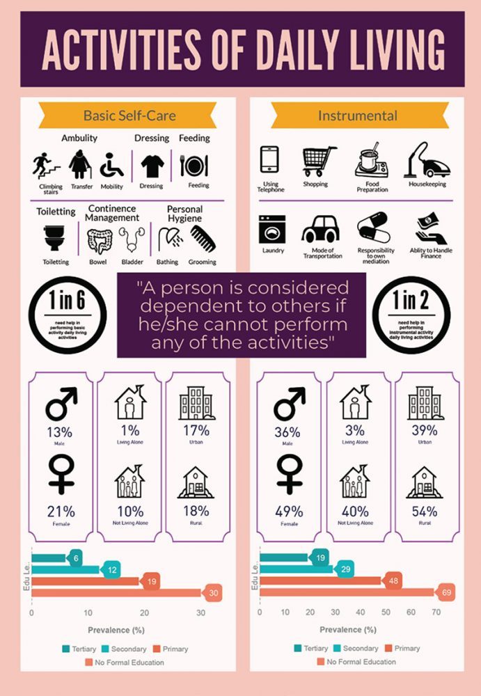


Piktochart for healthcare
There are currently more than 37,000 healthcare professionals using Piktochart to create educational and awareness posters and infographics that are shared to health centers and the general public. Easy design templates cover everything from infographics to visuals for social media posts, presentations, reports, flyers and posters.
Majority of users in the healthcare sector say that Piktochart has helped them improve their public awareness campaigns, with 78 percent saying that the online design tool helps them “communicate complex healthcare information more effectively” and 96 percent saying that Piktochart visuals “help improve general understanding of healthcare topics”.
Wok says health topics can often be difficult to explain, but by “going visual”, these healthcare professionals are bridging the communication gap and making it easier for people to understand health-related issues.