The role of a journalist is to research, shape and share relevant information and memorable stories with readers.
To get the story into as many hands as possible, journalist and bloggers need to leverage the internet. This means repurposing content into many formats– including video, slideshares, podcasts or audio interviews, images, infographics, webinars, micro content – in order to reach the largest possible audience.
One of the most effective forms of content is the infographic. They’re easy to create with the right tools (ahem… Piktochart!) and they’re the perfect avenue for engaging your readers, and establishing yourself as an industry thought leader. They are also visually attractive, memorable and easy to consume and share.
We’ve talked about repurposing articles and blog posts in the past. We’ve covered how to transform text into a visually compelling story, and we talked with Will Blunt, founder of Blogger Sidekick, about making superb infographics for your blog.
Both posts are fantastic and I encourage you to read them, but today let’s take a step backwards and return to the basics. I want to talk about how to use the Visualized Article Layout to repurpose any piece of written content into a beautiful and engaging infographic. And if you want to follow along, you can start by creating a free Piktochart account.
The Mise-En-Place: Preparing for the Roadmap Layout
Yes, yes. I’m aware I’m being a bit repetitive, but there’s a reason. Preparing everything beforehand is crucial to content creation success. I want to emphasize the importance of this process as infographics are no exception.
- Start by defining your goal. What’s the reason for turning your article into an infographic? What’s the purpose of the infographic? Do you want to reach a larger audience? Do you want to offer it to readers in exchange for a subscription? These answers will determine the type and look and feel of your content
- Think about your target audience – Who did you write the article for? This will help you determine the tone of your infographic.
- Start researching the core data of your content. Choose information that is essential and stick to it. Don’t try to visualize everything. Instead, make a list of the 5 or 6 most relevant points and transform those.
- Pick a Piktochart template. We have hundreds of beautiful templates in our library, and dozens that can be used to transform a content piece into an infographic.
- Start working your magic!
Which Piktochart Template Can I Use?
Piktochart has dozens of templates you can use to repurpose a blog post or an article into a stunning infographic. For today’s post, I picked 5 of my favorite templates.
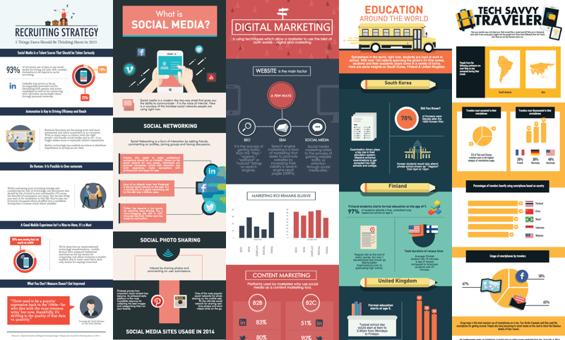
Just in case you were wondering, these are the links, ordered from left to right!
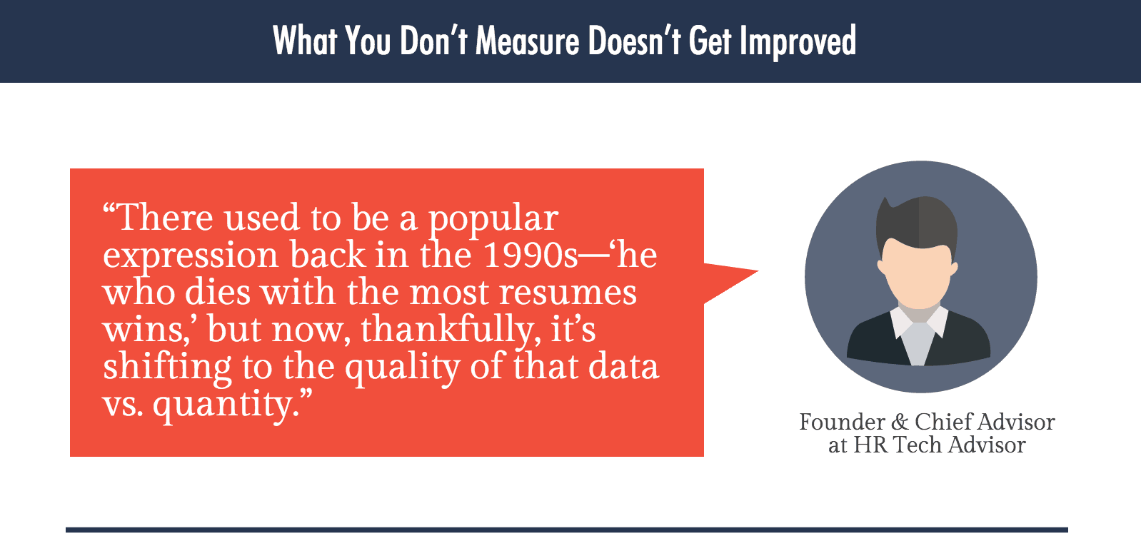
- Recruiting Strategy
- What is Social Media
- Digital Marketing
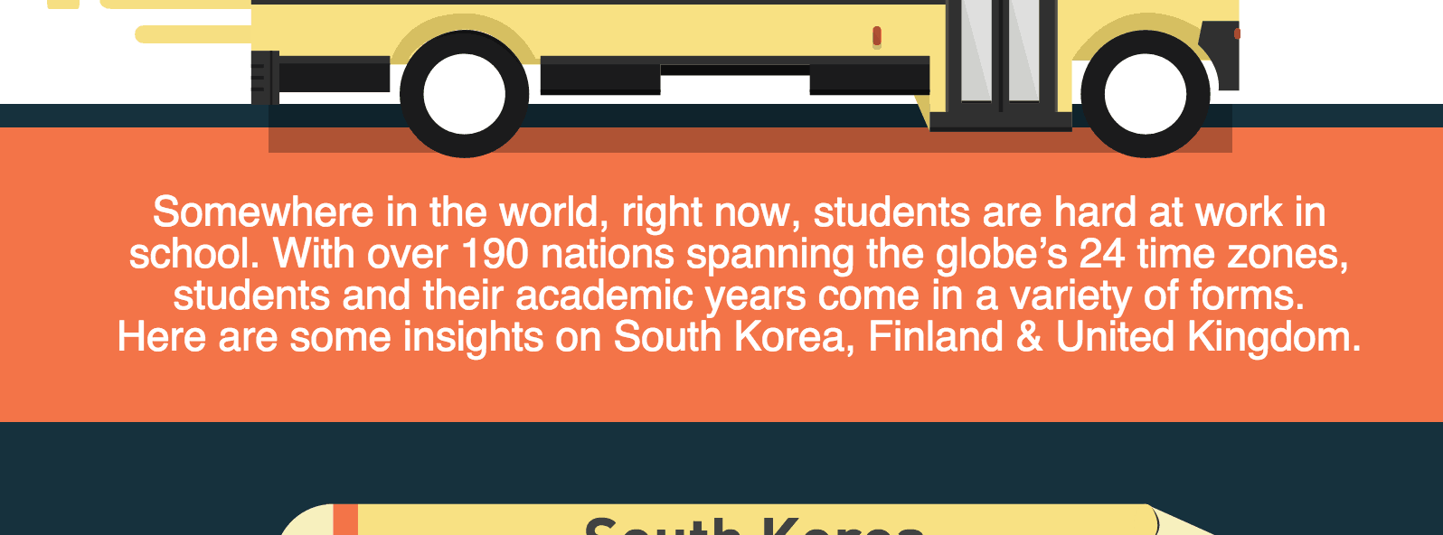
- Education Around The World
- Tech Savvy Traveler
How to Structure your Visualized Article Infographic
Once you sign up for Piktochart and pick your favorite template, it’s time to start thinking about how to structure your content and design. Our recommendation is you should approach it as if you are writing an essay for school: it has to have a clear separation between title, introduction, content and conclusion.

The Header
Start by creating your header, which in essence, is the title of your infographic. It’s the first thing users read, so it should be clear, concise and attractive, and should summarize what the infographic is about. For instance, if your infographic is about 10 simple paleo recipes, a fantastic title could be ‘Delicious Paleo Recipes’. Simple. Concise. Illustrative.
Now, there are three basic approaches for the header. The first includes a title and icons positioned in different ways (one icon, or many as the example below). Try to do some mind mapping and think of icons that visualize your industry, and the topic of your content.

The second approach is even more simple. It involves a simple title, and one of Piktochart’s pre-designed background. One great examples is the Digital Marketing template.

The third format uses a background photo, and a text frame for the title. A perfect example is the Blogomatic template. This is specially useful for creating Real-Life Infographics!
Remember: we just launched our photo search functions, which allows you to explore and use +3000 photos for your infographic, right from the Piktochart editor!

The Introduction
After the header/title block, you should plan a separate block for the introduction. The introduction is a brief explanation or preview of the content. We suggest you keep it simple, as the goal isn’t to explain the entire topic, but to get the audience’s attention before engaging them with more details and data.
The Content
This is where the magic happens. The content is where you make your point and illustrate what you want to transmit to your readers. You have a bit more flexibility, and you can go into some detail, but you shouldn’t create more than 3 blocks of content.
Imagine each block as an essay paragraph. Each one explains a different topic, and has a different layout. If you observe the example structure at the beginning of this section, you’ll see that Content Block I, Content Block II and Content Block III are all different.
To achieve this effect and deliver the best message possible, you can use charts, maps, points, parts of a timeline, heavy data and other layouts applying the rules we talked about in earlier posts.

The Conclusion
The conclusion is the closing argument of your message. It’s so important that it deserves one full block in your design. This is the perfect time to encourage readers to do something else by adding a clear call to action, like sharing the infographic with friends, or subscribing to the blog.
(An Optional Quote)
This, although entirely optional, is a great way to end your design. You could use a good summary of your infographic to make a point, or put forth a quote by an authority figure in your field.
The Source Of Your Information
Now, this is really the end! When you take data from different places (which you should do if you want to add relevant facts and figures for your readers), it’s important to give appropriate recognition to your sources by linking to them at the very end of your design.

Put your newly acquired knowledge into practice by signing up for Piktochart and picking a template that sparks your creativity.
This post is part of September’s Layout Series. Feel free to check it out!
Create your own infographic in Piktochart
Start for free by creating an account. Upgrade later.
Create your visual