Sometimes we ask business people around us and randomly in the web whether they use infographics and, if not, why?
Some say that infographics are not the most optimal content format for them, some say they lack time or tools (“How could I create graphs like in economist.com? I am not an information designer, I don’t have time! I can just throw my hands up, to add some drama.“), and some voice out that “infographics aren’t serious to be used for business“, citing numerous examples of infauxgraphics (if you don’t know what infauxgraphics are, check this blog post by Timo Elliott) that include memes and lolcats.
Can I create something good?
So there was a challenge for me: create an economist.com-like data report with limited time (and budget).
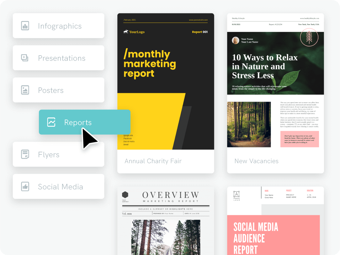
Theme in piktochart.com: Presenta board
Time: 1 hour 15 minutes
Cups of tea consumed: 2
Money spent: $0 (sign up for a free account in piktochart.com)
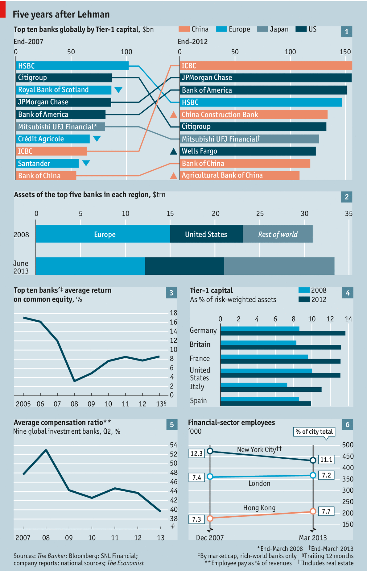
On September 14th, The Economist published a data report on the global banking industry, comparing the year 2007 (before the U.S. subprime mortgage crisis) and 2012 (5 years after). I tried to replicate it (Note to economist.com: it’s just for demonstrative purposes) and see the results! What do you think?
If you don’t fancy the style or the colors, you can choose a different template and freely adjust the content, fonts, colors, etc. so that the infographic report matches your presentation color scheme and/or company branding.
If you feel you need some help with infographics and the editor, check our “Support” webpage.
Hope it helps!
Infographics as business reports
Properly designed infographic reports can enhance company image and improve a report’s readability (and thus readers’ involvement in the company issues).
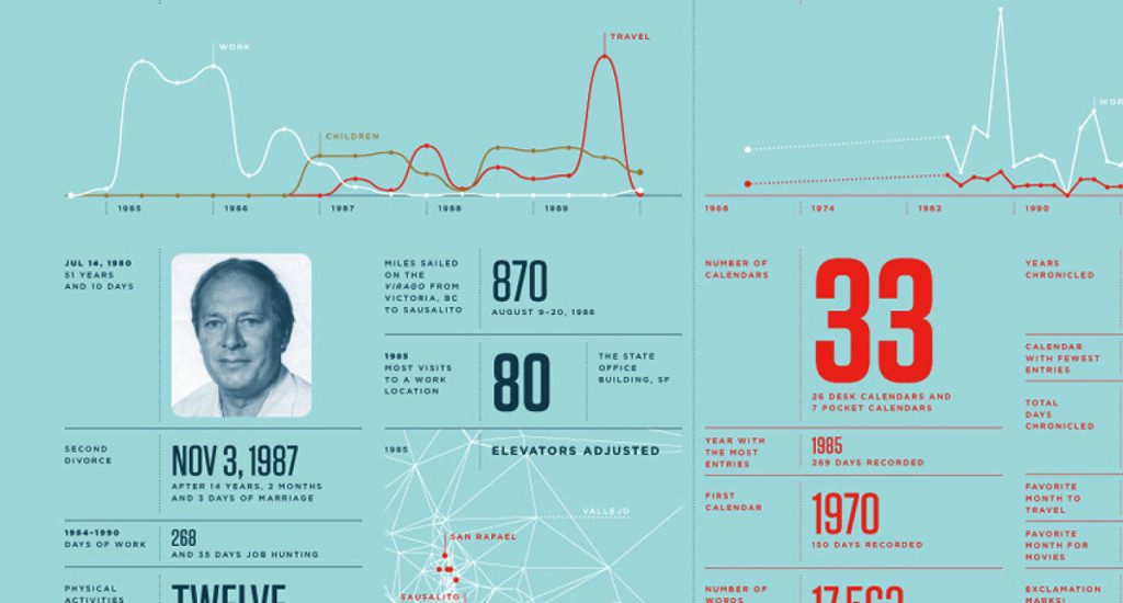
The most famous infographic reports were created by Nicholas Felton who recorded his activities during a year and “weaved numerous measurements into a tapestry of graphs, maps and statistics” in a yearly report (read more about his on his website). An example from his report:
Following the make-it-visual trend, corporations also jumped on the bandwagon and started experimenting with visualizations and infographical elements in their reports and other corporate material. An example from General Mills, an American Fortune 500 corporation, primarily concerned with food products, PR release on results for the first quarter of fiscal 2014.
Another example from Ernst & Young, the third largest professional services firm in the world and one of the “Big Four” accounting firms, that also harnesses the power of visual representation of information in its text heavy insight reports.
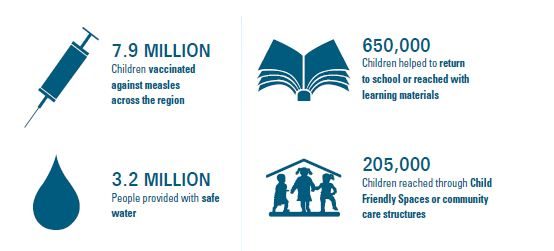
The last example comes from UNICEF, an international humanitarian organization, that uses short bits of infographic to report its results and achievements.
So are you convinced?
With Piktochart, you can create infographic reports, presentations, posters, social media graphics, and more. Get started by signing up for free.
