Client reporting is essential for professionals and freelancers. Unfortunately, it’s also time-consuming.
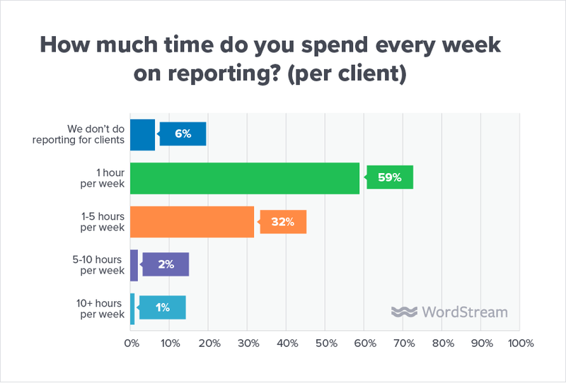
Wordstream’s 2019 State of the Internet Marketing Agency in 2019 report found that 59 percent of its respondents spend at least an hour (per client) on reporting every week.
The importance of client reports
Part of effective client management and retention is knowing how to communicate effectively.
When it comes to official business matters, every opportunity to interact with your clients must be on point. You want to meet your client’s wants and needs, providing them with information that’s important to them while also valuing their time. Naturally, the client report plays a vital role in communication.
Reports are a tool for conveying results clearly, and they support transparency by putting you and your client on the same page. When done right, reports keep your client engaged and committed to meeting your shared goals.
Unfortunately, many people fail to take advantage of their report’s potential. This leads to the chronic problem of boring reports—10-page documents filled to the brim with soporific text and statistics.
Sure, reports aren’t exactly known for being the most riveting of reads. But with a bit of visual design and thoughtful presentation of data, even the most numbers-heavy report can be interesting to your clients.
In this guide, we’ll go over a few ways to take your client reporting to the next level
Types of client reports
Marketing reports
Marketing reports can be as broad (i.e., high-level) or specific as you want them to be. These days, marketers churn out reports for:
- Social media marketing
- Search engine optimization (SEO) and search engine marketing (SEM)
- Organic traffic
- Pay-per-click (PPC) campaigns
- Advertising campaigns
Marketing reports play an important role in showing that your client is getting a healthy return on their investment.
Always include metrics and key performance indicators (KPIs) that you and your client agreed upon at the onset of any marketing campaign.
This ensures that all expectations are being met. If not, your report will indicate how far you still need to go, and how to get there if things aren’t working out at present.

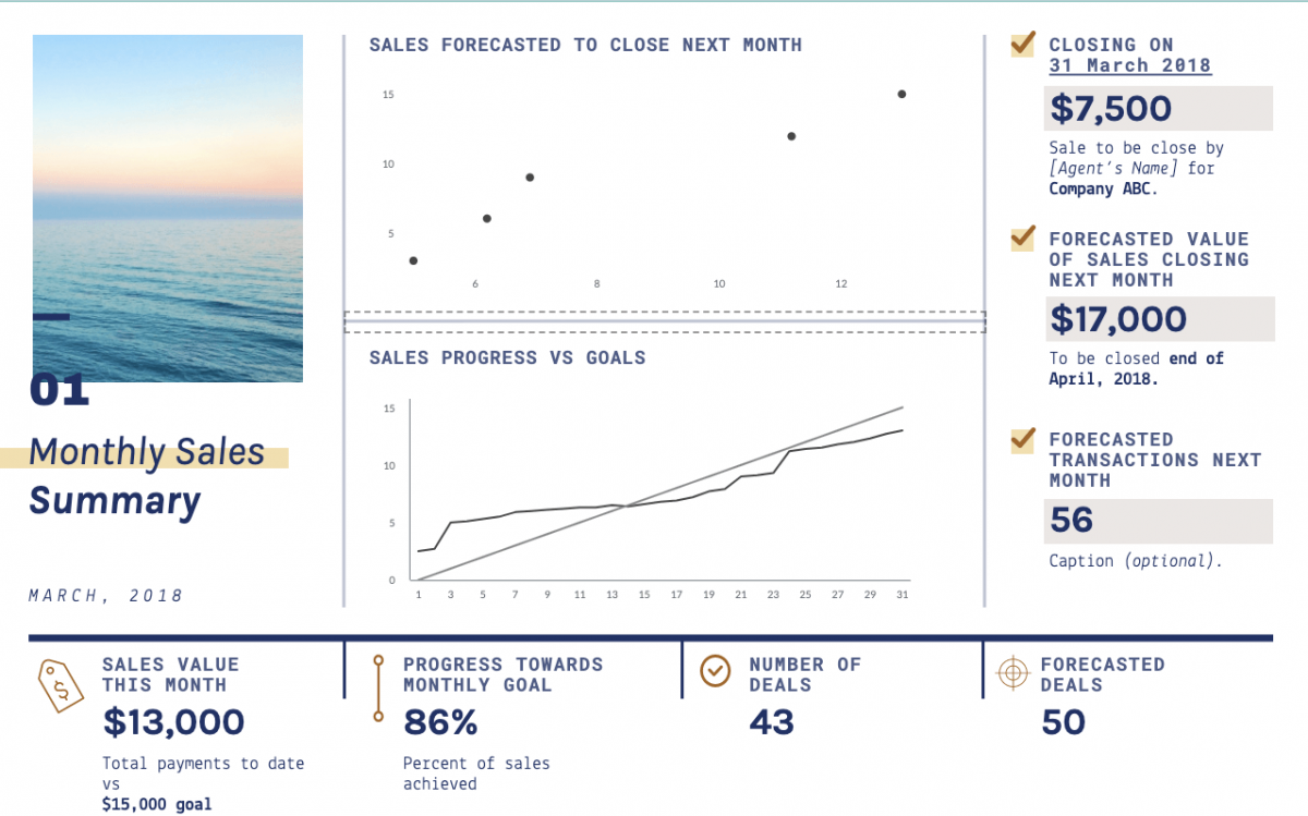
Sales reports
A sales report, also known as a sales analysis report, provides the client with an overall picture of the condition and results of sales activities that happened within a defined period.
It can explain the results of sales promotions, trends in sales volume over a certain time, customer profiles, and the performance of sales executives.
Sales reports also come in different forms, depending on the objective. For example, a daily sales report format might provide a list of KPIs that fluctuate every day, such as the number of phone calls and the number of leads generated from those calls.
Research report
Every student is familiar with the research report, which conveys information about the study’s premise, its methodology, its summary of findings, and its conclusion.
When it comes to client reports, however, research reports must have an actionable interpretation of the results—something the researcher feels the client may be interested in and act upon for a favorable result. For example, if you conducted market research for a client who wants to open up a new product line, your client report can answer questions such as:
- Is there a demand for this product line?
- Who is its target audience?
- Is there a newly discovered market segment worth exploring?
- Which companies offer competing product lines?
Project management or progress update report
A project management or progress status report communicates the current status of a project to your client and other relevant stakeholders (e.g., partners, investors, etc.).
The report is where you can give your client an overview of its present condition, the milestones you’ve accomplished, the challenges you (and your team) are facing, and what you’re doing to overcome these challenges.
This type of report is also an opportunity to make a budget/change request or recommend a new deliverable.
Investor report
Investor reports allow you to communicate any important updates, achievements, milestones, setbacks, and numbers to your client and other stakeholders. This kind of client report provides a thorough sense of where the company currently sits, and the direction it’s going towards.
Investor reports are usually designed to inspire confidence and optimism in the investor, which is why many reports these days use data visualization to make numbers easier to read and understand. Charts, graphs, and diagrams are common in these types of client reports.

Industry report and forecast
Industry reports provide an analysis and evaluation of an industry or market. They begin with a high-level overview, then delve into specific topics.
Industry reports are usually designed to give clients a comprehensive understanding of a particular industry, including market size, key players, history, industry trends, and forecasts. You always want to end these reports by answering the question, “Now what?”
Make sure your client can use the insights in your report to make a strategic decision.

How to write reports for clients with a visual twist
Now that you know about the different types of client reports, let’s go into the nitty-gritty of creating one of your own.
Determine what type of report you want to present
First things first: choose what type of client report you want to create. Your choice depends on what your client’s expectations are and what kind of information you wish to communicate.
This may seem like a basic step, but it’s common for people to start off with one client report type, then change their mind halfway through. For example, a marketing report can inadvertently dive into sales challenges. Remember, pick a type of report and stick to it.
You want a lean but informative report that contains only information that’s of absolute importance to the client.
Understand the audience’s needs
Next, take a moment to understand who you’re creating the report for. Knowing your audience will help determine which datasets the reader considers most important, and what angle to take in presenting those data.
Apart from your client, your report may be passed around to members of the organization’s upper, middle, or line management, as well as other departments.
Meanwhile, if your report is external-facing, visual elements like branding, colors, images, and logos go a long way towards making your report appear professional.
Here’s an example of a WWF report that’s consistent with the nonprofit’s image and brand.

Plan the data to be presented
Next, decide what type of data you want to present. This will set the parameters of your report, and lead to a clear and cohesive document. Examples of data types include:
- Factual information
- Analyses and correlations (i.e., relationships)
- Recommendations and justification for further action
- Conclusions from an investigation
- Feasibility studies
- Metrics and KPIs
Knowing what type of data you want to present in your report makes it easier to decide how to visualize it.
For example, a marketing report showing performance over time can use line graphs and side-by-side comparisons.

Stick to facts as much as possible
A good client report describes past, current, and possible future situations in a clear and objective manner.
When reporting facts and figures, you want to be as objective as possible and keep opinions to a minimum. Give your client the full picture with little to no distractions.

Yes, certain types of reports will have analyses and recommendations. However, these are usually found at the tail end of the report.
Here, you can go into what the numbers mean, why certain things happened, and what you need to do to reach your client’s goals (and maybe even exceed them).
Write clear and sharp content
Don’t try to impress the reader with your writing prowess. Be concise and sharp with your writing. Remember, your client may not have time to read a long report.
Go straight to the point and use unambiguous language, keeping technical jargon to a minimum. If you can’t help but write long sections of text, break paragraphs apart with headings and subheadings.
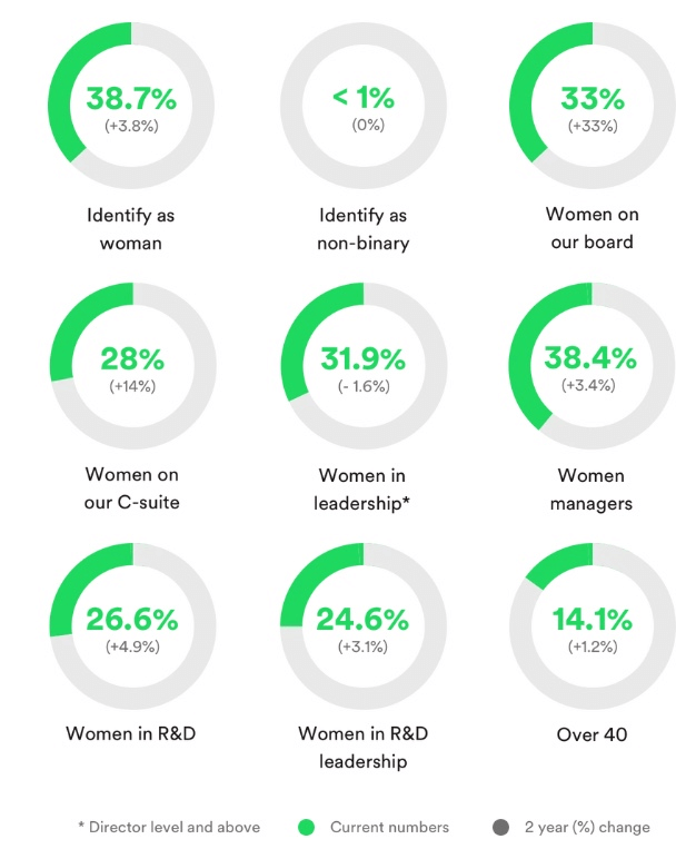
You can also use bullet points to help your client quickly see crucial information in the report. Better yet, consider using more visuals and less text. For instance, you can use a pie chart to visualize percentages and proportional data.
This example from Spotify puts this visualization technique into action.
Contextualize statistics and figures
Numbers and statistics are unavoidable in most client reports. To help your client understand what the numbers mean in your report, try to answer these questions:
- “What does this number mean?”
- “Why should the client care?”
Without any context, numbers and statistics are hard to remember and have little meaning. So whenever you need to communicate large numbers, try to connect this with the big picture. Take a page out of Apple’s playbook.
Its annual Keynote events are where the company talks numbers, including the number of devices sold, number of upgrades to the latest version of iOS, and current market share.
During WWDC 2014, CEO Tim Cook announced that Apple had installed over 40 million copies of its Mavericks operating system.
But he also added this little tidbit to add context to the statistic:
“Also, that makes over 50% percent of our installed base working on our latest operating system. This is the fastest adoption ever of any PC operating system in history.”
That additional fact places more meaning on the company’s ‘40 million copies installed’ achievement.
Wow the reader with data visualization
Now it’s time to get fancy with data visualization techniques and tools!
Presenting data visually through charts, graphs, and diagrams enable the reader to quickly understand complex concepts and grasp new patterns.
You can also use the visual elements commonly found in infographic reports to give a stronger visual impact. The clever use of relevant graphics, icons, images, and colors can elevate your report and make it a joy to read.
For more on this topic, check out our full guide on How to Communicate Using Data Visualizations.
Don’t forget the “Now What?”
As mentioned earlier, your client report must be actionable. Any data you present must lead to insights that clients can use or learn from.
At the end of your report, summarize the information you presented and provide a logical conclusion. This will ensure that your report tells a complete story that tells the client:
- This is where we were
- This is where we are now
- This is how we will take things to the next level
Create a winning report with Piktochart
Client reporting may not be fun, especially for someone averse to filing paperwork. But it nevertheless represents an important opportunity to illustrate and quantify the results of your work to your clients.
Clients, in turn, simply want to stay abreast of how things are going, whether it’s a project or portfolio you’re managing for them, the progress of a specific task, or an update on their return on investment.
Your job is to ensure they’re constantly engaged and up-to-date with your work.
Use Piktochart’s graphic design software to make your next client report informative and visually effective. Customize our wide range of samples for your marketing and sales reports, or progress and analytics reports.