Data visualization is the practice of using visuals, such as charts and graphs, to illustrate the meaning and context behind data. Every online activity that we participate in leaves behind huge trails of data exhaust. With so much raw data to work with, it can be a daunting task to navigate, analyze and interpret.
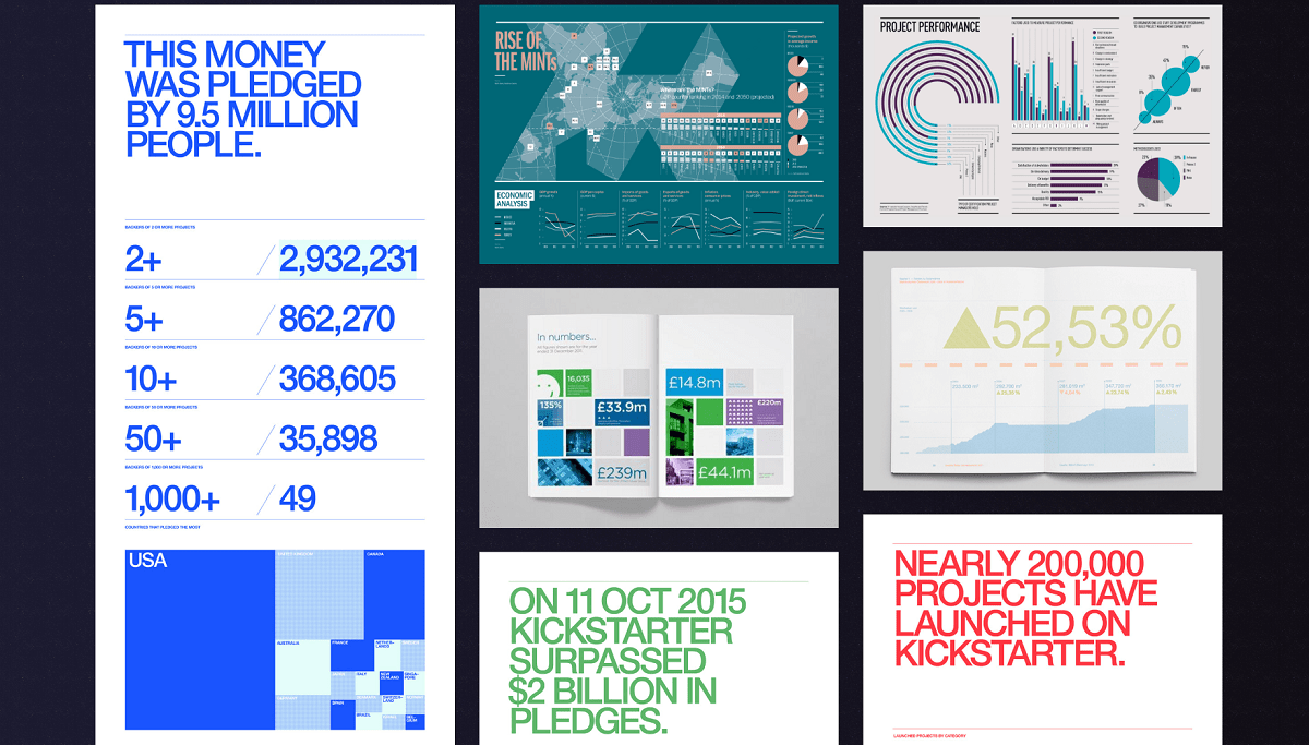
Which is why we put together this interactive site made up of 85 eye-catching data visualization examples, to inspire and motivate you in your next project. Click the below image to check it out!
Being mindful of how to enlighten your audience with data is crucial. Instead of frightening them with huge amounts of numbers, a little bit of knowledge in data visualization can really go a long way.
Visuals like bar charts are ideal for value comparisons, while line charts work much better in displaying trends. You can also use stacked graphs and donut charts to showcase the composition of data.
Let’s hop right in!
Selecting the Right Chart
Comparing values
Bar charts are ideal for comparing unique variables. It helps in gaining an overview of the highest or lowest performing categories.
Always start with the axis at 0 when plotting these graphs. Also, the bars should only be in one colour unless you want to specifically point something out.

Use horizontal bar charts when you have long data labels. You can display the variable name on the vertical axis.
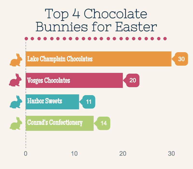
Horizontal Bar chart
Source: Easter Day Template
Showing Composition of the Data
Pie charts, stacked graphs, and donut graphs are commonly used to provide readers with a quick understanding of what the bulk of your data is made up of. It shows the proportions of each category by dividing a circle into arcs.
For this type of chart, it would be best for you to have no more than six categories. Having more than that would confuse the audience as it is hard to properly assess proportions on circles.
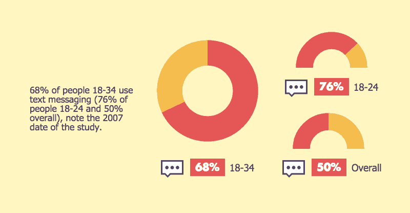
Donut Chart
Source: Mobile Text Message Usage Template
Piktochart also has a stacked graph feature that allows you to visualize parts to whole relationships and number in sections. The drawbacks of this, however, is that when you have too many segments with around the same size, the chart will get messy and confusing. In that case, it would be better to group the proportions and use a bar chart.
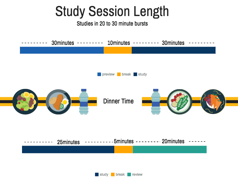
Stacked Chart
Source: Student Time Management template
Analyzing Trends and Data Sets
Line graphs are used to display quantitative value over a continuous interval or time span. You can plot this with other lines to identify trends and relationships over time.
The line serves as a guide to the eye and helps in recognizing a trend faster, as compared to dot graphs. Keep in mind that this should not be used in correlation-type graphs as the lines would interfere with the dots and make a mess.
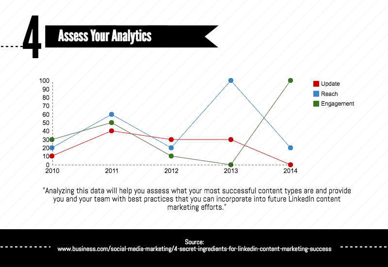
Line Graph
Source: Content Marketing Success Template
Distribution in Data
Scatter plots display values from a variable on each axis. These two variables can suggest whether or not there is a relationship and how they correlate with each other. You can also determine correlation strength and relationships as to whether it is positive, negative, or null.
Here’s an example of a scatter plot adapted from the vertical bar chart above and added with another variable called ‘life expectancy at birth’. From this, we can infer that there is a positive correlation between both values.
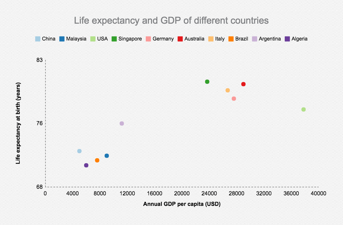
Scatter Plot
Special Charts
The Piktochart graph editor has its own few custom features, here are some of them.
Gradient hierarchy & icon matrix
Gradient hierarchy and icon matrix are graphs that can be customized using an icon from the Piktochart library or your own SVG (scalable vector graphic). Both can be used to provide a brief overview of the distribution and proportions of each category in a data set. The best part about this is that you can customize your message.
Icon matrix charts are used to display discrete data in units of dots, each colored to represent a particular category and grouped together in a matrix.
Pro tip: Try using a clear and simple picture to represent your icon!
![]()
Icon Matrix Chart
Source: Dark 2 Template
The gradient hierarchy is visualized as a whole of an icon where the area taken up will be proportional to the value in the data set.
Gradient Hierarchy
Source: Seasonal Template
Flowchart & process diagram
Piktochart has no shortage of flowchart templates to showcase the process or timeline of an event. You can use flowcharts to explain a series of sequential steps by using a set of connected symbols. This makes it intuitive and relatively easy to understand.
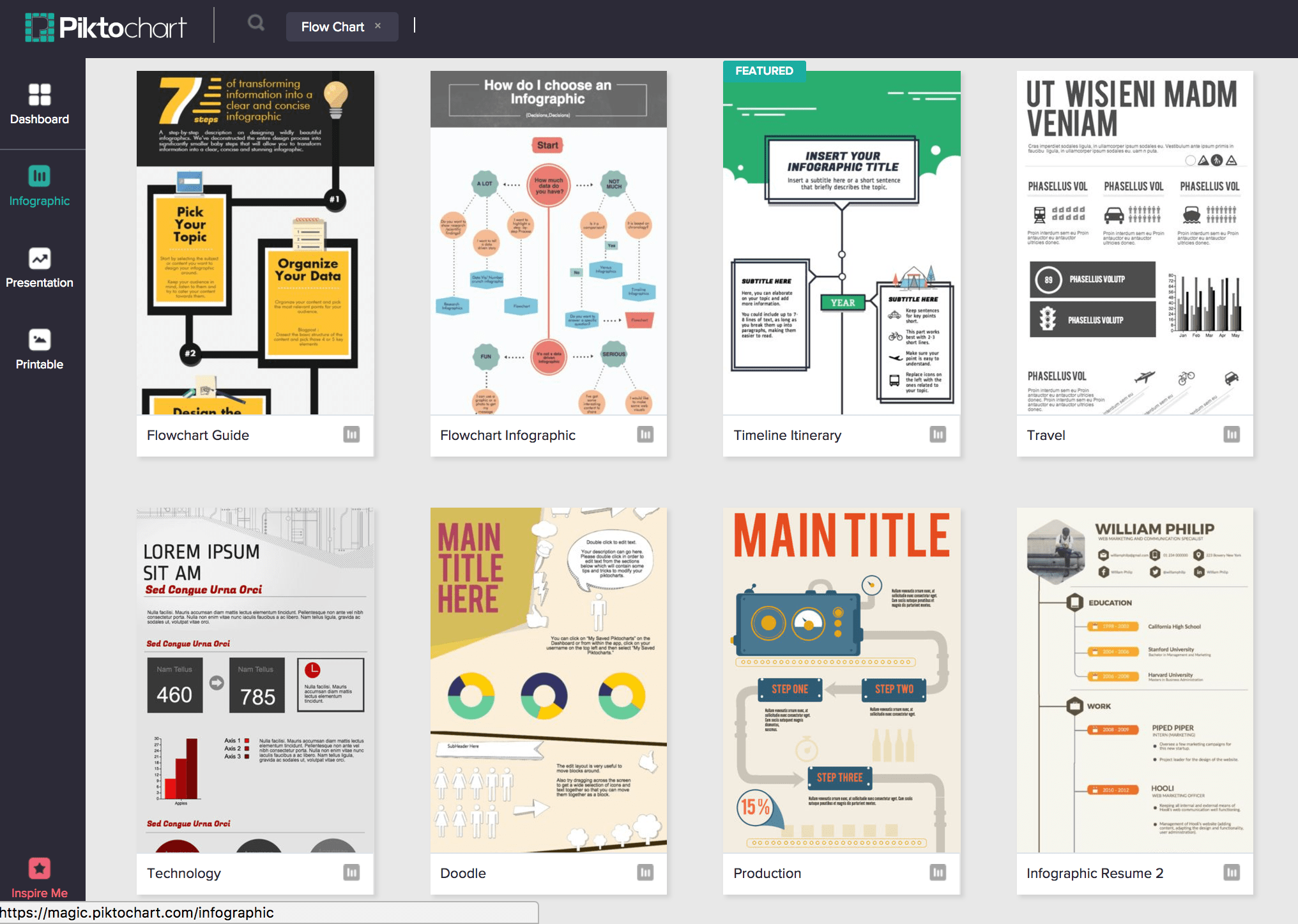
Flow Chart Templates
[clickToTweet tweet=”Every chart has its own story to tell, visuals speaks a thousand data points.” quote=”Every chart has its own story to tell, visuals speaks a thousand data points.”]
It’s imperative to always have a clear end goal in mind before you even start creating charts. Ask yourself, what message would I like to convey with my data?
I’ve curated a set of templates for you to try recreating what you’ve just learned about these charts. Go ahead and give them a try!
01. Content Marketing Audit Presentation Template

02. Annual Business Summary Report Template

03. Product Pitch Presentation Template

04. Social Media Report Template

05. Daily Progress Report Template

06. Client Research Report Template