Once upon a time, startups had nothing but their wits and smarts to get them through the hard times. Facebook, for example, had no YCombinator to turn to for connections and advice.
Today, we have resources and advice in bountiful abundance, but this presents yet another problem: there’s just too much of it out there now. One day, there are 16 essential metrics that any SaaS startup should track. Barely a month later, yet another 16 are added to the list.
But there’s one thing that everyone can agree on – that growth is the key to success. YCombinator’s Paul Graham puts it well:
“You have to know that growth is what you’re after. The good news is, if you get growth, everything else tends to fall into place. Which means you can use growth like a compass to make almost every decision you face.”
Over the past three years, we’ve been blessed with good growth here at Piktochart. Back in 2012, we started off with just three paying customers. Today, we have over three million users – and growing rapidly.
Not to rest on our laurels, our team works tirelessly to figure out what works and what doesn’t in order to delight our users. To determine this, we use 500 Startups founder Dave McClure’s famous Pirate Metrics (thusly termed because of its acronym AARRR), and here’s what we’ve learnt so far.
You can also check out our templates for presentations, reports, infographics and social media graphics and create an account to make beautiful visuals using them.
AARRR!
Many companies track metrics by the funnel, and then try to improve conversion rates from one of these stages to another.
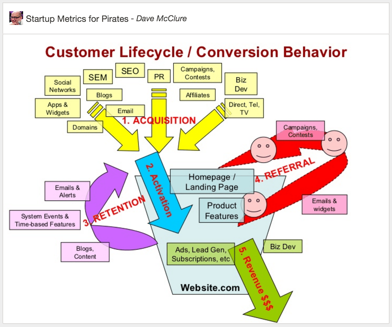
For the uninitiated, AARRR represents the five key metrics that Dave believes maps out the customer lifecycle, as shown below:
To be sure, there are other similar models out there as well, such as Hubspot’s “Attract – Convert – Close – Delight” methodology, which we think is more relevant for B2B companies with sales models.
There’s also the age old AIDA model that was invented way back in 1893, and is as such slightly outmoded today:
- A stands for Awareness: Attract the attention of the customer.
- I stands for the Interest of the customer.
- D stands for Desire: To convince customers that they want and desire the product or service and that it will satisfy their needs.
- A stands for Action: To lead customers towards taking action and/or purchasing.
As for us, we’ve been looking and utilizing the AARRR model as we found it to the closest one that models most typical user behavior in SaaS. Here are Piktochart’s big picture metrics right now:
- Acquisition: Number of user sign ups (+/- percent compared to week before).
- Activation: Percentage of users who saved an infographic (after they have signed up)
- Retention: Percentage of users who come back in week one, month one and, month three (we actually track week by week until week 10)
- Revenue: Breakdown by different pricing. Percentage of paying users that are continuously paying on a monthly basis (paid churn)
You might have noticed that we left out the last ‘R’ of the pirate metrics, which stands for Referral. This is deliberate – we have not found a good way to track referrals to our product just yet. Instead of just using a placeholder metric, we are not tracking this now.
Acquisition
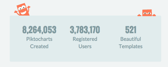
Determining our acquisition metrics is pretty straightforward. We pull the numbers directly from our database, and update them on our log in/sign up page weekly for all our users to see.

We have also included the total number of infographics created in our metrics, as sign-ups are not the only way of seeing how well the app is performing.
Activation
When it comes to activation, we look at the number of people who we think understood how to use Piktochart, and what the purpose of Piktochart is. This is determined once they have successfully created and saved an infographic in Piktochart.
For example, by looking at one of our tutorial videos alone, a user may get a rough idea of how Piktochart works, but still fumble around when actually trying to generate an infographic with it.
Similarly, a user that signs up might have a half an idea of what an infographic is for, but not fully understand how to create one.
Retention
For retention, we track how often our new users log in on a weekly basis, and we also look at this number on a monthly basis. We also track the number of sessions that each user has logged, which implies their frequency of use.
However, we have found that this may not be the best metric for us to determine retention accurately – more on this below.
Revenue
In terms of revenue cohort analysis, we are using co-founder of Point Nine Capital Christoph Janz’s free spreadsheet to calculate this.
Our customer lifetime value – the average length of time that a user remains on our Pro plan, or subscribed to a paid plan – is generated out of this model.
Additionally, we track these metrics too:
- Burn rate: How much we are spending per month. This includes everything from payroll to servers, operational and marketing costs. I have to say that we’re not acutely aware of how much we’re spending on a weekly basis, but we find it sufficient to calculate this on a monthly basis.
- Revenue run rate: How much revenue we’re getting on a weekly basis. In fact, we’ve just built an in-house system to query this by time. This helps us to calculate our rate of growth or decline on a weekly basis.
- Gross margins = Revenue – Burn. This can be projected on a monthly basis. We try to keep this to a 40 percent net margin.
What are some lessons we learned along the way?
-
Clearly define each metric and the reason why we’re tracking it
Like any other go-getting startup out there, we’re always tempted to track just about every click on Piktochart. However, we know it’s not very wise as it consumes a massive amount of data storage. Right now, we use between 20 GB to 200 GB of space.
Very recently, though, our activation metrics have been brought under scrutiny. As noted above, it was previously defined as number of people who understand the purpose of Piktochart and how to use it. We noted this with every new user who signed up, all the way up to the point when they saved an infographic.
This definition, however, has always simply been an assumption, and has not been tested until now. As such, we’re now embarking on the process of finding what really defines activation for us.
So far, we believe there are two actions that someone who has understood the purpose of Piktochart and likely learned the app will take:
- Publish or download the infographic as an end result
- The finished infographic should contain no “lorem ipsum” text that was originally in the template
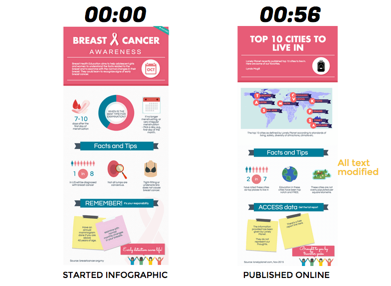
- Additional helpful data: the time it takes for a user to get from the start till end of a creation process
Once the definition and how to track it has been agreed upon, we can optimize the onboarding experience to get our users as close as possible towards activation. The end result:
Purpose of tracking Activation = Improving the learning curve of Piktochart
2. The metrics you track are unique to your app
Understanding who our users are and mapping out their journey are the first steps towards determining what needs to be tracked. Every user journey is unique, and there’s no template out there that can outline yours with 100 percent accuracy.
Here’s the journey that our users take:
- Sign up/log in
- Select a template/ saved infographic
- Edit
- Publish/download/save
- Share (offline/online)
- Repeat
3. Do not pick a number “just because”
Facebook’s famed “magic moment” – which occurs when a user has 10 friends in 14 days – is what they believe gets users to likely become returning users.
When attempting to find this mystical magic moment, it is best to look without bias at the totality of the sample, and figure out if there are any patterns that stand out.
For example, we ask ourselves when looking at our most active users: What did they do in the first month or week of their time in Piktochart? How many infographics did they create? Did they regularly log in?
We’re still in the process of discovering whether there is a “magic moment” for Piktochart’s users, so stay tuned.
4. Retention is a lot more complex than just tracking weekly/monthly cohorts
Retention is the holy grail for every SaaS app. However, not all SaaS apps should look at the same DAUs (Daily Active Users) and MAUs (Monthly Active Users).
To tax submission software TurboTax, when a user logs in once a year to file tax returns, that is considered as good retention.
To Facebook, that user has most definitely lost interest altogether!
Likewise, Piktochart’s retention is affected by:
- Seasonality: We have slow and peak seasons, and no surprises here, but traffic is a lot lower during both summer and winter holidays!
- User segments: In terms of frequency and product usage, not everyone has the same returning frequency. Some may have reports that they need to generate once every six months, while others create blog materials once every week.
The above has caused us to look into other metrics, and not take our weekly and monthly retention reports as sole indicators of how well the app is doing. For example, we now look into:
- The time that a user takes to complete an infographic: From loading a template until they publish/download it
- The number of infographics generated within a certain time frame
- Our net promoter score: From 1 to 10, how likely are you to recommend Piktochart to a friend?
5. Track log ins with timestamps on your own from an early stage
We used a combination of Google Analytics, Intercom, and Kissmetrics previously, and relied on their ability to help us do cohorts and the like.
Because the data that was given was aggregated, though, it was difficult to do meaningful analysis or to try to pinpoint the specific area of improvement. Storing important data such as login times was therefore helpful to have on our own database.
What we could track better
In general, it would be better to track every metric with more details. For example, we could have tagged every user by channel (SEO, social media, referred by Piktochart) so that we understand if any of our activated users came in from any of these channels.
We used Kissmetrics at the beginning for this type of analysis, but it began to get really expensive for the data that we were tracking, and also did not give us a detailed picture of what we were looking for.
In short, these are the data points that we hope to improve on in terms of granularity and tracking in the future:
- Number of sign-ups: Which channels do users come in from, and which give higher retention/conversion to our Pro plan
- Time taken in order to complete an infographic: This could help us to understand how much time people take in order to complete an infographic – although it is quite subjective. I might create a one-page flyer on the go, while a communication executive spends an hour every day for two weeks to polish his report for a client.
- Number of infographics created: Look into the length of infographic (purpose), number of items per infographic (complexity), and time it takes to create an infographic (effectiveness of our tool to help people create something)
- Where do users drop off on their onboarding: From the moment they sign up, until they save, download, or publish an infographic? We will also look into “time to complete infographic” and “customer tickets” that were raised while creating an infographic
- We haven’t gotten to the stage of tracking virality or referrals yet, because we do not have an in-app mechanism for users to send invites or invite their friends to join Piktochart. The most similar action to virality is when a user shares their infographic to the world.
What metrics do you track at your organization? We would love to hear from you, and we’ll be happy to update the article to include more tips from you!
With Piktochart, you can create beautiful infographics, presentations, reports, posters, and social media graphics within minutes. Sign up for free, and upgrade annually to get five months free each year!
Image via Flickr


