Imagine that you work in education, and your role as a training consultant has you focusing on developing the likes of course materials, presentations, and videos. So naturally, when there comes the need for marketing and communications related initiatives, the work would fall into your inbox.
For one of our users Eunice Ng, the Principal Consultant with the Ong Teng Cheong Labour Leadership Institute in Singapore, she focuses mainly on running training sessions and developing the course material for them. She is also expected to do a bit of marketing in her role, which can be tough if you’ve been specializing in learning and development your entire career.
Luckily for Eunice, she is comfortable with channeling her inner artist so she didn’t take much of an issue with tackling marketing work.
“I have always been a visual person. When information is presented in a visually appealing way, I feel happy. When I was in school, I used to write and draw my notes out.
Others would think I was just doodling, but I actually would draw my notes out in order to help me remember. It just helps me think, and I still do that at work – I am always doodling on my iPad during meetings,” she said.
The interesting thing is, amidst her doodling, Eunice found that she would come up with a myriad of ideas and solutions in this way. She likens the infographic as the “digital version” of her notes and believes that the strength of the infographic lies in its ability to combine information with graphics to tell a story, which is useful for her marketing work.
When asked to “revive” the organization’s internal communications, Eunice knew that she wanted to use infographics to communicate messages that were convincing and easy to understand. So she Googled ‘How To Create Infographics’ and came across Piktochart – which she deemed “easier to use than the others.”
She would need an easy-to-use visual tool to help her resuscitate those newsletters after all.
“Our newsletters used to be in prose form, long paragraphs of descriptions which nobody read in my opinion. Although they were well-written words, they are certainly not eye-catching enough and I think we get put off by too many words on the screen,” said Eunice.
“Based on my personal experience, I hate to hunker down and read the words on the screen, I prefer to be able to get to the gist of the message instead of reading it in full detail. Which is why I believe that infographics do well – it presents the main message and details quickly.”
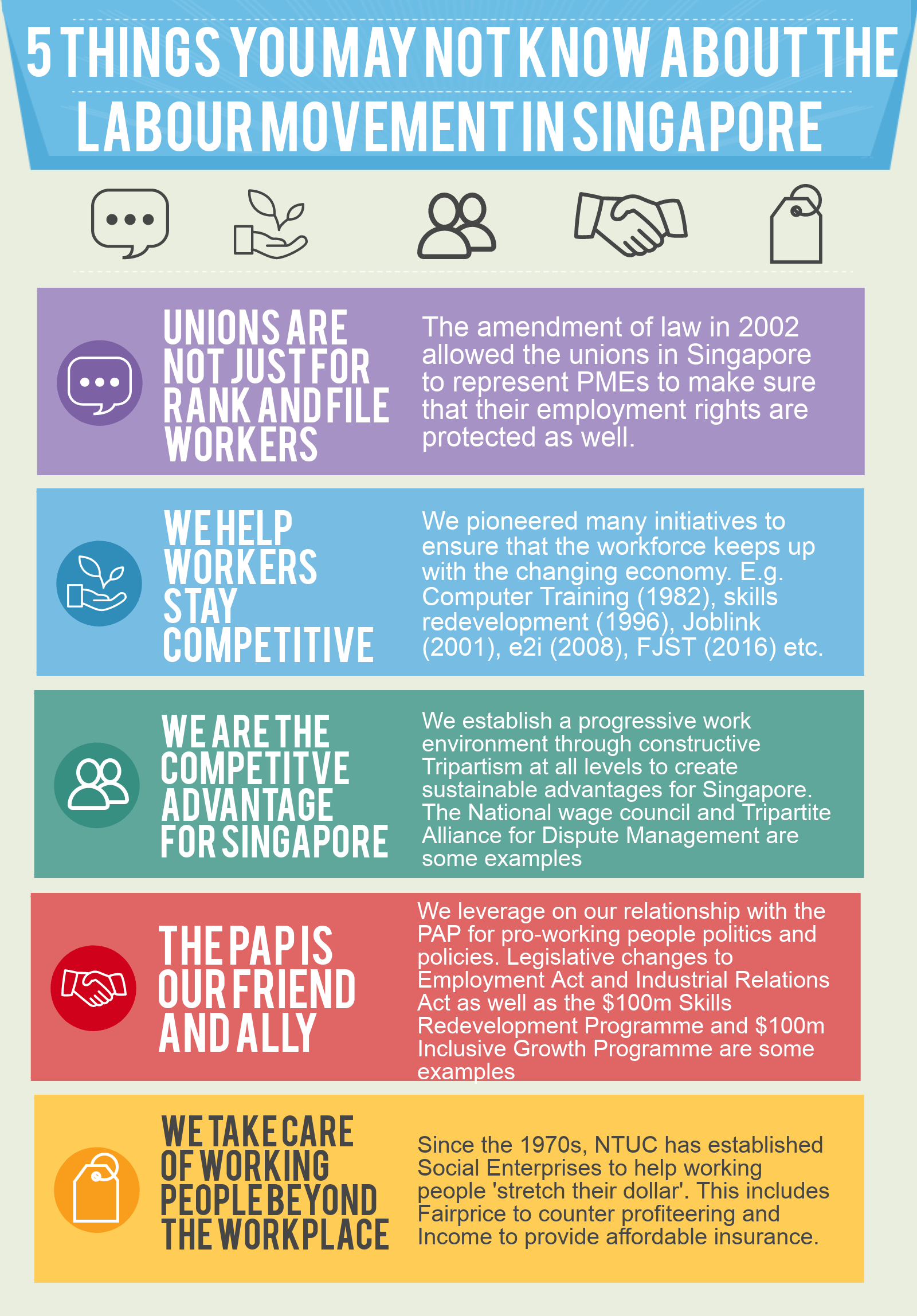
Then, Eunice was also asked to create an “internal circular,” which is a document for organizational announcements from upper management. The circular was urgent, so she quickly used an existing template on Piktochart and was able to push out the circular within two hours.
The idea behind this particular circular was to communicate the need for the entire organization to change, evolve and to keep up with the times. Certainly a message that, in order to be successful, would require a certain level of persuasiveness. Not an easy task, but luckily for Eunice she was able to use infographics to her advantage – and the circular was very well-received.
“Everyone said that the story and position behind the change was clearly communicated and easily understood,” she said. “Plus, they all said it was visually appealing!”
Click to see the full infographic.
Based on her experience, Eunice believes that when text is replaced by graphics, a message automatically becomes more “palatable” for the audience. And as our goal is to create messages that persuade others to take action, visual communication has worked very well for Eunice as a platform to convince and sway people into some form of decision making.
While new users to Piktochart typically start off being supported with templates, some of our power users, like Eunice, sometimes enjoys creating projects from scratch.
She recommends for those who want to venture off and use a blank slate within Piktochart to “start with an end in mind and know what look you want to create. Next, familiarize yourself with the different functions of the tool and understand what it can and cannot do. From there on, you’ll be able to think about how to achieve the look you want with the different functions of the tool,” said Eunice.
“Be open to experimenting. Try and if it doesn’t work – you can always hit undo or delete. Nothing is set in stone. Remember, ctrl-z is your best friend!”
If you’re a fellow consultant and regularly hire designers, but want to cut down on costs, you might want to check out our design cost calculator. It’s an interactive, research-driven site that helps you determine how much you’ve been spending on hiring designers and can help you figure out how to be more cost effective without sacrificing design quality.


