Today’s non-designers are equipped to create beautiful infographics without breaking a sweat. If you’re a Piktochart user, you know that you can easily drop your content and data into a myriad of professionally-designed templates and produce stunning visuals in no time. Beautiful visuals aside, you’ll also want your infographics to be effective and engaging.
So how do you make an infographic that has both beauty and brains?
Even if you don’t come from a design background, you can take refuge in the fact that every visual out there can be broken down into basic design principles. It’s these principles that will elevate your infographic from “it’ll get the job done” to “pretty darn incredible.”
This is why we’ve pieced together the holy trinity of pro tips that will make your infographic both stunning and effective. Give these tips a try with Piktochart for free by simply creating an account.
1. Pick the Right Set of Colors
At the heart of basic design principles is learning what to do with colors. It may not seem obvious from the get-go, but picking the right scheme is possibly the single most important design decision you’ll make. We’ve written about picking the right color schemes in the past if you’re looking for a reference.
Our Community Evangelist Jacqueline Jensen recently filmed a course on infographic making with Skillshare and she dove deep into how to optimize the colors on your visuals. Click here to access the course.
Picking your color scheme is tougher than you think, but Jacqueline says that the “Rule of 3 Colors” will lead the way.
It’s a two-step process:
Pick one primary color → Then pick two other complementary colors
The goal of the rule is just to simplify things for you and the recipient of your infographics. This way, colors are not fighting for attention so readers can focus on what really matters — your content.
Below are two familiar examples of color schemes that work.![]()
You should also ask yourself three questions when picking your colors:
- Any preset brand colors to keep in mind? Brand identity should be kept as consistent as possible, which is important to keep in mind if you are creating visuals for a client. This helps the audience quickly identify brand presence in the vast ocean of social media posts. A preset combination will also save you the time of picking colors.
- Is your visual for seasonal marketing? Get inspired by your season’s color palette! Whether it’s a holiday (think Easter) or a festive season (Halloween is our personal favorite), it’s important to keep in mind the colors associated with certain special dates which can evoke certain moods.
What is your content trying to say? If you’re stumped, your content can actually help dictate the colors that you’ll use. For example, if your infographic is about the great outdoors, then you can use shades of green and blue – just like the forests and ocean.
2. Manage Your White Space
We ran a blog post about white space management a little while ago. Otherwise known as the “space between” screen elements or the “negative space,” the white space is a zone in an infographic that is free of any info or graphics!
Proper use of white space can spruce up your infographic in a number of ways including:
- Improving the readability of your content. White space literally makes your infographic “easy on the eyes” for readers. It helps them focus on one section of content at a time, without being distracted by a nearby block. Without much white space, an infographic can appear to be cluttered and purposeless.
- Improving consumption and comprehension. White space can be considered the unsung hero of a visual, silently guiding eyeballs through your infographic. The right use of white space helps readers consume content in the intended order and helps with prioritizing what’s meant to be read first.
See the below visual for an example of white space guiding your eyeballs (and yes, this visual includes plenty of intentional white space).
Knowing how to leverage white space is a fundamental design principle, and one of the first lessons every novice designer goes through.
[clickToTweet tweet=”A key part of what drives good white space use is an obsessive approach to alignment.” quote=”A key part of what drives good white space use is an obsessive approach to alignment.”]
An infographic with proper alignment makes all the difference, and we’re talking every bit of text, your images, logos, blocks. After all, an infographic’s life purpose is to present information in a beautiful way – so why make it look cluttered and confusing?
The below image tells all and you can immediately see the difference good alignment makes.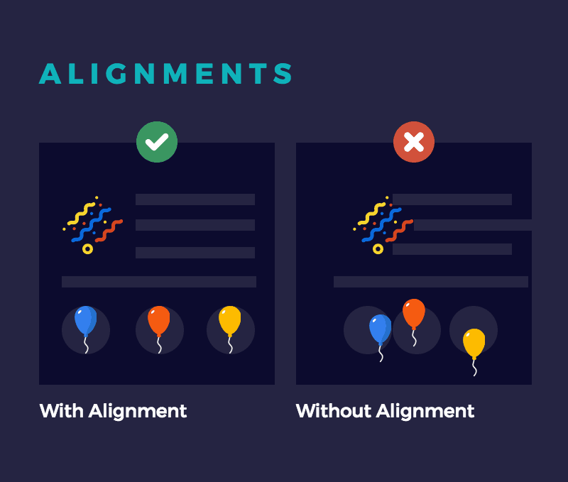
3. Choose the Right Typeface
To you, it might just be a matter of choosing a font that strikes your fancy, but there’s so much more to it.
[clickToTweet tweet=”Typefaces are a big part of your first impression, it defines content purpose and brand identity.” quote=”Typefaces are a big part of your first impression, it defines content purpose and brand identity.”]
So choose wisely!
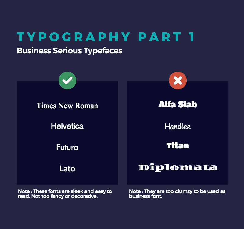
In this blog post about typefaces, our Head of Design See Mei Chow likens typefaces to knowing which dress code to adhere to for an upcoming event. Every typeface actually has its own set of personality traits, which is useful to keep in mind when setting the tone for each infographic.
One is the business serious typeface, which is perfect for the straight-shooter’s presentation. We’re talking no-nonsense, straight to the point, let’s close a deal. If this typeface was a person, they would likely be suited up with a stack of business cards in hand.
They work well for presentations such as:
- Quarterly financial reports
- Pitching to prospective clients
See below for samples of business serious typefaces.
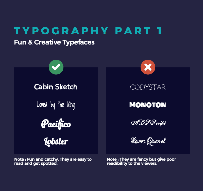
If your presentation takes on a more free-wheeling approach, then these fun and creative typefaces may be your best bet. These fonts are typically attention-grabbing and aesthetically-pleasing and is an opportunity to show off your personality. They might even be the life of the party.
These typefaces can be used for:
- A presentation describing your new passion project
- An infographic celebrating milestones of your business
One thing to keep in mind is that certain fun and creative typefaces may affect readability, which is one thing you won’t want to sacrifice.
With Pro, you can upload your own fonts and create your own custom infographic! Get started for free by creating an account.
Upping the Ante
With all the resources available, anyone can make an infographic these days. But if your infographic goals extend beyond internal communications and you’re trying to win new customers with your visuals, then you’ll have to up your game.
By taking note of the trio of basic design principles, you’ll be churning out beautiful and engaging infographics in no time. We have faith in you.
If you’d like to get started, our designer Maxi Albella recently wrote a blog post on some of our most versatile infographics templates, which could be a good way to test out your new basic design principles know-how.
Here are a few to spark inspiration:
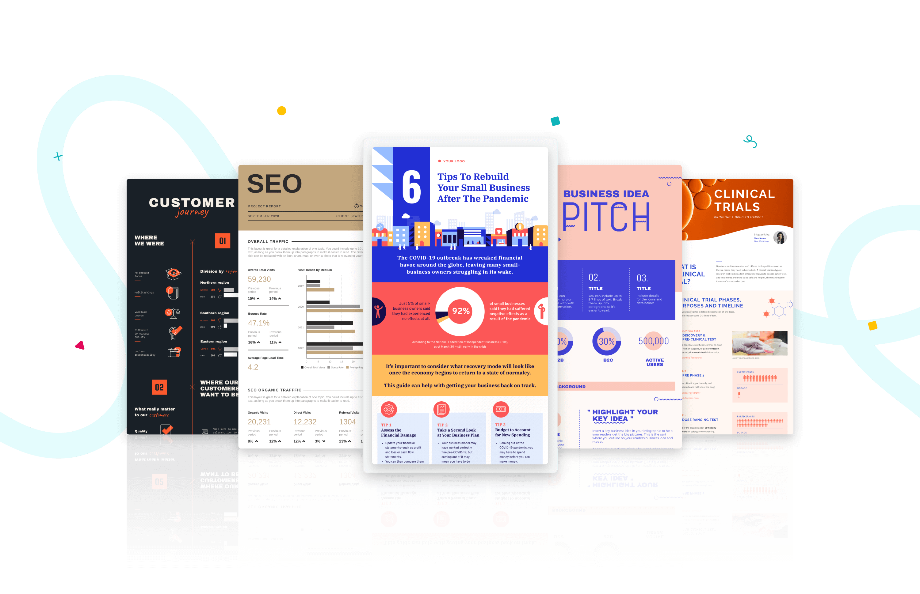
1. Business Basic – a very versatile template that works for every business scenario.
2. Startup Basic – a flexible template that channels the agile startup spirit.
3. Minimalist 2 – a template for those that believe less is more.
Piktochart offers professional templates for creating amazing infographics, presentations, reports, posters, social media graphics, and more. Sign up for free.
Create impressive visuals with Piktochart.
Make presentations, reports, infographics, and more.
Sign up for free