Infographics continue to be relevant. Just take a stroll through the internet if you’re curious! They are being used everywhere! You know why? Not only are they nice to look at, they’re a great (and condensed) way to present stories, data and knowledge. We here at Piktochart like to think that there are (at least) eight types of infographics for you to choose!
You can relay information, create brand awareness and engage with an audience in one fell swoop. And, you don’t have to be a professional designer to utilize them in your marketing campaign or announcements or presentations. Just keep in mind that great design will keep your stories from being inadvertently concealed from your readers.
So now that you’ve been wholeheartedly convinced that infographics are the right way to get your message out there (and that Piktochart is the right tool to use, hint hint), let’s talk details.
First, we need to cover how to get started with your infographics – the how.
- How should you think about structuring your infographic?
- How should your topic relate to the layout?
Next, we will cover the types of infographics that you can use to be successful – the what.
- What exactly are the layout categories?
- What does each layout pertain to?
- Which layout is appropriate?
Alright! Let’s get going, shall we?
To start, we need to talk about what exactly is layout.
In a nutshell, it can be defined as:
The sizing, spacing and placement or arrangement of design/visual elements for an infographic.
The reason why we should always decide on our layout right off the bat is it’ll make whatever content we are visualizing easy to digest for the audience.
But to choose a layout, you must first have an idea about what your end game is and ask yourself about the goal of your story.
Your approach is very important here. Is your goal to compare two topics like coffee vs. tea? Is it to make a lengthy article more visual? Maybe it’s to put a timeline or process to a procedure of some sorts like for instance, how to choose an infographic format!
This, of course, is in addition to knowing what your infographic will be about. Keeping these two things prior to starting will help you with the structure and readability of your chosen template. You’ll have to be focused with your communication though, since infographics and their layouts only allow for limited space.
When you are selecting a layout, just know that whatever you choose will direct your reader’s focus and allow them to follow your design with ease.
The placement and alignment of elements is paramount here relative to your purpose. The good thing is that this is all made to be easy for you in Piktochart! The layouts are all displayed in front of you. All you need to do is decide which one is appropriate for your infographic project!
Now that you have an idea about how to get started and what kind of questions to ask yourself, it’s time to get down to business. Matching your purpose and story to a type of infographic.
Flowchart infographics
Flowcharts or process infographics refer to information streams. It is the type of infographic you use to tell your mom about the steps you took to clean your room or if you’re more important – a process flow of your logistic sequence.
-
- Design for flowcharts can be simple
- Flowcharts are light hearted and humorous
- Work well on social media
Timeline infographics
Timelines usually tell a story in relation to time, it is essentially what happens from a ‘once upon a time, long long ago’ to a ‘and they all lived happily ever after…the end’. It takes users on a journey; that should be interesting enough to go on – we wouldn’t want to have a timeline of your toenail growth over a span of 6 month period now do we?
-
- Takes the user on a journey
- Can be simple or complex
- Has to be interesting/relevant so people care
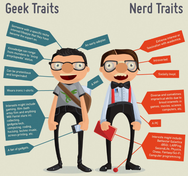
Versus infographics
Versus infographics are head to head comparisons of two things (sometimes more, but not too many!). You can’t decide if the quirky new hire is a nerd or a geek? Here’s something that may help you out.
-
- Design is important to visualize comparisons
- Works well with lots of data points and facts
- Has to be interesting/relevant so people care
Data Visualisation infographics
Data visualization is arguably the most used type of infographics on the web. It basically uses cool graphics to paint a data powered picture. Think of dull statistics being given a transformative makeover and being able dive right back into the information dating scene that is online media.
-
- Can answer a question or guide the reader
- Text can be used to describe/explain (don’t be too wordy)
- Design is usually simple and clean (think white space!)
Photo infographics
Photo infographics are the aesthetic prize winners of the lot. They are usually a photograph that includes some text to guide the user. As a rough example, Stop Signs are technically a photo infographic. Flyers for a pop concert, or invitations to an engagement party featuring just a snapshot of the lovebirds plus some info – these all fit the bill too.
-
- Needs a telling and visually intriguing picture
- Should focus on your topic
- Works well on social media
Visualized Article infographics
According to an urban legend, Visualized infographics were born in the deep dungeons of science, where meaningless algorithms, percentages, endless bodies of text, charts and scribblings from a mad scientist were the order of the day – all until he met a data scientist that was able to put all the findings together in an amazing, aesthetically pleasing form for the world (really, the internet) to see. True story!
-
- Needs a strong title
- Works well with lots of content
- Works well on social media
Useful Bait infographics
Attract the attention. Then, keep it. This is the kind of infographic you could find in a doctor’s office, in a classroom, in driver’s Ed. It needs to display important information in a way that is attractive but also relevant. In this case in particular, usability is the priority and as it tends to be printed, some resources like videos or URLs should be left out.
-
- Usability over design
- Can be printed to be referenced over and over
- Works particularly well on Pinterest and Stumbleupon
Number Crunch infographics
Have you ever struggled with a bunch of data and numbers, trying to make it digestible for other people? This is the infographic you need. Whenever you have a lot of content to process, graphics and charts will come to your aid to help you solve this graphic need. Make it visual and it will work better, even in grand scales. Take this, for example.
- Works with lots of content but pick key points wisely
- Made up of charts and numbers
- Good design needed to support the data
Now you know about the different types of infographics and how to choose a suitable type for your project. Give it a go and create something informative and beautiful! But if you find yourself scratching your head about how to get started with your infographic, make sure to use this checklist below to help you get going.

Checklist Material
How to get started with your infographic?
√ Research for content or find your data.
Hello, Sherlock! It’s research time! Dig for trending topics, data, general conversation topics and more. You need to find relevant information to back up your work.
√ Curate content.
Less is more. Choose the strongest points and make sure you filter out all the “fillers”. But don’t forget to include the relevant data you researched.
√ Decide on one layout.
Your information is talking. If you pay attention, you’ll be able to choose the layout that will make your content sing!
√ Prepare media and other elements to add on it.
Images, icons, maps, videos. Add the media that can complement your information and that will help your readers navigate your work more efficiently.
√ Choose a template that will fit your needs.
Our dream team of designers work hard to create different templates you can customize. Make use of them! Or you can also start from scratch – Go Picasso all the way!
√ Get started! Piktocharting time.
Time to get rocking! Let us know if you have any questions or if you wish to share your work with us. Happy Piktocharting!
Oh and be sure to check out more inspiring examples on our Pinterest board below! We hope that it gives you the creative juices you need to rock the socks off your next audience. Let us know what format you use most or like the best in the comment section!

