Another year has come and gone and we’re amazed at how quickly it’s flown by. It was chock full of challenges, incredible learning experiences, and exciting new milestones for us – and we’re grateful for all of it.
2017 was particularly action-packed! We’ve been through one wedding together, and have also welcomed three Pikto-babies to the family!
This year, we also celebrated our 5th birthday, crossed the mark of 10 million users, launched our Slack community for those users, we also released a new branding palette feature in our tool for businesses. As a company, we’ve also grown in size, made strategic decisions when it comes to our product and its respective teams, and expanded our horizons in terms of remote working.
To dive into our learnings for this year, we’re taking a leaf from last year’s post and using our PIKTOCHART acronym to get organized. Let’s dive in!
P is for People
For starters, we brought on board five new people this year to make up a total of 52 Pikto-peeps. And out of those 52 people, 20% of us are remote. Based on nationality, our people hail from 14 different countries from all around the globe, including the Americas, Europe, and Asia.
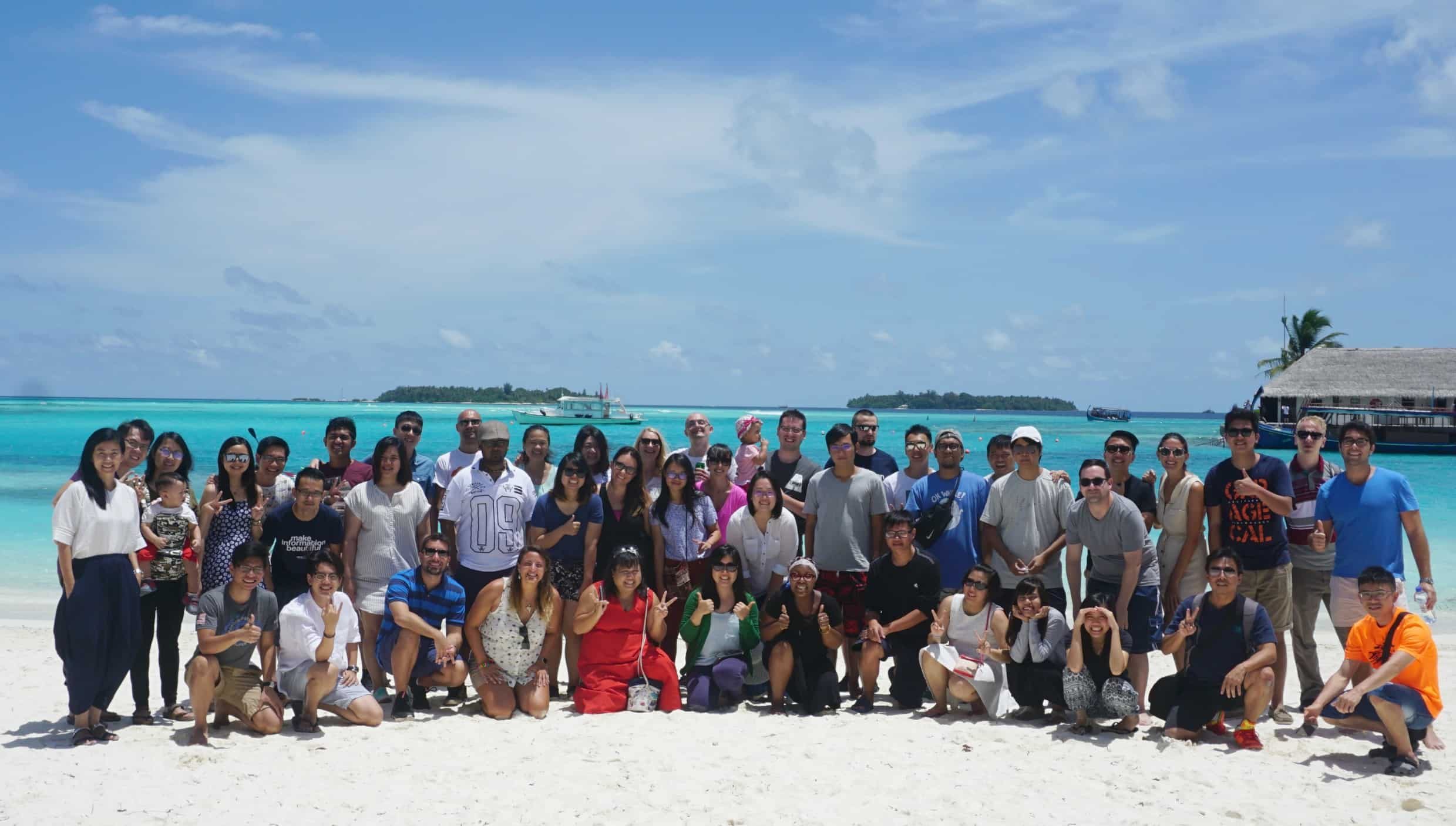
As a semi-distributed team with headquarters in Penang, the biggest challenge we’ve faced when it comes to recruitment is to get people to relocate. It hasn’t been easy, and this year we’ve learned that we’ll have to consider other locations in order to appeal to talented candidates. To address this, we decided to expand our remote working force and also hire in more countries in Southeast Asia. While this opens up a larger talent pool, it’ll still keep our people in the same timezone which is useful to remote collaboration.

To be more focused on building up our company culture, we’ve also introduced a brand new role – a People Success Officer. This person would focus on creating customized plans for our leaders via a coaching process, but would also dig deep into the career aspirations of every one of our Pikto-peeps. This, we believe, will help build a company culture that truly sticks.
I is for Infographic
2017 was also big for us in terms of fine tuning our brand identity. With our upcoming rebranding effort, which our website, design, and marketing teams have worked tirelessly on, we also dug deep and thought about what we wanted our future product to look like.
Historically, infographics have always been our bread and butter, and we’ve been striving to create an easy-to-use infographics tool for you.
This year, our infographics have been shared thousands of times – but our three most popular ones which have reached around 8,000 shares each are these:
The big winner for this year in terms of traffic was an infographic called “Keto On A Budget,” which according to our analytics – scored over 60,000 views. Kudos to you Keto Connect!
While infographics are still quite central to our identity as a product company, we also realized that we wanted to pivot to becoming more of a suite of creative design tools in the future.
The reason for this is competition in the visual communication software arena has become quite fierce over the years. While we started out as one of the pioneers in the space, we naturally needed to expand our offerings to become more multi-faceted. Case in point, this year, we were very proud to introduce a brand new addition to our printables section – the flyer format. We’re now working on introducing more new formats in the year to come, so watch this space!
K is for Knowledge
We like to get to know and cater to our users, all 11 million of you! This year was a big year of growth for us, as we welcomed 3.5 million new users into our community. Collectively, these users created almost 7 million visuals altogether. Well done to all of you, who created beautiful visuals on our platform all year long!
In 2017, a total of 7,319 customer support tickets have been resolved. We’ve also launched a new self-service knowledge base which helps answers frequently asked questions. This way, you can get your design-related issues resolved much faster.
This year, we also made great strides in getting to know you better by creating a Customer Success team, on top of our Customer Delight team. This way, our Pikto-peeps can either focus on helping you with any issues that you’ve experienced with our product, or zero in on things like improving your experience in Piktochart.
To us, user research is and should be an ongoing exercise. We’ve been working to stay on top of things like user happiness, engagement, adoption, retention, and so forth. We still have much to understand, which is why this coming year our research will be focused on those of you who find Piktochart useful and like coming back to us, to see how we can make your experience even more enjoyable in the future.
T is for Teams
Since we launched in beta, we’ve been taking notes based on the way that you’ve been interacting with the product, and after months of tirelessly tweaking – we’re ready to officially launch in early 2018!
For those unfamiliar, Piktochart for Teams is our collaborative design solution for groups. It’s a product that many of you have been asking for, to create ease in collaborating with internal teammates but also with clients. Over the past years, we’ve realized that the traditional feedback and review process within Piktochart has been a bit tedious, which is why we’ve now replaced it with an easy-to-use commenting feature. You’ve also told us that you’ve had trouble locating the right brand assets (ie. logos and colors), which is why we’re now creating a one-stop-shop experience for you.
While the beta version that you’ve been exploring up until this point works well for small teams of up to 10, we plan on scaling up big in 2018 to accommodate the workflows and asset volumes for larger teams of up to 100. So stay tuned!
O is for Open Up
Besides being one of our core values, where we care deeply about being transparent and honest with one another, ‘Open Up’ is something that we’ve struggled a bit with in the past year which does affect team operations and culture.
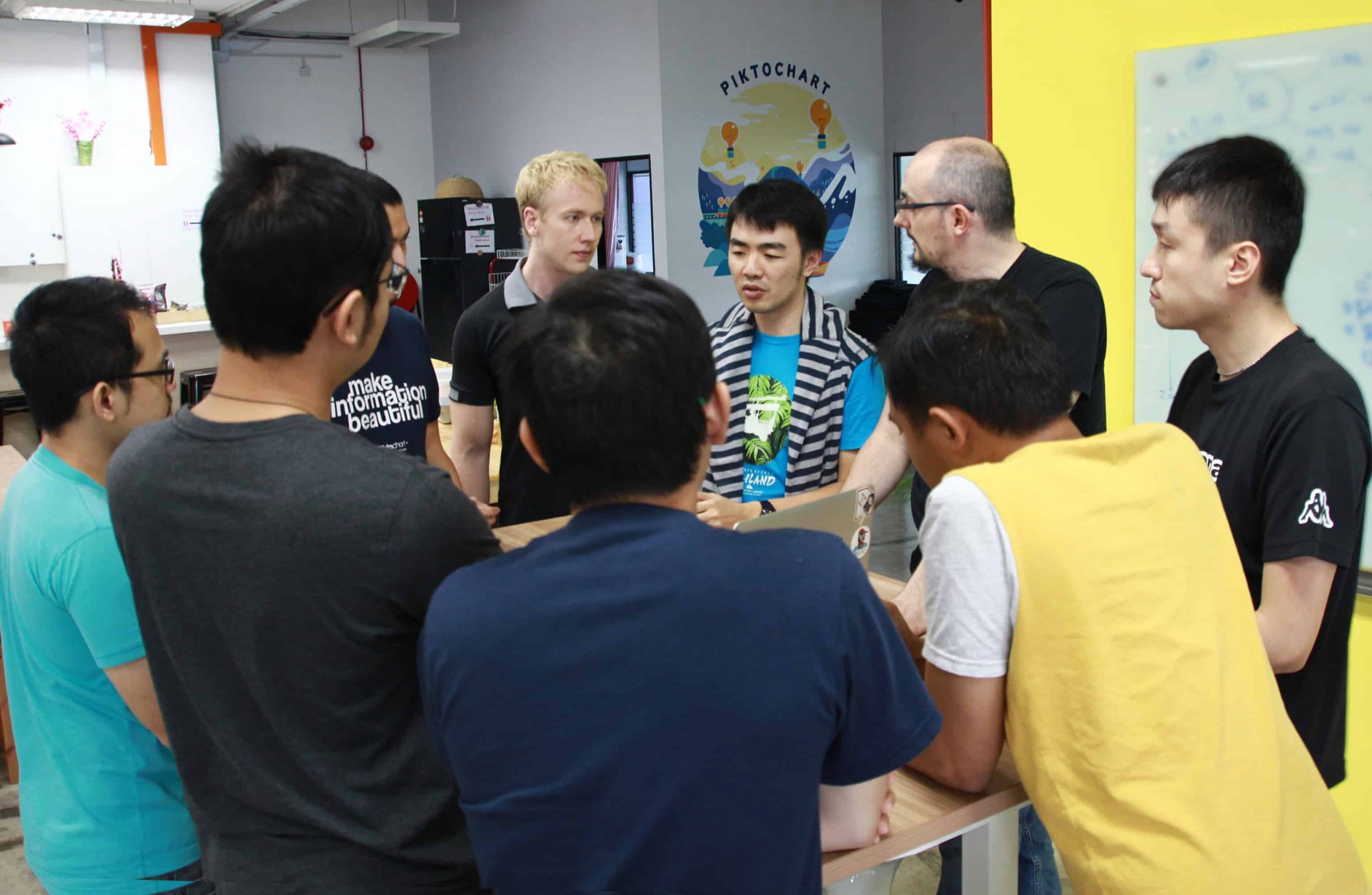
On the product side, we’ve felt that the overall transparency of the product direction and roadmap was lacking, and also that our product teams (which are split into Core and Teams) have been working in a bit of a silo-ed environment. To address this, we’ve introduced a monthly meetup between the Unity and PMs, as well as bi-weekly progress updates to the whole company.
C is for Community
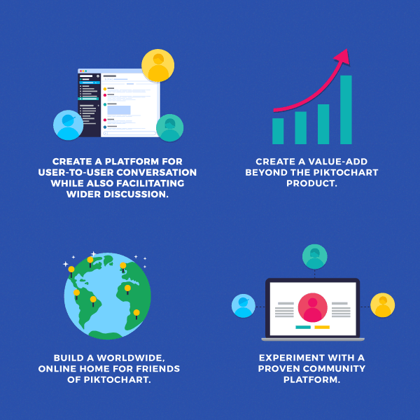
We have a lot of love for you, our users who continue to help us to become better. This is why we decided to launch a Slack community, as 70% of you said that you wanted to see and get inspired by how others were using the tool.
Here’s an infographic summarizing why we started the community:
The community witnessed explosive growth between the months of August to October, as it grew 998% from 155 to 1,702 members! We’re now working to launch yet another community for you, this time on Facebook – so stay tuned for that one!
H is for HOPEFUL
Besides the ongoing fixes that we’re making in the ‘Open Up’ arena, we’ve also made changes in terms of our core values.
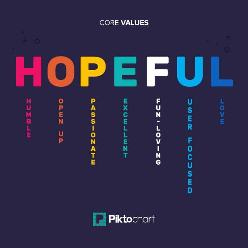
For those unfamiliar with our HOPEFUL values, here’s a quick overview:
H stands for Humble, as we value humility as a strength; O stands for Open Up and we believe in being transparent in all that we do; P stands for Passionate as we love what we do; E stands for Excellence as it’s what we strive for in our product and day to day work; F stands for Fun as a team that plays together stays together; U stands for User-focused and we’re always looking to understand you more; and L stands for Love which is present in how we relate to one another.
We decided to change one of these core values in 2017, specifically as it pertains to the ‘E.’ It had, for many years, stood for ‘Effective,’ but this year we felt that ‘Excellence’ was a better fit for the great work that we were trying to do. This is because while ‘Effective’ is likened to “getting things done,” ‘Excellence’ is more akin to “getting things done in the best way possible.” We’re not just looking to get things done, but to also take our implementations up a notch.
We also care a lot about giving back, internally as well as externally. This year, we’ve also donated $13,500 to a handful of charities via our employee recognition platform, Kudos. The platform provides a concrete and public way to praise your teammates. How it works is that you dole out points to others every month, which gets documented on a public forum for everyone in the company to see. Your teammates can then either exchange their points for gifts or donate to their favorite charity.
A is for Assets
Our design team has been tirelessly working to add a variety of templates to our editor. This year – we’ll have created 150 new templates, and many of them will be in a different style than you are used to!
They’ll be more varied, photo-heavy and will range from serious business looks to something more joyful and festive.
To dive into more specifics, in 2017 – our designers have created 88 new animated icons, added 400 text and photo frames, as well as 1,300 icons and SVGs.
And this year, our marketing team has also taken more ownership in the product – helping our designers brainstorm ideas and write copy for some of the newest templates that you see in the editor. In the future, we really aim to create new templates that are closely aligned to the visuals you need to create – whether it’s a pitch deck, a keynote presentation, or a social media post. The idea here is our templates are becoming more contextual and specific to your visual needs.
For instance, if on our blog we show you a string of visual examples for organizational announcements, we’ll also provide the templates so you’ll be able to pick and choose.
R is for Rebranding
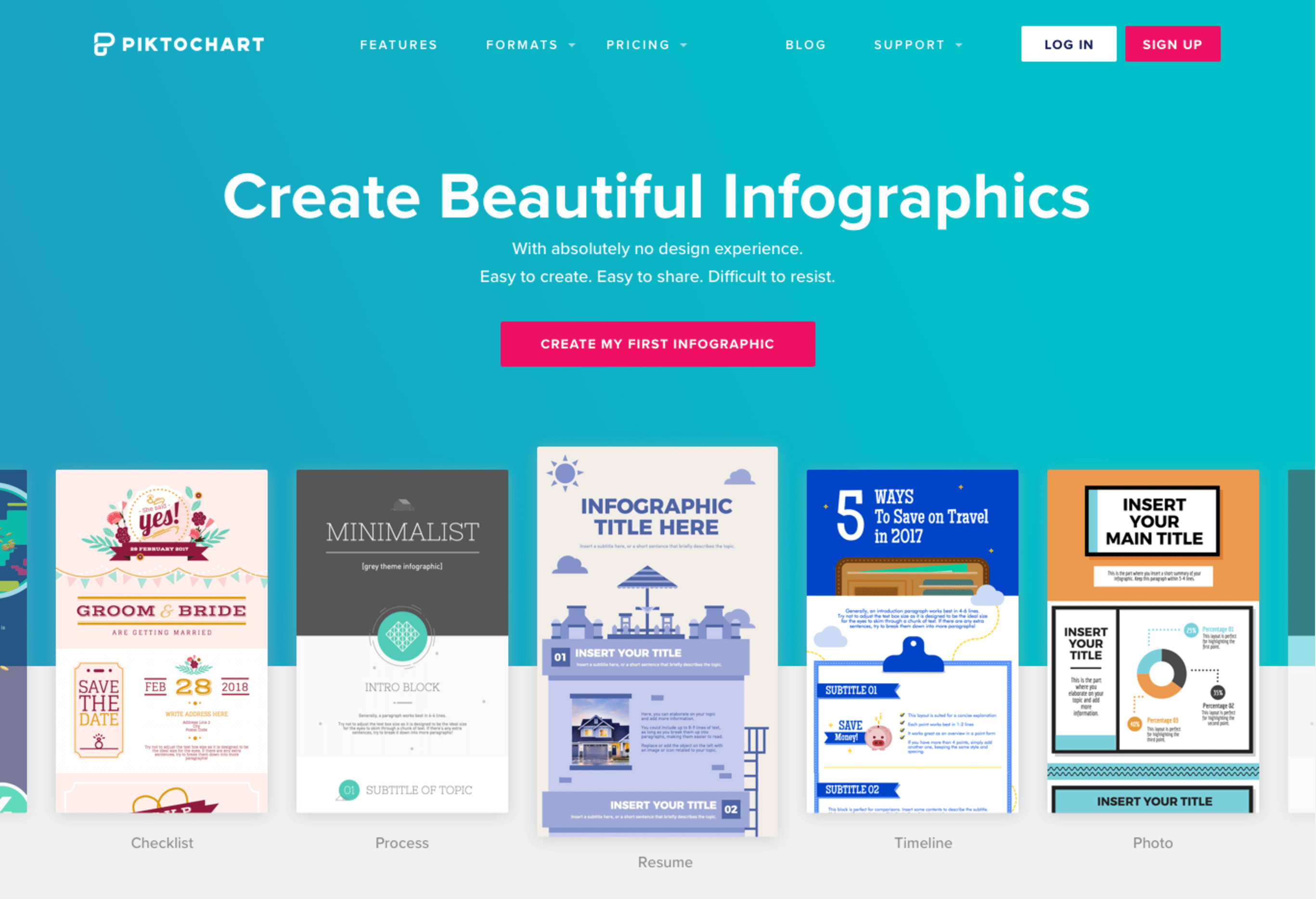
2017 was also a big year for us in terms of building our new brand identity, and we spent most of it on a rebranding effort that you’ll be seeing in the new year.
The need for change was born of our realization that we needed an integrated system. This thought was sparked all the way back in 2015, when it became clear that our design and marketing departments were working blindly without the help of a brand guide. If you can imagine, it was like these teams were navigating the same ocean with a handful of different maps.
We also needed something to represent our new product direction. Last year, we decided to position our product as a creative suite of apps, instead of being a one-product company, and the rebranding would help us communicate that to you. While the idea to rebrand was a long time coming, we took this time to design a new logo that would represent those important changes and to also create a brand new website that would reflect our new focus.
It took until this year to coordinate the logo redesign with a branding agency, as well as working with our website team to create a new look and feel, as well as re-write all the copy. It’s been a lot of work and we’re excited to show off the fruits of our labor!
Here`s a sneak peak of the new website below:
T is for To Infinity And Beyond!
This past year was eventful and productive for us, but we’re even more ecstatic about what the new year will bring. The overarching message or theme that we’d like to leave ourselves and you with though is to stay HOPEFUL.
We are hopeful in regards to our teammates that will be joining us in 2018, are hopeful about the product plans that we have coming up, and are definitely hopeful about accelerating our development so we can build the best possible tool for you to get your jobs done quickly and beautifully.
Happy new year from Piktochart, see you on the flip side!
